Global Warming – A Very Brief Summary
[last update: 2009/03/13]
The global warming or climate change issue is assumed by most people to be caused by anthropogenic carbon-dioxide (CO2) emissions. This is due to the media blitz following the Intergovernmental Panel on Climate Change (IPCC)‘s declarations of almost absolute certainty and Al Gore’s promotion of exaggerations. What is not widely reported is that many scientists disagree with that assumption and that the empirical data do not support it.
(see: www.appinsys.com/GlobalWarming/TheExperts.htm and www.appinsys.com/GlobalWarming/GW_Part7_PoliticalConsensus.htm)
The anthropogenic CO2 based theory is based strictly on computer models – the empirical data do not support it.
The United Nations IPCC was founded in 1988 with the purpose of assessing “the scientific, technical and socioeconomic information relevant for the understanding of the risk of human-induced climate change.” -- i.e. it is based on the assumption of “human-induced climate change” – there was no attempt to evaluate the scientific evidence of the cause of the warming. The IPCC released climate change reports in 1990, 1996, 2001 and 2007. Although the IPCC has become the “definitive” authority and always makes statements regarding the definite human causation, it has never provided substantial scientific evidence that anthropogenic CO2 is the cause. The only evidence provided is the output of computer models.
Global warming alarmism has taken over. As Richard Lindzen (Alfred P. Sloan Professor of Atmospheric Science at MIT) said [Ref.32]: “It isn't just that the alarmists are trumpeting model results that we know must be wrong. It is that they are trumpeting catastrophes that couldn't happen even if the models were right”
This brief summary examines the scientific evidence and provides a guide to further information.
Some of the important points that will be examined:
Global Temperatures
IPCC Model Implications
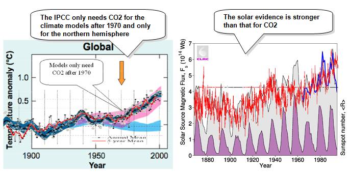
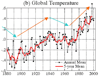
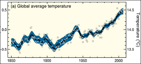
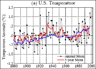
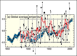
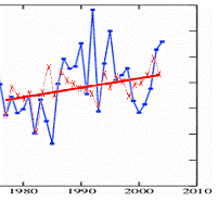
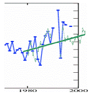
The following figures show the change in average global average surface temperature: (left): from 1880 to 1999 (Hansen et al at NASA – Ref 20) and (right): from 1850 to 2005 (from the 2007 AR4 IPCC Summary For Policymakers [Ref.1]). These sources are based on adjusted surface station data.
The following figure is from the IPCC 2007 Summary for Policymakers Figure SPM-4 showing the results of climate model simulations. It compares decadal temperature averages (black line) with the result of model simulations. The lower (blue) band shows the results of model simulations using only the natural forcings due to solar activity and volcanoes. The upper (pink) bands matching the temperature lines show the results of model simulations including anthropogenic CO2.
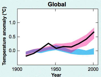
IPCC Model Simulations (from IPCC Figure SPM-4)
The next figure combines the previous three figures. It is important to note that the climate models only need the anthropogenic CO2 after 1970 – prior to that the models without anthropogenic CO2 also match the observed warming. In other words, anthropogenic CO2 has contributed to global warming only since 1970, according to the IPCC. The warming prior to that can be explained by the models with only natural variation.
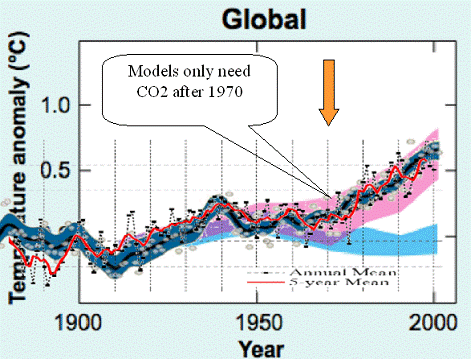
IPCC Models with Global Average Temperatures
Satellite Data
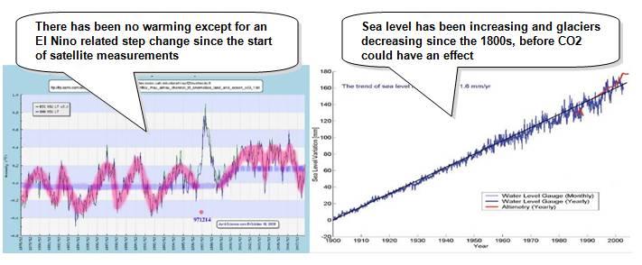
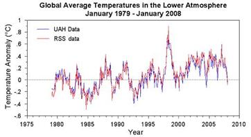
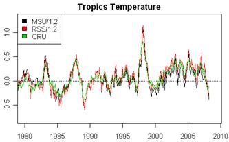
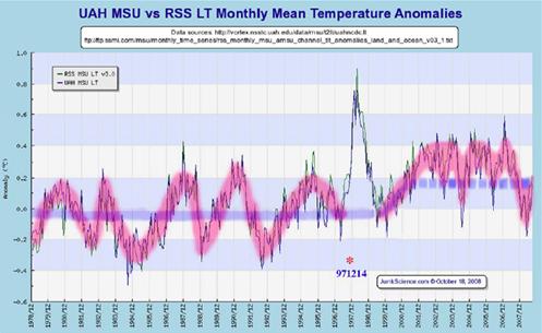
NASA started measuring the earth’s temperature by satellite microwave sounding unit in 1979. This provides less than 30 years’ data to the present, but allows some comparison with the surface station temperature measurements. The satellite data measured by NASA are processed at two locations: University of Alabama at Huntsville (UAH) and by RSS. The figure below left shows global lower atmosphere temperature from the satellite data. The right-hand plot compares the satellite data with the Hadley Climatic Research Unit data for the tropics. The 1998 spike was a severe El Nino.
The next pair of figures show global temperature data from 2002 to 2008. The figure below left compares the Hadley Climatic Research Unit with the NASA GISS surface station data. The right-hand figure shows the satellite-based data as process by UAH and RSS. In all data sets there is an absence of increased warming trends.
![[Had+Giss.bmp]](GW_Nutshell_files/image009.jpg)
![[Uah+Rss.bmp]](GW_Nutshell_files/image010.jpg)
In light of the lack of warming observed since 2001, it is interesting to compare the IPCC statements. From the 2001 IPCC TAR [http://www.grida.no/climate/ipcc_tar/wg1/pdf/tar-01.pdf]: “The fact that the global mean temperature has increased since the late 19th century and that other trends have been observed does not necessarily mean that an anthropogenic effect on the climate system has been identified. Climate has always varied on all time-scales, so the observed change may be natural. A more detailed analysis is required to provide evidence of a human impact.” And from the 2007 AR4 [http://ipcc-wg1.ucar.edu/wg1/wg1-report.html]: “Most of the observed increase in globally averaged temperatures since the mid-20th century is very likely due to the observed increase in anthropogenic greenhouse gas concentrations. This is an advance since the TAR’s conclusion that “most of the observed warming over the last 50 years is likely to have been due to the increase in greenhouse gas concentrations”. So no warming becomes more definitely anthropogenic global warming.
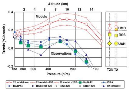
A study comparing the models to observations from satellites and balloons (1979-2004) also shows a problem with the models. The following figure is from the study. “A comparison of tropical temperature trends with model predictions”, by Douglass, D.H., J.R. Christy, B.D. Pearson, and S.F. Singer, 2007 - International Journal of Climatology. [http://www.scribd.com/doc/904914/A-comparison-of-tropical-temperature-trends-with-model-predictions]. The models exhibit the CO2 theory of most warming occurring in the troposphere. However, the satellite and balloon based observations show warming only at the surface of the earth. The report stated: “Model results and observed temperature trends are in disagreement in most of the tropical troposphere, being separated by more than twice the uncertainty of the model mean. … On the whole, the evidence indicates that model trends in the troposphere are very likely inconsistent with observations that indicate that, since 1979, there is no significant long-term amplification factor relative to the surface. If these results continue to be supported, then future projections of temperature change, as depicted in the present suite of climate models, are likely too high.”
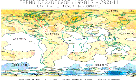
The University of Alabama at Huntsville provides monthly plots of worldwide temperature anomalies for the troposphere since 2000 [http://climate.uah.edu/]. The following figure is from UAH and shows the temperature trend (degrees per decade) for 1978 to 2006. According to the CO2 theory, warming should be occurring over both poles – but this is not happening.
Surface Station Data
Global average temperatures as reported by the IPCC, NASA, etc. are calculated from readings taken at surface stations. Temperature stations report daily min / max temperatures, which are averaged for each month. The monthly min / max / averages are available in GHCN database. Homogeneity adjustments are then made for further calculations. The temperature anomalies are calculated based on 1961 –1990 (i.e. the difference from the average on 1961 – 1990). The anomalies are then averaged for 5x5 degree cells around the globe. The IPCC interpolates temperatures for empty cells if there are some adjacent non-empty cells. The 5x5 grid cells are averaged for latitude bands and then the latitude bands are averaged for world.
The National Oceanic and Atmospheric Administration (NOAA) and NASA Goddard Institute for Space Studies (GISS) are the major providers of climatic data in the US. The following figure shows the distribution of temperature stations used by the GISS, as well as the number of stations by year [Ref. 19]. A problem with determining temperature trends results from the lack of coverage of the Earth. This is compounded due to the termination of measurement stations, especially during the 1980’s – 1990’s, a problem of lack of continuity.
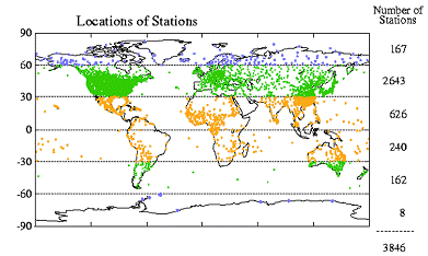
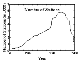
Temperature Measurement Stations: a) Locations, and b) Number of Stations by Year
The 30 to 60 degree North latitude band contains about 70 percent of the stations and more than half of those are located in the United States. The following figure shows the number of stations in the U.S. and the rest of the world (ROW) for various years. For most of the historical period, about 50 percent of the world’s stations are in the U.S. This implies that if these stations are valid, the calculations for the US should be more reliable than for any other area or for the globe as a whole.
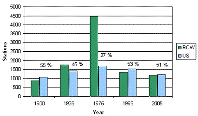
Stations in U.S. v Rest of World (ROW) For Various Years
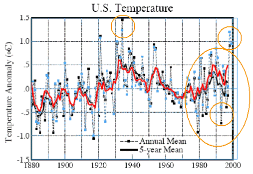
The following figure shows the temperature trend for the United States. The left-hand figure shows the annual average temperatures (black) along with the 5-year average (red) and the 5-year average of the global average temperature (blue) [Ref. 20]. The right-hand figure compares the US data with the IPCC global average figure. As can be seen, the United States exhibits significantly more variation than the global average; the temperature increase in the US is similar to the 1930’s.
Temperature Trend for the United States and Comparison With Global Average
As mentioned briefly above in how average temperatures are calculated, “homogeneity” adjustments are made to the temperature data to account for changes in equipment, station location time of observation etc. Adjustments are made based on data at nearby stations. The temperature adjustment methods also change with time. The following figure shows the temperature trend for the United States. The left-hand figure shows the adjusted temperatures calculated in 1999, while the right-hand figure shows the same data with the updated adjustments calculated in 2001 (both by NASA – 2001 from Ref 20). The same raw data went into both figures – only the adjustment method changed.
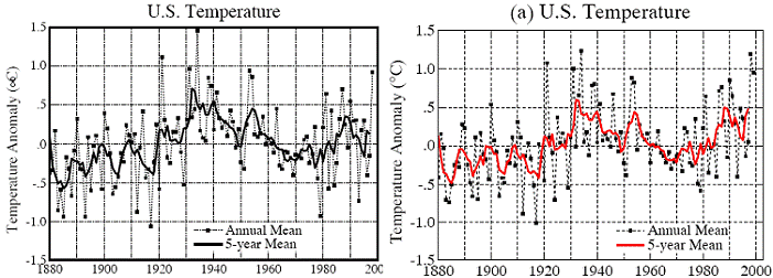
Temperature Trend for the United States – Left: Adjusted 1999, Right: Adjusted 2001
The next figure compares the two adjusted data graphs shown above. The new “improved” adjustment method creates more warming, reducing the temperatures in the 1930s and increasing the temperatures in the 1990s.
Temperature Trend Comparison: Blue points are from the 2001 Adjustments
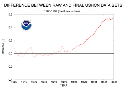
NOAA provides a summary of the adjustments made to the USHCN temperature data as shown in the following figure. [http://www.ncdc.noaa.gov/oa/climate/research/ushcn/ushcn.html] The report states: “The cumulative effect of all adjustments is approximately a one-half degree Fahrenheit warming in the annual time series over a 50-year period from the 1940's until the last decade of the century.” This is similar to the total amount of warming “observed”.
See www.appinsys.com/GlobalWarming/GW_Part2_GlobalTempMeasure.htm for more details on the measurement of global temperatures and the effects of the adjustments to create artificial warming.
The temperature station site and whether it is urban or rural has a great effect on the temperature trend (although this is downplayed by the IPCC saying that adjustments take care of it). The following figure shows a plot of temperature increase rate versus population for California [Ref.21] illustrating the urban heat island effect.
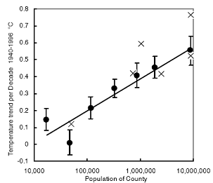
Urban Warming Effect
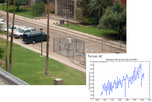
The following two figures compare an urban parking lot based station (Tucson, AZ) and the closest rural station (Tombstone, AZ).
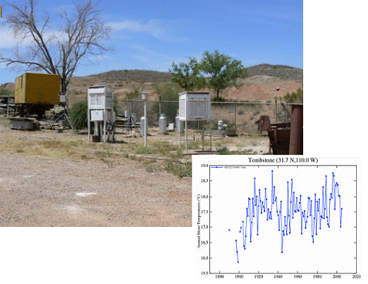
Within the United States (as in the rest of the world) there is significant regional variation in trends. The following figures show the two extremes. The central US (dustbowl area of the 1930’s) still does not have temperatures as high as the 1930’s. The Southern California / Arizona region includes mostly urban stations, including the top urban growth centers (including Los Angeles, Phoenix and Las Vegas).
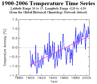
Temperature Trend for the Central US (left) and Southern CA / AZ (right)
The following figure illustrates the urbanization effect on temperature trends, comparing the urban Los Angeles station with the closest rural station. This is typical of the urban versus rural differences found all over the world (see the regional summary documents at www.appinsys.com/GlobalWarming/RS_Summary.htm).
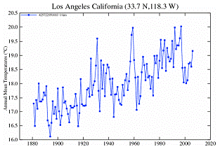
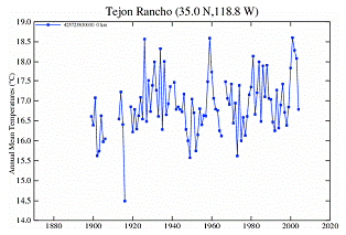
Temperature Trend for (urban) Los Angeles (left) and (rural) Tejon Rancho (right)
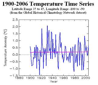
Other regions of the world also exhibit wide variations in temperature trends – the warming is generally a northern hemisphere phenomenon. The following figure shows plots comparing regional temperature trends for a) Southern Australia with Southern Africa, and b) Northern Europe with Northern Canada. The southern hemisphere regions exhibit warming that is still below temperatures in the early 1900’s, whereas the northern hemisphere regions show a warming trend that exhibits variations on a scale that exceed the total warming.
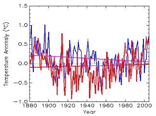
Regional Temperature Trends [left] Comparing Southern Australia (red) with Southern Africa (blue), and [right] Comparing Northern Europe (red) with Northern Canada (blue)
CO2 Theory Problem
The IPCC 2007 Report Chapter 9 – Understanding and Attributing Climate Change [http://ipcc-wg1.ucar.edu/wg1/Report/AR4WG1_Print_Ch09.pdf] provides a climate model based simulation of the expected CO2 “spatial signature” of all forcings including anthropogenic CO2 (left-hand figure below shows degrees change per decade). However, a study of actual data from radiosonde data shows a non-CO2 based signature [http://www.templatelab.com/climatescience-sap1-finalreport/]. The models do not match reality.
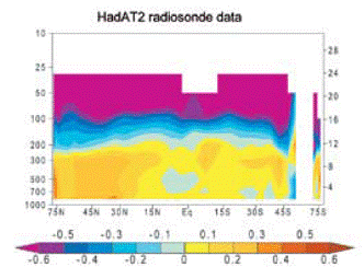
Trends in degrees per decade – left: IPCC CO2-based trend; right: actual data
In 1988 NASA’s James Hansen provided temperature predictions based on climate models (which he presented to the US congress). He modeled three scenarios: A had an increasing rate of CO2 emissions, B had constant rate of CO2 of CO2 emissions, whereas scenario C had reduced CO2 emissions rate from 1988 levels into the future. The following figures compare Hansen’s 1988 predictions with actual temperature data since then. The left-hand figure compares the NASA GISS surface station data (as compiled by Hansen), while the right-hand figure compares the satellite-based temperature data as processed by RSS. (Figures from Steve McIntyre [http://www.climateaudit.org/?p=3354] ). While actual atmospheric CO2 levels have increased since 1988, the fact that actual temperatures are similar to the reduced CO2 models implies a problem with the models. (See www.appinsys.com/GlobalWarming/HansensPredictions1988.htm for further details on these model predictions.)
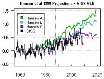
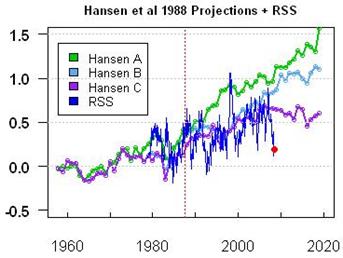
Comparison of Hansen’s predictions with actual data – left: GISS surface data; right: satellite-based data
The following figure shows the general trends before and after the unusual 1997/98 El Nino superimposed on the satellite lower troposphere data. There was no warming trend before or after the El Nino, but a step resulting from the El Nino. [http://icecap.us/images/uploads/ThereWasNoGlobalWarmingBefore1997(February15th2009).pdf]
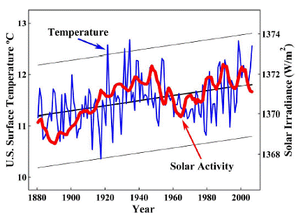
Correlation with Solar Irradiance
The following figure compares three figures from the IPCC 2007 Physical Basis for Climate Change report [Ref.2]. It shows a) the total solar irradiance and b) compares that with the temperature trend, as well as c) comparing the solar irradiance with the computer models. This deficiency of the computer models results in the deviation displayed in the right-hand figure, i.e. the models do not account for solar irradiance because the mechanism is as yet not understood and is therefore not incorporated in the models.

![]()
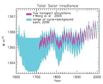
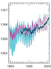
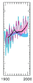
Solar Irradiance a) from IPCC Figure 2.17, b) with Temperature, and c) with Models
A study of temperature records in the northern hemisphere from Beer et al [Ref. 4] sates: “The global mean temperature changes between glacial and interglacial periods are large: about 20C for polar (Johnsen et al., 1995) and 5 for tropical regions (Stute et al., 1995). As a consequence the sensitivity for the 100 kyr Milankovitch forcing formally turns out to be about a 100 times larger than the values obtained from GCMs (emphasis added). This result illustrates that using global and annual averages to estimate the climate sensitivity can be very misleading, especially when seasonal and local effects are significant”.
Although the sunspot cycle is approximately 11 years, it varies over time and has generally been getting shorter over the last century. The following figure shows “Variations in the air temperature over land in the Northern Hemisphere (solid line) closely fit changes in the length of the sunspot cycle (dashed line). Shorter sunspot cycles are associated with increased temperatures and more intense solar activity. This suggests that solar activity is at least partly responsible for the rise in global temperatures over the last century” [Ref. 5]. The fact that the long-term temperature – sun correlation is better than the temperature – CO2 correlation indicates the deficiencies of the models in being able to account for the solar influence. Short cycles generate high sunspot maxima, whereas long cycles are characterized by weaker sunspot activity. Friis-Christensen and Lassen have shown that the close correlation extends back to the 16th century [Ref. 6].
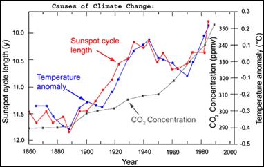
Correlation of Temperature With Sunspot Cycle Length and CO2
Many scientific studies provide evidence supporting the solar-based warming theory (see for example, Ref’s 7, 8, 9, 10, 11, 12, 13, 14). For example, a study by scientists at Armagh Observatory (Ireland) [Ref. 12] shows that the mean average temperature at Armagh is correlated to the length of the solar cycle. “We have found that it gets cooler when the Sun's cycle is longer and that Armagh is warmer when the cycle is shorter," said Dr Butler. In general, the more cosmic rays that reach the Earth, the more low cloud there is... reflecting more solar radiation back into space, so a drop in the amount of low cloud contributes to global warming.” The following figures show the results of a couple of those studies.
Correlation of Solar Irradiance and Average U.S. Temperature
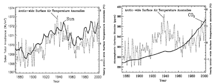
Correlation of Average Arctic Temperature with Left: Solar Irradiance and Right: CO2
A study done by the director of the Centre for Sun-Climate Research at the Danish Space Research Institute [Ref. 15] looked at the influence of the sun’s magnetic field on cosmic rays and cloud formation and found: “The sun... could explain most if not all of the warming this century… changes in the sun's magnetic field -- quite apart from greenhouse gases -- could be related to the recent rise in global temperatures”. A study done at the State University of New York [Ref. 16] found that: "The solar wind... deflects cosmic rays. As the sun becomes more active and the solar wind intensifies, the theory predicts fewer cosmic rays should reach the earth and less cloud should form. Data from the past 20 years backs this up: as the sun has become more active, low-altitude cloud cover has dropped."
The National Ocean and Atmospheric Administration (NOAA) web page called “The Sun-Climate Connection” states: “Many scientists find that these correlations are convincing evidence that the sun has contributed to the global warming of the 20th century” [Ref 17]. The following figure is from that article.
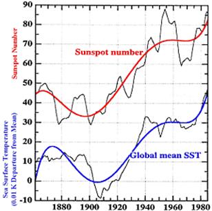
Correlation of Global Sea Surface Temperature With Sunspot Number
A study of solar irradiance at three locations in Oregon [Ref. 18] provides data showing a strong correlation between temperature and solar irradiance. The following figure shows the correlation of solar irradiance with temperature for the three locations (the temperature from the GISS database is shown as the blue line, the solar irradiance as yellow, red or green at the three locations).
Burns Eugene Hermiston
Correlation of Solar Irradiance and Temperature at Three Sites in Oregon
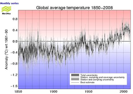
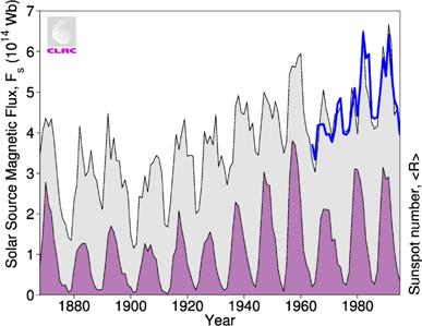
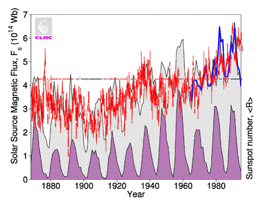
The following figures show the global average temperature from 1850 – 2008 (left) [http://hadobs.metoffice.com/hadcrut3/diagnostics/global/nh+sh/], and (right) the total solar magnetic flux (black line bounding grey shading and blue line) along with the annual sunspot number (shaded purple). The solar figure is from M. Lockwood, R. Stamper, and M.N. Wild: “A Doubling of the Sun's Coronal Magnetic Field during the Last 100 Years”, Nature Vol. 399, 3 June 1999 [http://www.ukssdc.ac.uk/wdcc1/papers/nature.html]) which states: “The magnetic flux in the solar corona has risen by 40% since 1964 and by a factor of 2.3 since 1901.”
The following figure superimposes the global temperature (from above left – changed to red) on the solar flux (from above right).
See www.appinsys.com/GlobalWarming/GW_Part6_SolarEvidence.htm for details of evidence of solar contribution to global warming.
Correlation with Oceanic Oscillations
While the El Nino / Souther Oscillatino has been measured for more than 100 years, the Pacific Decadal Oscillation (PDO) and Atlantic Multi-decadal Oscillation (AMO) were discovered in the 1990s. The following figure compares the correlation of temperature with the PDO+AMO (left) and with CO2 (right) [http://intellicast.com/Community/Content.aspx?a=127]. The oceanic oscillations have almost twice the correlation squared as for CO2. This also implies a problem with the models.
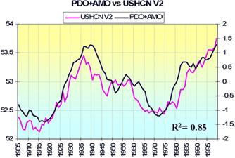
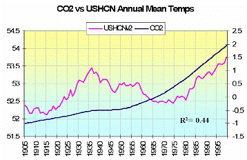
Correlation of Temperature with PDO+AMO (left) and with CO2 (right)
The following figure compares the correlation of temperature (green) for Western Washington and Oregon with the PDO (red / blue).
Correlation of Temperature with PDO for Western Washington and Oregon
See www.appinsys.com/GlobalWarming/PDO_AMO.htm for a more detailed description of the PDO and AMO, in terms of how they are measured and their effect on temperatures and other climatic phenomena.
Effects of Global Warming
Global warming is of some concern for its possible effects on increasing sea level (resulting from melting ice in Antarctica and Greenland), increased storms, droughts, etc. Most of the scare stories in this respect are outright fabrications.
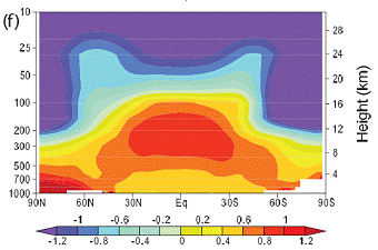
An article in GeoTimes on Antarctica [Ref. 22] states: “The North and South Poles were dubbed “climatic bellwethers” when scientists first began studying global trends. Most climate models predict that if global temperatures are going to change, the change will be noticed first at the poles” [emphasis added]. The modeling reported by the IPCC in the Third Assessment Report (2001) showed warming in Antarctica with cooling around the Antarctic Peninsula and in the adjacent Weddell Sea – exactly backwards from the observed trend. However, the IPCC Fourth Assessment Report (2007) does not even attempt to show modeling of Antarctica, because Antarctica does not fit the models. The following figure shows the IPCC modeled temperature changes per decade by latitude, with Antarctica ignored since it doesn’t match the models. Notice that in the 1979-2005 trend that the models without CO2 (blue shaded area) can explain all of the warming except for a narrow band in the northern hemisphere.
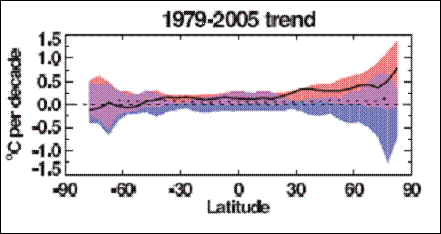
IPCC Modeled Temperature Change Per Decade (from IPCC AR 4 Figure 9.6)
Antarctic researcher Peter Doran led the National Science Foundation’s Long Term Ecological Research (LTER) team studying temperature changes in Antarctica [Ref. 22]. “We found that over the past 35 years, more of the continent has been cooling than warming, and the cooling has been about 1 degree Fahrenheit decrease per decade in the Dry Valleys since 1986... overall, 58 percent of the continent is cooling. As Ian Joughin of NASA’s Jet Propulsion Laboratory and Slawek Tulaczyk of the University of California at Santa Cruz write in the Jan. 18 Science, part of the ice sheet has actually begun to thicken, not melt. Tulaczyk says: “Climate models need to be improved to explain cooling. They do not currently account for spatial or temporal variabilities such as cooling. And these new aspects of ice-sheet behavior need to be incorporated into glaciological models of ice-sheet flow.” According to Tulaczyk the melting of the ice sheet at the edges of Antarctica is balanced by the growth in ice in the middle for close to zero net change. This is confirmed by the NOAA National Snow And Ice Data Center [Ref. 23], which provides updates on polar ice trends. Thus Antarctica is not contributing to sea level rise. (See the Antarctica regional summary at www.appinsys.com/GlobalWarming/RS_Antarctica.htm for more details).
Greenland is another region of concern since it contains a large ice sheet with potential to melt. Unlike Antarctica, Greenland has exhibited warming in recent decades, resulting the melting of exit glaciers (edges of the ice sheet flowing through valleys). However, researchers have found that the net decrease in the Greenland ice sheet is relatively small. One study states [Ref. 24]: “Greenland was about as warm or warmer in the 1930’s and 40’s, and many of the glaciers were smaller than they are now. This was a period of rapid glacier shrinkage world-wide, followed by at least partial re-expansion during a colder period from the 1950’s to the 1980’s… it does suggest that large variations in ice sheet dynamics can occur from natural climate variability.”
Another study [Ref. 25]: provides the following conclusions: “At the summit of the Greenland ice sheet the summer average temperature has decreased at the rate of 2.2 C per decade since the beginning of the measurements in 1987. This suggests that the Greenland ice sheet and coastal regions are not following the current global warming trend. A considerable and rapid warming over all of coastal Greenland occurred in the 1920s when the average annual surface air temperature rose between 2 and 4 C in less than ten years (at some stations the increase in winter temperature was as high as 6 C). This rapid warming, at a time when the change in anthropogenic production of greenhouse gases was well below the current level, suggests a high natural variability in the regional climate.”
The following figure shows the temperature trends at all of the long-term stations in Greenland.
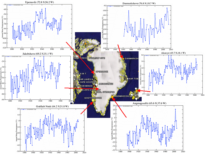
Greenland Temperature Stations
The following figure shows the melt water runoff trend from a study [Ref. 26], which stated: “The combined effect of temperature and precipitation trends over the 17-yr lead to increased rates of ablation and increased accumulation. The net effect of these competing factors demonstrates that the overall (total ice sheet) surface mass balance change is relatively small”.
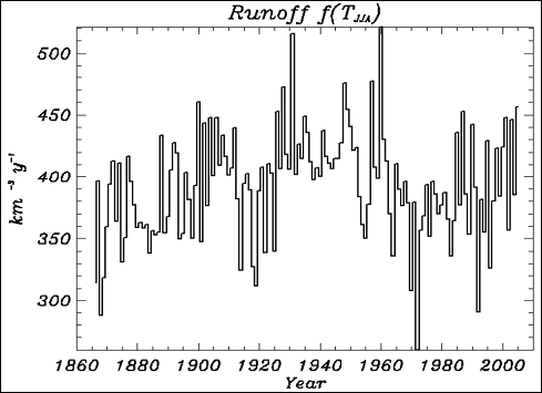
Greenland Melt Water Runoff Trend
(See the Greenland regional summary at www.appinsys.com/GlobalWarming/RS_Greenland.htm for more details).
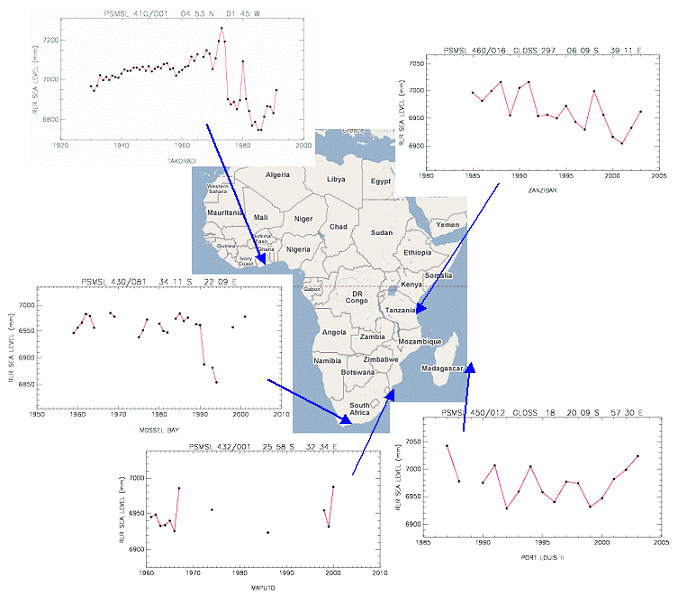
Sea levels have been falling in the 30 – 90 degree area northern hemisphere as the continents rebound from the last ice age. Slight rise has occurred as a result in some areas. Most of the world shows little or no change. The following figure shows the sea level rise around Africa.
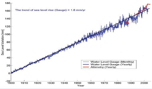
The following figure shows global cumulative sea level change for 1900 to 2002 [http://www.wamis.org/agm/meetings/rsama08/S304-Shum_Global_Sea_Level_Rise.pdf]. Since according to the IPCC, CO2-based warming has apparently only shown up since the 1970s, this sea level rise since prior to 1970 cannot be caused by anthropogenic CO2, and yet the trend has not increased.
(See the sea level summary at www.appinsys.com/GlobalWarming/GW_4CE_SeaLevel.htm for more details on sea level).
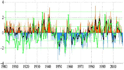
The following figure compares the occurrences of moderate to extreme drought and moderate to extreme wet conditions in the US for 1990 to 2008. Drought and wet are usually occurring somewhere, but no trend correlating to CO2.
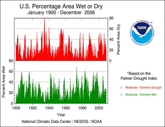
Moderate to extreme drought and moderate to extreme wet conditions in the US for 1990 to 2008
The following figure is from a study of 169 receding glaciers worldwide (Johannes Oerlemans, “Extracting a Climate Signal from 169 Glacier Records”, published in Science, 2005) and shows the composite average of up to 169 glaciers (the number varies in different time periods). These indicate the pattern that is consistent for most glaciers worldwide – the recession of the glaciers started at the end of the little ice age in the 1700s. The recession of glaciers started long before anthropogenic CO2 levels rose. Since the IPCC says that anthropogenic CO2-based warming has only had an effect since the 1970s, the recession of glaciers cannot be due to anthropogenic CO2-based global warming.
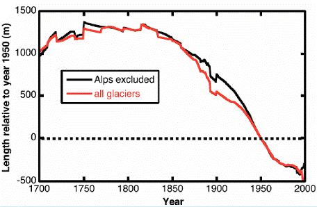
See www.appinsys.com/GlobalWarming/GW_4CE_Glaciers.htm for information on various glaciers around the world. See also the Regional Summary on East Africa at www.appinsys.com/GlobalWarming/RS_EastAfrica.htm for details on Mt. Kilimanjaro.
Mars
The planet Mars is also exhibiting a warming trend. A recent National Geographic article [Ref. 27] states: “Simultaneous warming on Earth and Mars suggests that our planet's recent climate changes have a natural—and not a human-induced—cause…. Habibullo Abdussamatov, head of space research at St. Petersburg's Pulkovo Astronomical Observatory in Russia, says the Mars data is evidence that the current global warming on Earth is being caused by changes in the sun. "The long-term increase in solar irradiance is heating both Earth and Mars," he said.” William Feldman of the Los Alamos National Laboratory (who is involved with NASA's Mars Odyssey orbiter) says: “One explanation could be that Mars is just coming out of an ice age” [Ref. 28]. The principal investigator for the Mars Orbiter Camera said: “The images, documenting changes from 1999 to 2005, suggest the climate on Mars is presently warmer, and perhaps getting warmer still, than it was several decades or centuries ago” [Ref. 29]. All of which indicates warming caused by the sun (i.e. there’s no anthropogenic CO2 on Mars).
Deforestation
If one really cared about the health of the planet, then the focus should be on deforestation. Al Gore got one thing correct in his book: page 227: “Almost 30 % of the CO2 released into the atmosphere each year is a result of the burning of brushland for subsistence agriculture and wood fires used for cooking.” The United Nations Food and Agriculture Organization (FAO) reported in October 2006 that deforestation accounts for 25 to 30 percent of the release of greenhouse gases [Ref.30]. The report states: “Most people assume that global warming is caused by burning oil and gas. But in fact between 25 and 30 percent of the greenhouse gases released into the atmosphere each year – 1.6 billion tonnes – is caused by deforestation.”
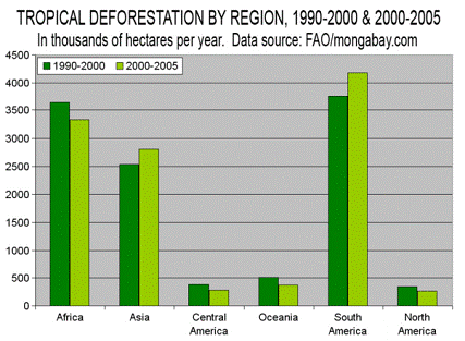
But the main problem with deforestation is not the CO2 - it’s the elimination of critical habitat in the most biologically diverse areas of the earth. It is also causing serious environmental consequences in those areas (decreased rainfall, increased flooding, increased warming) “An estimated 62 percent of precipitation occurs over land as a result of evapotranspiration from lakes and wetlands and dense vegetation, particularly forests, which pump ground water into the sky.” [Ref.31]. The following figure shows the major areas with deforestation. See www.appinsys.com/GlobalWarming/Deforestation.htm for more details.
Conclusion
The evidence examined in this brief summary of global warming shows the following:
- The evidence for solar irradiance as the main driver of the current warming is stronger than that for CO2 (see www.appinsys.com/GlobalWarming/GW_Part6_SolarEvidence.htm)
- The temperature trend varies significantly in various regions of the world, including cooling in some areas. Some areas have not yet reached the temperatures of the 1930’s (see regional summaries at www.appinsys.com/GlobalWarming)
- Urbanization plays a significant role in affecting temperatures that are included in the surface temperature averages (see www.appinsys.com/GlobalWarming/GW_Part3_UrbanHeat.htm)
- Temperatures have been artificially manipulated through adjustments that do not make sense in many cases (see www.appinsys.com/GlobalWarming/GW_Part2_GlobalTempMeasure.htm)
- The correlation with oceanic oscillations shows that any role of CO2 is insignificant (see http://www.appinsys.com/GlobalWarming/PDO_AMO.htm)
- Sea level rise and glacier retreat started in the early 1800s – long before CO2 is said to have any effect on temperatures
- The Antarctic and Greenland ice sheets (which could affect sea level) are not melting at a rate that would significantly affect sea levels (see www.appinsys.com/GlobalWarming/GW_Part4_ClimaticEvents.htm)
- The IPCC only needs CO2 for the climate models after 1970 and only for the northern hemisphere – due to deficiencies in their ability to model the solar effects.
[See www.appinsys.com/globalwarming for detailed analysis of these and more aspects of the global warming phenomena, including regional summaries]
References:
[1] IPCC AR4 Report – Summary For Policymakers, 2007 [http://ipcc-wg1.ucar.edu/wg1/wg1-report.html]
[2] IPCC AR4 Report – The Physical Basis of Climate Change, 2007 [http://ipcc-wg1.ucar.edu/wg1/wg1-report.html]
[3] [http://books.nap.edu//html/climatechange/]
[4] “The role of the sun in climate forcing”, J. Beer, W. Mende, R. Stellmacher, Swiss Federal Institute of Environmental Science and Technology, Switzerland and Institute of Meteorology, Germany, Quaternary Science Reviews, 2000
[5] Professor Kenneth R. Lang, Tufts University [http://ase.tufts.edu/cosmos/view_picture.asp?id=116]
[6] Lassen, K. & Friis-Christensen, E.: Variability of the solar cycle length during the past five centuries and the apparent association with terrestrial climate. Journal of Atmos. Terr. Phys. 57 (1995)
[7] G. Tsiropoula, National Observatory of Athens, Institute for Space Applications and Remote Sensing, Athens, Greece – “Signatures of solar activity variability in meteorological parameters” (Journal of Atmospheric and Solar-Terrestrial Physics 65 (2003) 469– 482) [http://zeus.nascom.nasa.gov/~bfleck/jastp_publ.pdf]
[8] Scafetta, N., and B. J. West, 2006. “Phenomenological solar contribution to the 1900-2000 global surface warming”. Geophysical Research Letters, doi: 1029/2005GL025539)
[9] “Solar Variability, Ozone and Climate” (Shindell 1999) [http://www.giss.nasa.gov/research/briefs/shindell_03/
[10] Claus Frohlich and Judith Lean, (World Radiation Center, Switzerland and E.O. Hulburt Center for Space Research, Naval Research Laboratory, Washington, DC) “Solar Radiative Output and its Variability: Evidence and Mechanisms” (Astronomy and Astrophysics Review)
[11] United Nations Food and Agriculture Organization [ftp://ftp.fao.org/docrep/fao/006/y5028e/y5028e01.pdf]
[12] “Sun's warming influence 'under-estimated'” says that the sun has been the main contributor to global warming over the past two centuries. [http://news.bbc.co.uk/2/hi/science/nature/1045327.stm ]
[13] [http://www.canada.com/nationalpost/news/story.html?id=d2113c58-030a-4390-a12c-30f45d75dfa5&p=1]
[15] “Solar Variability Over the Past Several Millennia” J. Beer, M. VonMoos and R. Muscheler (Swiss Federal Institute of Environmental Science and Technology, and NASA/Goddard Space Flight Center) Space Science Reviews, 2006 [http://www.eawag.ch/organisation/abteilungen/surf/publikationen/2006_solar_variability]
[17] [http://www.research.noaa.gov/spotlite/archive/spot_sunclimate.html] The Sun-Climate Connection illustrated is based on work by Reid, G.C., 1999. ‘Solar variability and its implication for the human environment’. (Journal of Atmospheric and Solar Terrestrial Physics 61, 3–14.)
[18] Strong Solar Evidence from Oregon [www.appinsys.com/GlobalWarming/solar_oregon.htm] using results from: Trends In Direct Normal Solar Irradiance In Oregon From 1979-2003, Laura Riihimaki and Frank Vignola, Department of Physics, University of Oregon [http://solardat.uoregon.edu/download/Papers/DirectNormalTrends.pdf ]
[19] Goddard Institute for Space Studies [http://data.giss.nasa.gov/gistemp/station_data/]
[20] “A Closer Look at United States and Global Surface Temperature Change”, J. Hansen, R. Ruedy, and M. Sato (NASA Goddard Institute for Space Studies), M. Imhoff, and W. Lawrence (NASA Goddard Space Flight Center) D. Easterling, T. Peterson, and T. Karl (NOAA National Climatic Data Center), 2001 [http://pubs.giss.nasa.gov/docs/2001/2001_Hansen_etal.pdf]
[21] “Environmental Effects of Increased Carbon Dioxide”, A.B. Robinson, S.L. Baliunas, W. Soon, Z.W. Robinson, 1998
[22] “Confusion Corner: Antarctica”, 2002 [http://www.geotimes.org/mar02/NN_antarctica.html]
[23] NOAA Sea Ice web page [http://nsidc.org/data/seaice_index/]
[24] “Rapid Retreat and Acceleration of Helheim Glacier, East Greenland”, by I.M. Howat, Department of Earth Sciences, University of California, Santa Cruz, California, I. Joughin, Applied Physics Lab, University of Washington, Seattle, S. Tulaczyk, Department of Earth Sciences, University of California, Santa Cruz, S. Gogineni, Center for Remote Sensing of Ice Sheets, University of Kansas, Geophysical Research Letters, 2005, along with author’s comments at [http://tierneylab.blogs.nytimes.com/2007/02/08/greenlands-glaciers-take-a-breather/]
[25] “Global Warming and the Greenland Ice Sheet”, P. Chylek, J. Box and G. Lesins, Space and Remote Sensing Sciences, Los Alamos National Laboratory; Department of Physics, New Mexico State University; Department of Physics and Atmospheric Science, Dalhousie University, Climatic Change 2004) [http://www.ingentaconnect.com/content/klu/clim/2004/00000063/F0020001/05140445#aff_1]
[26] “Greenland Ice Sheet Surface Mass Balance Variability (1988-2004) From Calibrated Polar MM5 Output”, Box, J.E., D.H. Bromwich, B.A. Veenhuis, L-S Bai, J.C. Stroeve, J.C. Rogers, K. Steffen, T. Haran, S-H Wang, Journal of Climate, Vol. 19, No. 12) [http://polarmet.mps.ohio-state.edu/jbox/pubs/Box_et_al_J_Climate_2006.pdf]
[27] [http://news.nationalgeographic.com/news/2007/02/070228-mars-warming.html]
[28] [http://www.space.com/scienceastronomy/mars_ice-age_031208.html]
[29] [http://www.abc.net.au/science/news/stories/2005/1464931.htm]
[30] [http://www.fao.org/newsroom/en/news/2006/1000385/index.html]
[31] [http://www.irinnews.org/report.aspx?reportid=61528]
[32] [http://www.opinionjournal.com/extra/?id=110008220]