Global Warming Science - www.appinsys.com/GlobalWarming
Climatic Events – Sea Level
[last update: 2012/12/13]
While the global warming scare got rolling, other climatic events such as receding glaciers have also garnered much alarmist attention.
Sea level increase is the focus of this document.
Other documents in this Climatic Events series include:
- Hurricanes
- Precipitation (including Tornadoes)
- Polar Ice Caps
- Glaciers
- Animals (including Polar Bears)
- Human Disease / Death (including Malaria and Extreme Weather)
- North Atlantic Thermohaline Circulation / Gulf Stream
|
|
|
See also: www.appinsys.com/GlobalWarming/SeaLevelRising.htm for debunking of some wild sea level claims made by politicians.
|
Sea Level
|
A major concern about global warming is the potential rise in sea level. This could result from the melting of the Greenland and/or the Antarctic ice sheets. Greenland has been exhibiting recent melting whereas Antarctica has not (see previous subsections on these).
The IPCC stated in the Third Assessment Report (2001) [http://www.grida.no/climate/ipcc_tar/wg1/425.htm]: “There is no evidence for any acceleration of sea level rise in data from the 20th century data … Mediterranean records show decelerations, and even decreases in sea level in the latter part of the 20th century”.
|
||||||||||
|
A 2012 NOAA report “The Budget of Recent Global Sea Level Rise 2005-2012” states: “The sum of steric sea level rise and the ocean mass component has a trend of 1.1 ± 0.8 mm/a over the period when the Paulson GIA mass correction is applied, well overlapping total sea level rise observed by Jason-1 and Jason-2 (1.3 ± 0.9 mm/a) within a 95% confidence interval.” These rates are less than the 20th century sea level rise rates.
Also: “The regional patterns of sea level change, however, are many times larger and can be extremely complex. Steric sea level change is the dominant contributor to the spatial trend patterns observed for total sea level”
|
||||||||||
|
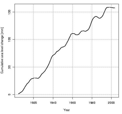
The following figure shows cumulative sea level change over the last 100 years (from “Decadal Rates of Sea Level Change During the Twentieth Century” Simon Holgate, Proudman Oceanographic Laboratory, Liverpool, UK [http://meteo.lcd.lu/globalwarming/Holgate/sealevel_change_poster_holgate.pdf]). The report states: “The mean rate for the twentieth century calculated in this way is 1.67±0.04 mm/yr. The first half of the century (1904-1953) had a slightly higher rate (1.91±0.14 mm/yr) in comparison with the second half of the century (1.42±0.14 mm/yr 1954-2003).”
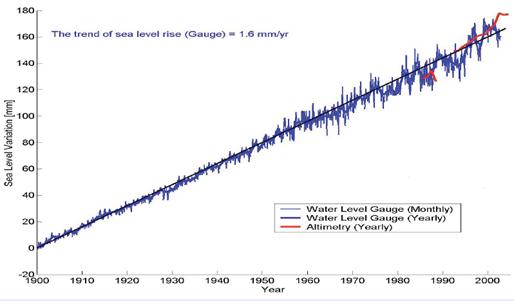
The following figure shows global cumulative sea level change for 1900 to 2002 [http://www.wamis.org/agm/meetings/rsama08/S304-Shum_Global_Sea_Level_Rise.pdf]. Since according to the IPCC, CO2-based warming has apparently only shown up since the 1970s, all of this sea level rise since prior to 1970 cannot be caused by anthropogenic CO2, and yet the trend has not increased.
The sea level rate in the 1990s was similar to the 1930s. “Nonlinear trends and multiyear cycles in sea level records” (Jevrejeva, S., A. Grinsted, J. C. Moore, and S. Holgate (2006), Journal of Geophysical Research) [http://www.agu.org/pubs/crossref/2006/2005JC003229.shtml] “global sea level trend estimate of 2.4 ± 1.0 mm/yr for the period from 1993 to 2000 …over the last 100 years the rate of 2.5 ± 1.0 mm/yr occurred between 1920 and 1945, is likely to be as large as the 1990s”
Although Al Gore and other alarmists make statements about scary unrealistic increases in sea level, the IPCC AR4 (2007) report predicts that sea level rise will be 0.6 – 1.9 feet by the year 2100. The larger value is reduced from the IPCC TAR (2001) report which predicted 0.3 to 2.9 feet by 2100. The historic rate of 1.6 mm/yr over the last 100 years translates into a sea level rise of about 6 inches by the year 2100.
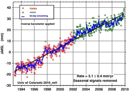
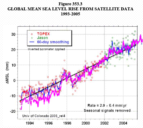
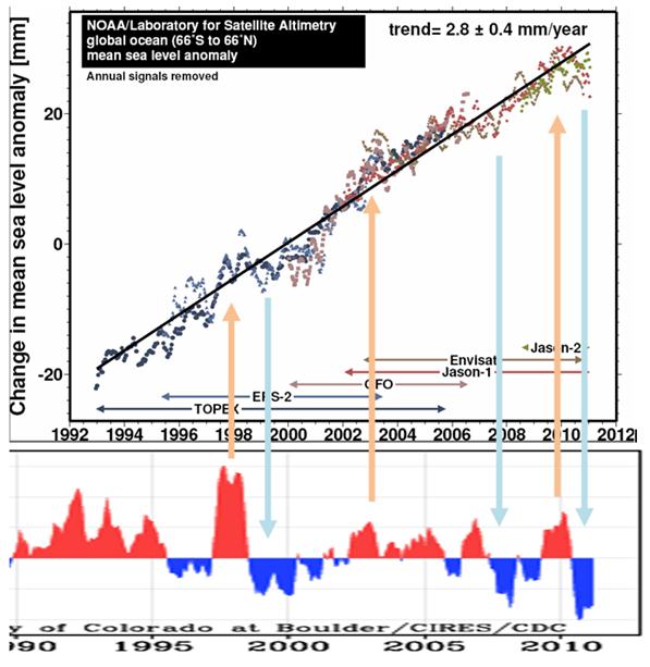
Alarmists say everything is accelerating and it’s worse than expected. But they carefully select start and end dates to create exaggeration. The following figure shows sea level from 1993 through 2009 [http://sealevel.colorado.edu/]. This figure shows a rate of 3.1 mm/year since it starts at a low point in the fluctuating data (the 1993 start indicated by the arrow in the above figure).
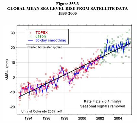
The following figure is from a 2006 publication on the EPA website showing the same data as above except through 2005. [http://oaspub.epa.gov/eims/eimscomm.getfile?p_download_id=446967]
There is a major difference between the above two versions of the same data through 2005 – the older data has more recently been adjusted downwards to increase the apparent rise. The following figure shows the data through 2009 changed to magenta and superimposed on the data published through 2005.
|
||||||||||
|
Sea level change varies constantly all over the Earth. Sea level gauges have been used the longest (although in very few locations) but require adjustment due to the fact that the earth is also changing its height in various places. For the northern part of the northern hemisphere, the earth is still rebounding from the weight of the ice in the last ice age (glacial isostatic rebound). This causes the appearance of falling sea levels in those locations (see the sea level figures in the Alaska Regional Summary, Western North America Regional Summary and Baltic Sea Area Regional Summary for examples of isostatic rebound sea level changes).
As a result of needing to adjust for isostatic rebound, studies have been made to try to determine real sea level change. A recent paper uses GPS measurements to determine adjacent land movements in order to determine the glacial-isostatic adjustment (“Geocentric Sea-Level Trend Estimates from GPS Analyses at Relevant Tide Gauges World-Wide”, G. Wöppelmann, B. Martin Miguez, Z. Altamimi, [http://ff.org/centers/csspp/library/co2weekly/20070809/20070809_06.pdf]). The paper states: “A dedicated GPS processing strategy is implemented to correct the tide gauges records, and thus to obtain a GPS-corrected set of ‘absolute’ or geocentric sea-level trends. The results show a reduced dispersion of the estimated sea-level trends after application of the GPS corrections. We obtain a value of 1.31 ± 0.30 mm/yr, a value which appears to resolve the ‘sea level enigma’”. (The enigma to which it refers is that the accepted approximate observed estimate of 1.7 mm/yr is too high for all the available sources of sea level increase. With the GPS-based adjustment to 1.3 mm/yr it is more in line with the calculation from available sources.)
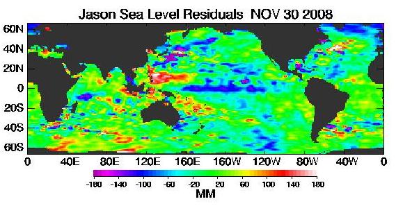
Since the use of satellites to measure Earth phenomena has developed, several satellites are used to measure sea level on a global basis. The following figure shows the a recent sea level figure from the NASA Jason satellite [http://sealevel.jpl.nasa.gov/science/jason1-quick-look/]. Unfortunately, satellite measurements for sea level began just over a decade ago.
|
||||||||||
|
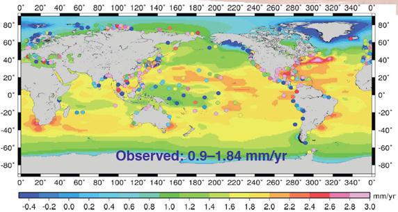
The following figure shows global sea level change rate from 1900 to 2003 based on 525 tide gauges (indicated as dots) and satellite altimetry. [http://www.wamis.org/agm/meetings/rsama08/S304-Shum_Global_Sea_Level_Rise.pdf]. The isostatic rebound is noticeable in the Arctic. The Oceania islands north of Australia (including the global warming poster-child Tuvalu) have less sea level rise than most of the tropics, with some stations showing sea level declines. The Gulf Stream is noticeable in its higher rate of sea level increase, likely due to the Gulf Stream getting warmer (this is also noticeable in the Jason figure above).
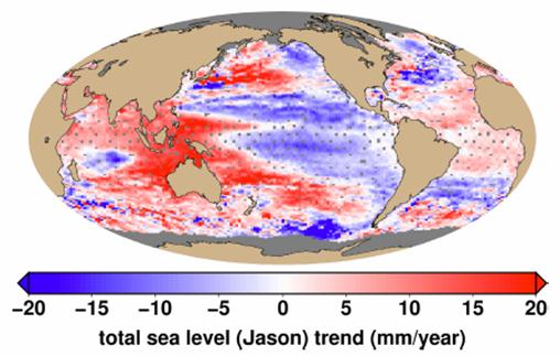
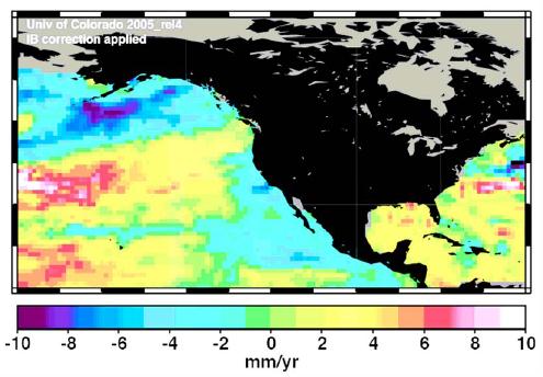
The following figure shows global sea level change rate from 2005 to 2012
|
||||||||||
|
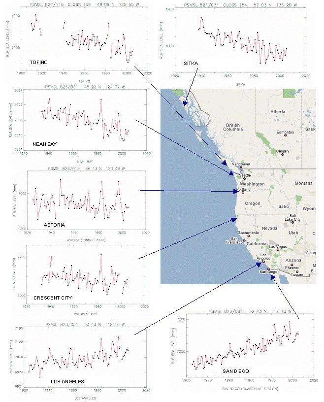
North America
The following figure shows the effects of isostatic rebound on sea levels along the western (Pacific) coast of North America.
The following figure is from a publication on the EPA website [http://oaspub.epa.gov/eims/eimscomm.getfile?p_download_id=446967]
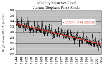
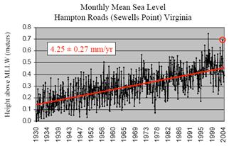
In addition to glacial isostatic rebound, continental plate tectonics affect local sea level changes. The following figures compare the falling sea level at Juneau, Alaska with the rising sea level at Hampton Roads, Virginia. “Virginia lies on a passive or ‘trailing edge’ continental margin - the tectonic opposite of the Alaskan example. Normally land rises on active margins and sinks on passive ones.” This is why the Virginia rise is greater than the global average – plate tectonics. [http://ccrm.vims.edu/cara_web/case%20studies_files/SEA%20COAST%20AND%20SEA%20LEVEL%20TRENDS%203.pdf]
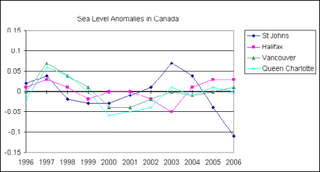
The Fisheries and Oceans Canada maintains data on sea levels at Canadian ports. [http://www.meds-sdmm.dfo-mpo.gc.ca/meds/Databases/TWL/Products/Monthly_Means_b.htm]. The following figure shows the annual sea level anomalies (in meters) for two east coast and two west coast ports for the last decade. In all cases the average sea level for the last decade is down by about 1 centimeter from the long-term average sea level. However, a decade does not provide much information on trends.
Sea Level Anomalies in Canada 1996 - 2006
|
||||||||||
|
Australia
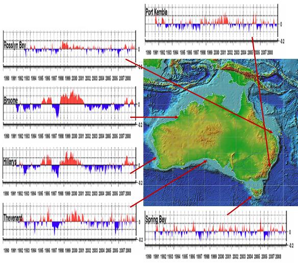
Australia started sea level measurements in the early 1990’s. The following figure shows sea level data at several locations around Australia to June 2009 (data from Fig. 10 in [http://www.bom.gov.au/ntc/IDO60202/IDO60202.2009.pdf]). Sea level trends vary greatly around Australia. The effect of the 1997-98 El Nino is quite noticeable on the west and north shores of the country.
|
||||||||||
|
Maldives
In an interview with Dr. Nils-Axel Mörner (head of the Paleogeophysics and Geodynamics department at Stockholm University in Sweden, past president (1999-2003) of the INQUA Commission on Sea Level Changes and Coastal Evolution, and leader of the Maldives Sea Level Project – he has been studying the sea level and its effects on coastal areas for some 35 years) by EIR (Argentine Foundation for a Scientific Ecology) [http://www.mitosyfraudes.org/Calen7/MornerEng.html] he talked about the IPCC misrepresentation of sea level data: “Then, in 2003, the same data set, which in their [IPCC's] publications,... was a straight line—suddenly it changed, and showed a very strong line of uplift, 2.3 mm per year, the same as from the tide gauge... It was the original one which they had suddenly twisted up, because they entered a “correction factor,” ... I accused them of this at the Academy of Sciences in Moscow —I said you have introduced factors from outside; it's not a measurement. It looks like it is measured from the satellite, but you don't say what really happened. And they answered, that we had to do it, because otherwise we would not have gotten any trend! That is terrible! As a matter of fact, it is a falsification of the data set. ... So all this talk that sea level is rising, this stems from the computer modeling, not from observations. The observations don't find it! I have been the expert reviewer for the IPCC, both in 2000 and last year. The first time I read it, I was exceptionally surprised.”
Morner also talks about the sea level project in the Maldives and measurements in Tuvalu: “In about 1970, the sea fell about 20 cm… The new level, which has been stable, has not changed in the last 35 years…. Another famous place is the Tuvalu Islands, which are supposed to soon disappear because they've put out too much carbon dioxide. There we have a tide gauge record, a variograph record, from 1978, so it's 30 years. And again, if you look there, absolutely no trend, no rise.”
In October 2009, the Maldives cabinet held an underwater meeting to “highlight the threat of global warming”. [http://news.bbc.co.uk/2/hi/8311838.stm] “At a later press conference while still in the water, President Nasheed was asked what would happen if the summit fails. "We are going to die," he replied.”
In December 2009, Nils-Axel Morner wrote a letter to the Maldives president, in which he castigates the president for misrepresenting the facts [http://www.spectator.co.uk/coffeehouse/5595813/why-the-maldives-arent-sinking.thtml] “why the scare-mongering? Could it be because there is money involved? If you inhabit a tiny island and can convince the world that its very existence is under threat because of the polluting policies of the West, the industrialised nations will certainly respond. The money is likely to flow in more quickly than the ocean will rise.”
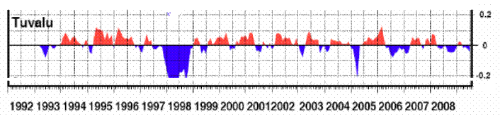
Tuvalu
The following figure shows sea level history at Funafuti, Tuvalu (an island that according to Al Gore is rapidly disappearing due to sea level rise). The Australian government installed a sea level gauge at Funafuti in 1993.
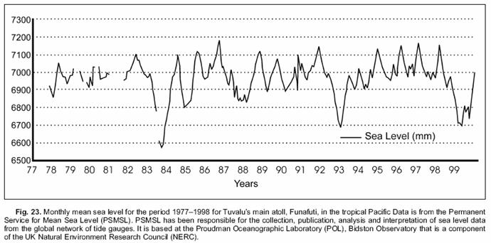
The following figure shows the available longer-term sea level data from Funafuti, Tuvalu from the original sea level gauge installed in 1977 [http://www.friendsofscience.org/assets/documents/deFreitas.pdf]
The following figure shows the updated SeaFrame Funafuti data through September 2008 (from Aung et al “Sea Level Threat in Tuvalu”, American Journal of Applied Sciences, 2009 [http://www.scipub.org/fulltext/ajas/ajas661169-1174.pdf] which states: “the sea level rise rate is not accelerating in the recent past or at least during the project period. It is also to be acknowledged, nevertheless that visually at least and at this stage, there is no clear evidence for acceleration in sea level trends over the course of the last century based upon the long-term data elsewhere.”
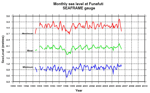
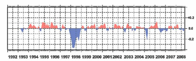
Tuvalu update 2009: The following figure shows sea level data at Funafuti, Tuvalu to June 2009 (From Fig 11 in [http://www-cluster.bom.gov.au/ntc/IDO60102/IDO60102.2009_1.pdf]) The figure speaks for itself.
Tuvalu issued a postage stamp sheet in 2009 featuring Obama and the “First Family of the United States of America”. (See: [http://www.appinsys.com/GlobalWarming/SeaLevelRising.htm])
|
||||||||||
|
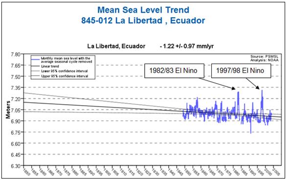
Ecuador
The El Nino / Southern Oscillation is calculated based on sea level pressure differences across the pacificThe following figures show the effects on seal level in Ecuador.
The following figure shows the sea level data for La Libertad, Ecuador from the NOAA database [http://tidesandcurrents.noaa.gov/sltrends/index.shtml]
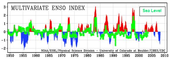
The following figure superimposes the sea level data for La Libertad from the figure above (changed to green) on the multivariate ENSO Index plot shown previously. This shows a strong correlation between the ENSO and sea level variation.
See http://www.appinsys.com/GlobalWarming/ENSO.htm for more details.
|
||||||||||
|
Relation to ENSO
Satellite sea level data exist for 20 years now. In that time the calculated rate of sea level rise has essentially been constant. The ups and downs within that time period correspond very well with the El Nino / Southern Oscillation (ENSO). The following figure compares the satellite-based sea level data (from http://ibis.grdl.noaa.gov/SAT/SeaLevelRise/LSA_SLR_timeseries_global.php) with the Multivariate ENSO Index (MEI – from http://www.esrl.noaa.gov/psd/people/klaus.wolter/MEI/)
Although the rate of sea level rise has been constant since the start of satellite data, Obama’s science advisor John Holdren sounds the alarm: “John Holdren told the BBC that the climate was changing much faster than predicted. … He added that if the current pace of change continued, a catastrophic sea level rise of 4m (13ft) this century was within the realm of possibility; much higher than previous forecasts.” [http://news.bbc.co.uk/2/hi/5303574.stm] The current “pace of change” is 2.8 +/- 0.4 mm / year. By 2100 the additional rise is 10 inches. It seems that Holdren has a problem with arithmetic (or a problem with telling the truth).
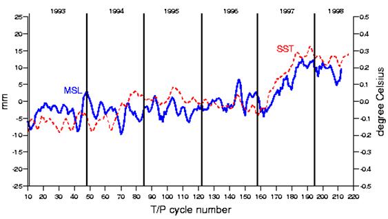
The following figure shows the effects of the 1997-98 El Nino on global sea level trends [http://www.aviso.oceanobs.com/en/applications/ocean/mean-sea-level-greenhouse-effect/regional-trends/index.html]
|
||||||||||
|
Relation to Solar Cycles
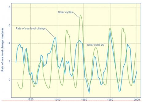
The following figure compares the rate of sea level change with the solar cycles [http://wattsupwiththat.com/2009/02/23/ice-ages-and-sea-level/#more-5804]. The blue line in the figure below is the same as the dark blue line in the figure above.
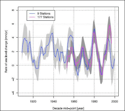
The following figure shows the fluctuating rate of change in sea level – positive rates indicate rising sea level, while negative rates indicate falling sea level. (On the decadal rates of sea level change during the twentieth century”, by S. J. Holgate, Proudman Oceanographic Laboratory, Liverpool, UK –GEOPHYSICAL RESEARCH LETTERS, VOL. 34, L01602, doi:10.1029/2006GL028492, 2007)
Rate of Sea Level Change 1904-2003
|
||||||||||
|
Long Term Trends
A study of long-term sea level trends based on basal peat below salt marshes and estuarine sediments adjusted for postglacial isostatic movement ( “A Search for Scale in Sea-Level Studies”, Curtis E. Larsen and Inga Clark, Journal of Coastal Research, 2006 [http://www.geogr.ku.dk/courses/4aar1-2/Estuarin/Larsen+Clark.pdf]) states: “there is no discernible divergence in the rate of sea-level rise over the past two centuries to suggest a connection with the documented increase in atmospheric CO2 concentration.”
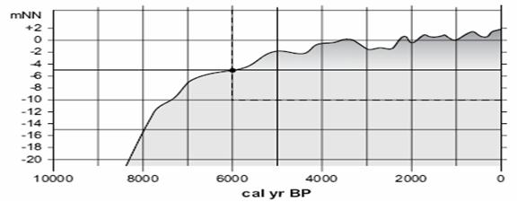
The following figure shows sea level change for the North Sea over the last 8000 years. [http://www.up.ethz.ch/publications/documents/Wanner_H._et_al._08] It is clear that the recent rate of sea level change is no different from the rate over the last 2000 years.
|
||||||||||
|
See the Regional Summary series for further information on sea level changes:
See also: www.appinsys.com/GlobalWarming/SeaLevelRising.htm for a 2009 update on Tuvalu as well exposing other sea level exaggerations.
|
||||||||||
|
Sea Level Data Websites
|