Global Warming Regional Summary series www.appinsys.com/GlobalWarming
Antarctica
[last update: 2009/04/18]
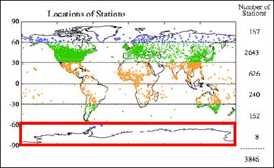
Unlike the northern hemisphere, temperature measurements in Antarctica only started in the 1950’s, and there are very few stations covering the 50-year period to the present.
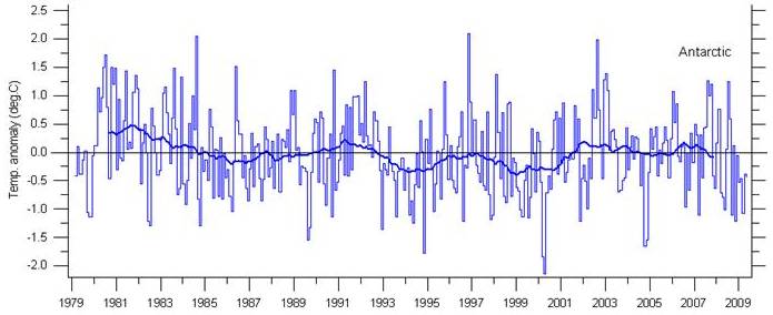
Satellite measurements (which started in 1979) show no warming in the Antarctic, as shown in the following figure (graph from http://climate4you.com/).
The IPCC states in the AR4 report on the physical science [http://ipcc-wg1.ucar.edu/wg1/Report/AR4WG1_Pub_Ch09.pdf] “The model-estimated responses to these external factors are detectable in the 20th-century climate globally and in each individual continent except Antarctica, where there are insufficient observations.” But actually there are sufficient observations – Antarctica just doesn’t fit the theory.
An article in GeoTimes (“Confusion Corner: Antarctica”, 2002) [http://www.geotimes.org/mar02/NN_antarctica.html] “The North and South Poles were dubbed “climatic bellwethers” when scientists first began studying global trends. Most climate models predict that if global temperatures are going to change, the change will be noticed first at the poles [emphasis added]. The models show amplified warming, as has been observed in Arctic regions and parts of Antarctica over the last half of the 20th century.” But the models got Antarctica wrong.
The following figure is from the IPCC AR4 report (2007). It does not show modeling of Antarctica, because Antarctica does not behave according to the models.
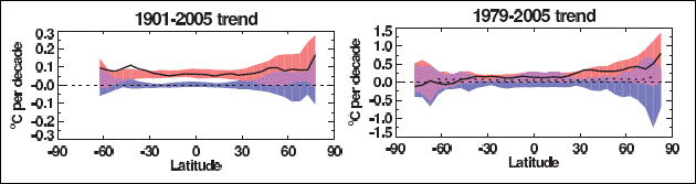
From IPCC AR 4 Figure 9.6
The following figure (left) is from the IPCC TAR report (2001). In it the models show warming in Antarctica with cooling around the Antarctic Peninsula and in the adjacent Weddell Sea – the models got it exactly backwards from the observed trend. The following figure (right) shows the observed temperature trend in the “cooling” area.
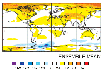
Left: From IPCC TAR Figure 9.2 – Modeled geographical distribution of temperature differences from 1975 to 1995 to the first decade in the 21st century. Right: From NASA / GISS database.
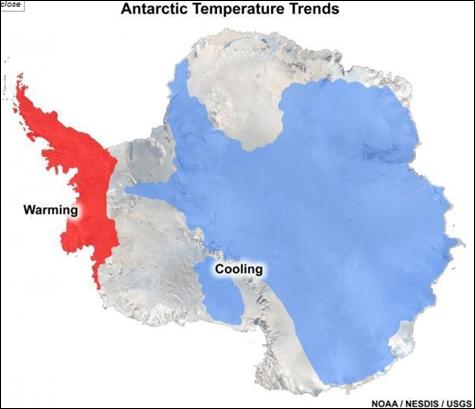
The following figure shows the approximate boundaries of areas that have warmed or cooled over the past 35 years. [http://www.sciencedaily.com/releases/2008/05/080507132855.htm] The Antarctic Peninsula (West Antarctica) goes through large variations in temperature. “during a major El Niño event from 1939 to 1942, temperatures in West Antarctica rose by about 6 to 10 degrees F (3-6 degrees C), and then dropped by an estimated 9 to 13 degrees F (5-7 degrees C) over the next two years.” [http://www.sciencedaily.com/releases/2008/08/080812160619.htm]
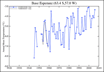
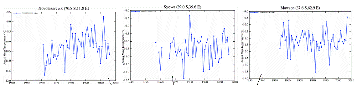
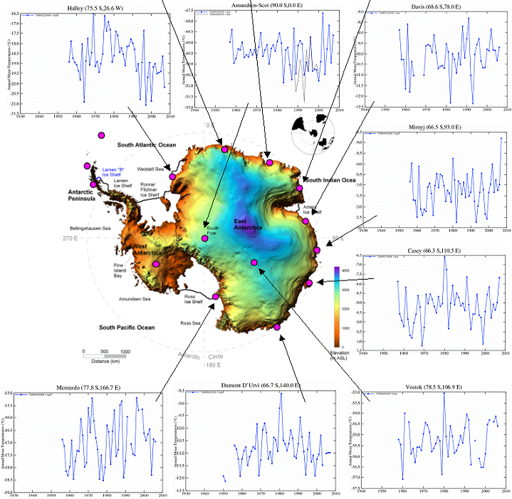
The following figure shows the temperature trends for each of the temperature stations within the Antarctic Circle that have at least 40 years of data.
From the article in GeoTimes mentioned previously (“Confusion Corner: Antarctica”, 2002) “Peter Doran led researchers with the National Science Foundation’s Long Term Ecological Research (LTER) team studying temperature changes. “We found that over the past 35 years, more of the continent has been cooling than warming, and the cooling has been about 1 degree Fahrenheit decrease per decade in the Dry Valleys since 1986,” Doran says. While the Dry Valleys are cooling much faster than the rest of the continent, areas such as the Antarctic Peninsula are warming faster. The LTER scientists’ analysis indicates that overall, 58 percent of the continent is cooling. As Ian Joughin of NASA’s Jet Propulsion Laboratory and Slawek Tulaczyk of the University of California at Santa Cruz write in the Jan. 18 Science, part of the ice sheet has actually begun to thicken, not melt. Tulaczyk says: “Climate models need to be improved to explain cooling. They do not currently account for spatial or temporal variabilities such as cooling. And these new aspects of ice-sheet behavior need to be incorporated into glaciological models of ice-sheet flow.”
A report by the University Centre in Svalbard (UNIS) in Norway (“Antarctic temperature changes during the observational period”) [http://www.unis.no/research/geology/Geo_research/Ole/AntarcticTemperatureChanges.htm] states that “all GCMs indicate that the Polar Regions should experience a much larger warming than would occur in lower latitudes due to two basic greenhouse mechanisms. Firstly, atmospheric carbon dioxide (CO2) has its greatest absorption of infrared radiation (IR) at sub-zero temperatures, as its absorption bands lie in the 12-16 micron wavelength band, corresponding to the wavelength of strongest IR emission from ice and snow. Secondly, water vapor, sharing overlapping absorption bands with CO2, is only present in limited amounts in the polar atmosphere due to low temperatures, allowing CO2 to exert a much greater influence than would be possible in warmer and moister air masses at lower latitudes. An important enhanced greenhouse signal would thus be strong warming in the polar and sub-polar regions and less warming at lower latitudes.”
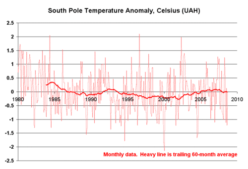
The following figure shows the satellite-based temperature anomalies for the South Pole.
An article in Science Daily about a study reported in the Journal of Geophysical Research (Oceans) [http://www.sciencedaily.com/releases/2005/06/050630064726.htm] (“Warmer Air May Cause Increased Antarctic Sea Ice Cover”, 2005) that used satellite observations from NASA's Special Sensor Microwave/Imager to assess snow depth on sea ice. The article states that “increases in precipitation due to warmer air temperatures from greenhouse gas emissions may actually increase sea ice volume in the Antarctic's Southern Ocean. This finding from a new study adds evidence of potential asymmetry between the two poles and may be an indication that climate change processes may have varying impacts on different areas of the globe.”
A 2007 report of work by David Bromwich, professor of geography and researcher with the Byrd Polar Research Center at Ohio State University clarified some aspects of climate change in Antarctica [http://www.newswise.com/articles/view/527313]: “temperatures during the late 20th century did not climb as had been predicted by many global climate models. … climate models are somewhat inconsistent with the evidence that we have for the last 50 years from continental Antarctica. … The westerlies have intensified over the last four decades of so, increasing in strength by as much as perhaps 10 to 20 percent. … The peninsula is the most northern point of Antarctica and it sticks out into the westerlies," Bromwich says. "If there is an increase in the westerly winds, it will have a warming impact on that part of the continent, thus helping to break up the ice shelves, he said.”
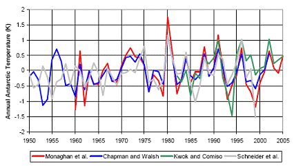
The following figure providing four temperature trends for Antarctica is from “Advances in describing recent Antarctic climate variability” by Andrew J. Monaghan and David H. Bromwich (Polar Meteorology Group and Atmospheric Sciences Program, Ohio State University, Submitted to Bulletin of the American Meteorological Society, August 2007), which states “None of the trends are statistically significant from zero.”
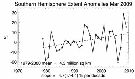
The following figure shows the sea ice extent anomalies for March (end of the melt season) [http://nsidc.org/data/seaice_index/]. The total amount of sea ice has an increasing trend since measurements began 30 years ago.
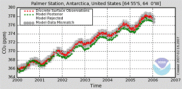
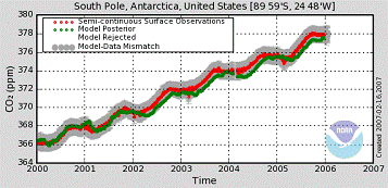
The NOAA Earth System Research Laboratory – Global Monitoring Division maintains a network of CO2 monitoring stations around the world. [http://www.esrl.noaa.gov/gmd/aggi/]. The following plots compare the recent CO2 trends at Palmer Station (on the Antarctic Peninsula) and the South Pole. There is virtually no difference between the two locations, although there is a substantial temperature difference as seen in the previous temperature trend graphs. In fact the CO2 measurements at all the world’s stations show a similar trend, whereas the temperatures do not.
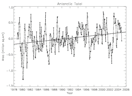
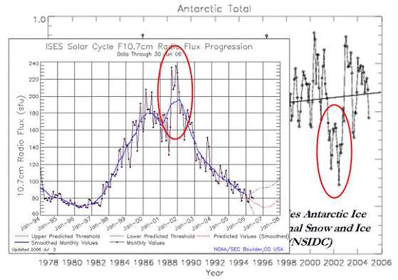
The following figure shows total Antarctic ice coverage for 1978 to 2006. The second figure compares that with the solar radio flux. [http://icecap.us/images/uploads/A_NEW_RECORD_FOR_ANTARCTIC_ICE_EXTENT.doc] The circled area is the 2002 collapse of the Larsen ice sheet. As can be seen, this event is correlated with solar input not with the CO2 variations shown above.
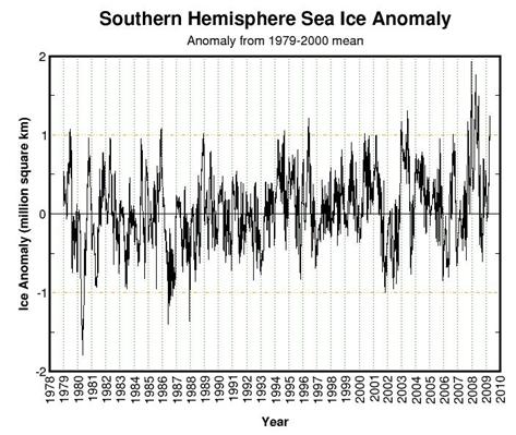
Sea ice trends are constantly updated at the cryosphere website [http://arctic.atmos.uiuc.edu/cryosphere/]. The following figure is from April 2009, showing a slight increase over the last 30 years.
|
|
Penguins
Penguins are often portrayed as succumbing to global warming. National Geographic is a major promoter of doomsday reporting, unsupported by actual facts:
Information about penguin species [http://lrs.ed.uiuc.edu/students/downey/project/penguins.html]: “There are 17 species of penguins some of which are found as far north as the equator. Penguins are categorized into three families: brush-tail, crested, and king/emperor penguins. Of the 17 species only six are found in Antarctica (Adélies, Chinstraps, Emperors, Gentoos, Macaronis, and Rockhoppers). … Originally, indigenous to warmer climates, penguins adapted to the cold as Antarctica made its move southward.”
Antarctic Connection [http://www.antarcticconnection.com/antarctic/wildlife/penguins/king.shtml]: “King penguins breed on seven sub-Antarctic island groups with large populations on the Falkland Islands, Macquarie Islands, Heard Island, Iles Crozet and Marion island. … King penguin colonies are established on beaches, valleys and glacial moraines free of snow and ice.”
An article on a 2001 Australian scientific expedition to Heard Island (“Remote Subantarctic Island Experiences Population Boom” http://www.aad.gov.au/default.asp?casid=1801) states: “Heard Island is still recovering from the last ice age. Combined with the effects of the current increase in global climate warming, many previously poorly vegetated areas are now lush with plants and the receding glaciers are now revealing new land for colonization …there was a staggering increase in the King penguin population on the Island. The records we have, photographic and data, reveal that the population totalled only three breeding pairs in 1947 - during our stint on the Island we have observed in excess of 25,000 pairs of King penguins. We have also found that the endemic Heard Island Cormorant, listed as vulnerable under national and international agreements, now has an estimated breeding population of 1200 pairs.”
According to “A Complete Guide To Antarctic Wildlife” by Hadoram Shirihai (Alula Press, 2002): regarding King penguins: “The total population is estimated to be 2.23 million pairs and is increasing.” [http://hapsara.smugmug.com/gallery/2648176_5qd2W/1/140003866_MMghp#140003866]
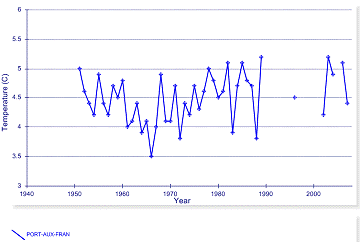
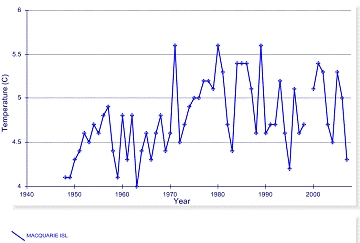
Very few temperature stations exist in the area of these sub-Antarctic islands. The following two figures show the only stations with more than 50 years of data. Port-aux-France (left) is on an island 300 miles from Heard Island. Macquerie Island is shown on the right.
A study of the Marion Island environment published in the journal Climatic Change (“Climate Change in the Sub-Antarctic: An Illustration from Marion Island” by V.R. Smith Department of Botany, University of Stellenbosch, South Africa, [http://www.springerlink.com/content/m71754124t3737q0/]) stated that: “between 1969 and 1999 annual mean surface air temperature at the island increased by 1.2 ° C. The interannual variability in annual total sunshine hours was large, and irregular, but a significant proportion of that variability could be ascribed to an average increase of 3.3 hours each year between 1951 and 1999. Hours of sunshine increased for all months in that period.”
Penguins’ breeding and life cycle success is more dependent on availability of food, which may be affected more by sea temperatures than air temperatures. However, King penguins eat mainly fish (lanternfish) and squid and rely much less on krill than other penguin species. They dive up to 300m for feeding since lanternfish are deep sea fish. Lanternfish is not a major commercial fishery species.
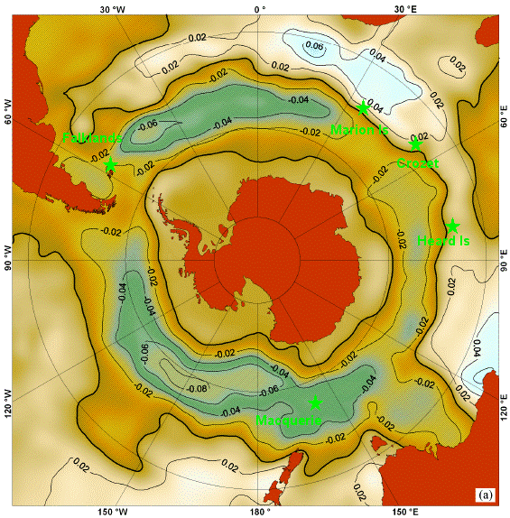
A study of southern ocean temperatures for the period of 1982 – 2005 (“Interannual trends in the Southern Ocean sea surface temperature and sea level from remote sensing data”, by S. A. Lebedev , Russian Academy of Sciences, published in the RUSSIAN JOURNAL OF EARTH SCIENCES, VOL. 9, 2007 [http://elpub.wdcb.ru/journals/rjes/v09/2007ES000283/2007ES000283.pdf]) provides the following figure showing sea surface temperature trends. The green stars and labels indicate the five main King penguin colony islands.
Some of the breeding islands are affected by warming due to currents from El Nino. The following figure (from “The El Nino–Southern Oscillation and Antarctica” by John Turner of the Antarctic Survey, UK National Environment Research Council, International Journal of Climatology, 2004 [http://www.scar.org/information/elnino/El_Nino.pdf]) shows the warming currents resulting from El Nino. The orange stars and labels indicate the five main King penguin colony islands. The next figure is from the same study and shows the strong correlation between sea surface temperature anomalies in the Ross Sea (south of Macquerie) and the El Nino region (in the Pacific ocean around the equator).
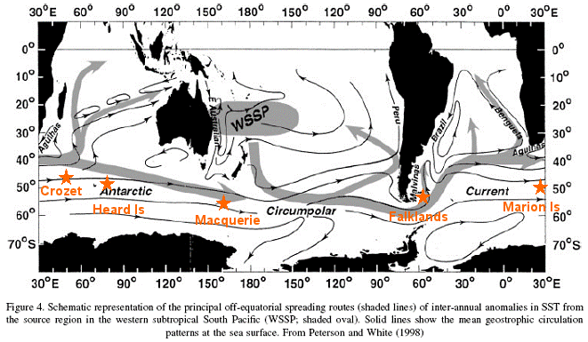
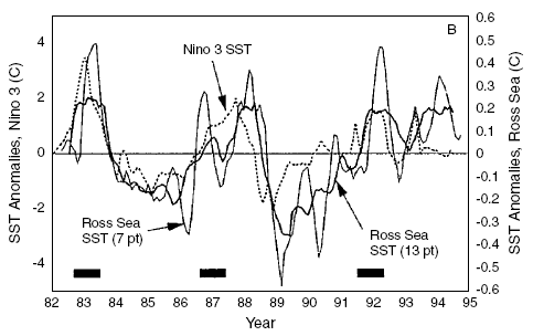
Figure: Correlation of El Nino Region SST with Ross Sea SST
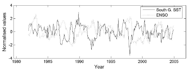
A recent study (“On the Interannual Variability of Ocean Temperatures Around South Georgia, Southern Ocean: Forcing by El Niño/Southern Oscillation and the Southern Annular Mode” by Michael P. Meredith, Eugene J. Murphy, Elizabeth J. Hawker, John C. King and Margaret I. Wallace, of the British Antarctic Survey [http://nora.nerc.ac.uk/1682/1/Meredith_et_al_double_spaced_with_figs.pdf]) provides the following figure of normalized sea surface temperature anomalies (and compared to the southern oscillation) for South Georgia Island (east of the Falklands, north of the Weddell Sea). This shows more recent cooling from the end of the previous figure and indicates a slight cooling trend over the last two decades.
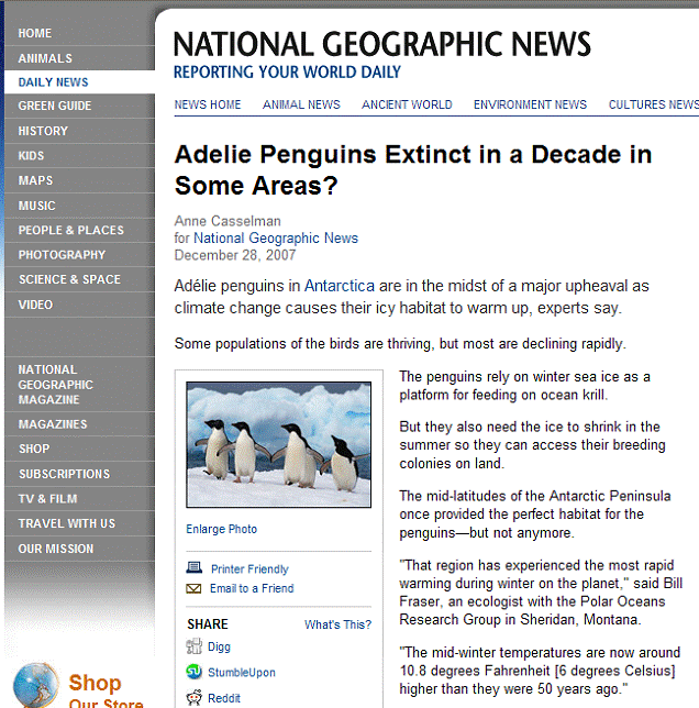
Once again, National Geographic bears the global warming doomsday message:
Adelie penguins breed around the entire coast of Antarctica in places where there is exposed rock. According to the International Penguin Conservation Work Group [http://www.penguins.cl/adelie-penguins.htm]: “A total of 2.5 millions pairs of Adélie penguins currently breed on the Antarctic continent and the small islands around it, the largest concentration being encountered in the Ross Sea region (1,000,000 pairs). … Studies conducted in several locations have revealed that populations of Adélie penguins are either stable or increasing … Adélie penguins colonize the ice-free zone of the Antarctic continent for the short summer breeding season
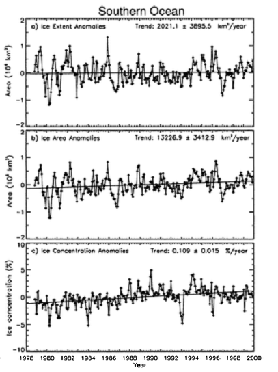
Adelie penguins are dependent on krill, which are also dependent on the Antarctic sea ice. The following figure showing Antarctic sea ice extent area and concentration anomalies for 1980 - 2000 is from a 2002 study (“Southern Ocean Climate and Sea Ice Anomalies Associated with the Southern Oscillation” by Kwok & Comiso, American Meteorological Society, Journal of Climate 2002 [http://ams.allenpress.com/perlserv/?request=get-document&doi=10.1175%2F1520-0442(2002)015%3C0487%3ASOCASI%3E2.0.CO%3B2#I1520-0442-15-5-487-F201].
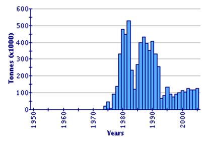
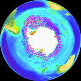
The following figure (left) shows the annual Antarctic krill fishery catch according to the UN Food and Agriculture Organization [http://www.fao.org/fishery/species/3393]. The image on the right shows the Antarctic krill distribution [http://en.wikipedia.org/wiki/Antarctic_krill].
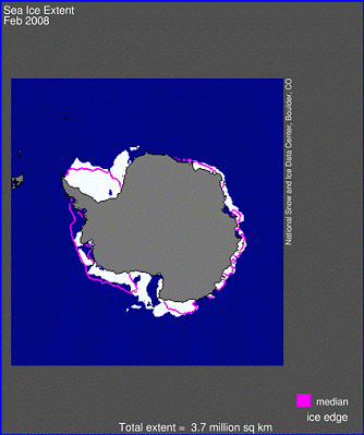
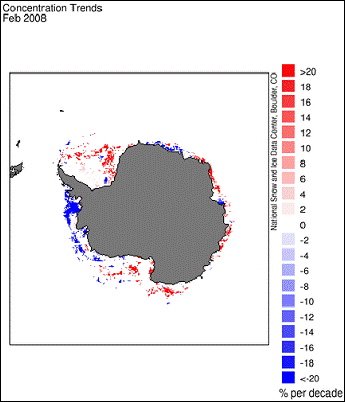
The following figures are from the National Snow and Ice Data Center [http://nsidc.org/data/seaice_index]. The left figure shows the sea ice extent (February 2008) compared with the median ice edge (magenta line). The Weddell Sea Ice Shelf (upper left corner of Antarctica), which is where the largest distribution of krill is, has been expanding. This is confirmed by the figure on the right, showing the sea ice concentration trends with red indicating increasing ice concentration. The only area with sea ice decline is the west coast of the Antarctic Peninsula.
See also:
Antarctic Peninsula: www.appinsys.com/GlobalWarming/RS_AntarcticPeninsula.htm
Polar Ice Caps: http://www.appinsys.com/GlobalWarming/GW_4CE_PolarIceCaps.htm