Global Warming Science - www.appinsys.com/GlobalWarming
The Urban Heat Effect
[last update: 2010/08/29]
|
Urban areas are known to warm due to increased area of thermal mass such as concrete buildings, pavements, etc. The increased thermal mass results in increasing temperatures with time since not all of the heat is released. This is known as the urban heat island (UHI) effect.
The IPCC AR4 Physical Basis report [http://www.ipcc.ch/ipccreports/ar4-wg1.htm] makes the following statements:
Since most of the long-term temperature stations are in cities, this is more significant than implied by the IPCC. This results in most of the population experiencing urban warming regardless of the amount of “global warming”. While reading this document comparing the effects of urbanization on temperature trends, keep in mind the IPCC’s position that: “Urbanisation impacts on global and hemispheric temperature trends have been found to be small.” (AR4, Chapter 3, 2007) - but the actual data tell a different story than the IPCC.
The Surface Stations web site [http://www.surfacestations.org/] is accumulating physical site data for the temperature measurement stations (including photographs) and identifying problem stations -- there are a significant number of stations with improper site characteristics – always leading to excessive warming.
|
|
California
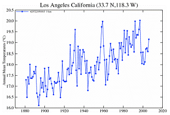
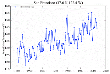
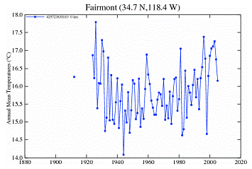
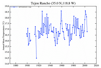
In California an examination of temperature stations within most of the state shows that most are highly urbanized - very few are land-based rural and of those many stopped reporting in the 1970’s – 1990’s. A comparison of urban and rural stations shows a very distinct difference in temperature trends. The urban stations exhibit distinct warming trends, while the rural stations either show no warming or cyclical warming that is not as warm as it was during the 1930’s.
Urban Stations:
Rural Stations:
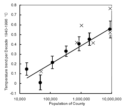
A study showing the effects of urban heat islands on temperatures in California (“Environmental Effects of Increased Carbon Dioxide”, A.B. Robinson, S.L. Baliunas, W. Soon, Z.W. Robinson, 1998) shows the following figure showing surface temperature trends for the period of 1940 to 1996 from 107 measuring stations in 49 California counties. After averaging the means of the trends in each county, counties of similar population were combined and plotted as closed circles along with the standard errors of their means. [http://www.friendsofscience.org/assets/documents/deFreitas.pdf]
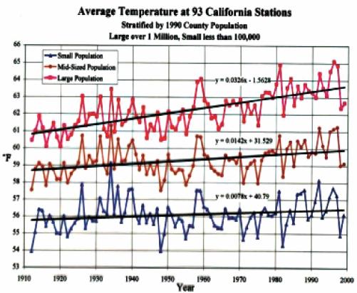
The following figure shows the annual average temperature for 93 stations in California, grouped by population [http://wwa.colorado.edu/colorado_river/docs/Colorado_River_Basin_Climate.pdf] The cited report states: “Counties with large populations show more warming than rural counties due to the urban heat island influence.”
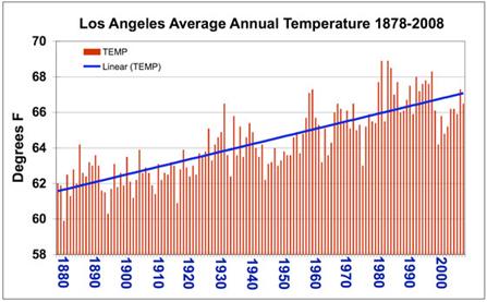
A 2008 study reported by NASA’s JPL of summer temperatures in Los Angeles [http://climate.jpl.nasa.gov/news/index.cfm?FuseAction=ShowNews&NewsID=24] states: “One hundred years of daily temperature data in Los Angeles were analyzed by scientists at NASA's Jet Propulsion Laboratory, Pasadena, Calif.; the University of California, Berkeley; and California State University, Los Angeles. They found that the number of extreme heat days (above 90 degrees Fahrenheit or 32.2 degrees Celsius in downtown Los Angeles) has increased sharply over the past century. … Most of the increase in heat days and length of heat waves, however, is due to a phenomenon called the "urban heat island effect." … Heat island-induced heat waves are a growing concern for urban and suburban dwellers worldwide. According to the U.S. Environmental Protection Agency, studies around the world have shown that this effect makes urban areas from 2 to 10 degrees Fahrenheit (1 to 6 degrees Celsius) warmer than their surrounding rural areas. Patzert says this effect is steadily warming Southern California, though more modestly than some larger urban areas around the world.” An interesting feature of the following graph from that report: the warming trend from 1880 to 1970 (which according to the IPCC was not due to CO2), is greater than the recent warming trend.
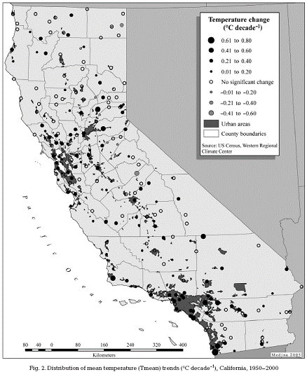
A study published in 2007 (“Recent California climate variability: spatial and temporal patterns in temperature trends”, Ladochy, Medina, Patzert, Climate Research Vol 33, 2007) provides the following figure showing mean temperature change per decade from 1950 to 2000 for California stations. This shows the warming in California to be mainly in the urban areas. Their paper states: “Most regions showed a stronger increase in minimum temperatures than with mean and maximum temperatures. Areas of intensive urbanization showed the largest positive trends, while rural, non-agricultural regions showed the least warming... Southern California had the highest rates of warming, while the NE Interior Basins division experienced cooling. Large urban sites showed rates over twice those for the state, for the mean maximum temperatures, and over 5 times the state’s mean rate for the minimum temperatures”.
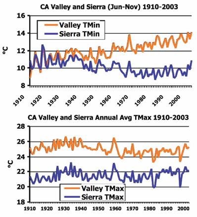
In 2006 John Christy (Professor of Atmospheric Science, University of Alabama in Huntsville) published a study of California Central Valley temperatures: “the nighttime temperatures in the 18 Valley stations were warming rapidly, about 6°F in summer and fall, while the same daytime temperatures fell about 3°F. This is consistent with the effects of urbanization and the massive growth in irrigation in the Valley. The real surprise was the composite temperature record of the 23 stations in the central Sierra foothills and mountains. Here, there was no change in temperature. These results did not match the results given by climate models specifically downscaled for California where the Sierra’s were expected to have warmed more than the Valley over this period” [http://www.nsstc.uah.edu/atmos/christy/ChristyJR_07EC_subEAQ_written.pdf]
The following figure is from Christy’s 2009 testimony to congress [http://www.nsstc.uah.edu/atmos/christy/ChristyJR_WM_Written_090225.pdf], in which he stated: “Temperature change in Central California for the nighttime (TMin) temperatures in the developed Valley (orange) and the adjacent undeveloped Sierra (blue). Note the rapid rise in nighttime temperatures in the Valley as agriculture and urbanization occurred. Bottom: Daytime (TMax) temperatures in the Valley (orange) and Sierra (blue) showing almost identical trends near zero change. This study shows that using nighttime temperatures from stations where development has occurred leads to a spurious warming signal. The popular surface datasets today use the average of the day and night temperatures, thus are influenced by this warming that is unrelated to CO2. If daytime temperatures, which are much more representative of the atmosphere as a whole, are used then there has been no warming in Central California since 1910 according to these results (nor in Alabama nor East Africa).”
|
|
US Southwest (excl. CA)
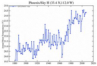
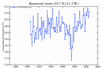
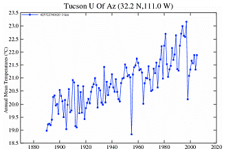
In the Southwestern United States other than California, shows a similar patter to California, and since the number of urban stations exceeds the rural, the problem is amplified. The following provides a comparison of four southwest cities, each with a nearby rural station.
Phoenix, AZ
(For a more detailed analysis of Phoenix’s urban heat effect, see: http://www.appinsys.com/GlobalWarming/Phoenix_UrbanHeat.htm )
Tucson, AZ
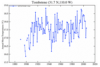
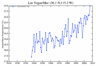
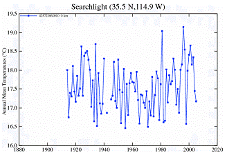
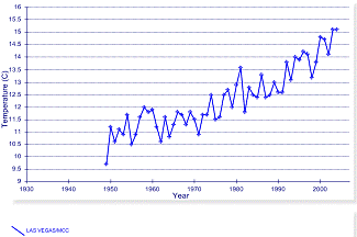
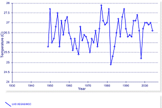
Las Vegas, NV
To examine this urban heat effect, the following figures provide a closer look at Las Vegas. The figure above showed the average mean temperature for Las Vegas. The following two figures show the average minimum temperature (left) and average maximum temperature (right). The average minimum temperature (left-hand figure) -- which occurs at night -- has been increasing, while the average maximum temperature (right-hand figure) -- which occurs in the daytime -- has not been increasing. This reduction in diurnal range caused by increasing nighttime temperatures is caused by urban warming, not CO2.
|
|
US NCDC
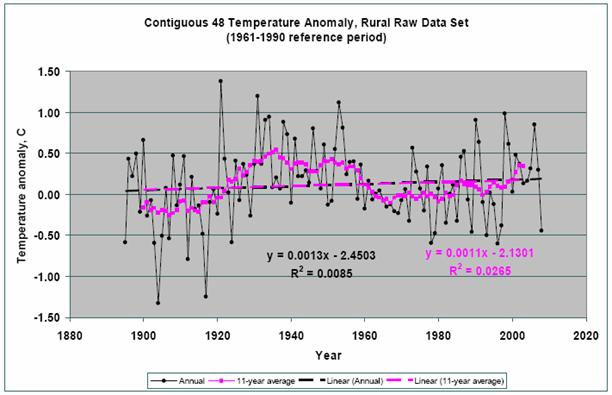
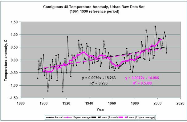
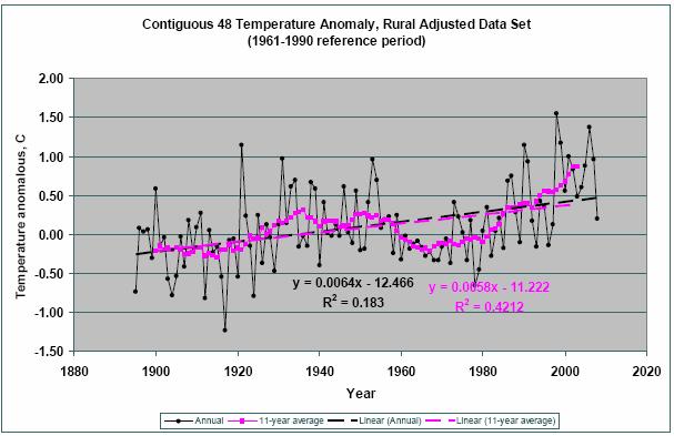
The US National Climatic Data Center (NCDC) adjusts the data that is displayed in their plots. Retired NASA physicist Edward Long compared the urban and rural US data before and after NCDC adjustments [http://scienceandpublicpolicy.org/images/stories/papers/originals/ Rate_of_Temp_Change_Raw_and_Adjusted_NCDC_Data.pdf]
The following figures are from the above report. The top figure shows rural unadjusted data , while the next figure shows urban unadjusted data.
The NCDC then artificially creates warming at rural stations through their data adjustments. The following figure shows the adjusted rural data – it now has almost the same trend as the urban data.
|
|
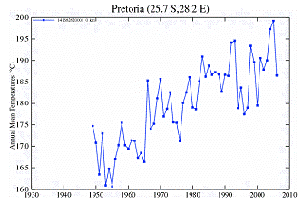
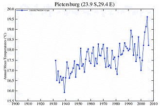
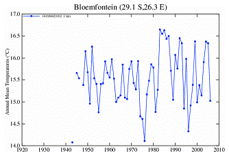
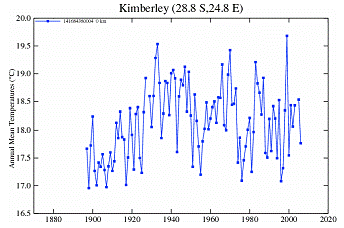
Southern Africa
In Southern Africa an examination of temperature stations shows a similar discrepancy between urban and rural stations.
Urban Stations:
Rural Stations:
|
|
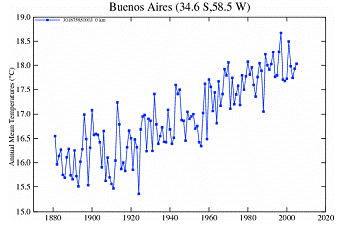
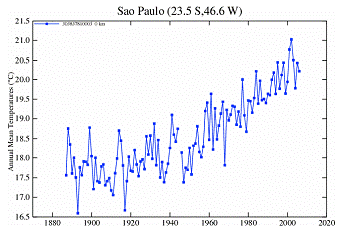
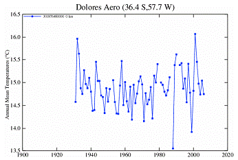
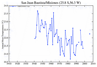
South America
In Southern South America an examination of temperature stations shows the common discrepancy between urban and rural stations. There are very few rural area stations, but several small town stations. Very few stations have data earlier than 1950.
Urban Stations:
Rural Stations:
|
|
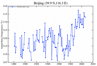
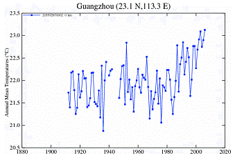
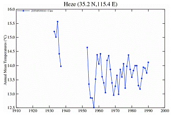
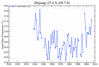
China
In China an examination of temperature stations shows a similar discrepancy between urban and rural stations. However, the Chinese data show another problem: most rural stations started collecting data in the mid-1950’s and stopped in 1990.
Urban Stations:
Rural Stations:
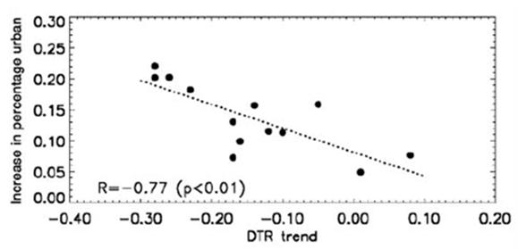
The following figure shows a relationship between the DTR trend and the increase in urbanization in China for 1979-1999 (From: Zhou et al “Evidence for a significant urbanization effect on climate in China” PNAS 2004 [http://www.ncbi.nlm.nih.gov/pmc/articles/PMC470710/pdf/1019540.pdf]) The study states: “Our estimated warming of mean surface temperature of 0.05°C per decade attributable to urbanization is much larger than previous estimates for other periods and locations. The spatial pattern and magnitude of our estimate are consistent with those of urbanization characterized by changes in the percentage of urban population and in satellite-measured greenness.”
|
|
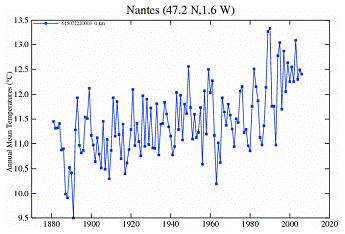
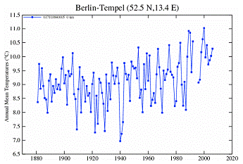
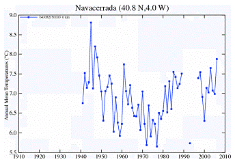
Europe
In Europe an examination of temperature stations shows a different problem: a lack of data. There are very few rural stations and close to zero rural stations with a long-term record. Although there are many urban stations, there are very few with long-term data. Many of those have a gap for 1930 – 1945 (World War II) or from 1915 – 1945 (a gap covering both World Wars). Very few stations have continued into the 2000’s. I couldn’t find any rural stations that started earlier than 1940 and continued to 2000 except for a couple of towns at high elevations in the Alps (Sonnblick, Saentis) which show warming but are in an extreme environment -- i.e. elevations > 10,000 feet, mean annual temperature below zero (in fact Sonnblick is the highest weather station in the world) and are thus in their own microclimate.
Urban Stations:
Rural Stations:
|