Global Warming
[This is part 4 of the Global Warming Summary series at www.appinsys.com/GlobalWarming]
Part 4: Climatic Events – Hurricanes, Sea Level, Glaciers, etc.
While the global temperature increase as instigated by the hockey stick graph got the climate movement rolling, other climatic events such as hurricanes, glaciers, snow pack, precipitation and seal level rise have also garnered much alarmist attention.
This document contains sections on:
- Hurricanes
- Tornadoes
- Precipitation
- Arctic Sea Ice
- Antarctic Ice Sheet
- Glaciers
- Sea Level
- Polar Bears
- Other Animals
- Malaria
- Death due to Extreme Weather
- North Atlantic Thermohaline Circulation
|
|
Hurricanes
Contradictory predictions have been made about the effect of global warming on hurricanes. However, most hurricane experts as well as the data, indicate that there is no link. The National Oceanic and Atmospheric Administration (NOAA) attributes increased recent hurricane activity to “natural occurring cycles in tropical climate patterns near the equator. These cycles, called “the tropical multi-decadal signal,” typically last several decades (20 to 30 years or even longer). As a result, the North Atlantic experiences alternating decades long (20 to 30 year periods or even longer) of above normal or below normal hurricane seasons. NOAA research shows that the tropical multi-decadal signal is causing the increased Atlantic hurricane activity since 1995, and is not related to greenhouse warming.” [http://www.magazine.noaa.gov/stories/mag184.htm]
The following figure shows the annual number of hurricanes for the period of 1944 to 2007. “Between 1966 and 2003, US major hurricane landfall numbers were below the long-term average”. “Although global surface temperatures have increased over the last century and over the last 30 years, there is no reliable data available to indicate increased hurricane frequency or intensity in any of the globe’s seven tropical cyclone basins. Meteorologists who study tropical cyclones have no valid physical theory as to why hurricane frequency or intensity would necessarily be altered significantly by small amounts (< ±1oC) of global mean temperature change.” [Extended Range Forecast of Atlantic Seasonal Hurricane Activity and U.S. Landfall Strike Probability for 2007, Klotzbach and Gray, Colorado State University, Dec. 2006 http://typhoon.atmos.colostate.edu/Forecasts/2006/dec2006/ ]
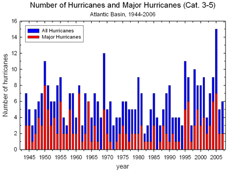
Hurricanes in the US 1944 – 2007 [http://www.ncdc.noaa.gov/oa/climate/research/2007/ann/us-summary.html]
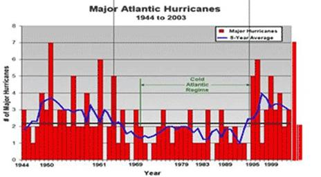
The next figure compares the major hurricanes (red bars in previous figure) with the 5-year average of the Atlantic Multidecadal Oscillation (AMO) index [http://intellicast.com/Community/Content.aspx?a=127], showing a strong correlation (see also www.appinsys.com/GlobalWarming/PDO_AMO.htm for more information on the AMO).
A recent study of the impact of global warming on hurricanes done at the University of Miami and reported in Science Daily (Global Warming Increases Wind Shear, Reduces Hurricanes, Climate Model Shows) [http://www.sciencedaily.com/releases/2007/04/070417182843.htm ] says “Climate model simulations for the 21st century indicate a robust increase in wind shear in the tropical Atlantic due to global warming, which may inhibit hurricane development and intensification. Historically, increased wind shear has been associated with reduced hurricane activity and intensity”.
The National Oceanic and Atmospheric Administration (NOAA) made the following statement in December 2006 [http://hurricanes.noaa.gov/pdf/hurricanes-and-climate-change-09-2006.pdf]:“Atlantic hurricane seasons since 1995 have been significantly more active, e.g. more hurricanes and more intense hurricanes, than the previous two decades [however] earlier periods, such as from 1945 to 1970 (and perhaps earlier), were apparently as active as the most recent decade.... The past decade has seen increased U.S. landfalls, however periods of even higher landfalls occurred early in the century.” In February 2008, a NOAA press release [http://www.noaanews.noaa.gov/stories2008/20080222_hurricane.html] stated: “There is nothing in the U.S. hurricane damage record that indicates global warming has caused a significant increase in destruction along our coasts”.
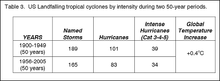
According to William Gray (Professor Emeritus of Atmospheric Science, Department of Atmospheric Science, Colorado State University) in a paper called Hurricanes and Climate Change (Oct. 2006) [http://ff.org/centers/csspp/pdf/20061011_gray.pdf] “The most reliable long-period hurricane records we have are the measurements of US landfalling tropical cyclones since 1900 (Table 3). Although global mean ocean and Atlantic surface temperatures have increased by about 0.4oC between these two 50-year periods (1900-1949 compared with 1956-2005), the frequency of US landfall numbers actually shows a slight downward trend for the later period. If we chose to make a similar comparison between US landfall from the earlier 30-year period of 1900-1929 when global mean surface temperatures were estimated to be about 0.5oC colder than they have been the last 30 years (1976-2005), we find exactly the same US hurricane landfall numbers (54 to 54) and major hurricane landfall numbers (21 to 21).”
According to researchers at the Department of Atmospheric Science at the Colorado State University (Extended Range Forecast of Atlantic Seasonal Hurricane Activity and U.S. Landfall Strike Probability for 2007, Klotzbach and Gray, Colorado State University, Dec. 2006) [http://typhoon.atmos.colostate.edu/Forecasts/2006/dec2006/]: “Between 1966 and 2003, US major hurricane landfall numbers were below the long-term average”. “Although global surface temperatures have increased over the last century and over the last 30 years, there is no reliable data available to indicate increased hurricane frequency or intensity in any of the globe’s seven tropical cyclone basins. Meteorologists who study tropical cyclones have no valid physical theory as to why hurricane frequency or intensity would necessarily be altered significantly by small amounts (< ±1oC) of global mean temperature change.”
Recent research reported in 2007 by the Woods Hole Oceanic Institute “Scientists Unearth Long Record of Past Hurricanes” [http://www.whoi.edu/oceanus/viewArticle.do?id=28207§ionid=1021] analyzing soil deposits representing the last 5,000 years in Puerto Rico found: “extensive periods of intense hurricanes in the past, when ocean temperatures were cooler than they are now. The record showed that the dominant forces spawning heightened hurricane activity appeared to be atmospheric conditions generated by weak El Niños in the tropical Pacific and strong West African monsoons”
A paper by Landsea et al -- “Downward trends in the frequency of intense Atlantic hurricanes during the past five decades“ -- Geophysical Research Letters, 1996 – by Christopher W. Landsea 1 and Neville Nicholls (Bureau of Meteorology Research Centre, Melbourne, Victoria Australia), William M. Gray, Department of Atmospheric Science, Colorado State Universit)y and Lixion A. Avila (National Hurricane Center, Miami) [http://www.aoml.noaa.gov/hrd/Landsea/downward/index.html] – states “contrary to many expectations that globally tropical cyclones may be becoming more frequent and/or more intense due to increasing concentrations of greenhouse gases, regionally the Atlantic basin has in recent decades seen a significant trend of fewer intense hurricanes and weaker cyclones overall. In addition, the maximum intensity reached in each year has shown no appreciable change.” The following figure is from this paper.
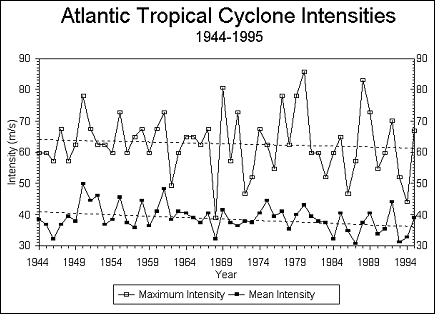
Atlantic Cyclone Intensities
A paper called “Annual Analyses of Basin and Hemispheric Tropical Cyclone Indices” by Levinson, Lawrimore, Gleason and Wallis (NOAA/NESDIS National Climatic Data Center, Asheville, North Carolina), 2006 [ftp://ftp.ncdc.noaa.gov/pub/data/papers/2006dlproc2c.4free.pdf] analyzed the occurrence of hurricanes / cyclones in the various global basins. The following figure shows annual values of the Accumulated Cyclone Energy (ACE) Index calculated for each of the seven global tropical cyclone basins ( the red lines denote the 1981-2000 base period means for each basin) showing no trend in ACE. The ACE combines wind speed and duration of cyclones to determine accumulated energy. The following figure is from that paper.
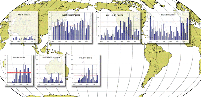 Worldwide
Regional Trends In Accumulated Cyclone
Energy (ACE) Index
Worldwide
Regional Trends In Accumulated Cyclone
Energy (ACE) Index
The following figure shows updated ACE to 2007 for the North Atlantic basin.
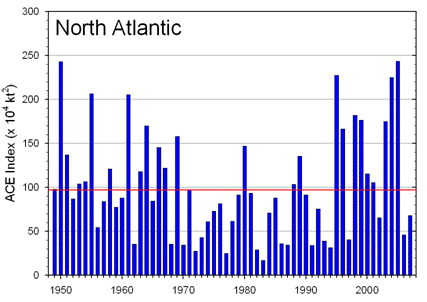
North Atlantic ACE 1949 - 2007 http://www.ncdc.noaa.gov/oa/climate/research/2007/ann/us-summary.html
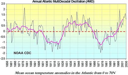
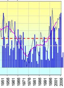
The following figure shows a plot of the Atlantic Multidecadal Oscillation (AMO) [see www.appinsys.com/GlobalWarming/PDO_AMO.htm for details about the AMO], along with the above North Atlantic ACE superimposed on the AMO plot. The correlation is clear.
In their 2008 hurricane summary (“Summary of 2008 Atlantic Tropical Cyclone Activity and Verification of Author’s Seasonal and Monthly Forecasts”, Philip J. Klotzbach and William M. Gray, Department of Atmospheric Science Colorado State University, Nov. 2008)
[http://tropical.atmos.colostate.edu/Forecasts/2008/nov2008/nov2008.pdf] the authors state: “Despite the global warming of the sea surface that has taken place over the last 3 decades, the global numbers of hurricanes and their intensity have not shown increases in recent years except for the Atlantic. This large increase in Atlantic major hurricanes is primarily a result of the multi-decadal increase in the Atlantic Ocean thermohaline circulation (THC) that is not directly related to global sea surface temperatures or CO2 gas increases. Changes in ocean salinity are believed to be the driving mechanism. These multi-decadal changes have also been termed the Atlantic Multidecadal Oscillation (AMO).” (See www.appinsys.com/GlobalWarming/PDO_AMO.htm for more info on the AMO).
The following figure is from the above mentioned Klotzback / Gray study and shows tracks of major (Category 3-4-5) hurricanes during the 25-year cooling period of 1945-1969 versus the 25-year warming period of 1970-1994. They state: “CO2 amounts in the later period were approximately 18 percent higher than in the earlier period. Major Atlantic hurricane activity was less than 1/2 as frequent during the latter period despite warmer global temperatures.”
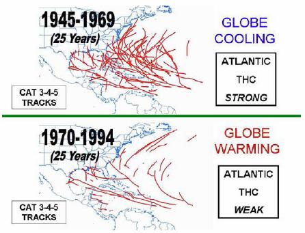
Tracks of major (Category 3-4-5) hurricanes during the 25-year cooling period of 1945-1969 versus the 25-year warming period of 1970-1994
The next figure (from the same study) shows tracks of East Coast and Florida Peninsula major landfalling hurricanes during the 43-year period of 1923-1965 versus the most recent 43-year period of 1966-2008. The authors state: “Although 2005 had a record number of tropical cyclones (28 named storms, 15 hurricanes and 7 major hurricanes), this should not be taken as an indication of something beyond natural processes. There have been several other years with comparable hurricane activity to 2005. For instance, 1933 had 21 named storms in a year when there was no satellite or aircraft data. Records of 1933 show all 21 named storm had tracks west of 60W where surface observations were more plentiful. If we eliminate all the named storms of 2005 whose tracks were entirely east of 60W and therefore may have been missed given the technology available in 1933, we reduce the 2005 named storm total by seven (to 21) – the same number as was observed to occur in 1933.”
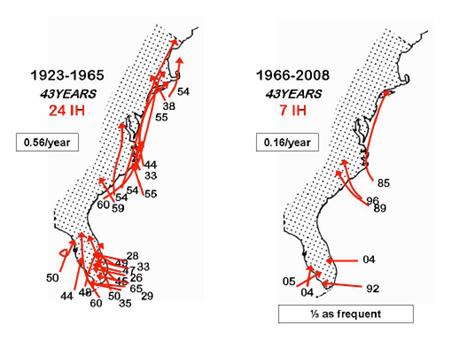
Tracks of East Coast and Florida Peninsula major landfalling hurricanes during the 43-year period of 1923-1965 versus the most recent 43-year period of 1966-2008.
|
|
Tornadoes
The following figure shows the annual number of strong tornadoes for the period of 1950 to 2006. The number of strong tornadoes has been decreasing since the 1960’s.
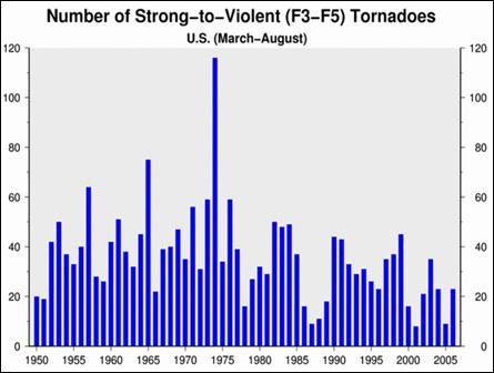
Tornadoes in the US 1950 – 2006 [http://www.ncdc.noaa.gov/oa/climate/research/2006/ann/us-summary.html]
|
|
Precipitation
The following figure shows US precipitation for 1895 – 2007.
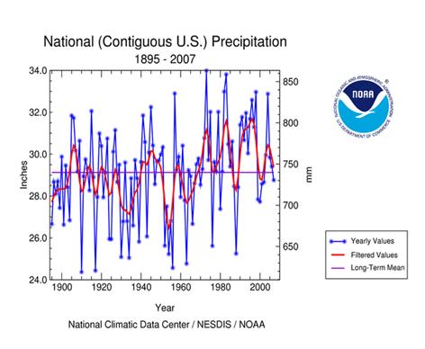
US Precipitation 1895 – 2007 http://www.ncdc.noaa.gov/img/climate/research/2007/dec/Reg110Dv00Elem01_01122007_pg.gif
The following figure shows precipitation anomalies for Feb 2003 to Jan 2007.
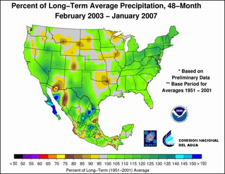
Precipitation Anomalies [http://www.ncdc.noaa.gov/oa/climate/research/2006/ann/us-summary.html]
The following figure compares the occurrences of moderate to extreme drought and moderate to extreme wet conditions in the US Feb 1990 to 2006.
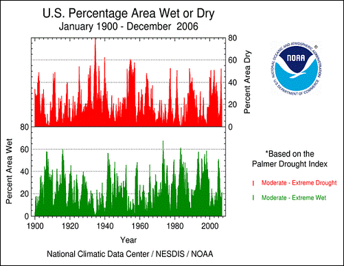
Moderate to extreme drought and moderate to extreme wet conditions in the US Feb 1990 to 2006
The following figure shows monthly percent wet / dry percent area in the US compared to the 1961 – 1990 average.
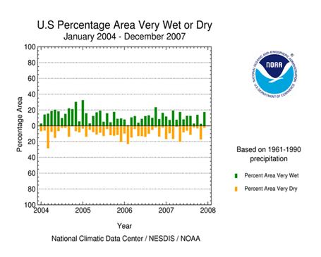
Percent Area Very Wet or Very Dry (monthly Jan 2004 – Dec 2007)
http://www.ncdc.noaa.gov/img/climate/research/2007/dec/Reg110_Elem01_paex_01041207_pg.gif
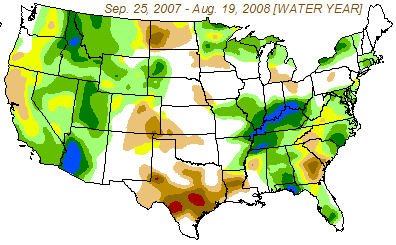
There are always some areas in the US that are experiencing drought or extreme wet, as indicated in the above two figures. The following figure shows the change in drought severity from Sep 2007 to Aug 2008. Drought in southern California and Arizona has lessened, while drought in Texas and Georgia has worsened.
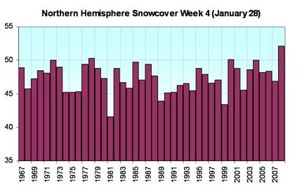
The following figure shows northern hemisphere snow cover for late January from 1967 to 2008.
See also: www.appinsys.com/GlobalWarming/RS_Washington_usa.htm for a look at Cascade Mountain snowpack and precipitation in Washington State.
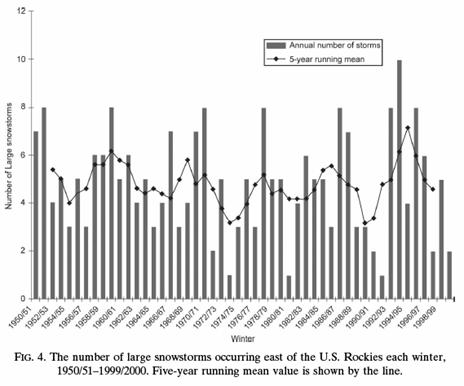
The following figure shows number of large snowstorms for the U.S. east of the Rockies 1950 – 2000, no trend observed (Changnon, D., C. Merinsky, and M. Lawson, 2008. Climatology of surface cyclone tracks associated with large central and eastern U.S. snowstorms, 1950–2000. Monthly Weather Review, 136). [http://ams.allenpress.com/archive/1520-0493/136/8/pdf/i1520-0493-136-8-3193.pdf]
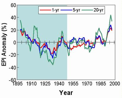
The following figure shows the Extreme Precipitation Index (EPI) values for 1, 5, and 20-year baselines since 1895. (Kunkel et al) [http://www.worldclimatereport.com/index.php/2006/03/15/an-extreme-view-of-global-warming/]
|
|
Arctic Sea Ice and Greenland Ice Sheet
Arctic sea ice has been declining in recent decades as shown in the following figure:
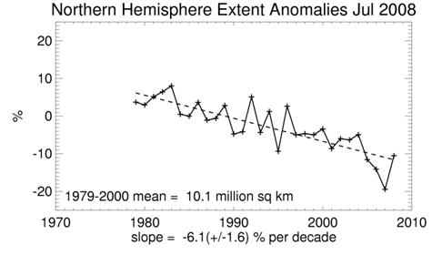
Arctic Sea Ice Extent 1979 -2008 [http://nsidc.org/data/seaice_index/]
Sea ice is ice that is in the ocean (and therefore does not contribute to sea level rise as it melts). The Greenland ice sheet is on land and thus its melting would contribute to sea level rise. The problem with most available data is the lack of a long-term perspective.
The following figure shows a graph of the HadCRUT3 land and sea surface data (from data graphing at CO2Science.org http://www.co2science.org/cgi-bin/temperatures/jones.pl). Temperatures are recently becoming similar to during the 1930s.
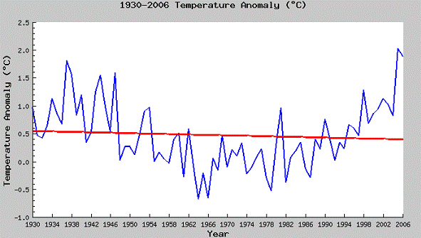
Arctic Temperature 1930 - 2006
To put this in a longer time-frame perspective, A study of climate trends in Greenland by University Geoscience researchers in Denmark and Norway "Meteorological trends (1991-2004) at Arctic Station, Central West Greenland (69º15’N) in a 130 years Perspective" [http://www.rdgs.dk/image/pub_pdf/artikler/2006_1/GT106_04_Hansen_Elberling_Humlum_Nielsen.pdf] concluded: "we conclude that markedly changes can be noted, including increasing mean annual air temperatures on the order of 0.4°C per year and 50% decrease in sea ice cover. Changes are mainly noted for the winter period, but also the summer period has been affected as increasing thawing depths and an increase in the growing season. When data are compared to other data series it becomes clear that meteorological observations at Arctic Station are in line with other longer records including data Ilulissat/Jakobshavn, which makes it possible to estimate data from Arctic Station back to 1873. Over this long time period, estimated winter temperatures correlate significantly with NAO and reveal that although the documented climate changes the last decade are dramatic, they are on the same order as changes that occurred between 1920 and 1930". The following figure shows the 1870 - 2004 temperature graph is from their study.
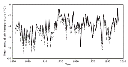
Greenland Temperature Trend 1870 - 2004
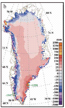
A paper by Jason Box et al (Box, J.E., D.H. Bromwich, B.A. Veenhuis, L-S Bai, J.C. Stroeve, J.C. Rogers, K. Steffen, T. Haran, S-H Wang, “Greenland Ice Sheet Surface Mass Balance Variability (1988-2004) From Calibrated Polar MM5 Output”, Journal of Climate, Vol. 19, No. 12) [http://polarmet.mps.ohio-state.edu/jbox/pubs/Box_et_al_J_Climate_2006.pdf] states “The combined effect of temperature and precipitation trends over the 17-yr lead to increased rates of ablation and increased accumulation (Fig. 10b). The net effect of these competing factors demonstrates that the overall (total ice sheet) surface mass balance change is relatively small”.
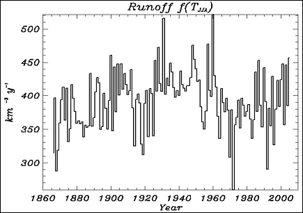
The following figures show the 17-year change in average annual surface mass balance for the Greenland ice sheet (left - Figure 10b referred to above) and the reconstructed runoff from the ice sheet from 1860 – 2004 (right). The mass balance figure indicates melting at some edges with increase in ice in the center. The runoff figure shows that the melting is similar to the 1930s.
See www.appinsys.com/GlobalWarming/RS_Greenland.htm for more details on Greenland.
See www.appinsys.com/GlobalWarming/RS_Arctic.htm for more details on the Arctic.
|
|
Antarctic Ice Sheet
The Antarctic ice sheet is massive and is situated on top of the land, thus the melting of it would significantly raise sea levels. However studies show that Antarctic is not warming. The ice sheet is melting at the edges where it is in contact with the ocean, which is warming, but most of the ice sheet is gaining mass balancing the loss at the edges.
The following figure shows the Antarctic sea ice extent [http://nsidc.org/data/seaice_index/] showing a slight increase over the last few decades.
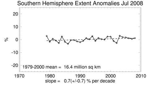
Antarctic Ice Extent Anomalies 1979 - 2008
An article in Science Daily about a study reported in the Journal of Geophysical Research (Oceans) [http://www.sciencedaily.com/releases/2005/06/050630064726.htm] (“Warmer Air May Cause Increased Antarctic Sea Ice Cover”, 2005) that used satellite observations from NASA's Special Sensor Microwave/Imager to assess snow depth on sea ice. The article states that “increases in precipitation due to warmer air temperatures from greenhouse gas emissions may actually increase sea ice volume in the Antarctic's Southern Ocean. This finding from a new study adds evidence of potential asymmetry between the two poles and may be an indication that climate change processes may have varying impacts on different areas of the globe.”
An article in GeoTimes (“Confusion Corner: Antarctica”, 2002) documenting research by the National Science Foundation’s Long Term Ecological Research (LTER) team studying temperature changes [http://www.geotimes.org/mar02/NN_antarctica.html] in which Peter Doran led researchers “We found that over the past 35 years, more of the continent has been cooling than warming, and the cooling has been about 1 degree Fahrenheit decrease per decade in the Dry Valleys since 1986,” Doran says. While the Dry Valleys are cooling much faster than the rest of the continent, areas such as the Antarctic Peninsula are warming faster. The LTER scientists’ analysis indicates that overall, 58 percent of the continent is cooling. As Ian Joughin of NASA’s Jet Propulsion Laboratory and Slawek Tulaczyk of the University of California at Santa Cruz write in the Jan. 18 Science, part of the ice sheet has actually begun to thicken, not melt. Tulaczyk says: “Climate models need to be improved to explain cooling. They do not currently account for spatial or temporal variabilities such as cooling. And these new aspects of ice-sheet behavior need to be incorporated into glaciological models of ice-sheet flow.”
The following figures show temperature trends from two stations in Antarctica. No warming trend is evident.
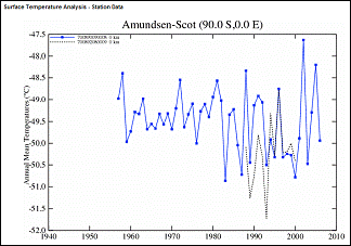
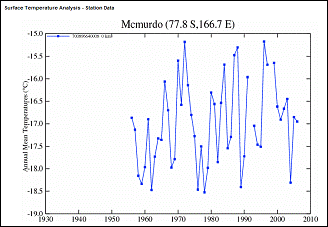
Antarctica Temperature Trends at the South Pole (Amundsen-Scott) and McMurdo
See the Regional Summary on Antarctica at www.appinsys.com/GlobalWarming/RS_Antarctica.htm
See the Regional Summary on the Antarctic Peninsula at www.appinsys.com/GlobalWarming/RS_AntarcticPeninsula.htm
|
|
Glaciers
Most glaciers around the world (alpine and Greenland ice-sheet glaciers) are melting as part of the warming phenomenon (although some are actually increasing).
A recent paper by Syun-Ichi Akasofu at the International Arctic Research Center (University of Alaska Fairbanks) provides an analysis of warming trends in the Arctic. [http://www.iarc.uaf.edu/highlights/2007/akasofu_3_07/index.php ] The authors analyzed various climate-related trends in the Arctic, including the contraction of sea ice and glaciers (shown in the following figrue): “Figure 8 shows that the southern edge of sea ice in the Norwegian Sea has been continuously receding from about 1800. Figure 9 shows examples of glaciers in Greenland and Alaska, which have been receding from the time of the earliest records (about 1800 for Greenland and 1900 for Alaska). There are a large number of similar records from the European Alps and elsewhere (Grove, 1982). Therefore, it can be assumed that many glaciers advanced during the Little Ice Age and have been receding since then. Thus, the retreat is not something that happened only in recent years.”
The authors’ conclusions: “The fact that an almost linear change has been progressing, without a distinct change of slope, from as early as 1800 or even earlier (about 1660, even before the Industrial Revolution), suggests that the linear change is natural change”
See also the Regional Summary on Alaska at www.appinsys.com/GlobalWarming/RS_Alaska.htm , which describes the Hubbard glacier – one of 8 major glaciers in Alaska that have been expanding in recent decades. See also: http://www.appinsys.com/GlobalWarming/HubbardGlacier.htm.
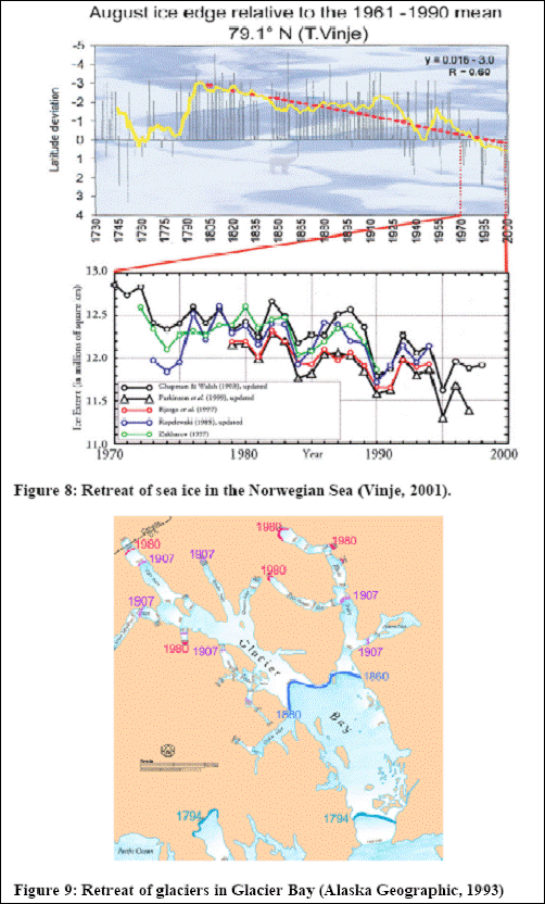
Sea Ice and Glacier Retreat [from Akasofu]
The Mount Kilimanjaro glacier has been touted as an effect of anthropogenic global warming. The disappearing glacier is due to solar effects. In fact the Mount Kilimanjaro glaciers mainly sublimate directly to the atmosphere, rather than melting into runoff water.
A recent study of Mount Kilimanjaro: “Kilimanjaro Glaciers: Recent Areal Extent From Satellite Data and New Interpretation of Observed 20th Century Retreat Rates” by Cullen, Molg, Kaser, Hussein, Steffen, and Hardy (Tropical Glaciology Group, Department of Earth and Atmospheric Sciences, University of Innsbruck, Austria; Cooperative Institute for Research in Environmental Sciences, University of Colorado, and Climate System Research Center, Department of Geosciences, University of Massachusetts) (Geophysical Research Letters, 2006) states: “All ice bodies on Kilimanjaro have retreated drastically between 1912–2003. Despite air temperatures always being below freezing, areal retreat of plateau glaciers is governed mostly by solar radiation induced melt on vertical walls that characterize their north and south margins [Mölg et al., 2003]. Though the processes responsible for the formation of the vertical walls is still not well understood, once established, the vertical wall retreat is irreversible, and no change in 20th century climate appears to have significantly altered their ongoing demise. ... Rather than changes in 20th century climate being responsible for their demise, glaciers on Kilimanjaro appear to be remnants of a past climate that was once able to sustain them. Hastenrath [2001, 2006] suggests an increase in net shortwave radiation, accompanied by a decrease in cloudiness and precipitation, initiated the retreat of the glaciers during the last two decades of the 19th century. This is supported by a recent finding that a higher frequency of climatically significant Indian Ocean Zonal Mode events in the 19th century (1820–1880) may have provided a mechanism to contribute to a wetter climate in East Africa, and thus stable glaciers.“
In another paper “Modern Glacier Retreat on Kilimanjaro as Evidence of Climate Change: Observations and Facts” by Kaser, Hardy, Molg, Bradley and Hyera (Tropical Glaciology Group, Department of Geography, University of Innsbruck, Austria, Climate System Research Center, Department of Geosciences, University of Massachusetts, and Tanzania Meteorological Agency) (International Journal of Climatology, 2004) [http://www.geo.umass.edu/faculty/bradley/kaser2004.pdf] the researchers state: “From a hydrological point of view, meltwater from Kibo’s glaciers has been of little importance to the lowlands in modern times… Most glacier ablation is due to sublimation, and where ice does melt it immediately evaporates into the atmosphere… The scenario presented offers a concept that implies climatological processes other than increased air temperature govern glacier retreat on Kilimanjaro in a direct manner. However, it does not rule out that these processes may be linked to temperature variations in other tropical regions.” The following figure is from this paper, showing the decrease in glacier extents going back at least as far as the late 1800s.
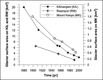
Reduction of African Glacier Areas over the Last Century
For further details on Mount Kilimanjaro, see also the Regional Summary on East Africa at www.appinsys.com/GlobalWarming/RS_EastAfrica.htm.
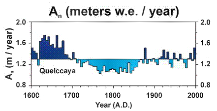
A study of ice cores from glaciers in South America (Thompson L.G., Mosely-Thompson E., Dansgaard, W., and Grootes, P.M., “The Little Ice Age As Recorded in the Stratigraphy of the Tropical Quelccaya Ice Cap”, Science 1986) states: “Ice cores from the tropical Quelccaya Ice Cap suggest that the Little Ice Age occurred in South America between 1490 and 1880 with onset and termination within a few decades.” The following figure shows the Quelccaya glacier accumulation over the last 400 years.
[http://www.pnas.org/content/103/28/10536.full.pdf+html]
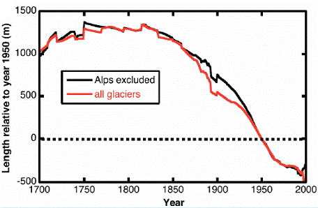
The following figures are from a study of 169 receding glaciers worldwide (Johannes Oerlemans, “Extracting a Climate Signal from 169 Glacier Records”, published in Science, 2005). The first shows relative glacier length for five glaciers, two of which have data back to the 1700s. The second shows the composite average of up to 169 glaciers (the number varies in different time periods). These indicate the pattern that is consistent for most glaciers worldwide – the recession of the glaciers started at the end of the little ice age in the 1700s. The recession of glaciers started long before anthropogenic CO2 levels rose. Since the IPCC says that anthropogenic CO2-based warming has only had an effect since the 1970s (see: www.appinsys.com/GlobalWarming/gw_nutshell.htm), the recession of glaciers cannot be due to anthropogenic CO2-based global warming. In fact many non-alps glaciers have either been increasing, or have had a decrease in the rate of retreat in recent decades (as indicated in the figures below).

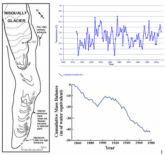
The following figure shows the Nisqually Glacier on Mount Rainier in Washington State, USA. The left-hand figure shows the reduction of the glacier from the early 1800s to 1997 (corresponding to the graph in the lower-right). The upper right graph shows the temperature trend from 1910 to 2007 for the closest temperature station at Longmire.
See also the regional summary on western Montana at www.appinsys.com/GlobalWarming/RS_Montana_usa.htm for information on Glacier National Park (while temperatures have not been warming, the glaciers have been receding since the 1800s).
|
|
Sea Level
A major concern about global warming is the potential rise in sea level. This could result from the melting of the Greenland and/or the Antarctic ice sheets. Greenland has been exhibiting recent melting whereas Antarctica has not (see previous subsections on these).
The IPCC stated in the Third Assessment Report (2001) [http://www.grida.no/climate/ipcc_tar/wg1/425.htm]: “There is no evidence for any acceleration of sea level rise in data from the 20th century data … Mediterranean records show decelerations, and even decreases in sea level in the latter part of the 20th century”.
The following figure shows cumulative sea level change over the last 100 years (from “Decadal Rates of Sea Level Change During the Twentieth Century” Simon Holgate, Proudman Oceanographic Laboratory, Liverpool, UK [http://meteo.lcd.lu/globalwarming/Holgate/sealevel_change_poster_holgate.pdf]). The report states: “The mean rate for the twentieth century calculated in this way is 1.67±0.04 mm/yr. The first half of the century (1904-1953) had a slightly higher rate (1.91±0.14 mm/yr) in comparison with the second half of the century (1.42±0.14 mm/yr 1954-2003).”
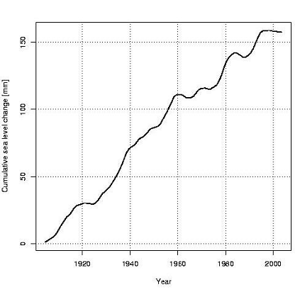
The following figure shows global cumulative sea level change for 1900 to 2002 [http://www.wamis.org/agm/meetings/rsama08/S304-Shum_Global_Sea_Level_Rise.pdf]. Since according to the IPCC, CO2-based warming has apparently only shown up since the 1970s, all of this sea level rise since prior to 1900 cannot be caused by anthropogenic CO2.
Sea level change varies constantly all over the Earth. Sea level gauges have been used the longest (although in very few locations) but require adjustment due to the fact that the earth is also changing its height in various places. For the northern part of the northern hemisphere, the earth is still rebounding from the weight of the ice in the last ice age (glacial isostatic rebound). This causes the appearance of falling sea levels in those locations (see the sea level figures in the Alaska Regional Summary, Western North America Regional Summary and Baltic Sea Area Regional Summary for examples of isostatic rebound sea level changes).
As a result of needing to adjust for isostatic rebound, studies have been made to try to determine real sea level change. A recent paper uses GPS measurements to determine adjacent land movements in order to determine the glacial-isostatic adjustment (“Geocentric Sea-Level Trend Estimates from GPS Analyses at Relevant Tide Gauges World-Wide”, G. Wöppelmann, B. Martin Miguez, Z. Altamimi, [http://ff.org/centers/csspp/library/co2weekly/20070809/20070809_06.pdf]). The paper states: “A dedicated GPS processing strategy is implemented to correct the tide gauges records, and thus to obtain a GPS-corrected set of ‘absolute’ or geocentric sea-level trends. The results show a reduced dispersion of the estimated sea-level trends after application of the GPS corrections. We obtain a value of 1.31 ± 0.30 mm/yr, a value which appears to resolve the ‘sea level enigma’”. (The enigma to which it refers is that the accepted approximate observed estimate of 1.7 mm/yr is too high for all the available sources of sea level increase. With the GPS-based adjustment to 1.3 mm/yr it is more in line with the calculation from available sources.)
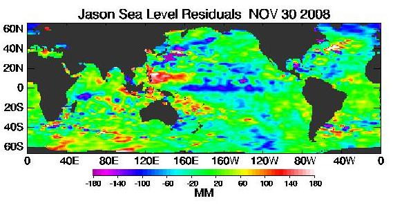
Since the use of satellites to measure Earth phenomena has developed, several satellites are used to measure sea level on a global basis. The following figure shows the a recent sea level figure from the NASA Jason satellite [http://sealevel.jpl.nasa.gov/science/jason1-quick-look/]. Unfortunately, satellite measurements for sea level began just over a decade ago.
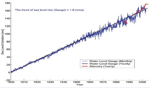
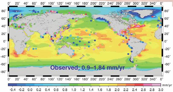
The following figure shows global sea level change rate from 1900 to 2003 based on 525 tide gauges (indicated as dots) and satellite altimetry. [http://www.wamis.org/agm/meetings/rsama08/S304-Shum_Global_Sea_Level_Rise.pdf]. The isostatic rebound is noticeable in the Arctic. The Oceania islands north of Australia (including the global warming poster-child Tuvalu) have less sea level rise than most of the tropics, with some stations showing sea level declines. The Gulf Stream is noticeable in its higher rate of sea level increase, indicating that perhaps the Gulf Stream is getting warmer (this is also noticeable in the Jason figure above).
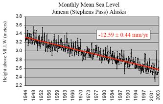
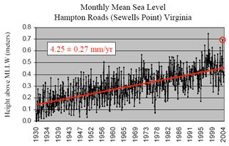
In addition to glacial isostatic rebound, continental plate tectonics affect local sea level changes. The following figures compare the falling sea level at Juneau, Alaska with the rising sea level at Hampton Roads, Virginia. “Virginia lies on a passive or ‘trailing edge’ continental margin - the tectonic opposite of the Alaskan example. Normally land rises on active margins and sinks on passive ones.” This is why the Virginia rise is greater than the global average – plate tectonics. [http://ccrm.vims.edu/cara_web/case%20studies_files/SEA%20COAST%20AND%20SEA%20LEVEL%20TRENDS%203.pdf]
The Fisheries and Oceans Canada maintains data on sea levels at Canadian ports.
[http://www.meds-sdmm.dfo-mpo.gc.ca/meds/Databases/TWL/Products/Monthly_Means_b.htm]. The following figure shows the annual sea level anomalies (in meters) for two east coast and two west coast ports for the last decade. In all cases the average sea level for the last decade is down by about 1 centimeter from the long-term average sea level. However, a decade does not provide much information on trends.
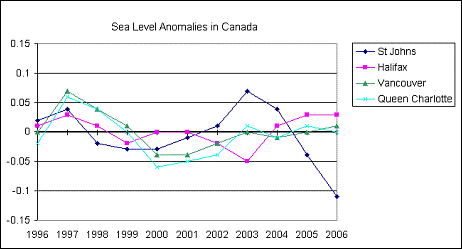
Sea Level Anomalies in Canada 1996 - 2006
The sea level rate in the 1990s was similar to the 1930s. “Nonlinear trends and multiyear cycles in sea level records” (Jevrejeva, S., A. Grinsted, J. C. Moore, and S. Holgate (2006), Journal of Geophysical Research) [http://www.agu.org/pubs/crossref/2006/2005JC003229.shtml] “global sea level trend estimate of 2.4 ± 1.0 mm/yr for the period from 1993 to 2000 …over the last 100 years the rate of 2.5 ± 1.0 mm/yr occurred between 1920 and 1945, is likely to be as large as the 1990s”
In an interview with Dr. Nils-Axel Mörner (head of the Paleogeophysics and Geodynamics department at Stockholm University in Sweden, past president (1999-2003) of the INQUA Commission on Sea Level Changes and Coastal Evolution, and leader of the Maldives Sea Level Project – he has been studying the sea level and its effects on coastal areas for some 35 years) by EIR (Argentine Foundation for a Scientific Ecology) [http://www.mitosyfraudes.org/Calen7/MornerEng.html] he talked about the IPCC misrepresentation of sea level data: “Then, in 2003, the same data set, which in their [IPCC's] publications,... was a straight line—suddenly it changed, and showed a very strong line of uplift, 2.3 mm per year, the same as from the tide gauge... It was the original one which they had suddenly twisted up, because they entered a “correction factor,” ... I accused them of this at the Academy of Sciences in Moscow —I said you have introduced factors from outside; it's not a measurement. It looks like it is measured from the satellite, but you don't say what really happened. And they answered, that we had to do it, because otherwise we would not have gotten any trend! That is terrible! As a matter of fact, it is a falsification of the data set. ... So all this talk that sea level is rising, this stems from the computer modeling, not from observations. The observations don't find it! I have been the expert reviewer for the IPCC, both in 2000 and last year. The first time I read it, I was exceptionally surprised.
Morner also talks about the sea level project in the Maldives and measurements in Tuvalu: “In about 1970, the sea fell about 20 cm… The new level, which has been stable, has not changed in the last 35 years…. Another famous place is the Tuvalu Islands, which are supposed to soon disappear because they've put out too much carbon dioxide. There we have a tide gauge record, a variograph record, from 1978, so it's 30 years. And again, if you look there, absolutely no trend, no rise.”
The following figure shows sea level history at Tuvalu (an island that according to Al Gore is rapidly disappearing due to sea level rise).
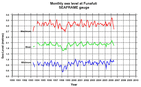
Sea Level History at Funafuti, Tuvalu
The following figure shows the fluctuating rate of change in sea level – positive rates indicate rising sea level, while negative rates indicate falling sea level. (On the decadal rates of sea level change during the twentieth century”, by S. J. Holgate, Proudman Oceanographic Laboratory, Liverpool, UK –GEOPHYSICAL RESEARCH LETTERS, VOL. 34, L01602, doi:10.1029/2006GL028492, 2007)
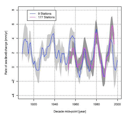
Rate of Sea Level Change 1904-2003
A study of long-term sea level trends based on basal peat below salt marshes and estuarine sediments adjusted for postglacial isostatic movement ( “A Search for Scale in Sea-Level Studies”, Curtis E. Larsen and Inga Clark, Journal of Coastal Research, 2006 [http://www.geogr.ku.dk/courses/4aar1-2/Estuarin/Larsen+Clark.pdf]) states: “there is no discernible divergence in the rate of sea-level rise over the past two centuries to suggest a connection with the documented increase in atmospheric CO2 concentration.”
See the Regional Summary series for further information on sea level changes:
- The Oceania summary [www.appinsys.com/GlobalWarming/RS_Oceania.htm ] shows graphs of historical sea level for the available several locations in the south Pacific islands (and guess what - sea levels have not changed significantly)
- The Alaska summary [www.appinsys.com/GlobalWarming/RS_Alaska.htm] shows graphs of historical sea level for the available several locations in Alaska – all of which show declining sea levels due to isostatic rebound.
- The Western North America summary [www.appinsys.com/GlobalWarming/RS_WesternNorthAmerica.htm] shows historical sea level trends for the North American Pacific coast.
- The Baltic Sea summary [www.appinsys.com/GlobalWarming/RS_Baltic.htm] shows historical sea level trends for the Baltic Sea.
- The Africa summary [www.appinsys.com/GlobalWarming/ReutersAfrica.htm] shows historical sea level trends for Africa.
Although Al Gore and other alarmists make statements about substantial increases in sea level, the IPCC AR4 (2007) report predicts that sea level rise will be 0.6 – 1.9 feet by the year 2100. The larger value is reduced from the IPCC TAR (2001) report which predicted 0.3 to 2.9 feet by 2100.
|
|
Polar Bears
Polar bears are often referred to as going extinct due to global warming. Polar bears use the sea ice as hunting platforms to hunt seals and Antarctic sea ice has been declining with recent warming. But the reality is that a) some polar bear populations are increasing, some are declining, some are stable and b) similar temperatures and conditions existed in both the 1930’s and during the Medieval Warm Period.
The following figure is from the World Wildlife Fund (whose position is that global warming will cause the polar bears to become extinct). According to the World Wildlife Fund (WWF), there are about 20 distinct polar bear populations accounting for approximately 22,000 polar bears worldwide. Population patterns, according to the WWF data, do not show a temperature-linked decline:
- Only two of the distinct bear populations — accounting for about 16.4 percent of the total number of bears — are decreasing, and they are in areas where air temperatures have actually fallen, such as the Baffin Bay region.
- Ten populations — comprising about 45.4 percent of the total number of bears — are stable.
- Another two populations — about 13.6 percent of the total number — are growing, and they live in areas were air temperatures have risen, such as near the Bering Strait and the Chukchi Sea
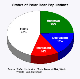
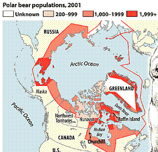
Polar Bear Population Status 2002 (left), Polar Bear Distribution (right)
A recent article in the Christian Science Monitor http://www.csmonitor.com/2007/0503/p13s01-wogi.html discusses the results of a study of polar bears in Canada by biologist Mitchell Taylor (Canada hosts about two-thirds of the world’s estimated 25,000 polar bears): “the number of polar bears in the Davis Strait area of Canada's eastern Arctic – one of 19 polar bear populations worldwide – has grown to 2,100, up from 850 in the mid-1980s. Dr. Taylor explained his conviction that threats to polar bears from global warming are exaggerated and that their numbers are increasing… The battle to ban the hunting of harp seal pups has meant that the harp seal population has jumped from 2 million to 5 million. It also means sealers, especially those from Norway, are no longer hunting the polar bears, which they used to do when the seal hunt was larger.”
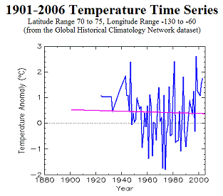
There is a shortage of long-term temperature records for the polar bear inhabited regions. The following figure shows the temperature trends for two regions (the representative rectangles on the map are approximate since the temperature graphs are for latitude / longitude areas, but the map projection is not rectangular).
![]()
![]()
![]()

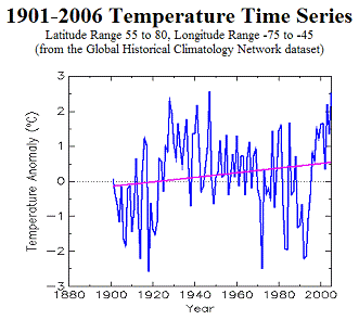
Average Annual Temperature Trends for Two Polar Bear Areas
May 14, 2008: the polar bear was declared a threatened species under the Endangered Species Act [http://www.nytimes.com/2008/05/15/us/15polar.html?_r=1&em&ex=1210910400&en=4a56875483b0a38b&ei=5087%0A&oref=slogin]. The NY Times article states: “There are more than 25,000 bears in the Arctic, 15,500 of which roam within Canada’s territory. A scientific study issued last month by a Canadian group established to protect wildlife said that 4 of 13 bear populations would most likely decline by more than 30 percent over the next 36 years, while the others would remain stable or increase.” “Never before has a thriving species been listed” under the Endangered Species Act, he said, “nor should it be.”
The US Department of the Interior Secretary Kempthorne is also into modeling. In her speech [http://www.doi.gov/secretary/speeches/081405_speech.html] she : “Although the population of bears has grown from a low of about 12,000 in the late 1960’s to approximately 25,000 today, our scientists advise me that computer modeling projects a significant population decline by the year 2050. This, in my judgment, makes the polar bear a threatened species – one likely to become in danger of extinction in the foreseeable future.”
Professor J. Scott Armstrong of the Wharton School (author of Long-Range Forecasting, the most frequently cited book on forecasting methods, and Principles of Forecasting.) says “In fact, the polar bear populations have been increasing rapidly in recent decades due to hunting restrictions. Assuming these restrictions remain, the most appropriate forecast is to assume that the upward trend would continue for a few years, then level off. … a key feature of the U.S. Geological Survey reports [on polar bears] is not scientifically supported” [http://www.sciencedaily.com/releases/2008/05/080508132549.htm]
The whole “polar bear issue” is based on recently reduced summer sea ice (the winter sea ice has still been normal). But a study of Greenland’s north cost (“Less Ice In Arctic Ocean 6000-7000 Years Ago” [http://www.sciencedaily.com/releases/2008/10/081020095850.htm]) states: “The climate in the northern regions has never been milder since the last Ice Age than it was about 6000-7000 years ago. … such old beach formations require that the sea all the way to the North Pole was periodically ice free for a long time.”
See the regional summary for the Arctic www.appinsys.com/GlobalWarming/RS_Arctic.htm for more information on the Arctic.
|
|
Other Animals
Claims have been made that global warming is currently adversely affecting many different animal species. However, examination of the details leads to either an untrue claim or a misrepresentation of the effects of local land use change – usually deforestation. See the following for examples:
- King and Adelie Penguins: www.appinsys.com/GlobalWarming/RS_Antarctica.htm
- Golden Toad: www.appinsys.com/GlobalWarming/RS_CostaRica.htm
- Monkeys in Kenya: www.appinsys.com/GlobalWarming/ReutersAfrica.htm
- Eelpouts in Northern Europe: www.appinsys.com/GlobalWarming/Eelpout.htm
- Moose in Minnesota: www.appinsys.com/GlobalWarming/Minnesota_MooseDecline.htm
|
|
Malaria
The alarmist scenario predicts an increase in malaria around the world since tropical areas are warmer and have more malaria – therefore warming areas will have more in the future. This scenario ignores the actual factors influencing malarial outbreaks.
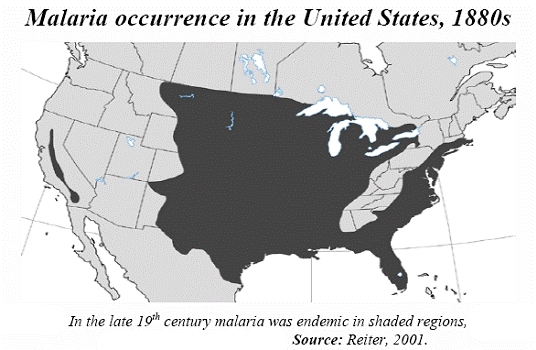
Malaria was common in the United States during the late 1800s. “In 1878, 100,000 Americans were infected with malaria, and some 25,000 died. Malaria was eradicated from the United States in the 1950s not because of climate change (it was warmer in the 1950s than in the 1880s), but because of technological advances. Air conditioning, the use of screen doors and windows, and the elimination of urban overpopulation brought about by the development of suburbs and automobile commuting were largely responsible for the decline in malaria (Reiter, 1996).” [http://scienceandpublicpolicy.org/images/stories/papers/originals/wyoming_climate_change_2008.pdf]
See The Malaria Journal, Dec 2008: “Global warming and malaria: knowing the horse before hitching the cart” by Paul Reiter [http://www.malariajournal.com/content/7/S1/S3] for a good explanation that debunks the “global warming will cause malaria” alarm. Some points from that paper:
- There is a widespread misconception that mosquito-borne diseases require tropical temperatures, or at least the temperatures of the warmer temperate regions.
- Few people are aware that it is less than forty years since the final eradication of malaria in Europe and the United States. Indeed, the disease was common in the period from the 16th to 18th centuries that climatologists term the Little Ice Age, and data from burial records around the Thames estuary reveal that mortality in "marsh parishes" of England was comparable to that in areas of transmission in sub-Saharan Africa today
- In the 1880s, it was widespread in nearly all states east of the Rocky Mountains, from the semitropical Gulf Coast states to the northern border and into Canada. It was also present west of the Rocky Mountains, particularly in areas where rainfall is abundant. As living conditions improved, and anti-malarial drugs became more widely available, the incidence of the disease declined.
- Simplistic reasoning on the future prevalence of malaria is ill-founded; malaria is not limited by climate in most temperate regions, nor in the tropics, and in nearly all cases, "new" malaria at high altitudes is well below the maximum altitudinal limits for transmission. Future changes in climate may alter the prevalence and incidence of the disease, but obsessive emphasis on "global warming" as a dominant parameter is indefensible
|
|
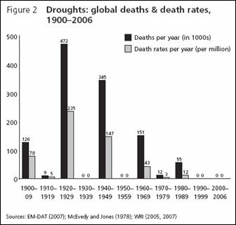
Death Due To Extreme Weather
Some global warming alarmists suggest that global warming will result in increasing deaths of humans due to extreme heat events in summer (even though the data show that where there is warming, it is mostly due to increased minimum temperatures not maximum temperatures).
A study by Indur Goklany published in 2007 (“Death and Death Rates Due to Extreme Weather Events -- Global and U.S. Trends, 1900–2006” [http://www.csccc.info/reports/report_23.pdf]) shows that even during the period of 1970 – 2006 (the period in which the IPCC says has experienced anthropogenic global warming), deaths due to extreme weather continue to decline. The following figures are from that paper.
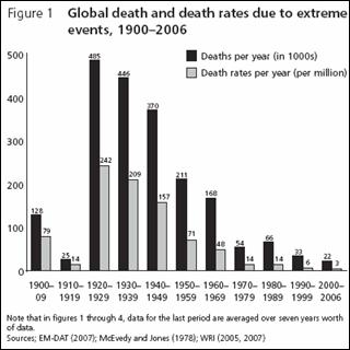
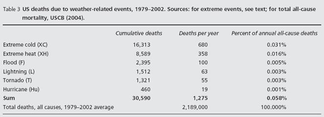
The following table is also from the above paper. It shows that in the United States, deaths due to extreme cold are about twice deaths due to extreme heat.
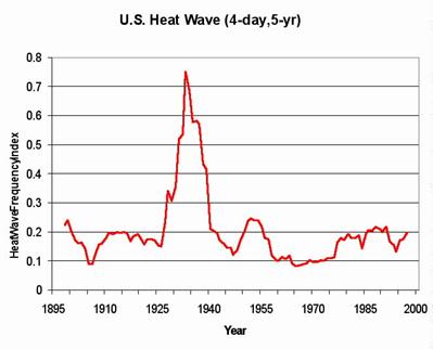
The following figure shows the frequency of heat waves since 1895. (Kunkel et al) [http://www.worldclimatereport.com/index.php/2006/03/15/an-extreme-view-of-global-warming/]
|
|
North Atlantic Thermohaline Circulation
Some global warming alarmists suggest that the North Atlantic Thermohaline Circulation will be disrupted by the melting of the Arctic ice cap, causing an ice age. This is known by scientists to be a bogus scenario. A 2006 article by Richard Seager (senior research scientist at Columbia University's Lamont-Doherty Earth Observatory) in American Scientist - “The Source of Europe's Mild Climate”) [http://www.americanscientist.org/issues/pub/2006/4/the-source-of-europes-mild-climate/1] provides the following explanation:
“the still-tentative connections investigators have made between thermohaline circulation and abrupt climate change during glacial times have combined with the popular perception that it is the Gulf Stream that keeps European climate mild to create a doomsday scenario: Global warming might shut down the Gulf Stream, which could "plunge western Europe into a mini ice age," making winters "as harsh as those in Newfoundland," or so claims, for example, a recent article in New Scientist. This general idea been rehashed in hundreds of sensational news stories.”
“The germ of truth on which such hype is based is that most atmosphere-ocean models show a slowdown of thermohaline circulation in simulations of the 21st century with the expected rise in greenhouse gases. The conveyer slows because the surface waters of the subpolar North Atlantic warm and because the increased transport of water vapor from the subtropics to the subpolar regions (where it falls as rain and snow) freshens the subpolar North Atlantic and reduces the density of surface waters, which makes it harder for them to sink. These processes could be augmented by the melting of freshwater reserves (glaciers, permafrost and sea ice) around the North Atlantic and Arctic.”
“The temperature difference between Europe and Labrador should remain. Temperatures will not drop to ice-age levels, not even to the levels of the Little Ice Age, the relatively cold period that Europe suffered a few centuries ago. The North Atlantic will not freeze over, and English Channel ferries will not have to plow their way through sea ice. A slowdown in thermohaline circulation should bring on a cooling tendency of at most a few degrees across the North Atlantic—one that would most likely be overwhelmed by the warming caused by rising concentrations of greenhouse gases. This moderating influence is indeed what the climate models show for the 21st century and what has been stated in reports of the Intergovernmental Panel on Climate Change. Instead of creating catastrophe in the North Atlantic region, a slowdown in thermohaline circulation would serve to mitigate the expected anthropogenic warming!”
“The play that the doomsday scenario has gotten in the
media—even from seemingly reputable outlets such as the British Broadcasting
Corporation—could be dismissed as attention-
grabbing sensationalism. But at root, it is the ignorance of how regional
climates are determined that allows this misinformation to gain such traction. ...
The blame lies with modern-day climate scientists who either continue to
promulgate the Gulf Stream-climate myth or who decline to clarify the relative
roles of atmosphere and ocean in determining European climate. This abdication
of responsibility leaves decades of folk wisdom unchallenged, still dominating
the front pages, airwaves and Internet, ensuring that a well-worn piece of
climatological nonsense will be passed down to yet another generation.”