Global Warming Science - www.appinsys.com/GlobalWarming
Washington State, USA
[last update: 2010/05/02]
This document contains the following sections:
- Washington State Average Temperature
- Pacific Decadal Oscillation (PDO)
- Puget Sound Area Temperatures
- Coastal Washington Temperatures
- Central Washington Temperatures
- Eastern Washington Temperatures
- Precipitation
- Snowpack [update 2009/07/24]
- Sea Level Rise [update 2010/05/02]
- Solar Influence
- Mountain Glaciers
- Land Use
|
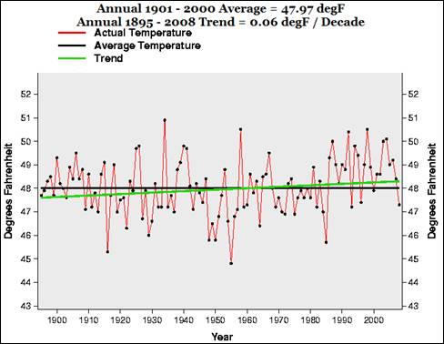
Washington State Average Temperature
The following figure shows the annual average temperature for Washington State since 1895 according to the NCDC [http://www.ncdc.noaa.gov/oa/climate/research/cag3/wa.html]
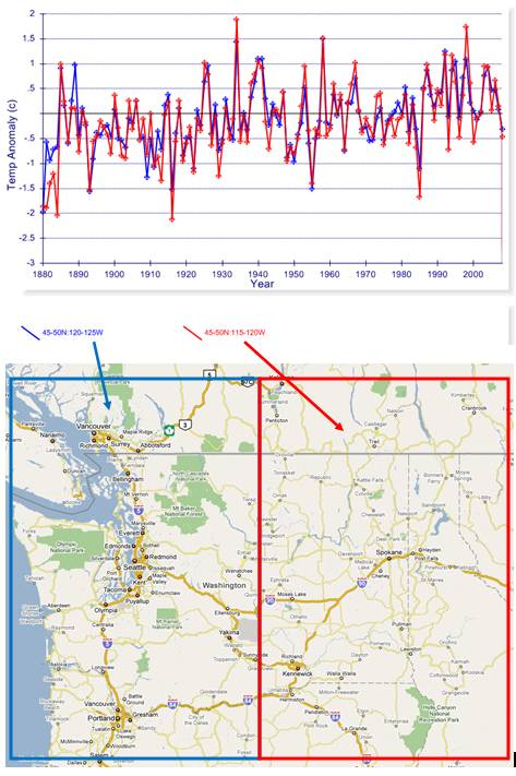
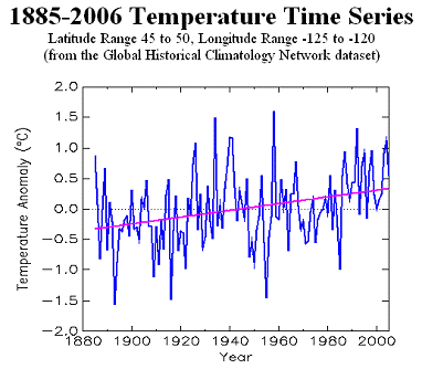
The following figure shows the annual average temperature anomalies for the two 5x5 degree grids covering Washington State since 1880 from the Hadley Climatic Research Unit (HadCRU – CRUTEM3 plotted at http://www.appinsys.com/GlobalWarming/climate.aspx) The HadCRU data is used by the IPCC.
In February 2009 the alarmist Seattle Times reported in “Report: Climate Change to Wallop State” that Washington “is in for a double whammy from global warming” based on a report from the state climatologist [http://seattletimes.nwsource.com/html/localnews/2008731012_climate11m.html] The report cites all the standard alarmist scenarios of things that “could” happen in the future. The problem is that “the analysis was based primarily on computer models” -- while the actual historical data does not support these alarmist scenarios as documented below.
|
|
Pacific Decadal Oscillation (PDO)
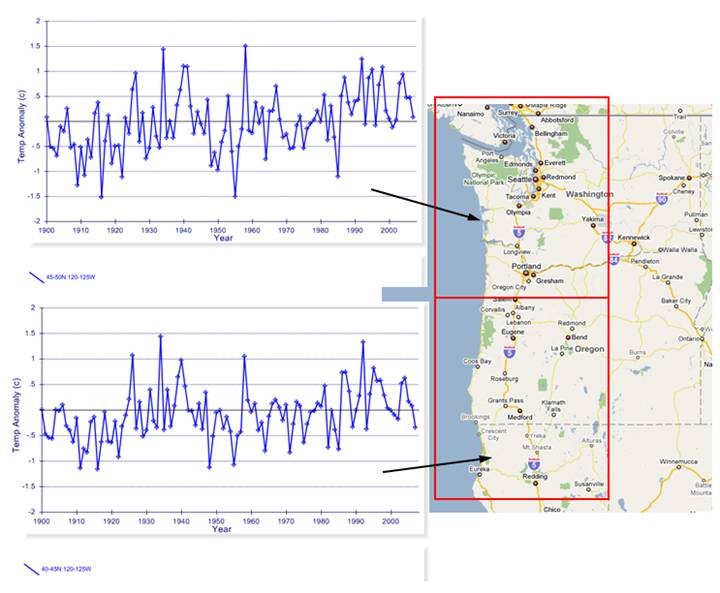
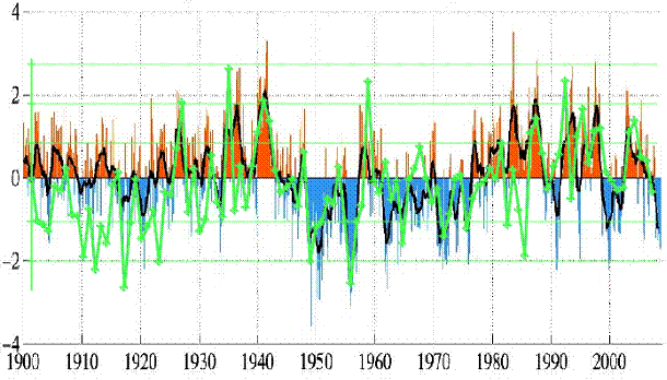
The temperature in the Pacific Northwest is governed by the Pacific Decadal Oscillation (PDO) – a natural cycle. The following figure shows the annual mean temperature anomalies for the two 5x5 degree grids covering the Pacific Northwest coast of the U.S. -- western Oregon and Washington from 1900 to 2007. This data is from the Hadley Climatic Research Unit (HadCRU) as used by the IPCC.
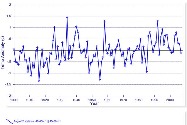
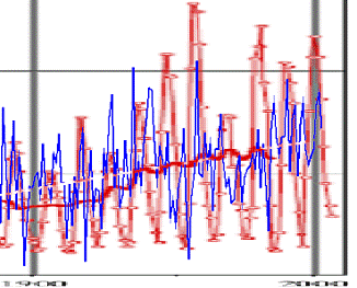
The following figure shows the average of the two grids shown above. The graph was made from [http://www.appinsys.com/GlobalWarming/climgraph.aspx?pltparms=HCRUG100AJanDecA190020080900210AR40-45N:120-125Wx45-50N:120-125Wx]. Temperatures have been declining since 1992. The next figure superimposes the two-grid average annual temperature anomaly (changed to green) on the Pacific Decadal Oscillation (PDO). The PDO figure is from http://jisao.washington.edu/pdo/. A strong correlation exists between the PNW coastal temperatures and the PDO. CO2 does not affect the climate in Washington.
See http://www.appinsys.com/GlobalWarming/PDO_AMO.htm for more information on the PDO.
A study of the effects of climate cycles (Hessl et al, “Drought and Pacific Decadal Oscillation Linked to Fire Occurrence in the Inland Pacific Northwest” [http://www.esajournals.org/doi/abs/10.1890/03-5019]) states: “long-term fire planning using the PDO may be possible in the Pacific Northwest, potentially allowing decadal-scale management of fire regimes, prescribed fire, and vegetation dynamics”
The PDO is also related to the Cascade Mountain snowpack – see the Snowpack section in this document.
|
|
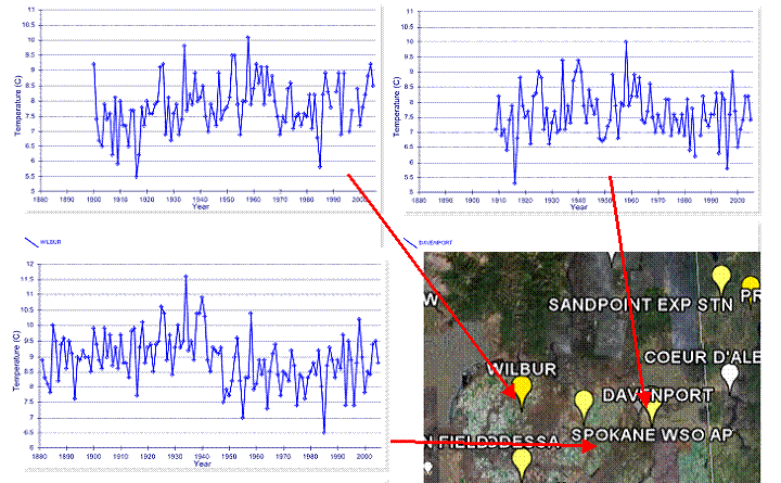
Puget Sound Area Temperatures
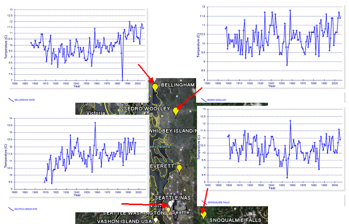
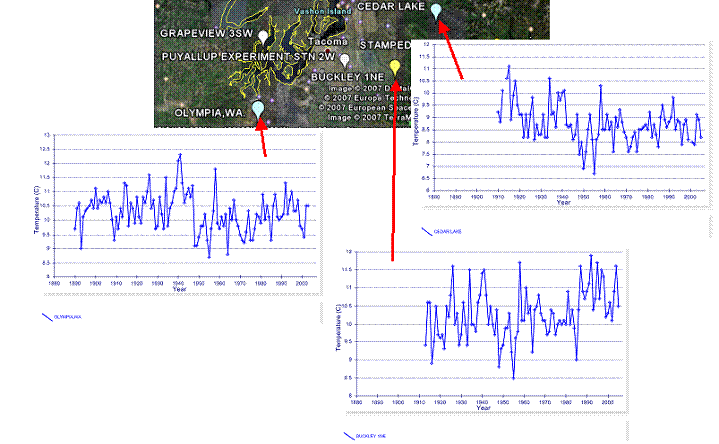
The following figure shows most of the available long-term stations in the Puget Sound area (mean annual temperature from the NOAA database). Most stations show no long-term warming trend.
A closer look at the few stations that actually show some recent warming trend follows below.
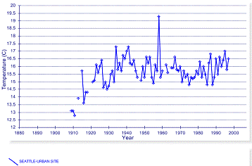
Seattle: The following two graphs show annual average maximum (left) and minimum (right) temperature. The maximum shows no unprecedented warming, while the minimum shows a continuous warming trend. The maximum temperature occurs during the day (typically in the afternoon), while the minimum temperature occurs during the night. The fact that nighttime minimum temperatures are warming, while daytime maximum temperatures are not is symptomatic of the urban heat effect – i.e. not climatic warming, but heat retention due to increasing amounts of concrete and paved areas.
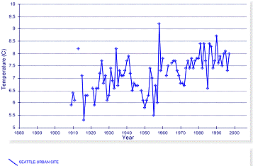
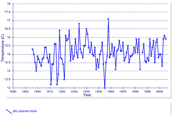
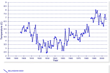
Bellingham: The following two graphs show annual average maximum (left) and minimum (right) temperature. This exhibits the same urban warming effects as described above for Seattle.
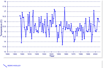
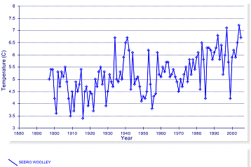
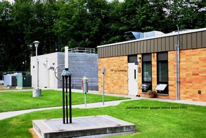
Sedro Woollley: The following two graphs show annual average maximum (left) and minimum (right) temperature. The maximum is not increasing whereas the minimum is. Although Sedro Woolley is listed as a rural station, it also exhibits nighttime warming. This may be due to improper site characteristics as shown in the following photo (too close to buildings, parking lots, etc.) – [photo from surfacestations.org].
|
|
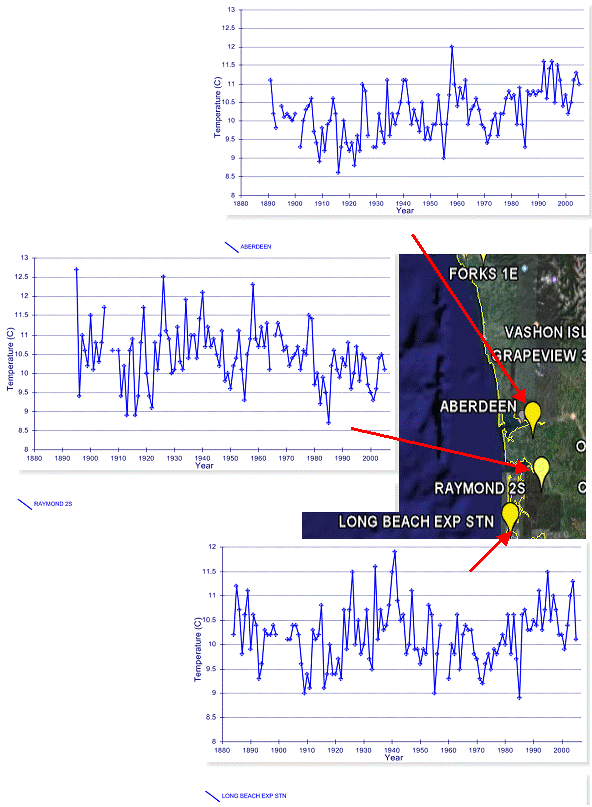
Coastal Washington Temperatures
The following figure shows the available long-term stations in the Coastal Washington area (mean annual temperature from the NOAA database). Most stations show no unprecedented long-term warming trend.
|
|
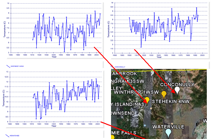
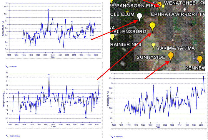
Central Washington Temperatures
The following figure shows most of the available long-term stations in the Central Washington area (mean annual temperature from the NOAA database). Most stations show no long-term warming trend.
A closer look at the few stations that actually show some recent warming trend shows the familiar urban warming effects.
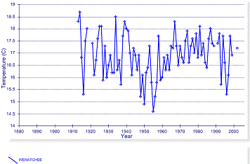
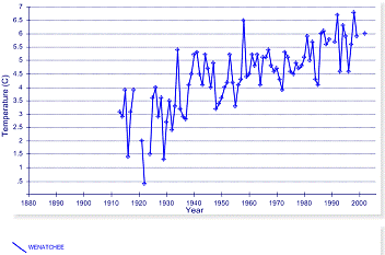
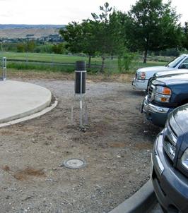
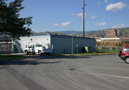
Wenatchee: The following two graphs show annual average maximum (left) and minimum (right) temperature. The maximum shows no unprecedented warming, while the minimum shows a continuous warming trend. This is the urban warming effect. The photos below show the Wenatchee site too close to a parking lot.
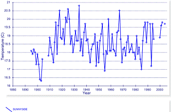
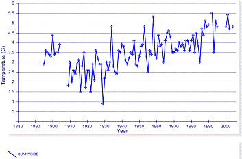
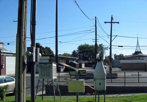
Sunnyside: The following two graphs show annual average maximum (left) and minimum (right) temperature. The maximum shows no unprecedented warming, while the minimum shows a continuous warming trend. This is the urban warming effect. The photos below show the Sunnyside site too close to a parking lot.
|
|
Eastern Washington Temperatures
The following figure shows most of the available long-term stations in the Eastern Washington area (mean annual temperature from the NOAA database). Most stations show no long-term warming trend.
|
|
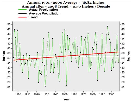
Precipitation
The following figure shows the annual total precipitation for Washington State since 1895 according to the NCDC [http://www.ncdc.noaa.gov/oa/climate/research/cag3/wa.html] According to the state climatalarmist cited in the Seattle Times at the start of this document, there will be increasing droughts and less water available for hydroelectricity.
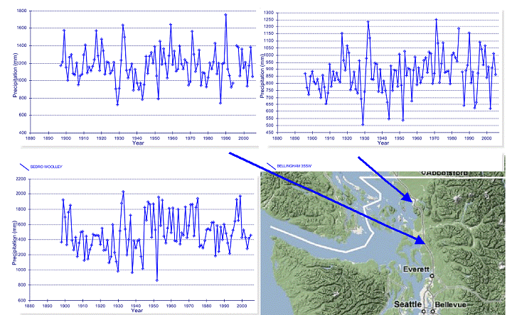
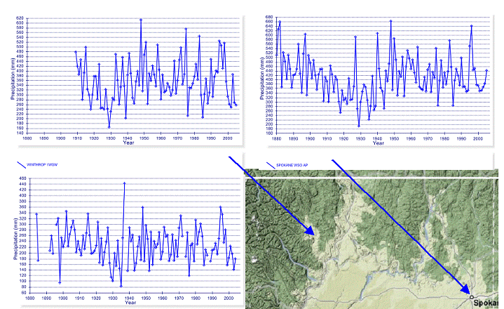
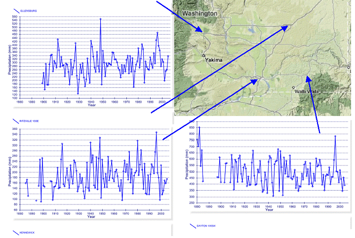
The following graphs show the historical annual total precipitation for various locations in Washington State. Historical variations greatly exceed any recent trends.
|
|
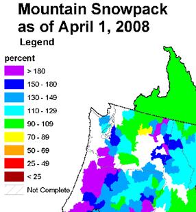
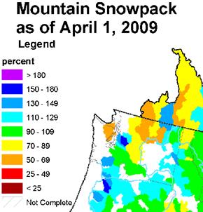
Mountain Snowpack
An important climatic feature for Washington State is the mountain snowpack, since this provides much of the water source for the western populated area of the state. There is significant variation in snowpack from year to year. Historical snowpack data is not as comprehensive as temperature data.
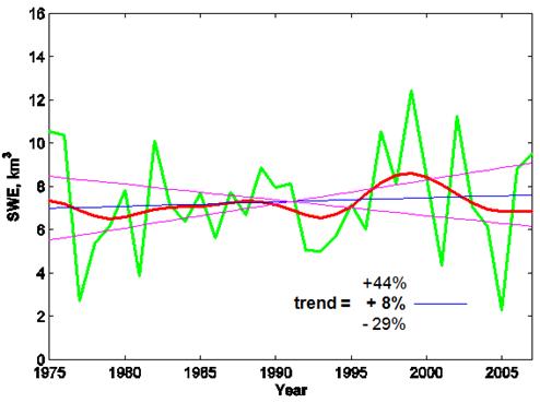
University of Washington researcher Mark Stoelinga has studied the Cascade snowpack and concludes “Snowpack trend since the ramp-up in global temperature in the 1970s is slightly positive” [ftp://ftp.atmos.washington.edu/stoeling/presentations/PNWWW_2008_Snowpack.ppt]
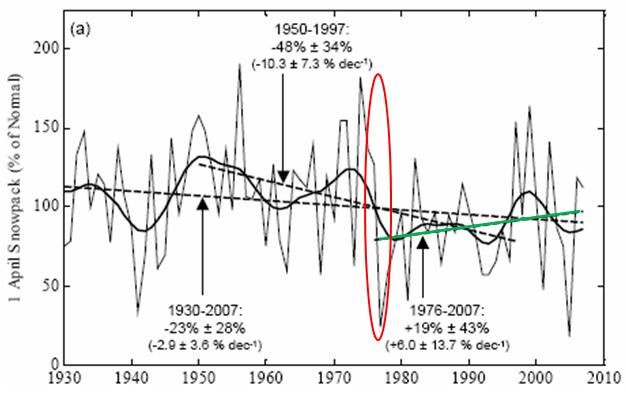
The following figure from Stoelinga’s research shows the Snow Water Equivalent (SWE) for the Cascades from 1975 – 2007 (April data being designated as the critical timeframe for snowpack).
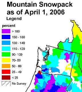
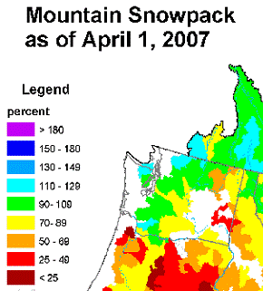
The USDA provides mountain snowpack maps for each “snow month” of the year (Jan – May) from 1980 to the present [http://www.wcc.nrcs.usda.gov/cgibin/westsnow.pl].
How is it then that Washington State Democratic politicians are always sounding the alarm by saying the Cascade snowpack has declined by more than 30%? (For example a Gregoire letter here: http://www.washingtonpolicy.org/Centers/environment/PDF/Governor_letter_response.pdf)
The following figure shows April snowpack since 1930 [ftp://ftp.atmos.washington.edu/stoeling/manuscripts/SWEpaper30Oct_rendered.pdf]. The 1930 – 2007 decline is 23 +/- 28 % (i.e. not statistically significant from zero). The only significant decline took place during the Pacific Climate Shift of 1977 and since then “snowpack increased 19% during the recent period of most rapid global warming (1976-2007)” (although this change is also not statistically different from zero). (See http://www.appinsys.com/GlobalWarming/The1976-78ClimateShift.htm for more details on the 1997 climate shift.
This is significant since the 1930-1970 period was a cooling period and according to the IPCC, CO2 has only caused warming since 1970s (See: http://www.appinsys.com/GlobalWarming/GW_SimplifiedNutshell.htm). Thus the Democratic Party politicians are abusing statistics and turning them into deceitful positions.
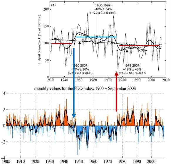
The snowpack is related to the PDO. The following figure compares the snowpack to the Pacific Decadal Oscillation (PDO). The PDO is derived from sea surface temperatures and sea level pressures in the north Pacific Ocean. (See http://www.appinsys.com/GlobalWarming/PDO_AMO.htm for more detailed information on the PDO.) The changes in general snowpack levels correspond with the shifts in the PDO between negative and positive phases. The negative phase of the PDO corresponds to increased snowpack levels.
(See http://www.appinsys.com/GlobalWarming/CascadesSnowpack.htm for more details on the snowpack)
|
|
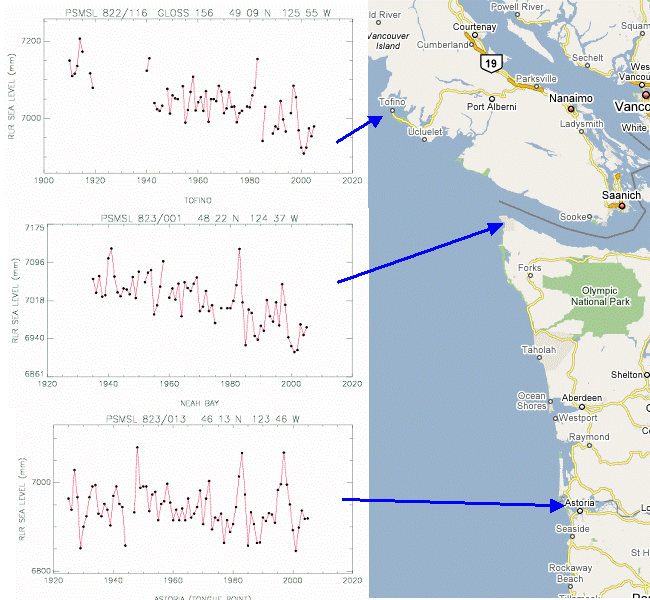
Sea Level Rise
The UK-based Permanent Service for Mean Sea Level (PSMSL) maintains a database of sea level measurements around the world. The following figure shows the available historical sea level data for the Pacific Ocean adjacent to the Washington State region. Sea level has not been rising in the Pacific on the northwest coast of the US.
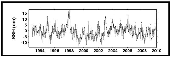
The University of Colorado at Boulder has an interactive sea level change graphing tool based on the satellite data. The following figure shows the sea level data (SSH = sea surface height) for the northern coast of Washington (48 N, 125 W) [http://sealevel.colorado.edu/wizard.php?dlon=235&dlat=48&map=t&fit=n&smooth=n&days=60]
|
|
Solar Influence
One thing that is noticeable in the Washington climate data is: no unprecedented warming at rural stations, nighttime warming at urban stations. This indicates urban warming, but does not support the CO2 theory. So what might influence the climate?
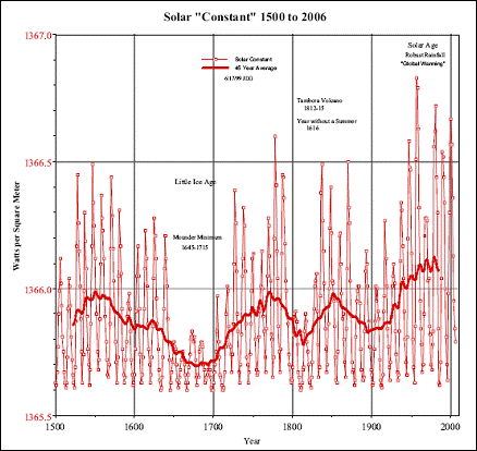
The following figure shows the solar irradiance from 1500 to 2006 (from UN Food and Agriculture Organization [ftp://ftp.fao.org/docrep/fao/006/y5028e/y5028e01.pdf]).
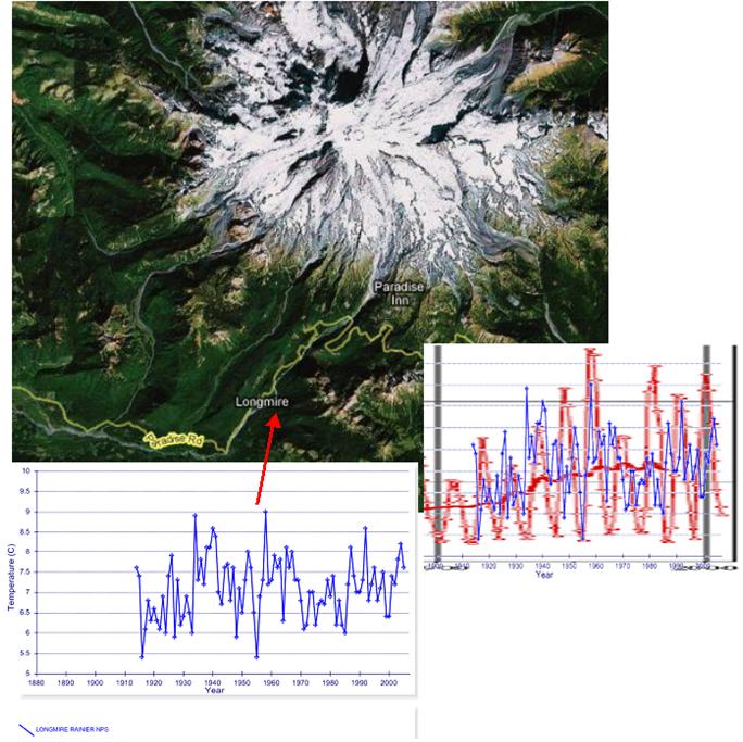
The following figure shows the annual mean temperature from Longmire, Mt Rainier National Park, as well as a chart combining the solar irradiance (from the above figure) with Longmire temperature.
The following figures show the gridded (5x5 degree average) for the 5x5 grid including western Washington [left] (the adjacent 5x5 degree grid including eastern Washington is almost identical) and combined with the solar irradiance data [right]. While the atmospheric CO2 has been increasing continuously throughout this period, this level of coincidence between solar and temperature is no accident.
|
|
Mountain Glaciers
Mount Rainier
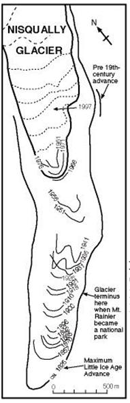
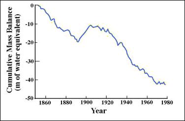
According to a report by Stephen Porter (“Recent glacier and climate variations in the Pacific Northwest” - Quaternary Research Center, University of Washington [http://faculty.washington.edu/scporter/Rainierglaciers.html]) the retreat of glaciers on Mount Rainier has been observed since the 1800’s when observations were first recorded. The following figures are from that report. The left figure shows the extent of the Nisqually Glacier as recorded in various years showing the glacier retreat since 1825. The right figure shows the Nisqually Glacier mass balance trend since 1850. This trend is similar to most receding glaciers in the world – it cannot be blamed on anthropogenic CO2.
Mount St Helens
According to a recent article [www.katu.com/news/outdoors/18948279.html], the glacier in the Mt St Helens crater has been increasing in size in recent years: “The eruption 28 years ago hollowed out the center of the mountain and thrust it almost directly north, leaving a towering crater wall to shield the crater's interior from the melting effects of the sun during most months of the year, especially the winter months. Researcher Joseph Walder with the U.S. Geological Survey says the shade from the crater wall is allowing the glacier to grow in height by about 15 feet per year.” So it appears that without direct sun, global warming has no effect in causing glacier melting.
|
|
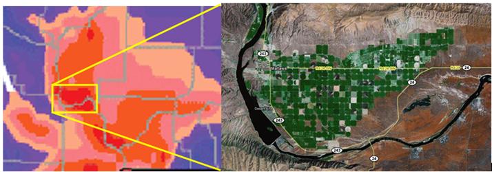
Land Use Change
The effect of land use change (which frequently creates localized warming) is commonly conflated with “global warming”. The U.S. Global Climate Change Research Program of the National Science and Technology Council released a report “Global Climate Change Impacts in the United States” (June 2009). In the section on the Northwest US they come up with some extreme warming for parts of Washington.
The following figure shows an aerial photo of an area said to be expected to warm 6 – 8 degrees. There is no USHCN station in this area, but the reason for the warming is obvious. Introducing center-pivot irrigation into a desert area increases the specific humidity of the local lower atmosphere resulting in increased temperatures (although ground-level temperatures during irrigation will be cooler due to evaporation). The diversion of Columbia River water for use as irrigation water also increases the water temperature as it runs off and returns to the river, raising the river temperature.
See: http://www.appinsys.com/GlobalWarming/US_GCCRP_NW.htm for more details
|
|
|