Global Warming Science: www.appinsys.com/GlobalWarming
Pacific Decadal Oscillation (PDO) + Atlantic Multidecadal Oscillation (AMO)
[last update: 2010/01/03]
|
It is only in recent years that scientists are starting to recognize the influence of atmospheric and oceanic cycles in influencing climate.
A 2008 study – “Oceanic Influences on Recent Continental Warming”, by Compo, G.P., and P.D. Sardeshmukh, (Climate Diagnostics Center, Cooperative Institute for Research in Environmental Sciences, University of Colorado, and Physical Sciences Division, Earth System Research Laboratory, National Oceanic and Atmospheric Administration), Climate Dynamics, 2008) [http://www.cdc.noaa.gov/people/gilbert.p.compo/CompoSardeshmukh2007a.pdf] states: “Evidence is presented that the recent worldwide land warming has occurred largely in response to a worldwide warming of the oceans rather than as a direct response to increasing greenhouse gases (GHGs) over land. Atmospheric model simulations of the last half-century with prescribed observed ocean temperature changes, but without prescribed GHG changes, account for most of the land warming. … Several recent studies suggest that the observed SST variability may be misrepresented in the coupled models used in preparing the IPCC's Fourth Assessment Report, with substantial errors on interannual and decadal scales. There is a hint of an underestimation of simulated decadal SST variability even in the published IPCC Report.”
This document describes the combination of the Pacific Decadal Oscillation (PDO) and Atlantic Multidecadal Oscillation (AMO).
|
See the additional documents with details on oceanic oscillations:
- Atlantic Multi-decadal Oscillation (AMO)
- Pacific Decadal Oscillation (PDO)
- Arctic Oscillation (AO) / North Atlantic Oscillation (NAO)
- El Nino / Southern Oscillation (ENSO)
|
|
|
Background
The PDO is described in the following document: Pacific Decadal Oscillation (PDO)
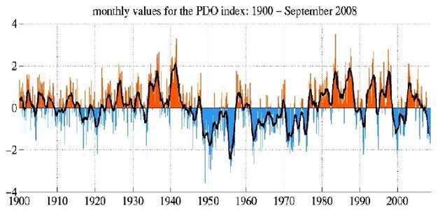
The following figure shows the monthly PDO index from 1900 to September 2008 [http://jisao.washington.edu/pdo/]
The AMO is described in the following document: Atlantic Multi-decadal Oscillation (AMO)
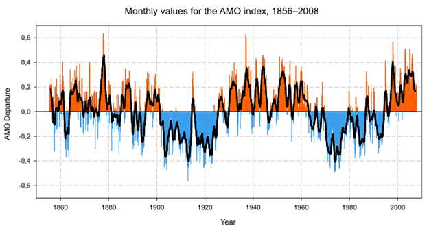
The following figure shows the AMO from 1850 to 2008 [http://en.wikipedia.org/wiki/File:Amo_timeseries_1856-present.svg].
|
|
PDO and AMO / Global Temperatures
In a CRU email between Edward Cook and Michael Mann in May 2001, Cook stated: “most researchers in global change research would agree that the emergence of a clear greenhouse forcing signal has really only occurred since after 1970. I am not debating this point, although I do think that there still exists a significant uncertainty as to the relative contributions of natural and greenhouse forcing to warming during the past 20-30 years at least.” [http://www.eastangliaemails.com/emails.php?eid=228&filename=988831541.txt]
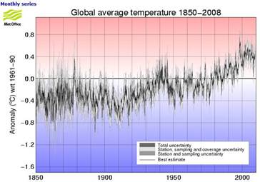
The figure below left shows the global average temperature anomalies (from the Hadley Climatic Research Unit (CRU) which provides the data used by the IPCC [http://hadobs.metoffice.com/hadcrut3/diagnostics/global/nh+sh/]).
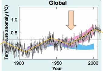
The figure below right superimposes the CRU temperature anomalies on the IPCC graph of model outputs. (IPCC 2007 AR4 Figure SPM-4 [http://www.ipcc.ch/pdf/assessment-report/ar4/syr/ar4_syr_spm.pdf]) In this figure, the blue shaded bands show the result climate model simulations using only natural forcings. Red shaded bands show the result model simulations including anthropogenic CO2.
This clearly shows that prior to about 1973, the global warming is fully explained by climate models using only natural forcings (i.e. no human CO2). The models need input of CO2 only after about the mid-1970s – prior to 1970 all warming was natural, according to the IPCC.
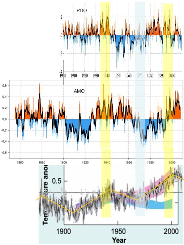
The following figure temporally aligns the graphs of PDO, AMO and global temperature. Periods of synchronization of PDO + AMO are indicated by the vertical shaded bars.
|
|
PDO Plus AMO / US Temperatures
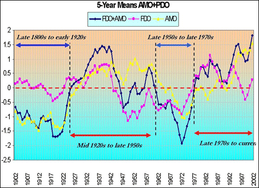
Joseph D’Aleo has conducted a correlation analysis between the PDO, AMO and temperatures [http://icecap.us/images/uploads/US_Temperatures_and_Climate_Factors_since_1895.pdf] and [http://intellicast.com/Community/Content.aspx?a=127]. The following figures are from D’Aleo’s analysis.
The following figure shows the 5-year means of PDO, AMO and PDO + AMO.
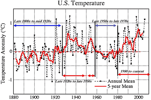
The next figure shows the US temperature anomalies as calculated by NASA’s James Hansen (2001). The periods when the temperature anomalies are positive correspond almost exactly to when the PDO+AMO changes between warm and cool phases.
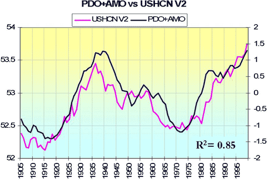
The following figure compares the PDO+AMO with the US average annual temperatures. D’Aleo calculated an r-squared of 0.85 between the two – an extremely good correlation.
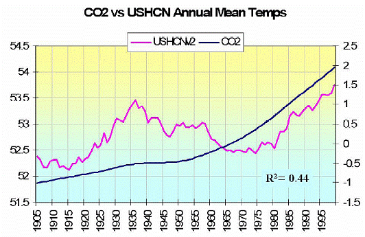
The next figure compares the same temperature data with atmospheric CO2. D’Aleo calculated an r-squared of 0.44 between the two – a fair correlation, but poor in comparison to the PDO+AMO correlation. Although correlation does not prove causation, lower correlation is evidence of lower probability of causation.
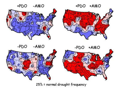
The following figure shows the combined effect of PDO and AMO on drought in the United States [http://oceanworld.tamu.edu/resources/oceanography-book/oceananddrought.html]. Further information on these drought relationships can be found at [http://www.pnas.org/content/101/12/4136.full]
|