James Hansen’s 1988 Global Warming Predictions
In 1988 NASA’s climate alarmist James Hansen provided temperature predictions based on climate models (results of which he presented to the US congress). He modeled three scenarios: A had an increasing rate of CO2 emissions, B had constant rate of CO2 of CO2 emissions, whereas scenario C had reduced CO2 emissions rate from 1988 levels into the future. (Hansen’s 1988 paper can be found at: http://pubs.giss.nasa.gov/abstracts/1988/Hansen_etal.html)
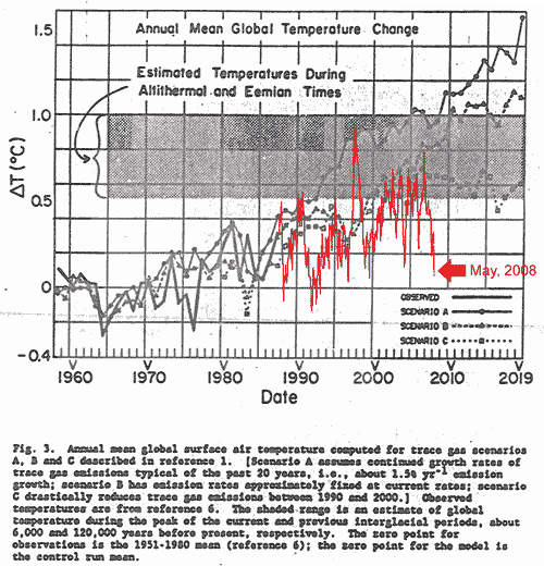
The following figure shows Hansen’s Figure 3 with satellite temperature data superimposed (from:
http://www.climate-skeptic.com/2008/06/gret-moments-in.html). The Figure 3 caption also provides a brief explanation of the scenarios.
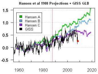
The following figures compare Hansen’s 1988 predictions with actual temperature data since then. The left-hand figure compares the NASA GISS global data (as compiled by Hansen), while the right-hand figure compares the satellite-based temperature data as processed by RSS. (Figures from Steve McIntyre [http://www.climateaudit.org/?p=3354] ). While actual atmospheric CO2 levels have increased since 1988, the fact that actual temperatures are similar to the reduced CO2 models implies a problem with the models
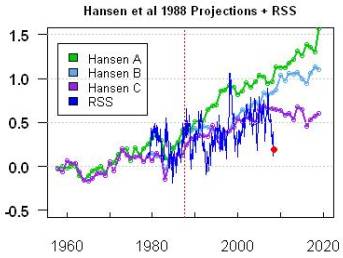
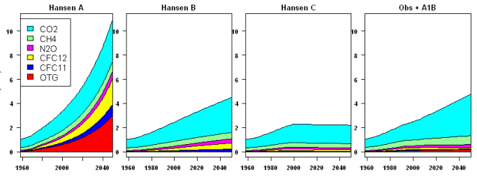
The next figure shows the greenhouse gas emissions scenarios used in the plots, as well the observed (1988 – 2008) plus future based on scenario B. The observed CO2 emissions is closest to the scenario B input, but the observed temperature is closer to scenario C output – indicating a problem with the models. (Figures from Steve McIntyre [http://www.climateaudit.org/?p=3354] ).
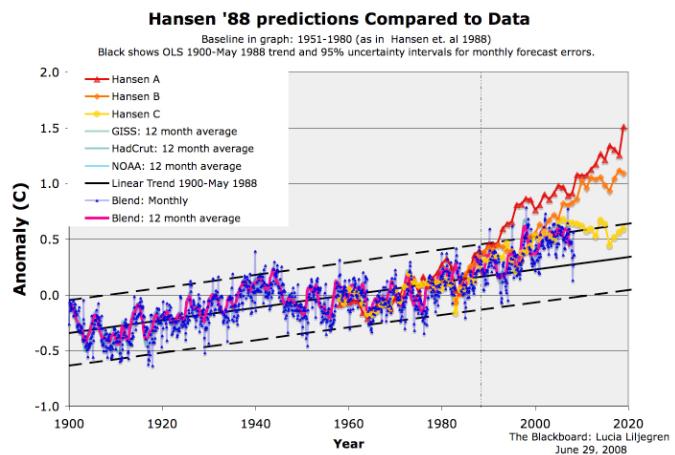
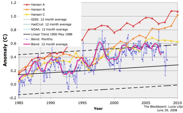
The next figure shows a plot of Hansen’s predictions along with actual temperature data from various sources – GISS, HadCRU and NOAA (from: http://rankexploits.com/musings/2008/ordinary-eyeball-how-did-hansens-predictions-do/ ).