Global Warming Science - www.appinsys.com/GlobalWarming
The Measurement of Global Temperatures
[last update: 2010/07/19]
|
The term “global warming” is based on an increasing trend in global average temperature over time. The IPCC reported in 2007 that “Global mean surface temperatures have risen by 0.74°C ± 0.18°C when estimated by a linear trend over the last 100 years (1906–2005).” [4AR, Chapter 3, 2007]. However, the measurement of a “global” temperature is not as simple as it may seem. Historical instrumentally recorded temperatures exist only for 100 to 150 years in small areas of the world. During the 1950s to 1980s temperatures were measured in many more locations, but many stations are no longer active in the database. Satellite measurements of atmospheric temperature were begun in 1979.
The main global surface temperature data set is managed by the US National Oceanic and Atmospheric Administration (NOAA) at the National Climatic Data Center (NCDC). This is the Global Historical Climate Network (GHCN) [http://www.ncdc.noaa.gov/oa/climate/ghcn-monthly/index.php]: “The period of record varies from station to station, with several thousand extending back to 1950 and several hundred being updated monthly”. This is the main source of data for global studies, including the data reported by the IPCC.
|
|
[2010/07/19]: NOAA creates misleading temperature maps by interpolating data where none exists See: http://www.appinsys.com/GlobalWarming/NOAA_JanJun2010.htm
|
|
|
|
|
|
Average surface air temperatures are calculated at a given station location based on the following procedure: record the minimum and maximum temperature for each day; calculate the average of the minimum and maximum. Calculate the averages for the month from the daily data. Calculate the annual averages by averaging the monthly data. (Various adjustments are also made, so it is not actually that simple, as discussed later in this document.)
|
This document contains the following sections:
- IPCC / HadCRU
- Surface Station Data – Historic Data Availability
- Calculating Global Averages
- Temperature Data Adjustment
- Temperature Adjustment Examples
- Satellite Data – See also separate page: Global Temperature From Satellites
- Comparison of Global Data Sets
- Global Warming is Not Global
- Attribution by the IPCC
- Recurrent Cycles
- Acceleration
|
The IPCC uses data processed and adjusted by the UK-based Climatic Research Unit of the University of East Anglia (HadCRU), although much of the HadCRU raw data comes from the GHCN. The UK-based HadCRU provides the following description [http://www.cru.uea.ac.uk/cru/data/temperature/] (emphasis added):
“Over land regions of the world over 3000 monthly station temperature time series are used. Coverage is denser over the more populated parts of the world, particularly, the United States, southern Canada, Europe and Japan. Coverage is sparsest over the interior of the South American and African continents and over the Antarctic. The number of available stations was small during the 1850s, but increases to over 3000 stations during the 1951-90 period. For marine regions sea surface temperature (SST) measurements taken on board merchant and some naval vessels are used. As the majority come from the voluntary observing fleet, coverage is reduced away from the main shipping lanes and is minimal over the Southern Oceans.”
“Stations on land are at different elevations, and different countries estimate average monthly temperatures using different methods and formulae. To avoid biases that could result from these problems, monthly average temperatures are reduced to anomalies from the period with best coverage (1961-90). For stations to be used, an estimate of the base period average must be calculated. Because many stations do not have complete records for the 1961-90 period several methods have been developed to estimate 1961-90 averages from neighbouring records or using other sources of data. Over the oceans, where observations are generally made from mobile platforms, it is impossible to assemble long series of actual temperatures for fixed points. However it is possible to interpolate historical data to create spatially complete reference climatologies (averages for 1961-90) so that individual observations can be compared with a local normal for the given day of the year.”
It is important to note that the HadCRU station data used by the IPCC is not publicly available – neither the raw data nor the adjusted data - only the adjusted gridded data (i.e. after adjustments are made and station anomalies are averaged for the 5x5 degree grid).
|
|
Surface Station Data – Historic Data Availability
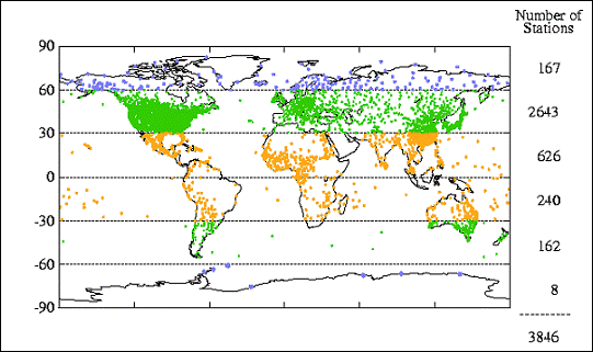
The NASA Goddard Institute for Space Studies (GISS) is a major provider of climatic data in the US (with the NOAA GHCN as the source for NASA GISS). The following figure shows the distribution of temperature stations used by the GISS. As can be seen in the Figure, the 30 to 60 degree North latitude band contains 69 percent of the stations used and almost half of those are located in the United State s. This implies that if these stations are valid, the calculations for the US should be more reliable than for any other area or for the globe as a whole.
Worldwide Distribution of Temperature Stations
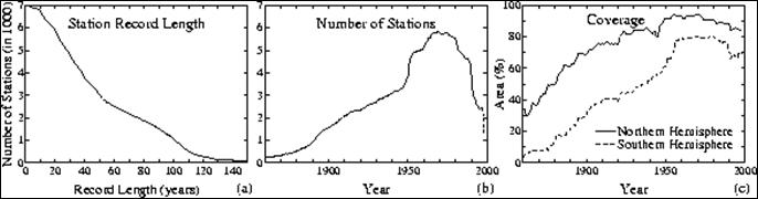
In addition to the extensive problem of sparseness, the network has also been historically constantly changing - the number of available temperature reporting stations changes with time. The so-called "global" measurements are not really global at all. The coverage by land surface thermometers slowly increased from less than 10% of the globe in the 1880s to about 40% in the 1960's, but has decreased rapidly in recent years. The GISS web site shows how the number of stations has changed, as shown in the following figure [http://data.giss.nasa.gov/gistemp/station_data/]. Note that in c) in this figure the definition of percent coverage is based on “percent of hemispheric area located within 1200 km (720 miles) of a reporting station”! Yet 720 miles is about twice the width or height of the largest 5x5 degree grid box.
Number of Stations By Year (c shows the percent of hemispheric area located within 1200km of a reporting station)
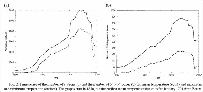
The following figure shows the variation in the number of stations (a) in the GHCN from 1850 to 1997 and the variation in the global coverage of the stations as defined by 5° ´ 5° grid boxes (b). [http://www.ncdc.noaa.gov/oa/climate/ghcn-monthly/images/ghcn_temp_overview.pdf]
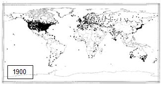
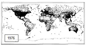
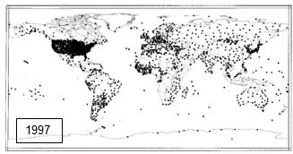
There was a major disappearance of recording stations in the late 1980’s – early 1990’s. The following figure compares the number of global stations in 1900, 1970s and 1997 showing the increase and then decrease. [Peterson and Vose: http://www.ncdc.noaa.gov/oa/climate/ghcn-monthly/images/ghcn_temp_overview.pdf]. The 1997 figure below shows the station coverage of stations that can be used as of 1997 – i.e. the blank areas do not have coverage in recent times.
Comparison of Available GHCN Temperature Stations Over Time
The University of Delaware has an animated movie of station locations over time [http://climate.geog.udel.edu/~climate/html_pages/air_ts2.html]. In addition, many stations move locations and some stop collecting data during periods of war (or for example, during the Cultural Revolution in China) – leading a major problem of discontinuities.
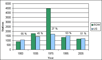
The following figure shows the number of stations in the GHCN database with data for selected years, showing the number of stations in the United States (blue) and in the rest of the world (ROW – green). The percents indicate the percent of the total number of stations that are in the U.S.
Comparison of Number of GHCN Temperature Stations in the U.S. versus Rest of the World
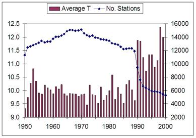
The following figure shows a calculation of straight temperature averages for all of the reporting stations for 1950 to 2000 [http://www.uoguelph.ca/~rmckitri/research/nvst.html]. While a straight average is not meaningful for global temperature calculation (since areas with more stations would have higher weighting), it illustrates that the disappearance of so many stations may have introduced an upward temperature bias. As can be seen in the figure, the straight average of all global stations does not fluctuate much until 1990, at which point the average temperature jumps up. This observational bias can influence the calculation of area-weighted averages to some extent. A study by Willmott, Robeson and Feddema ("Influence of Spatially Variable Instrument Networks on Climatic Averages, Geophysical Research Letters vol 18 No. 12, pp2249-2251, Dec 1991) calculated a +0.2C bias in the global average due to pre-1990 station closures.
Calculation of Average Temperatures From Reporting Stations for 1950 to 2000
Temperature measurement stations must be continually reevaluated for suitability for inclusion due to changes in the local environment, such as increased urbanization, which causes locally increased temperatures regardless of the external environmental influences. Thus only rural stations can be validly used in calculating temperature trends. As a result, adjustments are made to temperature data at urban stations (as discussed below).
There is substantial debate in the scientific community regarding the use of various specific stations as well as regarding the factors that can affect the uncertainty involved in the measurements. For example, the Pielke et al paper available at http://www.climatesci.org/publications/pdf/R-321.pdf is a recent (Feb 2007) publication by 12 authors describing the temperature measurement uncertainties that have not been taken into sufficient consideration.
The Surface Stations web site [http://www.surfacestations.org/] is accumulating physical site data for the temperature measurement stations (including photographs) and identifying problem stations -- there are a significant number of stations with improper site characteristics, especially in urban areas.
|
|
Different agencies use different methods for calculating a global average. After adjustments have been made to the temperatures, the temperatures at each station are converted into anomalies – i.e. the difference from an average temperature for a defined period.
In the HadCRU method (used by the IPCC), anomalies are calculated based on the average observed in the 1961 – 1990 period (thus stations without data for that period cannot be included). For the calculation of global averages, the HadCRU method divides the world into a series of 5 x 5-degree grids and the temperature is calculated for each grid cell by averaging the stations in it. The number of stations varies all over the world and in many grid cells there are no stations. Both the component parts (land and marine) are separately interpolated to the same 5º x 5º latitude/longitude grid boxes. Land temperature anomalies are in-filled where more than four of the surrounding eight 5º x 5º grid boxes are present. Weighting methods can vary but a common one is to average the grid-box temperature anomalies, with weighting according to the area of each 5° x 5° grid cell, into hemispheric values; the hemispheric averages are then averaged to create the global-average temperature anomaly. [http://www.cru.uea.ac.uk/cru/data/temperature/]. The IPCC deviates from the HadCRU method at this point – instead the IPCC uses “optimal averaging. This technique uses information on how temperatures at each location co-vary, to weight the data to take best account of areas where there are no observations at a given time.” Thus empty grid cells are interpolated from surrounding cells. [http://www.cru.uea.ac.uk/cru/data/temperature/#faq] Other methods calculate averages by averaging the cells within latitude bands and then average the latitude bands.
The GISS uses: “A grid of 8000 grid boxes of equal area is used. Time series are changed to series of anomalies. For each grid box, the stations within that grid box and also any station within 1200km of the center of that box are combined using the reference station method. A similar method is also used to find a series of anomalies for 80 regions consisting of 100 boxes from the series for those boxes, and again to find the series for 6 latitudinal zones from those regional series, and finally to find the hemispheric and global series from the zonal series.” [http://data.giss.nasa.gov/gistemp/sources/gistemp.html]
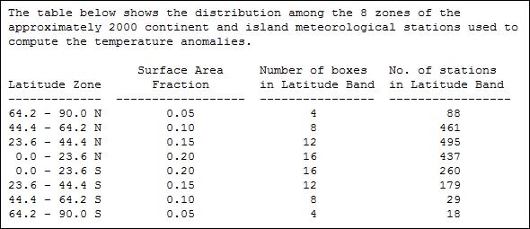
The following table shows the distribution of stations by latitude band [http://badc.nerc.ac.uk/data/gedex/detail/giss_tmp.det]
HadCRU versus GISS
The NASA GISS processes the GHCN data through a series of data adjustments to calculate global temperatures using a different method than HadCRU (See http://data.giss.nasa.gov/gistemp/ for details). The following figures compare the GISS 2005 temperature anomalies (left) with the HadCRU – HadCRUT data. GISS uses a 1200-km smoothing which creates an artificial expansion of data into areas without data. Thus the Arctic shows more (artificial) warming in the GISS data than in the HadCRUT. Grey areas are areas without data. (See http://wattsupwiththat.com/2010/05/21/visualizing-arctic-coverage/#more-19789 for more details on the comparison.)
Historical Adjustment
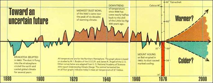
The following figure shows the Northern Hemisphere temperature from National Geographic – November, 1976. [http://revolution2.us/content/docs/global_cooling/614-615.html]
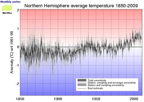
The following figure shows the Northern Hemisphere temperature anomalies from the Met Office Hadley Centre [http://hadobs.metoffice.com/hadcrut3/diagnostics/hemispheric/northern/]
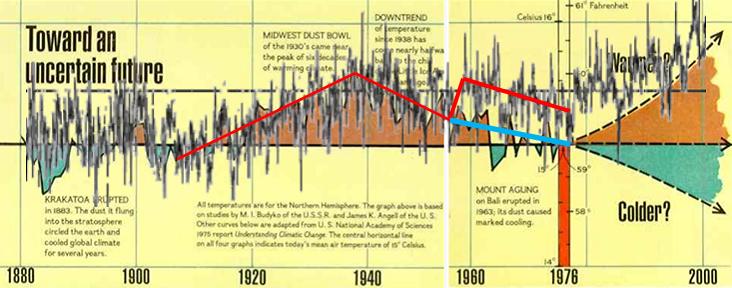
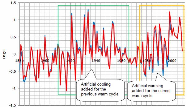
The following figure combines the above two figures. A warming revision occurred in the 1958 data.
|
|
The temperature data recorded from the stations is not simply used in the averaging calculations: it is first adjusted. Different agencies use different adjustment methods. The station data is adjusted for homogeneity (i.e. nearby stations are compared and adjusted if trends are different). The U.S. based GHCN data set is feely available including both raw and adjusted data so that anyone can see what the station data show. However, the HadCRU data used by the IPCC is not publicly available – neither the raw data nor the adjusted data. They publish only a list of stations and the calculated 5x5 degree grid anomaly results.
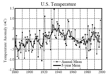
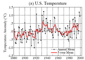
As an illustration of the sometimes questionable effects of temperature adjustments, consider the United States data (almost 30 percent of the world’s total historical climate stations are in the US; rising to 50 % of the world’s stations for the post-1990 period). The following graphs show the historical US data from the GISS database as published in 1999 and 2001. The graph on the left was produced in 1999 (Hansen et al 1999 [http://pubs.giss.nasa.gov/docs/1999/1999_Hansen_etal.pdf]); the graph on the right was produced in 2000 (Hansen et al 2001 [http://pubs.giss.nasa.gov/docs/2001/2001_Hansen_etal.pdf]). They are from the same raw data – the only difference is that the adjustment method was changed by NASA in 2000.
U.S. Temperature Changes Due to Change in Adjustment Methods (Left: 1999, Right 2001)
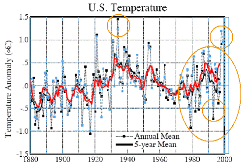
The following figure compares the above two graphs, showing how an increase in temperature trend was achieved simply by changing the method of adjusting the data. Some of the major changes are highlighted in this figure – the decreases in the 1930s and the increases in the 1980s and 1990s.
Comparison of U.S. Temperature Changes Due to Change in Adjustment Methods
See http://www.appinsys.com/globalwarming/Hansen_GlobalTemp.htm for more info on Hansen’s data manipulations.
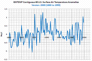
The following figures show a more recent example of the GISS re-adjustment of data (from: Bob Tisdale at http://i44.tinypic.com/29dwsj7.gif). The 2000 and 2009 versions of the GISTEMP data are compared. This shows the additional artificial warming trend created through data adjustments.
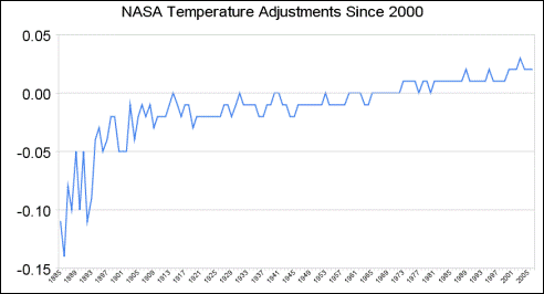
Since 2000, NASA has further “cleaned” the historical record. The following graph shows the further warming adjustments made to the data in 2005. (The data can be downloaded at http://data.giss.nasa.gov/gistemp/graphs/US_USHCN.2005vs1999.txt; the following graph is from http://www.theregister.co.uk/2008/06/05/goddard_nasa_thermometer/print.html). This figure plots the difference between the 2000 adjusted data and the 2005 adjusted data. Although the 2000 to 2005 adjustment differences are not as large as the 1999 to 2000 adjustment differences shown above, they add additional warming to the trend throughout the historical record.
The temperature adjustments made to the US Historical Climate Network are described here: http://cdiac.ornl.gov/epubs/ndp/ushcn/ndp019.html. The adjustments include:
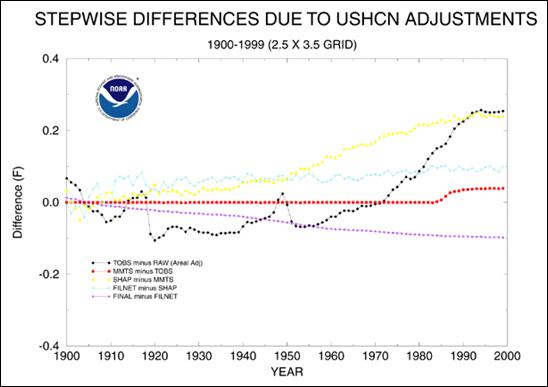
The following figures show the resulting adjustment from each individual adjustment (top) and differences between successive adjustment steps (bottom).
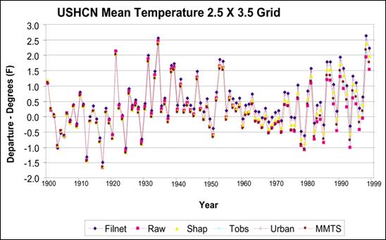
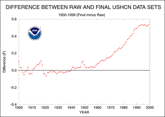
NOAA provides a summary of the adjustments made to the USHCN temperature data as shown in the following figure. [http://www.ncdc.noaa.gov/oa/climate/research/ushcn/ushcn.html] The report states: “The cumulative effect of all adjustments is approximately a one-half degree Fahrenheit warming in the annual time series over a 50-year period from the 1940's until the last decade of the century.” This is similar to the total amount of warming “observed”.
Average Total Warming Created by Adjustments to USHCN Data
|
|
Temperature Adjustment Examples
Temperature station adjustments are theoretically supposed to make the data more realistic for identifying temperature trends. In some cases the adjustments make sense, in other cases – not.
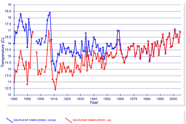
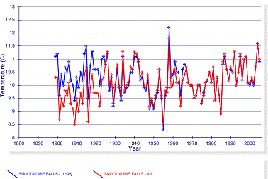
Temperature adjustments are often made to U.S. stations that do not make sense, but invariably increase the apparent warming. The following figure shows the closest rural station to San Francisco (Davis - left) and closest rural station to Seattle (Snoqualmie – right). In both cases warming is artificially introduced to rural stations. (See: http://www.appinsys.com/GlobalWarming/GW_Part3_UrbanHeat.htm for details on the Urban Heat Island effects evident in the surface data)
Artificial Warming Trends in Adjustments to U.S. Rural Stations
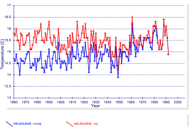
Here is an example where the adjustment makes sense. In Australia the raw data for Melbourne show warming, while the nearest rural station does not. The following figure compares the raw data (blue) and adjusted data for Melbourne. However, this seems to be a rare instance.
Comparison of Adjusted and Unadjusted Temperature Data for Melbourne, Australia
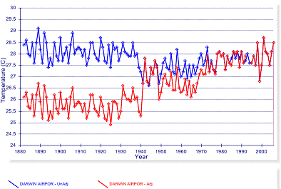
The following graph is more typical of the standard adjustments made to the temperature data – this is for Darwin, Australia (blue – unadjusted, red – adjusted). Warming is created in the data through the adjustments.
Comparison of Adjusted and Unadjusted Temperature Data for Darwin, Australia
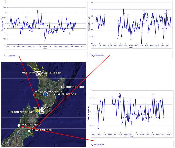
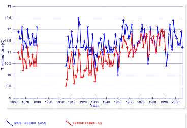
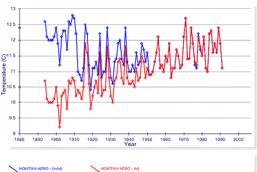
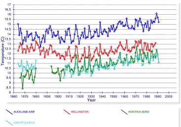
In New Zealand the temperature adjustments do not make sense (and this is not an isolated incident). The following two graphs show the available long-term (raw) data for the urban areas of Wellington (left) and Christchurch (right). No warming is observed in these urban areas. To the right of the New Zealand map is the nearest and only long-term rural station, Hokitika Aero (all graphs show 1860 to 2006, although both Wellington and Kokitika end around 1990).
Long-Term Temperature Stations in New Zealand Show No Long-Term Warming
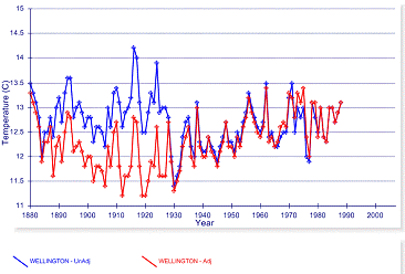
After adjustments, the urban stations exhibit warming. The following figures compare the adjusted (red) with the unadjusted data (blue) for Wellington (left) and Christchurch (right). These adjustments introduce a spurious warming trend into urban data that show no warming.
Comparison of Adjusted and Unadjusted Temperature Data for Wellington and Christchurch
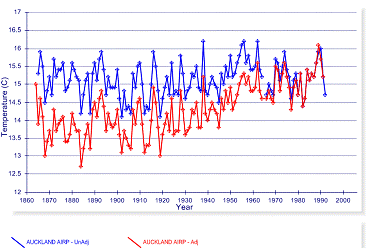
Even the Hokitika station (below, right), listed as rural, ends up with a very significant warming trend.
Comparison of Adjusted and Unadjusted Temperature Data for Auckland and Hokitika
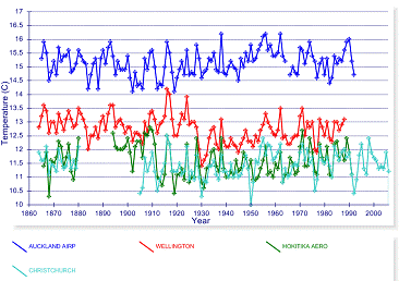
Adjustments to the data – this is how all of New Zealand (which exhibits no warming) ends up contributing to “global warming” – the graphs below show unadjusted (left) and adjusted (right) for Auckland, Wellington, Hokitika and Christchurch.
Comparison of Adjusted and Unadjusted Temperature Data
|
|
Problems With IPCC (HadCRU) Methods
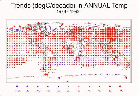
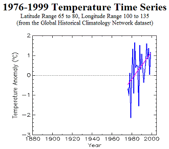
HadCRU / IPCC uses an interpolation method for 5x5 degree grids that have no stations. Siberia provides an example of the flaws involved. The following figure shows 5 x 5 degree grids with interpolated data as used by the IPCC, showing the temperature change from 1976 to 1999. Some Siberian 5x5 grids are highlighted in the upper-right green box in the following figure. These are the area of 65 – 80 latitude x 100 -135 longitude. This illustrates the effect of selecting a particular start year and why the IPCC selected 1976.
IPCC Warming from 1976 to 1999 in 5x5 degree grid cells [from Figure 2.9 in the IPCC Third Annual Report (TAR)]
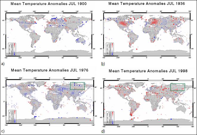
The NOAA National Climatic Data Center (NCDC) has an animated series showing the temperature anomalies for July of each year from 1880 to 1998 (no interpolation into empty grids). [http://www.ncdc.noaa.gov/img/climate/research/ghcn/movie_meant_latestmonth.gif]. The images in the following figure are from that series. These give an indication of the global coverage of the grid temperatures and how the coverage has changed over the years, as well as highlighting 2 warm and 2 cool years. The 1930’s were a very warm period (compare 1936 in b with 1998 in d below).
Temperature Anomalies for 5x5-Degree Grids For Selected Years (GHCN data)
In the GHCN data shown above, grid boxes with no data are left empty. In the IPCC method, many empty grid boxes are filled in with interpolations, with the net effect of increasing the warming trend.
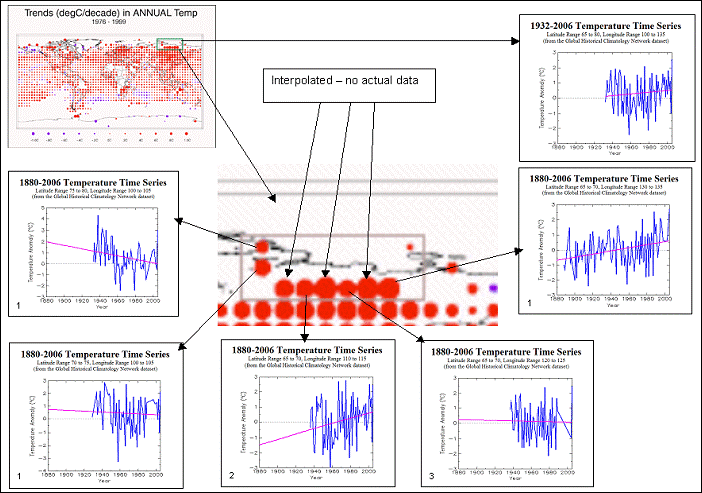
The following figure shows temperature trends for the Siberian area highlighted previously (Lat 65 to 80 - Long 100 to 135). Of the eight main temperature dots on the IPCC map, three are interpolated (no data). Of the five with data, the number of stations is indicated in the lower left corner of each grid-based temperature graph. The only grid with more than two stations shows no warming over the available data. The average for the entire 15 x 35 degree area is shown in the upper right of the figure. Of the eight individual stations, only two exhibit any warming since the 1930’s (the one in long 130-135 and only one of the two in long 110-115). An important issue is to keep in mind is that in the calculation of global average temperatures, the interpolated grid boxes are averaged in with the ones that actually have data. This example shows how sparse and varying data can contribute to an average that is not necessarily representative.
Temperatures for 5x5 Grids in Lat 65 to 80 - Long 100 to 135
Misrepresentation via Selective Period
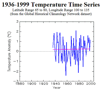
They selected 1976 as a starting point since that was a relatively cool year as well as a low point in the multi-decadal trends and would thus show greater warming towards 1999. But most long-term starting points do not exhibit such exaggerated warming trends. If they selected 1936 to 1998 as the time period, the following figure would not be so dramatic. The selective use of data is one of the primary problems in representing actual phenomena.
Trends from 1976 to 1999 (left) and 1936 to 1999 (right) Showing IPCC’s Selectivity in Start Year
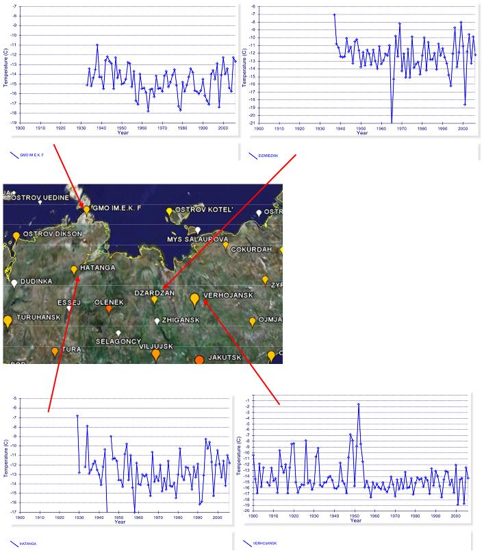
The following figure shows the four Siberian temperature
stations with the longest-term data. The IPCC has misrepresented the warming
trend in Siberia by selective use of the start date.
Four Long-term Temperature Stations in Siberia
|
|
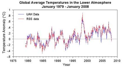
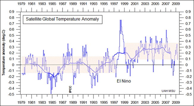
Satellites have more recently been used to remotely sense the temperature of the atmosphere, starting in 1979. The following figure shows the satellite data for Jan 1979 – Jan 2008 (top) and for Jan 2001 – Jan 2008 (bottom) [http://www.worldclimatereport.com/index.php/2008/02/07/more-satellite-musings/#more-306]. A consistent warming trend is not displayed, as it should be if CO2 were playing its hypothesized role. Satellite data is of somewhat limited use due to its lack of long-term historical data – many locations show warm periods in the 1930s-40s, but satellite data starts in 1979.
The following figure shows the global satellite temperature anomalies since satellite data first started to become available in 1979. From 1979 to 1997 there was no warming. Following the major El Nino in 1997-98, there was a residual warming and since then, no warming. All of the warming occurred in a single year.
See also: http://www.appinsys.com/GlobalWarming/SatelliteTemps.htm
|
|
Comparison of Global Data Sets
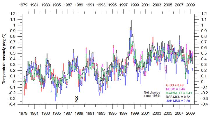
There are three main surface station based global temperature data sets (NASA GISS, NOAA NCDC, and Hadley HadCRUT – all starting from essentially the same base raw data set, but using different adjustment calculations) and two satellite temperature data sets (RSS and UAH – starting from the same satellite data, using different processing techniques).
The following figure compares these five data sets, in terms of the global average temperature since 1979 (the start of the satellite-based data) (Figure from http://climate4you.com/GlobalTemperatures.htm).
The differences between the data sets are insignificant (although the GISS adjustments result in more warming than any other data set, making this one the least reliable).
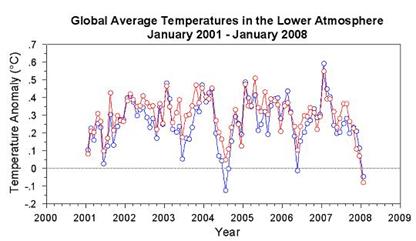
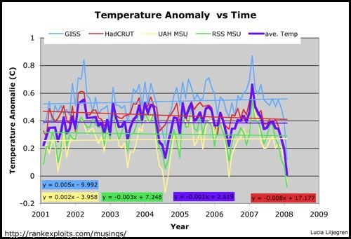
The following figure shows a comparison of the satellite temperature data (UAH MSU and RSS MSU) with the NASA-GISS and HadCRU data for 2001 to 2008. The recent seven-year period shows no warming (although NASA’s adjustments to the data produce slight warming). (Figure from http://rankexploits.com/musings/2008/ipcc-projections-overpredict-recent-warming/)
Klotzbach et al 2009 conducted a comparison analysis of the data sets and found that the surface station-based land temperature had an increasing warm bias compared to sea surface measurements and to satellite measurements. [http://www.climatesci.org/publications/pdf/R-345.pdf]
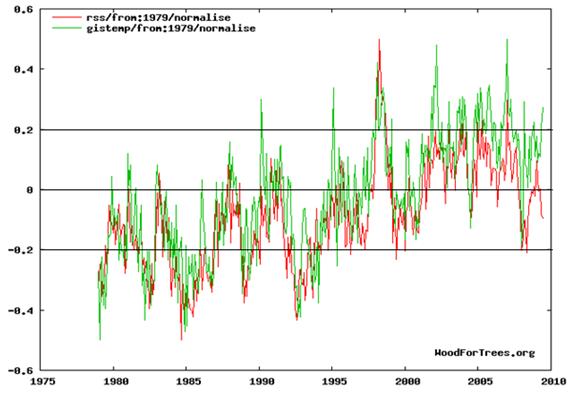
The following graph compares the RSS satellite data with the GISS surface data (plotted at [http://www.woodfortrees.org/plot/rss/from:1979/normalise/plot/gistemp/from:1979/normalise] which allows comparison of data sets). There has been a greater divergence over the last few years indicating that the warming in the GISS data set is not due to CO2 (since it should be warming the lower atmosphere).
Given the lack of coverage of surface stations for much of the globe, the satellite based data should be the data set used in the future (but it won’t likely be the definitive since it is not open to as many adjustments).
|
|
What is the meaning of a global average temperature? Global warming is not uniform on the globe and has a distinct North / South variance with cooling in the Southern Hemisphere There are also major differences in regions within the hemispheres.
A recent paper by Syun-Ichi Akasofu at the International Arctic Research Center (University of Alaska Fairbanks) provides an analysis of warming trends in the Arctic. [http://www.iarc.uaf.edu/highlights/2007/akasofu_3_07/index.php ] “It is interesting to note from the original paper from Jones (1987, 1994) that the first temperature change from 1910 to 1975 occurred only in the Northern Hemisphere. Further, it occurred in high latitudes above 50° in latitude (Serreze and Francis, 2006). The present rise after 1975 is also confined to the Northern Hemisphere, and is not apparent in the Southern Hemisphere; … the Antarctic shows a cooling trend during 1986-2005 (Hansen, 2006). Thus, it is not accurate to claim that the two changes are a truly global phenomenon”.
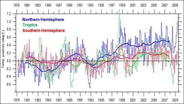
The following figure shows satellite temperature anomaly data for the three world regions of Northern Hemisphere, Tropics and Southern Hemisphere - warming has only been occurring in the Northern Hemisphere.
(See: http://www.appinsys.com/GlobalWarming/GW_NotGlobal.htm for details on this).
|
|
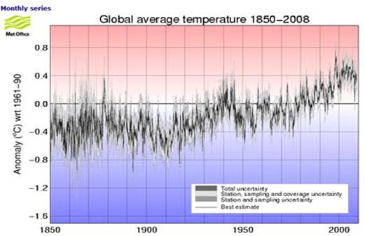
The following figure shows global temperature anomalies 1850 – 2008 (Hadley Centre data used by IPCC [http://hadobs.metoffice.com/hadcrut3/diagnostics/global/nh+sh/])
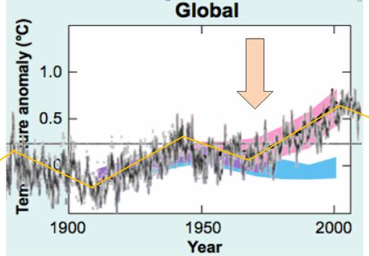
The following figure superimposes the above temperature anomalies on the IPCC graph of model outputs. (IPCC 2007 AR4 Figure SPM-4 [http://www.ipcc.ch/pdf/assessment-report/ar4/syr/ar4_syr_spm.pdf])
In the above figure, the blue shaded bands show the result of 19 simulations from 5 climate models using only the natural forcings. Red shaded bands show the result of 58 simulations from 14 climate models including anthropogenic CO2. This clearly shows that prior to about 1972, the global warming is fully explained by climate models using only natural forcings (i.e. no human CO2). The models need input of CO2 only after 1972 – prior to 1972 all warming was natural, according to the IPCC models.
This is very significant – most people assume the IPCC attribution of warming to human CO2 is for the entire 20th century, whereas the models only attribute warming to CO2 after 1972. There is no empirical evidence relating CO2 to the post-1972 warming – only the output of computer models.
|
|
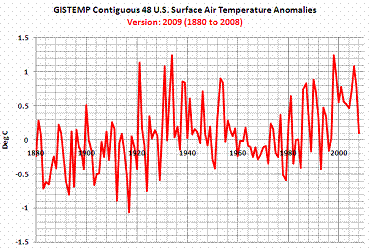
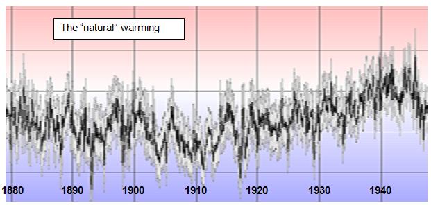
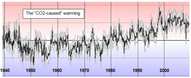
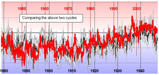
The following figures show the global temperature anomalies from the Hadley figure shown previously. Top figure: 1880-1946; middle: 1940-2008; and bottom: 1942-2008 changed to red and overlaid on 1880-1946 (shifted by 0.3 degrees).
As can be seen from the above figures, the two cycles were virtually identical, and yet the IPCC says the models can explain the early 1900s cycle with natural forcings, but anthropogenic CO2 is needed for the later cycle! There appears to be a problem with the models.
There is an overall upwards net trend in the cycles due to the fact that the earth has been warming since the Little Ice Age: “The coldest time was during the 16th and 17th Centuries. By 1850 the climate began to warm.” [http://www.windows.ucar.edu/tour/link=/earth/climate/little_ice_age.html]
|
|
Perspective
According to the global data sets, the Earth has warmed about 0.3 – 0.4 degrees in the last 30 years. This is less than the measurement error of temperature recording devices.
|
|
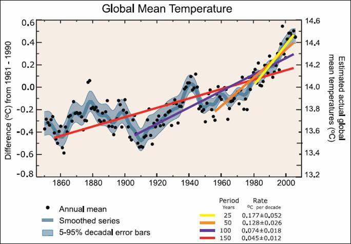
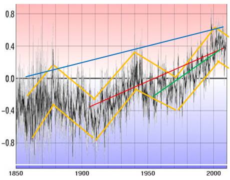
The IPCC creates artificial acceleration of warming by calculating short term linear trends within cyclical data. The following figure is Fig. FAQ 3.1 from Chapter 3 of the IPCC AR4 2007 report [http://www.ipcc.ch/pdf/assessment-report/ar4/wg1/ar4-wg1-chapter3.pdf]
The report states “Note that for shorter recent periods, the slope is greater, indicating accelerated warming.”
What they are obfuscating is the variation in the actual data as well as the fact that the warming occurs on a 60-year cycle. The calculation of linear trends with disregard to the non-linear cyclical nature gives erroneous (or dishonest) results.
The following figure shows the HadCRU temperature data that went into developing the above graph, along with orange lines indicating the 60-year cycle. The red line on the figure below shows the 0.74 degrees per century (shown in purple above), while the green line shows the 1.28 degrees per century (shown in orange above). The linear warming trend shown when accounting for the cycle is actually about 0.3-0.4 degrees per century as shown by the blue line on the figure below based on the trend in the peaks of the 60-year cycle.
The warmest year globally was 1998 – since then there has been no warming.
See: http://www.appinsys.com/globalwarming/Acceleration.htm for other “accelerations”.
See: http://www.appinsys.com/globalwarming/SixtyYearCycle.htm for more details on the 60-year cycle.
See: http://www.appinsys.com/GlobalWarming/LinearTrends.htm for info on how linear trends are often inappropriately used.
|
|
|
