Global Warming Science - www.appinsys.com/GlobalWarming
Linear Trends
[last update: 2010/02/18]
|
The use of linear trends in climate data analysis can lead to misperceptions and erroneous conclusions. Problems exist with the calculation of linear trends for a couple of reasons: 1) in cyclical or highly varying data, the choice of start and end points is highly influential, and 2) non-linear events can be obscured by a linear trend.
|
|
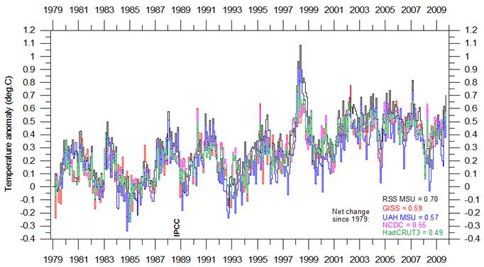
Global Temperatures
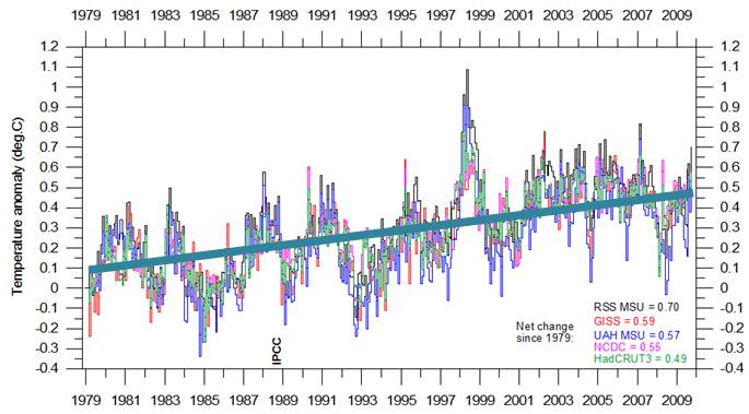
The following figure shows global average temperature from five data sets since the start of the satellite temperature data era in 1979 through October 2009 (RSS MSU and UAH MSU are satellite data, HadCRUT3, NCDC and GISS are surface station data sets – graph from http://climate4you.com/GlobalTemperatures.htm).
Here are some linear trends based on the above data:
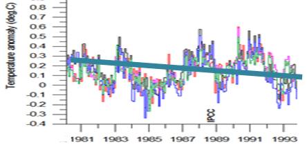
A cooling global temperature trend (approx. -0.15 degrees per decade) for the 14 years from 1980 to 1994. Realistic? No.
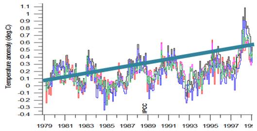
A warming global temperature trend (approx. +0.25 degrees per decade) for the 20 years from 1979 to 1999. Realistic? No.
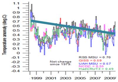
A cooling global temperature trend (approx. -0.35 degrees per decade) for the 11 years from 1998 to 2009. Realistic? No.
A warming global temperature trend (approx. 0.12 degrees per decade) for the 30 years from 1979 to 2009. Realistic? No.
So what is realistic? The annual variance in the data is large compared to any trend. There are clearly visible cycles in the data (approx. 4-year cycle is visible in the 30-year data). So what does the satellite era data actually show? No warming from 1979 to 1997; a significant El Nino event in 1997-98 resulting in a step change of about 0.3 degrees; no warming from 1999 to 2009. All of the warming in the last 30 years occurred in a single year.
Simple rule of thumb: If a linear trend calculated for different sub-periods yields significantly different results, a linear trend though the data whole data set is only meaningful with sufficient length of data set. For cyclical data, this means having several complete cycles of data. The definition of climate is weather averaged over 30 years. So the entire satellite era record provides essentially a single data point.
|
|
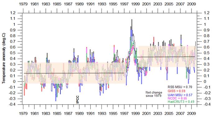
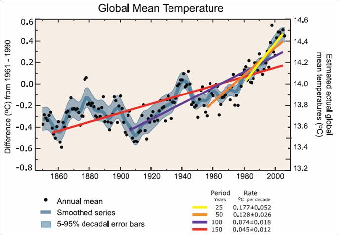
IPCC Global Temperature Interpretation
The IPCC creates artificial “global warming acceleration” by calculating short term linear trends within cyclical data. The following figure is Fig. FAQ 3.1 from Chapter 3 of the IPCC AR4 2007 report [http://www.ipcc.ch/pdf/assessment-report/ar4/wg1/ar4-wg1-chapter3.pdf]
The report states “Note that for shorter recent periods, the slope is greater, indicating accelerated warming.”
The following figure shows the HadCRU temperature data that went into developing the above graph from ([http://hadobs.metoffice.com/hadcrut3/diagnostics/global/nh+sh/]), along with orange lines indicating the 60-year cycle. The red line on the figure below shows the 0.74 degrees per century (shown in purple above), while the green line shows the 1.28 degrees per century (shown in orange above). The linear warming trend shown when accounting for the cycle is actually about 0.3-0.4 degrees per century as shown by the blue line on the figure below based on the trend in the peaks of the 60-year cycle.
|
|
Alaska Temperatures
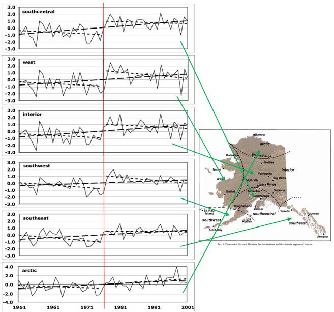
The following figure is from a study published in 2005 (Brian Hartmann and Gerd Wendler: “The Significance of the 1976 Pacific Climate Shift in the Climatology of Alaska”, Journal of Climate, Vol.18, 2005) [http://climate.gi.alaska.edu/ResearchProjects/Hartmann%20and%20Wendler%202005.pdf]. The figure shows temperature trends for each climate region in Alaska, including linear trends for the entire period and for the two periods separated by 1976. Linear trends through the whole period provide a very misleading interpretation. Except for the Arctic region, all of the warming in Alaska occurred in the two-year period of – 1976 - 1978. The temperature trend was decreasing prior to the 1976 climate shift and since then has also not been warming.
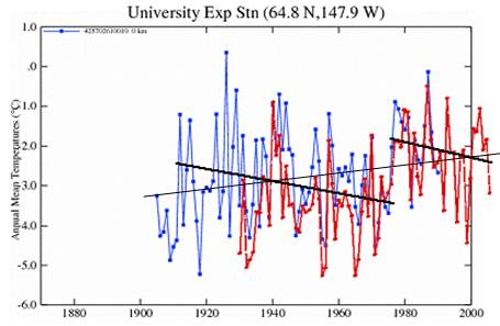
This same effect can be seen for the Fairbanks (red) / University Exp Stn (blue) [also in Fairbanks] from the GISS database – a linear trend through the whole data set (thin black line) provides a very different interpretation than noticing a shift in 1976-1978 and calculating separate linear trends for the two sub-periods (thicker black lines).
So what does the Alaska data actually show? Cooling until 1976; a significant increase in 1976-78 resulting in a step change of about 1.5 degrees; cooling since 1978. All of the warming in the last 80 years essentially occurred in a single 2-year period.
|
|
Cascades Snowpack
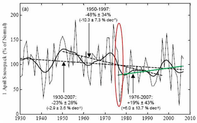
The following figure shows April snowpack since 1930 including various linear trends [ftp://ftp.atmos.washington.edu/stoeling/manuscripts/SWEpaper30Oct_rendered.pdf]. The 1930 – 2007 decline is 23 +/- 28 % (i.e. not statistically significant from zero). The only significant decline took place during the Pacific Climate Shift of 1977 and since then “snowpack increased 19% during the recent period of most rapid global warming (1976-2007)” (although this change is also not statistically different from zero).
This is again an example where alarmists abuse statistics using linear trends. Washington State Democratic politicians are always sounding the alarm by saying the Cascade snowpack has declined by more than 30% since 1950, but they fail to mention it has increased during the “global warming” period – the oppositeof their alarmist implication. (For example a Gregoire letter here: http://www.washingtonpolicy.org/Centers/environment/PDF/Governor_letter_response.pdf)
The Cascades snowpack is correlated with the PDO. See: http://www.appinsys.com/GlobalWarming/RS_Washington_usa.htm#snowpack for more details on this.
See http://www.appinsys.com/GlobalWarming/The1976-78ClimateShift.htm for more details on the 1997 climate shift.
|
|
|
|
Sea Level Trends
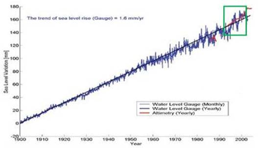
The opposite effect of data analysis can be observed in the historical record of sea level data. For example, Obama’s science adviser, John Holdren, provided the following figure in an alarmist presentation on global warming [http://www.whrc.org/resources/online_publications/warming_earth/index.htm] (he says sea level rise is due to warming caused by CO2).
He chose to ignore the long-term available data. Sea level has been rising since the little ice age in the 1700s. The following figure shows global cumulative sea level change for 1900 to 2002 (Holdren’s focus on 1992 – 2002 is 10 years – the green square in the graph below). [http://www.wamis.org/agm/meetings/rsama08/S304-Shum_Global_Sea_Level_Rise.pdf]. Since according to the IPCC, CO2-based warming has apparently only shown up since the 1970s, all of this sea level rise since prior to 1970 cannot be caused by warming due to anthropogenic CO2, and yet the linear trend has not changed in 100 years.
This data shows the opposite misinterpretation compared to the temperature data examined previously: i.e. when the linear trend does not change over various sub-periods, there is NO evidence to say that something (in this case CO2) had any effect during the time frame.
|
|
|
|
(One of the basics taught in most data analysis courses – first thing: plot the data before calculating anything – this helps to reduce mistaken interpretations.)
|
|
|
|
More Information:
Obama’s science adviser is a science-abuser. See: http://www.appinsys.com/GlobalWarming/ObamasGovernment.htm
Alaska: See: http://www.appinsys.com/GlobalWarming/RS_Alaska.htm
Sea Level: See: http://www.appinsys.com/GlobalWarming/GW_4CE_SeaLevel.htm
|
|
|