Global Warming Science: www.appinsys.com/GlobalWarming
El Nino – Global Temperature Driver
[last update: 2009/06/13]
The El Nino is the main driver of global temperatures.
|
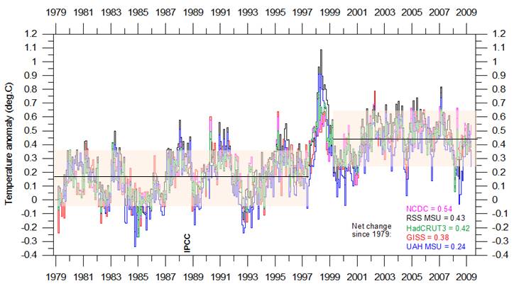
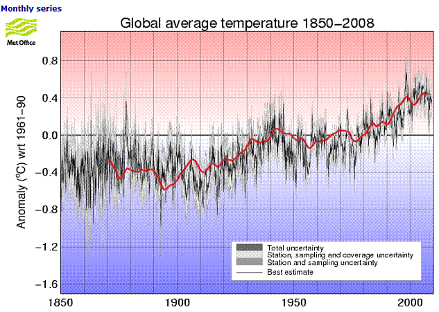
The following figure shows global average temperature from five data sets since the start of the satellite temperature data era in 1979 (RSS MSU and UAH MSU are satellite data, HadCRUT3, NCDC and GISS are surface station data sets – graph from http://climate4you.com/GlobalTemperatures.htm). From 1979 to 1997 there was no warming trend. The major El Nino then resulted in a residual warming of about 0.3 degrees. Since the 1998 end of the El Nino there has also been no warming trend – all of the warming in the last 30 years occurred in a single year.
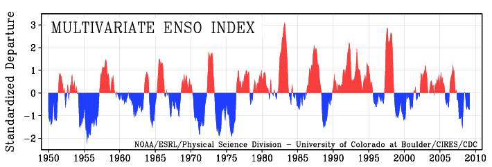
The following figure shows the Multivariate El Nino / Southern Oscillation Index (MEI) calculated from sea-level pressure, zonal and meridional components of the surface wind, sea surface temperature, surface air temperature, and total cloudiness fraction of the sky (from http://www.cdc.noaa.gov/people/klaus.wolter/MEI/). (See www.appinsys.com/GlobalWarming/ENSO.htm for details on the El Nino phenomenon.)
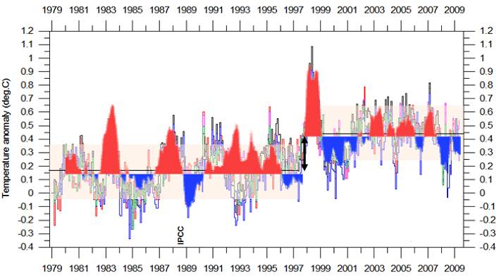
The following figure combines the above two figures, with a step change in the MEI in 1997. This shows how the El Nino governs global temperatures. The global temperature cycles match the El Nino cycles, except for a couple of places: the step change associated with the 1997-98 El Nino and the out-of-sync portion in 1992-93. (The out-of-sync portion in 1992-93 is due to the atmospheric cooling resulting from the Mount Pinatubo volcano explosion overcoming the El Nino warming [http://www.nasa.gov/centers/goddard/news/topstory/2007/aerosol_dimming.html]). The 1998 step change is an unexplained phenomenon.
|
|
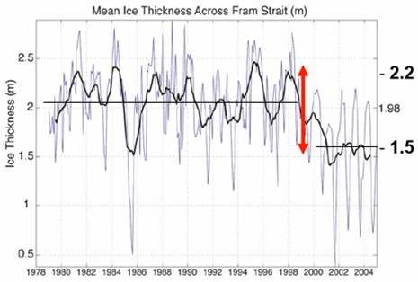
The effects of the 1998 step change have also been observed in the ice thickness in the Fram Strait – the outlet of the Arctic sea iceinto the Altantic, as shown in the following figure [http://www.ees.hokudai.ac.jp/coe21/dc2008/DC/report/Maslowski.pdf].
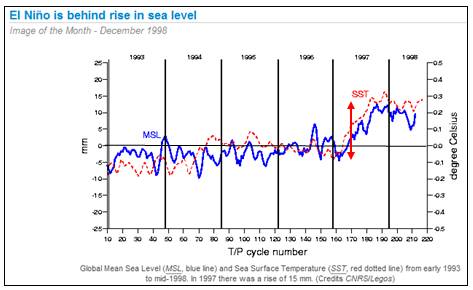
It was also observed in global sea level rise, shown below (right) [http://www.aviso.oceanobs.com/en/news/idm/1998/dec-1998-el-nino-is-behind-rise-in-sea-level/index.html].
|
|
Why did the 1997-98 El Nino result in this step change in temperatures whereas the 1983 El Nino did not? It appears that the combination of phase correspondence with the Atlantic Multidecadal Oscillation (AMO) is the influencing factor, along with the influence of volcanic aerosols causing simultaneous cooling.
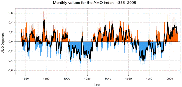
The following figure shows the AMO since 1850 (see www.appinsys.com/GlobalWarming/PDO_AMO.htm for more information on the AMO).
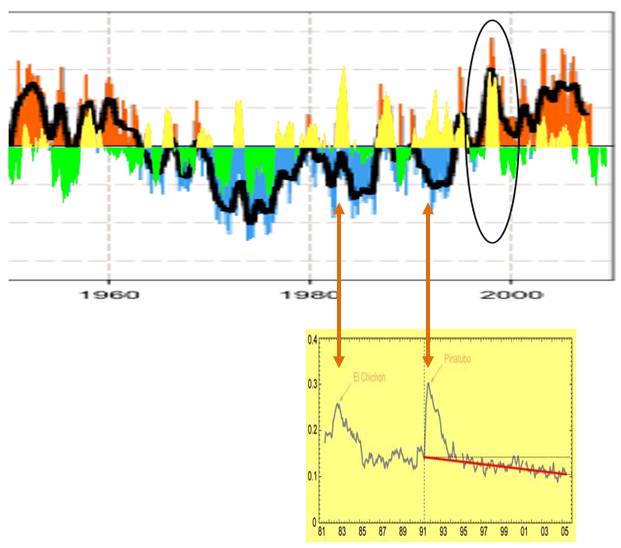
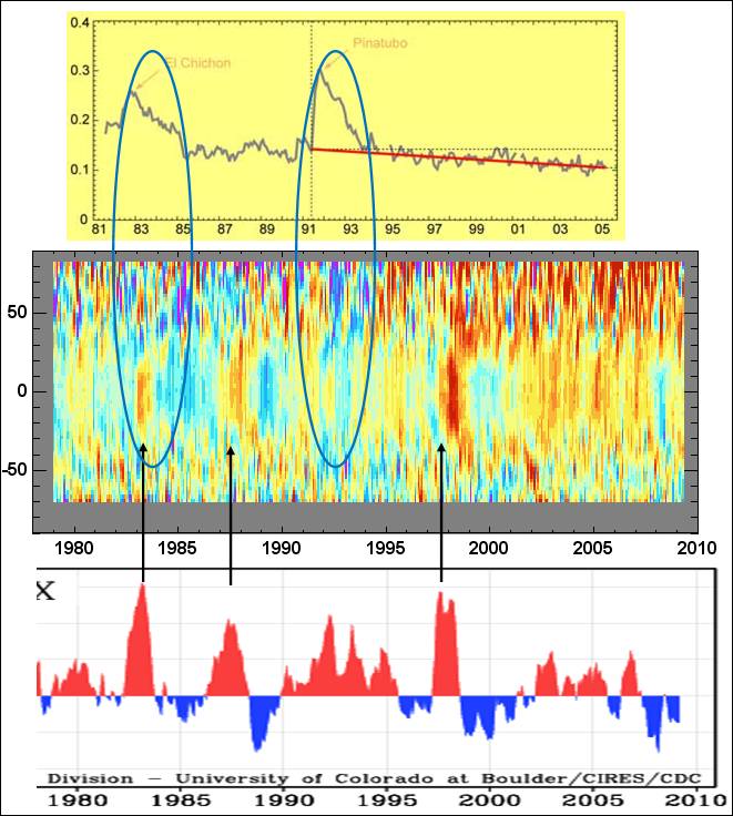
The next figure shows the ENSO-MEI, changed to yellow / green, superimposed on the AMO. The 1997-98 El Nino corresponded to a similar event in the AMO whereas the 1983 El Nino was out of phase with the AMO. It also shows the volcanic aerosols from 1981 – 2006 (graph with yellow background, from [http://www.nasa.gov/centers/goddard/news/topstory/2007/aerosol_dimming.html]). The El Chichon volcano eruption created atmospheric aerosols that counteracted the 1982-83 El Nino.
|
|
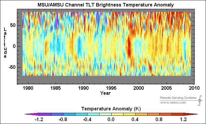
The following figure shows the global temperature anomalies by latitude for 1979 – 2009 from the RSS satellite data for the lower troposphere near the earth’s surface [http://www.ssmi.com/msu/msu_data_description.html] – latitude on the y-axis.
The following figure shows the correspondence of the El Nino to the tropical latitude warming, along with cooling effects of aerosols from the major volcano explosions.
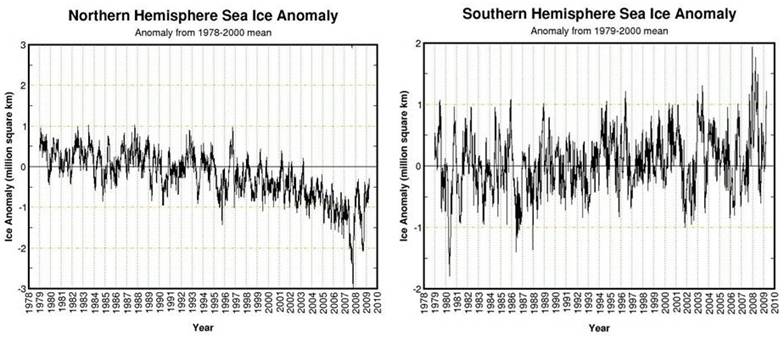
The following figures show sea ice extent anomalies for the Arctic (left) and Antarctic (right) to March 2009 [http://arctic.atmos.uiuc.edu/cryosphere/]
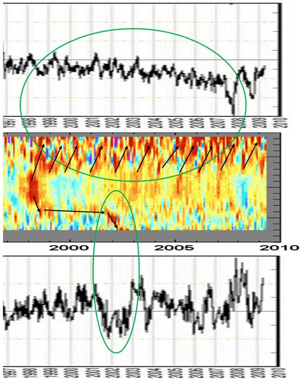
The following figure combines the sea ice figures from above with the global temperature trend shown previously. The El Nino propagated more quickly to the Arctic and shows persistent reemergence in the Arctic region.
|
|
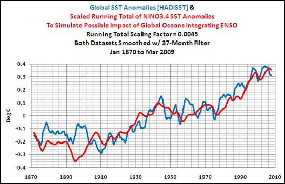
The following figure compares the integral (running sum) of Nino 3.4 SST anomlaies with global SST anomalies, (37-month smoothing filter) [http://bobtisdale.blogspot.com/2009/06/reemergence-mechanism.html].
The following figure overlays the integral of Nino 3.4 SST anomalies from above on the Hadley global average temperature anomalies (from [http://hadobs.metoffice.com/hadcrut3/diagnostics/global/nh+sh/]).
See also the study of tropical SSTs / global temperature / cloud cover www.appinsys.com/GlobalWarming/TropicalSST.htm
|
|
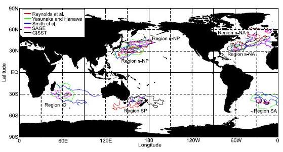
The El Nino heat propagates to other areas of the ocean through the “reemergence” phenomenon. Bob Tisdale provides an overview of the reemergence mechanism [http://bobtisdale.blogspot.com/2009/06/reemergence-mechanism.html] He also shows the following figure from the paper “Reemergence Areas of Winter Sea Surface Temperature Anomalies in the World’s Oceans” – Hanawa & Sugimoto, Geophysical Research Letters, 2004. The following figure shows reemergence areas detected by lag correlation analyses for five SST data sets – contours denote areas where lag correlations exceed the 99% significance level.
The above figure shows that the main reemergence areas are in the northern hemisphere.
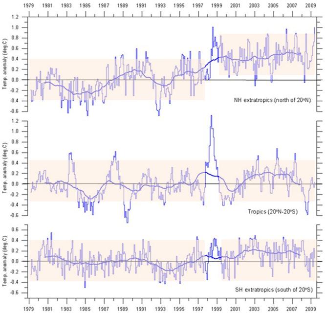
The following figure shows the global average temperature near the Earth’s surface from satellite data, for the northern hemisphere (north of 20N), the tropics (20N – 20S) and the southern hemisphere (south of 20S) (figure from http://climate4you.com/). The Northern Hemisphere exhibits the step change in temperature resulting from the 1997-98 El Nino similar to the global average, whereas there is no increase in the tropics and only a very small increase of shorter duration in the southern hemisphere. This matches the pattern of the reemergence areas by hemisphere.
|