Global Warming Science - www.appinsys.com/GlobalWarming
Tropical Pacific Sea Surface Temperatures – Driving the Global Average Temperature
[last update: 2009/05/06]
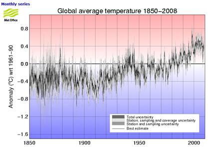
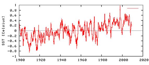
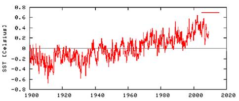
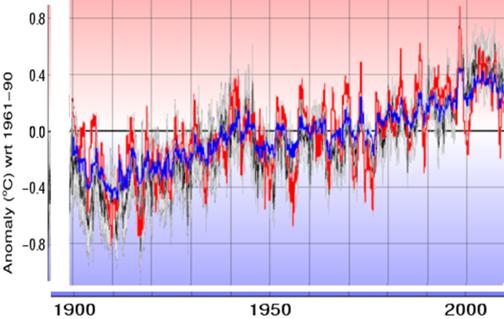
The following figures show global average temperature anomalies (left, from [http://hadobs.metoffice.com/hadcrut3/diagnostics/global/nh+sh/]) and sea surface temperature (SST) anomalies for the tropical Pacific Ocean area of 20N – 20S x 90W – 120E (right, from the ERSST v3b SST data plotted at [http://climexp.knmi.nl/start.cgi?someone@somewhere]).
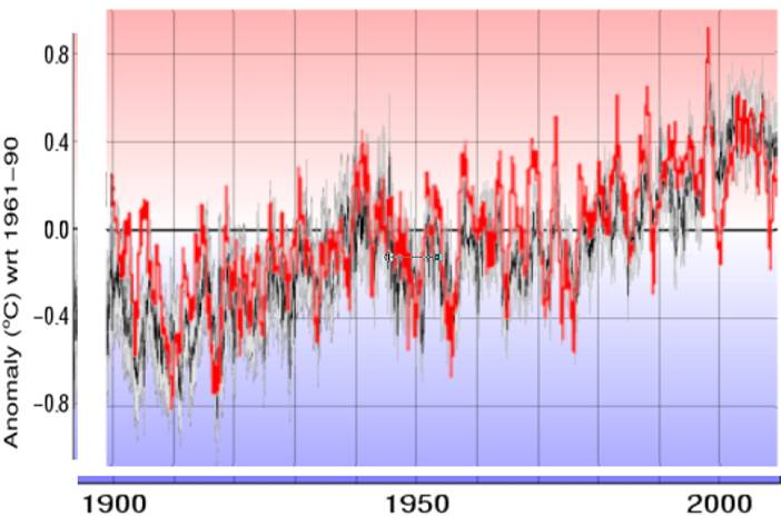
The following figure combines the above two.
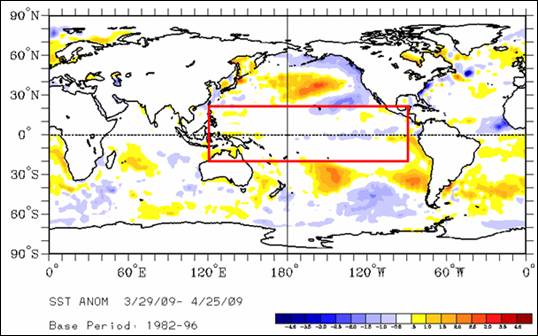
The following figure shows the tropical Pacific Ocean area of 20N – 20S x 90W – 120E as indicated by the red box (map from [http://www.cdc.noaa.gov/enso/enso.current.html]).
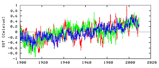
The following figures show sea surface temperature anomalies for the Pacific Ocean area of 20N-60N (left) and 20S-60S (right) from the KNMI climate explorer cited previously.

The following figure compares SST for the Pacific Ocean 20N-20S (red) with the 20N-60N (green) and the 20S-60S (blue) from the above figures. Only the tropical Pacific provides the strong correlation with global average temperatures shown previously.
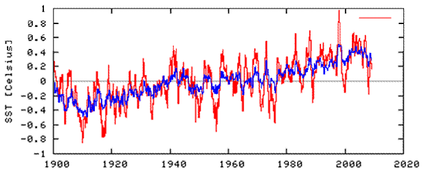
The following figure compares SST anomalies for the Pacific Ocean 20N-20S (red) with the global SST temperature anomalies (blue). The global average follows an almost identical pattern with the tropical Pacific, with the tropical Pacific showing a larger variation.
The following figures compares global SST anomalies (blue) and Pacific Ocean 20N-20S (red) with the global temperature. While the global average SST is similar to the global surface temperature, the tropical Pacific SST matches the variation more closely.
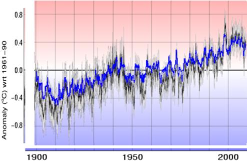
The tropical Pacific Ocean sea surface temperature drives the global air temperature.
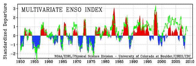
The following figure compares the tropical Pacific Ocean 20N-20S (green) temperature anomalies with the multivariate El Nino / Southern Oscillation (ENSO) index since 1950 [http://www.cdc.noaa.gov/people/klaus.wolter/MEI/].
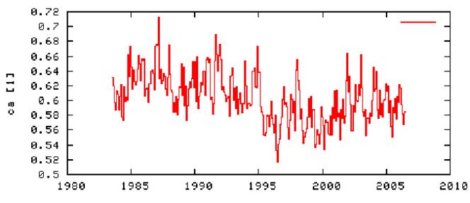
The following figure shows total cloud cover for the Pacific Ocean area of 20N – 20S x 90W – 120E from the ICCPS database plotted at the KNMI climate explorer [http://climexp.knmi.nl/start.cgi?someone@somewhere]. (The ICCPS is the International Satellite Cloud Climatology Project with data starting in 1983 [http://isccp.giss.nasa.gov/].)
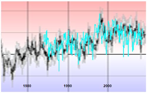
The following figure shows the cloud cover from above, inverted, changed to blue and superimposed on the global average temperature graph shown previously. Thus tropical Pacific cloud cover has a strong correlation with global average temperature.
The following figure (left) is from the IPCC AR4 report (2007) figure 9.6. It shows the average temperature trend by latitude for 1979 – 2005, with the average “observed” as the black line, along with outputs from the computer climate models – models using only natural climate forcings in blue and models using CO2 in red. The tropical latitudes of 20N – 20S are indicated by the green box. The black line indicates about 0.1 degrees warming per decade. The figure below right shows the satellite lower troposphere temperature data for the tropics (figure from http://climate4you.com/). The red line indicates the 1979 – 2005 warming corresponding to the timeframe of the figure on the left.
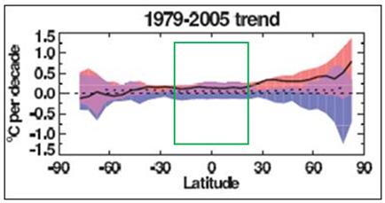

The IPCC figure shown above left indicates that the warming in the tropics is fully explained by the climate models using only natural factors – no CO2 required (as indicated by the observed black line being within the blue model band). The correspondence between the cloud cover and sea surface temperatures in the tropics with the global average temperatures shown previously indicate that the global average warming comes from the tropics – not from CO2.