Global Warming Science - www.appinsys.com/GlobalWarming
United States
[last update: 2010/06/09]
|
The United States has the most comprehensive historical climate records of any area on the Earth. The US National Oceanic and Atmospheric Administration (NOAA) maintains the Global Historic Climate Network (GHCN) used as the basis for world temperature calculations by various agencies.
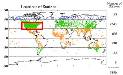
More temperature measurement stations exist in the US than any other country or area of the world (about 30 percent of the world’s stations historically and about 50 percent at present). The following figure shows the location and density of stations in the world.
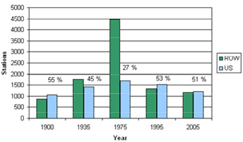
The following figure shows the number of stations in the GHCN database with data for selected years, with the number of stations in the United States (blue) and in the rest of the world (ROW – green). The percents indicate the percent of the total number of stations that are in the U.S.
|
||||
|
National Temperature Trend
The station data are processed by NOAA, GISS and NCDC using various adjustment methods.
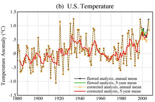
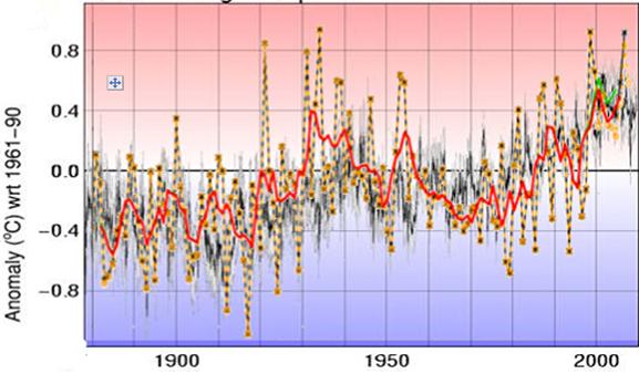
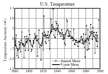
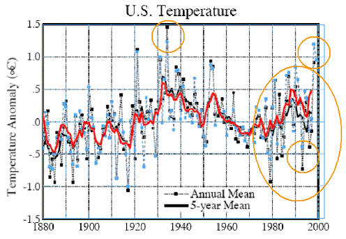
NASA’s Goddard Institute for Space Studies (GISS) provides periodic updates of US average temperature. The following figure was created by GISS in 2007 [http://data.giss.nasa.gov/gistemp/2007/]
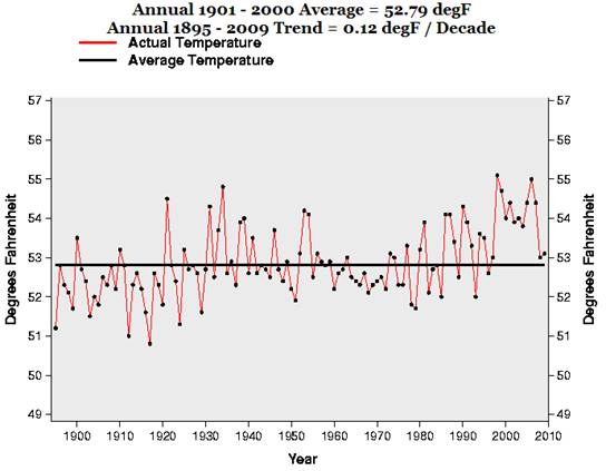
The National Climatic Data Center (NCDC) has a web page for graphing temperature and precipitation data:
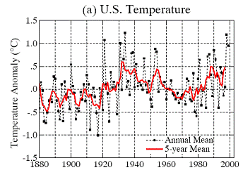
The following figure is from the NCDC national data.
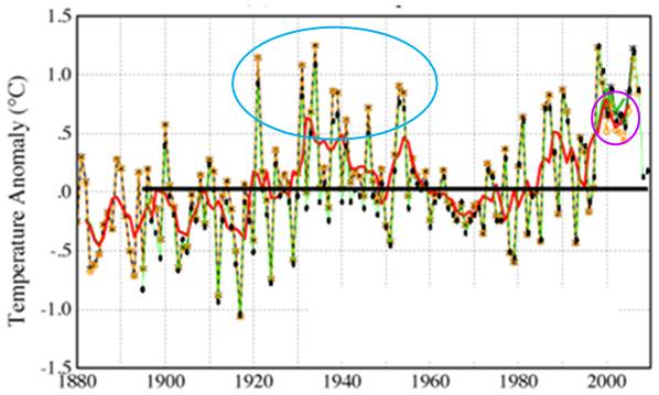
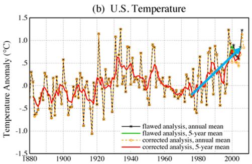
The following figure compares the GISS data and the NCDC (changed to green with black points). The NCDC shows lower temperatures in the 1930s-1940s compared with the GISS data (indicated in blue circle). NCDC also has higher temperatures in the late 1990s-early 2000s (indicated in the magenta circle) since they are still using what NASA terms “flawed analysis” as indicated on the GISS plot shown initially.
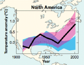
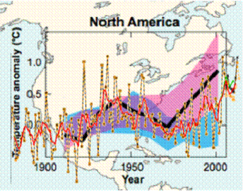
The following figure from the IPCC AR4 provides the results of models for North America (pink= models with CO2, blue= models without CO2, black= observed average). This indicates that prior to 1970 the climate models can reproduce the historical temperature without using anthropogenic CO2. Combining the IPCC model plot and the GISS US temperature trend yields the plot on the right. The IPCC North America includes Canada and thus shows more warming in recent decades due to the influence of the Arctic. The US trend is within the natural forcing band until 1980.
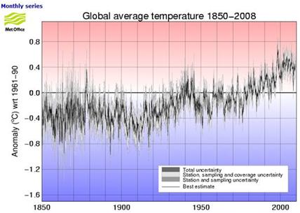
The following shows the Hadley Climatic Research Unit global average temperature anomalies (the IPCC uses data provided by HadCRU – plot from: [http://hadobs.metoffice.com/hadcrut3/diagnostics/global/nh+sh/]).
The following figure superimposes the GISS US temperature data for comparison with the global average. The US experienced considerable warming in the 1903s compared to the global average.
|
||||
|
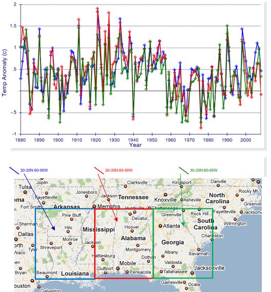
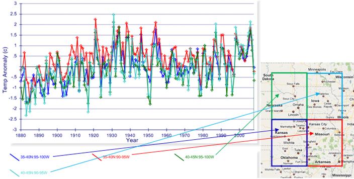
Regional Temperature Trends
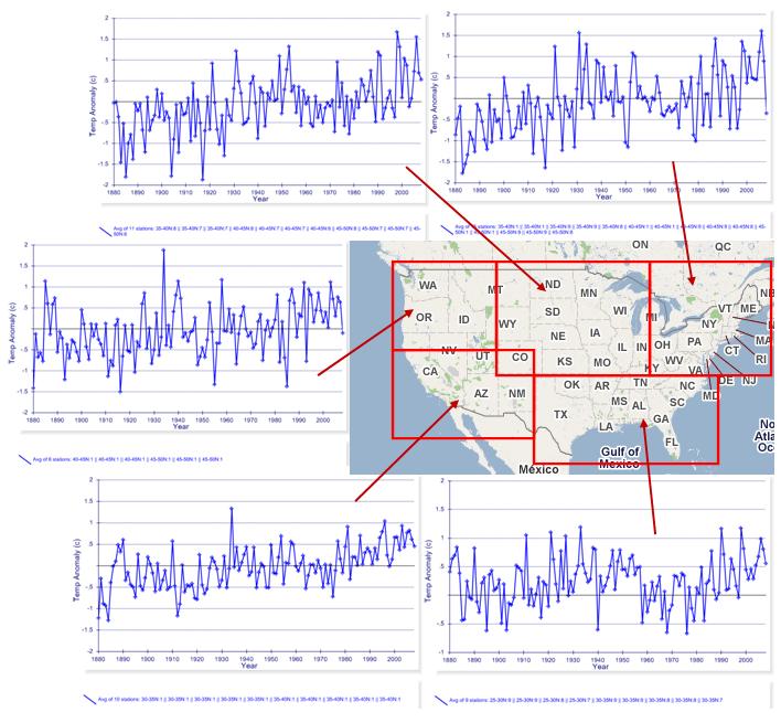
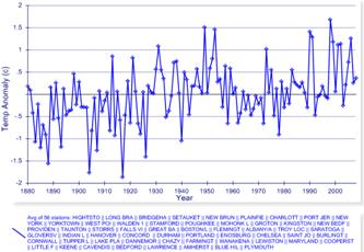
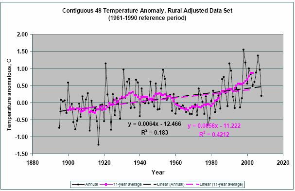
The following figure shows the average annual temperature trend for several regions within the United States (the data is from the Hadley Climatic Research Unit CRUTEM3 database (used by the IPCC), plotted at http://www.appinsys.com/GlobalWarming/climate.aspx). Hadley data does not exclude urban station data which are influenced by the increased amounts of concrete and pavement. Their data is also adjusted using an unpublished process and then averaged for 5x5 degree grids. For most areas of the US no statistically significant warming has occurred since the 1903s.
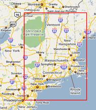
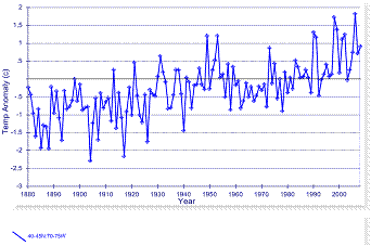
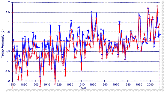
The actual warming has not been as much as indicated above since the HadCRU data adjustment introduces artificial warming. The following figures compare the HadCRU CRUTEM3 data with the NOAA GHCN station data for one 5x5 degree grid: 40-45N x 70-75W (as indicated in the red rectangle on the map). The left figure is the CRUTEM3 data, the right figure is the average of all 56 long-term stations in the NOAA GHCN data. The next figure below compares the two with the HadCRU data changed to red for comparison. Hadley has artificially increased the warming in the data (or excluded stations that don’t show warming).
Combining the above two graphs:
HadCRU CRUTEM3
data v NOAA
GHCN data
The following table shows some closer looks at a few regions in the US. For warming to be significant in terms of anthropogenic global warming, it must be statistically significant within the “CO2 Era” – that is, since 1970, because the models can explain all warming prior to that using only natural climate forcings.
|
||||
|
NASA / GISS Deception
The GISS periodically publishes average US temperatures, which include their adjustments. Adjustment methods are sometimes changed by the agency. The following graphs show the historical US data from the GISS database as published in 1999 and 2001. The graph on the left was produced in 1999 (Hansen et al 1999 [http://pubs.giss.nasa.gov/docs/1999/1999_Hansen_etal.pdf ]); the graph on the right was produced in 2000 (Hansen et al 2001 [http://pubs.giss.nasa.gov/docs/2001/2001_Hansen_etal.pdf]). They are from the same raw data – the only difference is that the adjustment method was changed by NASA in 2000.
U.S. Temperature Changes Due to Change in Adjustment Methods (Left: 1999, Right 2001)
The following figure compares the above two graphs, showing how an increase in temperature trend was achieved simply by changing the method of adjusting the data. Some of the major changes are highlighted in this figure – the decreases in the 1930s and the increases in the 1980s and 1990s.
Comparison of U.S. Temperature Changes Due to Change in Adjustment Methods
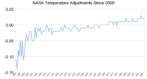
Since 2000, NASA has further “cleaned” the historical record. The following graph shows the further warming adjustments made to the data in 2005. (The data can be downloaded at http://data.giss.nasa.gov/gistemp/graphs/US_USHCN.2005vs1999.txt; the following graph is from http://www.theregister.co.uk/2008/06/05/goddard_nasa_thermometer/print.html). This figure plots the difference between the 2000 adjusted data and the 2005 adjusted data. Although the 2000 to 2005 adjustment differences are not as large as the 1999 to 2000 adjustment differences shown above, they add additional warming to the trend throughout the historical record.
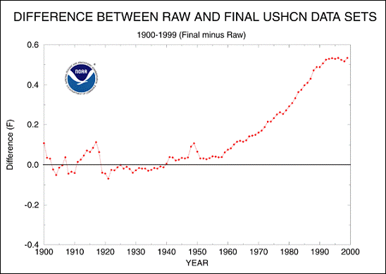
NOAA provides a summary of the adjustments made to the USHCN temperature data as shown in the following figure. [http://www.ncdc.noaa.gov/oa/climate/research/ushcn/ushcn.html] The report states: “The cumulative effect of all adjustments is approximately a one-half degree Fahrenheit warming in the annual time series over a 50-year period from the 1940's until the last decade of the century.” This is similar to the total amount of warming “observed”.
Average Total Warming Created by Adjustments to USHCN Data
|
||||
|
NOAA / CPC Deception
The NOAA Climate Prediction Center (with “Vision: To be the world’s best and most trusted climate service center”) provides the following graph [http://www.cpc.noaa.gov/charts.shtml]. Although the US has data going back to the late 1800s, the CPC does not provide any other graphs than trends starting in 1976.
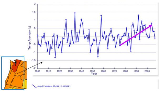
The reason for the selection of 1976 as the start year for trend calculation is shown below. By selectively ignoring the cyclical nature of the temperature trends, one can create a false impression of warming.
The following figure shows the annual mean temperature anomalies averaging the two 5x5 degree grids covering the coast of Oregon and Washington from 1900 to 2007. This data is from the Hadley Climatic Research Unit (HadCRU) as used by the IPCC. The warmest year was 1934. The CPC gives the deceptive impression of warming in this area.
|
||||
|
NCDC Urban Warming Deception
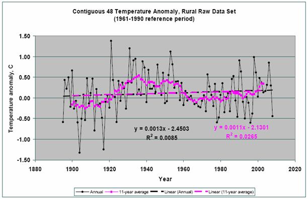
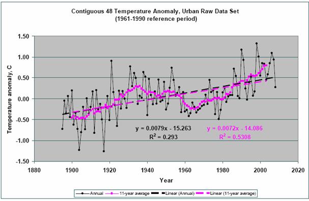
The NCDC adjusts the data that is displayed in their plots. Retired NASA physicist Edward Long compared the urban and rural data before and after NCDC adjustments [http://scienceandpublicpolicy.org/images/stories/papers/originals/ Rate_of_Temp_Change_Raw_and_Adjusted_NCDC_Data.pdf]
The following figures are from the above report. The top figure shows rural unadjusted data , while the next figure shows urban unadjusted data.
The NCDC then artificially creates warming at rural stations through their data adjustments. The following figure shows the adjusted rural data – it now has almost the same trend as the urban data.
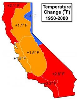
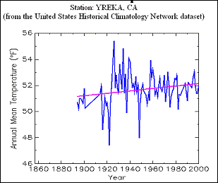
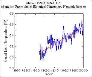
A March 31, 2007 Science Daily article “Climate Data Shows California Has Been Heating Up” reporting on a NASA study [http://www.sciencedaily.com/releases/2007/03/070330221144.htm] provides some moderation to the GHG scenario: “Their objective was to shed new insights into the relative roles humans and natural climate events play in affecting California regional temperatures… (using air temperature patterns from 1950 to 2000 )… Climate change models and assessments often assume global warming's influence here would be uniform. That is not the case. If we assume global warming affects all regions of the state, then the small increases our study found in rural stations can be an estimate of this general warming over land. Larger increases would therefore be due to local or regional changes in land surface use due to human activities… The largest temperature increases were seen in the state's urban areas … Rural, non-agricultural regions warmed the least." Note on the individual station graphs that for rural areas, that the selection of starting year (in the study case 1950) can affect the trend. The study’s careful selection of 1950 allows it to ignore the previous warm decades of the 1930’s -1940’s.
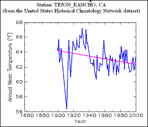
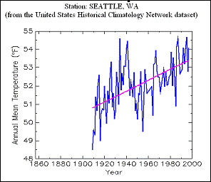
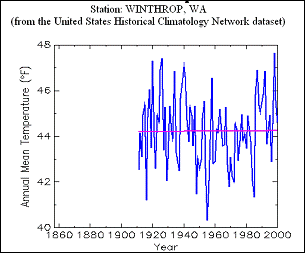
Another example comparing urban and rural stations is shown below for Seattle and Winthrop, Washington.
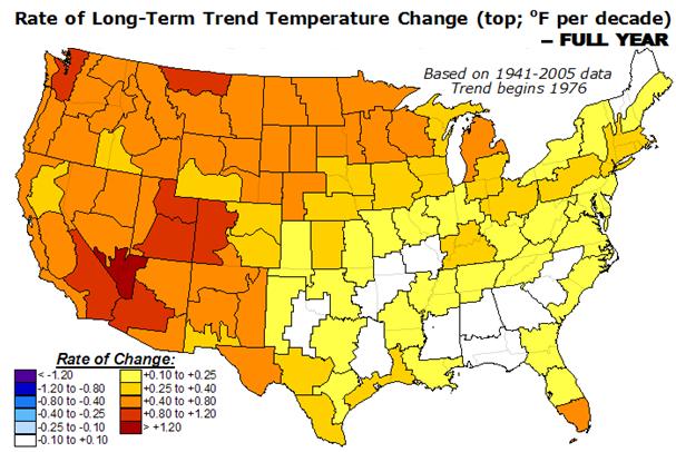
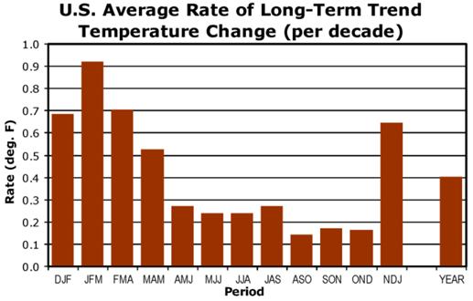
The following figure from the NOAA CPC shows the average rate of temperature trend change since 1976 [http://www.cpc.noaa.gov/trendusa.gif]. The temperature change has mainly been in the winter months – consistent with the urban heat effect.
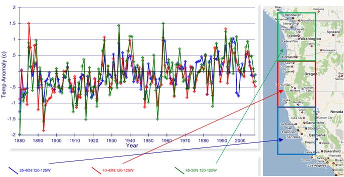
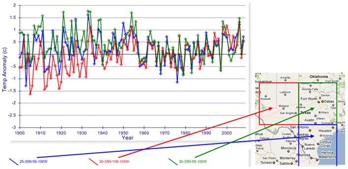
See the other regional summaries covering North America for further examples of urban versus rural differences:
For more information on the Urban Heat Island effect in the US see: http://www.appinsys.com/GlobalWarming/GW_Part3_UrbanHeat.htm
|
||||
|
State Temperature Records
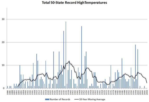
The following graph shows the count of monthly maximum temperature records for the 50 states by year as well as a 10-year moving average of the data. [http://hallofrecord.blogspot.com/2009/01/where-is-global-warming-extreme_19.html]
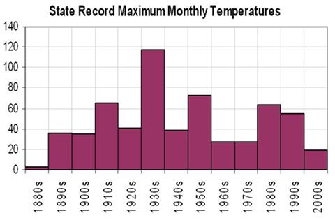
The following graph shows the count of monthly maximum temperature records for the 48 contiguous states summarized by decade [http://hallofrecord.blogspot.com/2009/01/decadal-occurrences-of-statewide.html]
Individual state temperature records can be found here: http://ggweather.com/climate/extremes_us.htm
|
||||
|
Precipitation / Drought
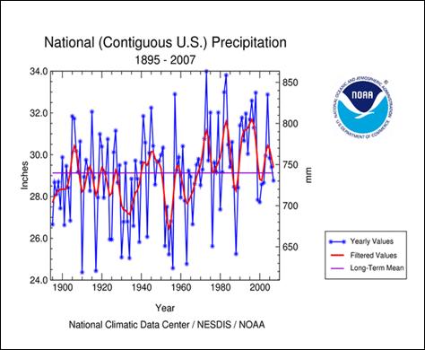
The following figure shows US precipitation for 1895 – 2007.
US Precipitation 1895 – 2007 http://www.ncdc.noaa.gov/img/climate/research/2007/dec/Reg110Dv00Elem01_01122007_pg.gif
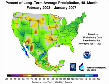
The following figure shows precipitation anomalies for Feb 2003 to Jan 2007.
Precipitation Anomalies [http://www.ncdc.noaa.gov/oa/climate/research/2006/ann/us-summary.html]
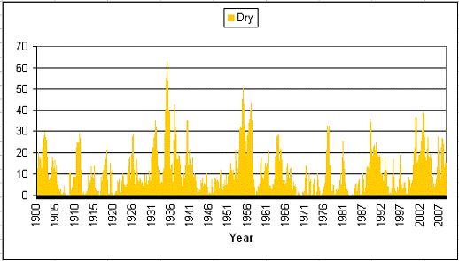
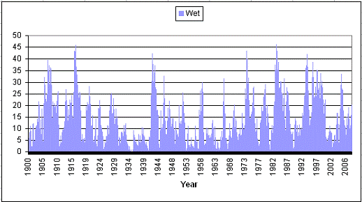
NOAA’s National Climatic Data Center provides historical monthly data on extreme wet and dry conditions in the US: http://www.ncdc.noaa.gov/oa/climate/research/2008/jul/uspctarea-wetdry-svr.txt. Plotting this data shows the following results (1900 to July 2008):
Severe to Extreme Dry (Percent Area)
Severe to Extreme Wet (Percent Area)
A study of extreme drought and precipitation in the US (United States Geological Survey (2004, March 10). Research Links Long Droughts In U.S. To Ocean Temperature Variations) [http://www.sciencedaily.com/releases/2004/03/040310080316.htm] states: “researchers believe that such large and sustained shifts in U.S. precipitation are linked with the natural variability of sea surface temperatures, the mechanisms are not well understood and cannot yet be used to help predict the likelihood of droughts. These sea surface temperature variations are characterized by climatic indices dubbed the Pacific Decadal Oscillation, or PDO, and the Atlantic Multidecadal Oscillation, or AMO. McCabe and his coauthors suggest that large-scale droughts in the United States are likely to be associated with positive AMO -- the kind of warming of sea surface temperatures that occurred over the North Atlantic in the 1930s, 50s, and since 1995.” See www.appinsys.com/GlobalWarming/AMO.htm for more details on the effects of the AMO on the US climate.
A study of past 1930s-type dustbowl droughts (National Oceanic And Atmospheric Administration (1998, December 21). Droughts More Severe Than Dust Bowl Likely) [http://www.sciencedaily.com/releases/1998/12/981221083346.htm] states: “The authors found a greater range of drought variability in the past than found in the instrumental record. Droughts of the 20th century have been only moderately severe and relatively short, compared with droughts of much longer ago. Woodhouse said that paleoclimatic records of the past 400 years strongly indicate that the severe droughts of the 20th century, the 1930s Dust Bowl and the l950s drought, were not unusual events and suggest that we can expect to have droughts of this magnitude once or twice a century.”
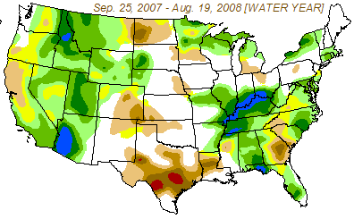
There are always some areas in the US that are experiencing drought or extreme wet, as indicated in the above two figures. The following figure shows the change in drought severity from Sep 2007 to Aug 2008. Drought in southern California and Arizona has lessened, while drought in Texas and Georgia has worsened.
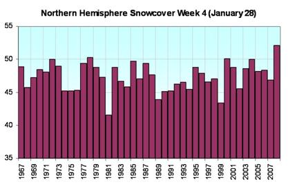
The following figure shows northern hemisphere snow cover for late January from 1967 to 2008.
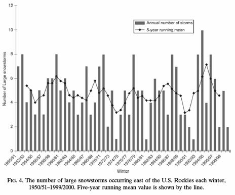
The following figure shows number of large snowstorms for the U.S. east of the Rockies 1950 – 2000, no trend observed (Changnon, D., C. Merinsky, and M. Lawson, 2008. Climatology of surface cyclone tracks associated with large central and eastern U.S. snowstorms, 1950–2000. Monthly Weather Review, 136). [http://ams.allenpress.com/archive/1520-0493/136/8/pdf/i1520-0493-136-8-3193.pdf]
|
||||
|
Extreme Weather
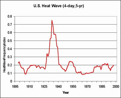
The following figure, from work by Ken Kunkel, shows frequency of heat waves [http://www.worldclimatereport.com/index.php/2006/03/15/an-extreme-view-of-global-warming/]
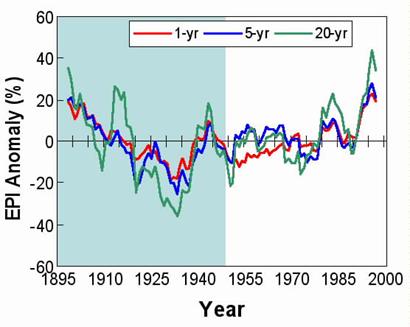
The following figure shows the Extreme Precipitation Index (EPI) values for 1, 5, and 20-year baselines since 1895. (Kunkel et al) [http://www.worldclimatereport.com/index.php/2006/03/15/an-extreme-view-of-global-warming/]
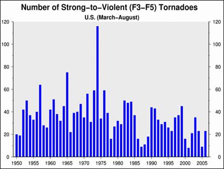
The following figure shows the annual number of strong tornadoes for the period of 1950 to 2006. The number of strong tornadoes has been decreasing since the 1960’s.
Tornadoes in the US 1950 – 2006 [http://www.ncdc.noaa.gov/oa/climate/research/2006/ann/us-summary.html]
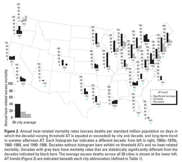
The National Institute of Environmental Health Sciences published the following figure in 2003 (Davis et al, “Changing Heat-Related Mortality in the United States” [http://ehp.niehs.nih.gov/members/2003/6336/6336.html]). The report states: “We calculated the annual excess mortality on days when apparent temperatures--an index that combines air temperature and humidity--exceeded a threshold value for 28 major metropolitan areas in the United States from 1964 through 1998. Heat-related mortality rates declined significantly over time in 19 of the 28 cities. For the 28-city average, there were 41.0 ± 4.8 (mean ± SE) excess heat-related deaths per year (per standard million) in the 1960s and 1970s, 17.3 ± 2.7 in the 1980s, and 10.5 ± 2.0 in the 1990s. In the 1960s and 1970s, almost all study cities exhibited mortality significantly above normal on days with high apparent temperatures. During the 1980s, many cities, particularly those in the typically hot and humid southern United States, experienced no excess mortality. In the 1990s, this effect spread northward across interior cities. … Heat-related mortality has consistently declined on a decadal basis (Figure 2). In 19 of our 28 study cities, total annual heat-related (population-adjusted) mortality was statistically significantly lower in the 1990s than in our 1960s-1970s decade. … In the United States and other countries, mortality is higher in winter than in summer”
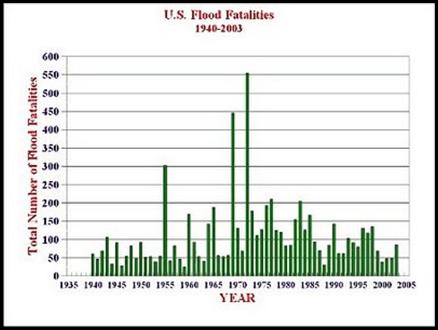
There is also no relationship between global warming and flood deaths.
|
||||
|
Hurricanes
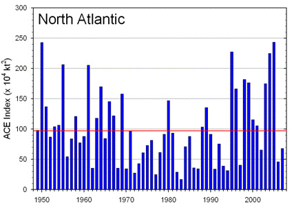
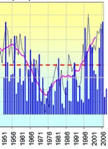
The following figure shows the Accumulated Cyclone Energy (ACE) to 2007 for the North Atlantic basin. The ACE provides a measure of total hurricane intensity over the year.
North Atlantic ACE 1949 - 2007 http://www.ncdc.noaa.gov/oa/climate/research/2007/ann/us-summary.html
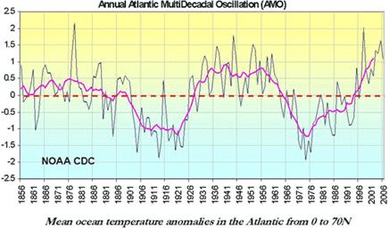
The following figure shows a plot of the Atlantic Multidecadal Oscillation (AMO) (see www.appinsys.com/GlobalWarming/PDO_AMO.htm for details about the AMO), along with the above North Atlantic ACE superimposed on the AMO plot. The correlation is clear.
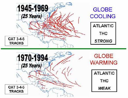
In their 2008 hurricane summary (“Summary of 2008 Atlantic Tropical Cyclone Activity and Verification of Author’s Seasonal and Monthly Forecasts”, Philip J. Klotzbach and William M. Gray, Department of Atmospheric Science Colorado State University, Nov. 2008) [http://tropical.atmos.colostate.edu/Forecasts/2008/nov2008/nov2008.pdf] the authors state: “Despite the global warming of the sea surface that has taken place over the last 3 decades, the global numbers of hurricanes and their intensity have not shown increases in recent years except for the Atlantic. This large increase in Atlantic major hurricanes is primarily a result of the multi-decadal increase in the Atlantic Ocean thermohaline circulation (THC) that is not directly related to global sea surface temperatures or CO2 gas increases. Changes in ocean salinity are believed to be the driving mechanism. These multi-decadal changes have also been termed the Atlantic Multidecadal Oscillation (AMO).”
The following figure is from the above mentioned Klotzback / Gray study and shows tracks of major (Category 3-4-5) hurricanes during the 25-year cooling period of 1945-1969 versus the 25-year warming period of 1970-1994. They state: “CO2 amounts in the later period were approximately 18 percent higher than in the earlier period. Major Atlantic hurricane activity was less than 1/2 as frequent during the latter period despite warmer global temperatures.”
Tracks of major (Category 3-4-5) hurricanes during the 25-year cooling period of 1945-1969 versus the 25-year warming period of 1970-1994
|
||||
|
CO2 Emissions
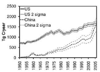
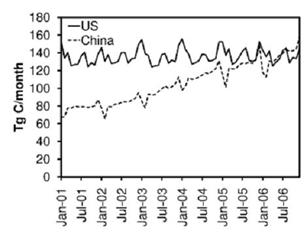
A study published in 2008 reports that China (which was excluded from the Kyoto requirements) became the largest emitter of CO2 from fossil fuel combustion and cement production in 2006. (Gregg, J. S., R. J. Andres, and G. Marland, “China: Emissions pattern of the world leader in CO2 emissions from fossil fuel consumption and cement production”, Geophysical Research Letters 35, 2008) [http://www.agu.org/pubs/crossref/2008/2007GL032887.shtml]. The following figures are from that study. The left-hand figure compares the US annual carbon emissions with China’s since 1950. The right-hand figure compares the monthly carbon for 2001 – 2007. The study states: “the annual emission rate in the US has remained relatively stable between 2001–2006 while the emission rate in China has more than doubled.”
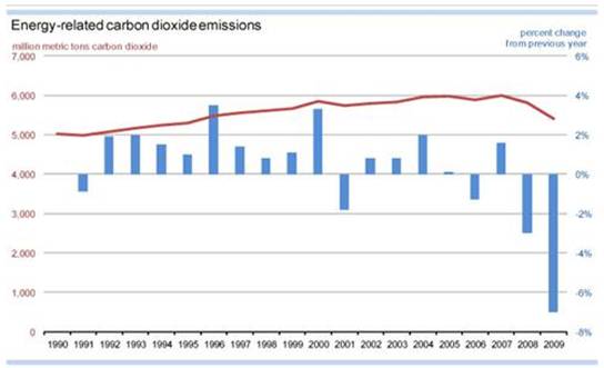
(USA Today, May 6, 2010) – “Energy-related carbon dioxide emissions fell a record 7% last year, due partly to the economic downturn, the U.S. government reported Wednesday. While emissions have fallen in three of the last four years, 2009's drop was the largest since the U.S. Energy Information Administration (EIA) began keeping comprehensive data in 1949. The report comes as the U.S. Senate is gearing up to consider a possible climate bill that would require a reduction in greenhouse gas emissions. … "The large decline in emissions was driven by the economic downturn, combined with an ongoing trend toward a less energy-intensive economy and a decrease in the carbon-intensity of the energy supply," said Richard Newell, head of EIA, a data-analysis section of the Department of Energy. ” [http://content.usatoday.com/communities/greenhouse/post/2010/05/us-carbon-dioxide-emissions-fell-record-7-last-year/1]
The EIA CO2 summary [http://www.eia.doe.gov/oiaf/environment/emissions/carbon/index.html] provides the following figures.
CO2 emissions have fallen in 3 of the last 4 years.
See http://www.appinsys.com/globalwarming/WhiteHouseDeception.htm for more info on emissions.
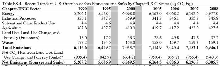
The EPA (2010) also reports that total US GHG emissions for 2008 are below 2000 levels as shown in the following table [http://www.epa.gov/climatechange/emissions/downloads10/US-GHG-Inventory-2010-Chapter-Executive-Summary.pdf]
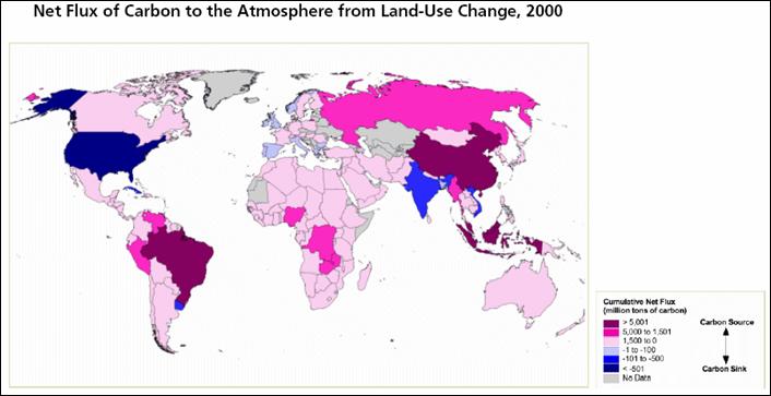
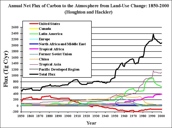
US Is The World’s Leader in Positive Land Use Change
The following figure shows the net flux of carbon to the atmosphere due to land use change (which results mainly due to deforestation for agriculture and fuel-wood in the tropics and reforestation in the US). The United States has the largest land use change carbon sink in the world – i.e. while much of the world is burning its forests, the US is absorbing the carbon from the atmosphere. This figure shows: “Cumulative Emissions of C02 From Land-Use Change measures the total mass of carbon absorbed or emitted into the atmosphere between 1950 and 2000 as a result of man-made land use changes (e.g.- deforestation, shifting cultivation, vegetation re-growth on abandoned croplands and pastures). Positive values indicate a positive net flux ("source") of CO2; for these countries, carbon dioxide has been released into the atmosphere as a result of land-use change. Negative values indicate a negative net flux ("sink") of CO2; in these countries, carbon has been absorbed as a result of the re-growth of previously removed vegetation.” [http://earthtrends.wri.org/pdf_library/maps/co2_landuse.pdf].
The same report also states: “While the majority of global CO2 emissions are from the burning of fossil fuels, roughly a quarter of the carbon entering the atmosphere is from land-use change.”
The following figure shows the effect of land-use change on atmospheric CO2 – the US leads the world in land use emissions reduction [http://cdiac.ornl.gov/trends/landuse/houghton/houghton.html]
Annual Effect of Land-Use Change on Atmospheric CO2
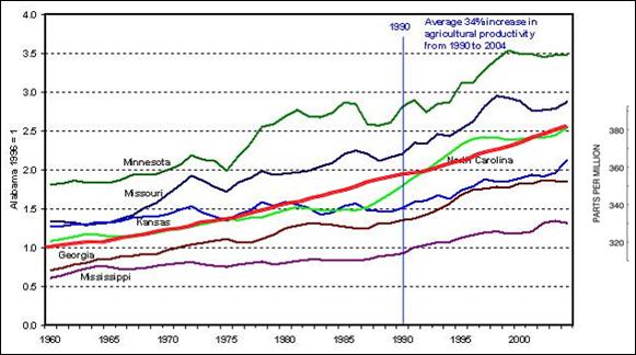
The following figure shows agricultural productivity for several states since 1960 along with atmospheric CO2 (red – scale at right). (Agricultural productivity data from http://icecap.us/images/uploads/STATESPRODUCTIVITY.JPG combined with CO2 graph from http://www.esrl.noaa.gov/gmd/ccgg/trends/co2_data_mlo.html).
|
||||
|
|


 :
: