Global Warming Science - www.appinsys.com/GlobalWarming
Antarctic Sea Ice – Wilkins Ice Shelf
[last update: 2009/04/18]
|
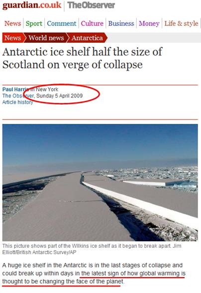
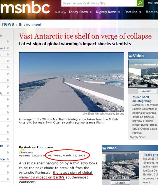
The annual media portrayal of the Wilkins Ice Shelf in Antarctica has become a predictable event. The following screen captures show the “latest sign of global warming’s impact” from the Guardian and MSNBC. Notice that these reports are from two different years. |
|
Guardian - April 5, 2009 |
MSNBC – March 25, 2008 |
|
|
|
|
http://www.guardian.co.uk/world/2009/apr/05/ice-shelf-wilkins-antarctic |
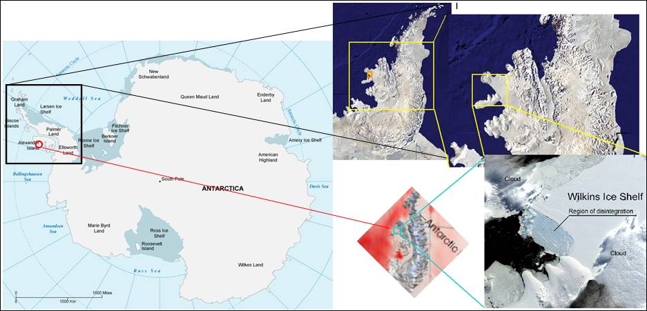
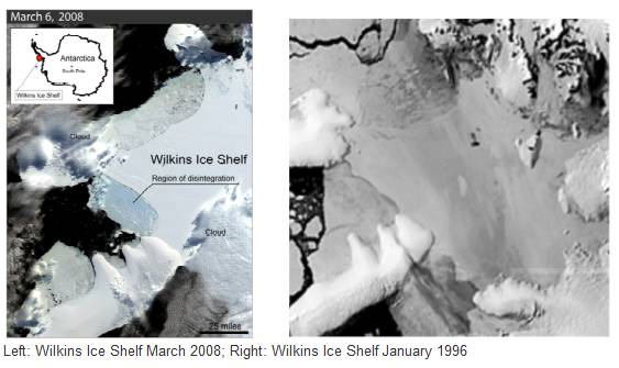
Here is where the Wilkins ice shelf is located:
|
The MSNBC 2008 article reports on a NSIDC article which states: “NSIDC Lead Scientist Ted Scambos, who first spotted the disintegration in March, said, "We believe the Wilkins has been in place for at least a few hundred years. But warm air and exposure to ocean waves are causing a break-up."
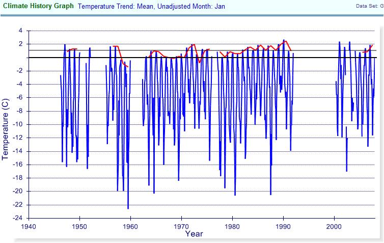
The closest station to the Wilkins Ice Shelf in the NOAA Global Historical Climate Network database is Rothera Point. The following figure shows the historical data for Rothera Point, with monthly temperatures in blue and the annual January temperature in red. Summer (Dec – Mar) temperatures have not increased – the 2000s January temperatures are similar to the 1940s (the oldest data available). So why does Scambos blame it on air temperatures?
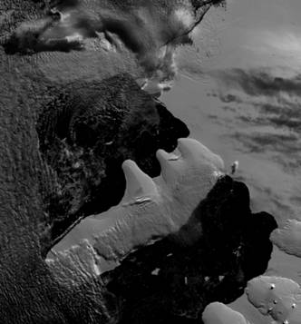
Ted Scambos said something similar in 1999: “On the southwest side of the peninsula, the Wilkins ice shelf retreated nearly 1,100 square kilometers in early March of last year [1998], said Scambos. … Within a few years, much of the Wilkins ice shelf will likely be gone” [http://www.heatisonline.org/contentserver/objecthandlers/index.cfm?ID=3209&Method=Full&PageCall=&Title=Antarctic%20Ice%20Shelf%20Break-Up%20Accelerates&Cache=False]. But, as can be seen from the following January 1996 and March 2008 images, there has been hardly any change in a decade. The ice shelf goes through its annual
|
|
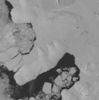
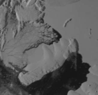
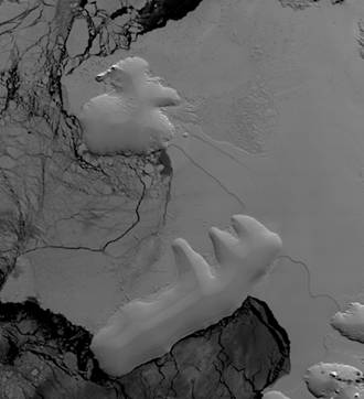
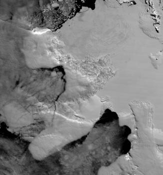
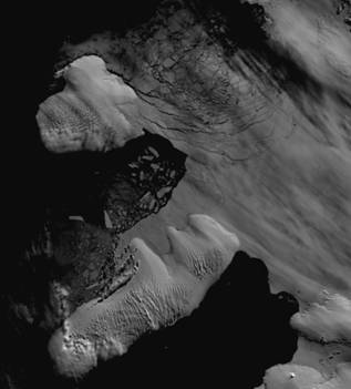
As the following historical satellite images of the Wilkins Ice Shelf show, the disintegration / re-growth is an annual event (left - after winter ice re-growth season; right – after summer melt season).
|
|
|
December 1993
|
February 1994 – disintegration
|
|
October 2003 – it grew back again
|
March 2004 – it disintegrated once again
|
|
November 2008 – it grew back again
|
February 2009 – it disintegrated once again
|
(Above images from NSIDC: [http://nsidc.org/data/iceshelves_images/wilkins.html])
|
Sea ice extent for the end of the 2009 melt season in Antarctica
|
The trend is that Antarctic sea ice is increasing over the last 30 years
|
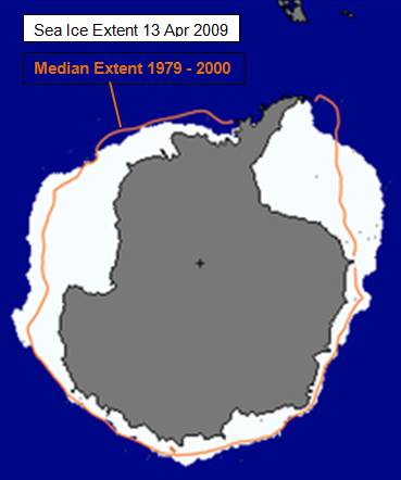
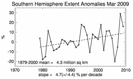
(Above figures from the National Snow and Ice Data Center [http://nsidc.org/data/seaice_index/], April 14, 2009.)
|
|
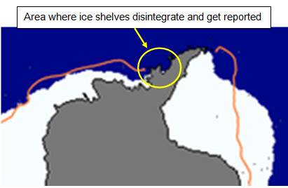
This figure shows the area where ice shelves disintegrate and get reported in the media. What does not get reported is that many of these ice shelves disintegrate periodically. The size gets reported without keeping it in proportion to what is actually happening – areas of larger than usual ice growth. Notice that the area where the shelves disintegrate does not even have an orange line representing the median of the 1979-2000 ice extent in the area. This is because it is not unusual for the ice to melt in this area. |
|
(figure from [http://www.scar.org/information/elnino/El_Nino.pdf]) |
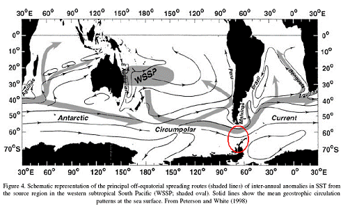
The Antarctic Peninsula ice shelves disintegrate not from warm air temperatures, but from beneath - from warmer sea water. The reason that the Antarctic Peninsula frequently has disintegrating ice shelves is because this is the area where the warmer South Pacific currents hit the Antarctic Peninsula.
|
|
In the media reports shown at the start of this document, the recycled picture shows shear failure of the ice slabs indicating that it is not caused by melting due to warming in the air – the weakness of the ice shelf structure is from thinning ice due to warmer local sea temperatures below. |
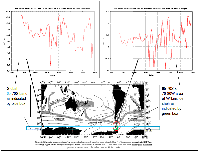
Sea surface temperatures (SST): The following figures show annual Jan-Feb-Mar average SST
|
(graphs from: [http://www.cdc.noaa.gov/cgi-bin/data/timeseries/timeseries1.pl]) |
|
The above figures show that while the J-F-M ocean temperatures in the global 65-70S band have been on a general cooling trend, the opposite is true for the area of the ice shelves – where the ocean temperatures have been warming where the south Pacific water encounters the peninsula. |
|
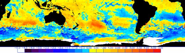
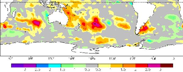
The following figures show SST for early February 2004 (top) and SST anomalies for the same period (bottom). The effect of the western subtropical south Pacific warm pool and current illustrated above can be seen in these images below. (Wilkins Ice Shelf for March 2004 shown previously.)
(from [http://www.osdpd.noaa.gov/PSB/EPS/SST/climo.html])
(from [http://www.ncdc.noaa.gov/oa/climate/research/sst/weekly-sst.php]) |
|
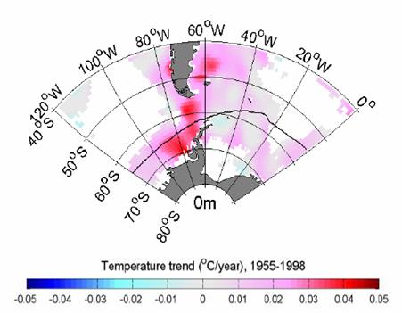
The following figure shows the sea surface temperature trend for 1955 to 1998 showing how the Antarctic Peninsula area has warmed significantly compared with the surrounding area. [http://www.ocean-partners.org/documents/Cooper%202007%20lecture.pdf]
|
For more details see:
Antarctica: http://www.appinsys.com/GlobalWarming/RS_Antarctica.htm
Antarctic Peninsula: http://www.appinsys.com/GlobalWarming/RS_AntarcticPeninsula.htm