Global Warming Science - www.appinsys.com/GlobalWarming
Hawaii
[last update: 2011/11/07]
|
Temperature
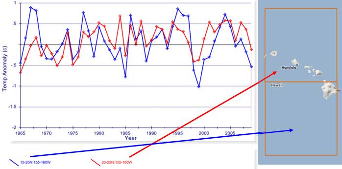
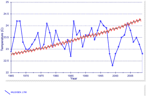
The following figure shows the annual average temperature anomalies from the Hadley CRUTEM3 database for the two 5x5 degree grids covering most of the islands in the State of Hawaii, for 1965 through 2009 (plotted at http://www.appinsys.com/GlobalWarming/climate.aspx).
The IPCC shows in AR4 that warming prior to 1970 is explained by natural causes, while warming after that requires anthropogenic CO2 in the models. (See http://www.appinsys.com/GlobalWarming/SeekingWarming.htm for details). In Hawaii there has been no warming in the anthropogenic global warming era.
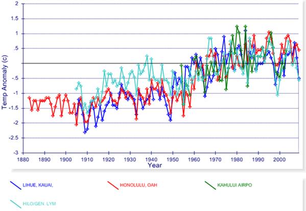
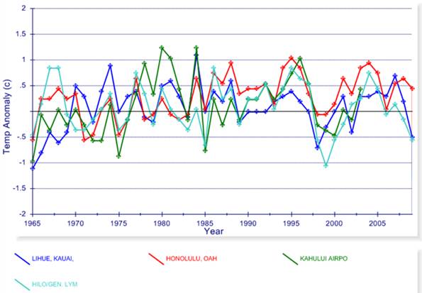
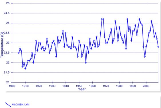
The following figure shows the annual mean temperature anomalies for all four of the long-term stations in Hawaii in the NOAA Global Historical Climate Network database. There was warming mainly during the 1950 – 1965 (when the world was cooling on average) and then the warming stopped. Since 1965 there has been no warming as shown in the next figure.
|
|
National Park Service: “Tilting at Windmills”
The NPS is trying to reduce CO2 emissions at Hawaii Volcanoes National Park on the island of Hawaii. Given that the volcano constantly emits at least 8,000 tonnes of CO2 per day, this is “tilting at windmills”.
“In 2006, Hawaii Volcanoes NP's GHG emissions totaled 5,971 metric tons of carbon equivalent (MTCE). … the largest source of Hawaii Volcanoes NP's emissions is Mobile Combustion - totaling 4,372 MTCE.”
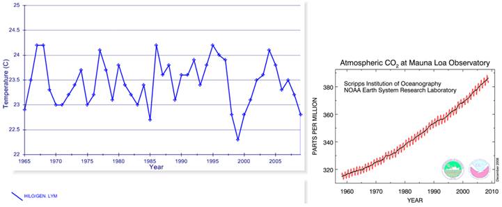
The following figure (left) shows the annual average temperature at Hilo (the closest station in the GHCN to Volcanoes National Park) for the last 45 years. [http://www.appinsys.com/GlobalWarming/climgraph.aspx?pltparms=GHCNT100AJanDecI188020090900110AR42591285000x] With no warming occurring during the anthropogenic global warming era, it is difficult to understand what warming the NPS is trying to stop.
Hilo is also the closest station to the Mauna Loa observatory, where the longest continuous record of CO2 measurements is from, starting in 1958 (as shown in the figure above right – from http://www.esrl.noaa.gov/gmd/ccgg/trends/co2_data_mlo.html). The next figure combines above two. Although CO2 has continued to increase, the effects are no warming in Hawaii.
According to the USGS, “studies here at Kilauea show that the eruption discharges between 8,000 and 30,000 metric tonnes of CO2 into the atmosphere each day.” [http://hvo.wr.usgs.gov/volcanowatch/2007/07_02_15.html]
Their emission reduction goal (as stated in the NPS report cited above): “Reduce Transportation Emissions by 12.5% below 2006 levels by 2012.”
At 8,000 tonnes per day versus the visitors’ cars’ 4,700 tonnes per year, the volcano beats cars by a factor of more than 660. Eliminating all cars would reduce the Park’s emissions by 0.15 %.
But they will spend tax dollars to “implement a safe biking program to reduce visitor vehicle miles traveled, develop a marketing campaign to increase bus ridership, provide two hydrogen shuttle buses…” etc. (The park consists mainly of fairly steep roads, so replacing cars with bikes is just wishful thinking.)
|
|
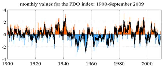
Pacific Decadal Oscillation (PDO)
The following figure shows the Pacific Decadal Oscillation (PDO) from [http://jisao.washington.edu/pdo/] (See: http://www.appinsys.com/GlobalWarming/PDO.htm for more info on the PDO.)
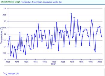
The following figure shows the complete Hilo average annual temperature record.
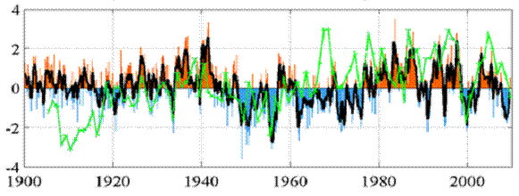
The following figure shows the annual mean temperature for Hilo (from above – changed to green) superimposed on the PDO. The temperature shows a strong correlation with the PDO since 1920.
The above figure shows a significant discrepancy in 1967-68, which is examined below.
|
|
Volcano Effects
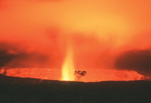
What happened in 1967 to cause the Hilo temperature discrepancy shown above? The following figure shows the eruption of Halema`uma`u in the Kilauea caldera [http://pubs.usgs.gov/ds/2007/293/site/night-halemaumau.html]. “Since the 1924 explosive eruption, Halema`uma`u has been gradually filling with lava from numerous short-lived eruptions. The longest of these eruptions lasted about eight months from 1967-1968. It was the longest-lived lava lake at Halema`uma`u since 1919. It is also the most recent year that a long-lived lava lake has occupied Halema`uma`u.” [http://www.fireworkstudios.com/erupt.html].
It appears that the formation and then sudden release of this lava lake cause the 1967-68 warming. The Hilo temperature is governed by the sea surface temperatures (SST) and the release of this lava into the ocean over the 1967-68 period caused the ocean to warm locally.
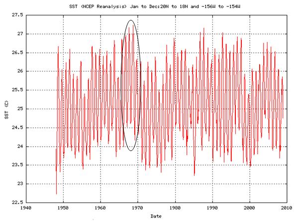
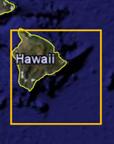
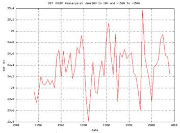
The following figure shows the monthly SST for the 2x2 degree grid shown below-right from the NOAA SST database [http://www.cdc.noaa.gov/cgi-bin/data/timeseries/timeseries1.pl]. The 1967-68 warm anomaly is noticeable.
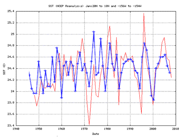
The following figures show the annual mean January SST (left) and annual mean January temperature at Hilo (right). The next figure below compares these two. This shows a very strong correlation between SST and Hilo air temperatures for January. The 1967-68 anomaly is not distinct in the January temperatures.
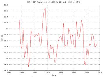
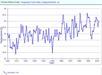
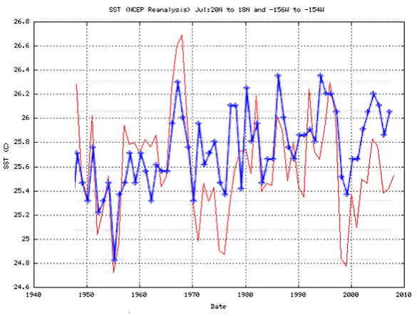
The following figures show the annual mean July SST (left) and annual mean July temperature at Hilo (right). The next figure below compares these two. This shows a very strong correlation between SST and Hilo air temperatures for July, with a slight divergence after 1997. The 1967-68 temperature anomaly is very distinct in the July temperatures.
|
|
Sea Level
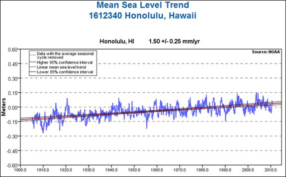
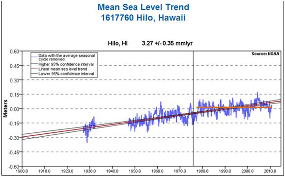
The following figures show sea level history from the NOAA sea level data site [http://tidesandcurrents.noaa.gov/sltrends/index.shtml] for Honolulu (top) and Hilo (bottom).
Sea level at Hilo has been virtually unchanged since the late 1970s (as indicated by the orange line on the Hilo graph above).
A 2005 study (Caccamise, D. J., II, M. A. Merrifield, M. Bevis, J. Foster, Y. L. Firing, M. S. Schenewerk, F. W. Taylor, and D. A. Thomas (2005), “Sea level rise at Honolulu and Hilo, Hawaii: GPS estimates of differential land motion”, Geophysical Research Letters 32. [http://www.agu.org/pubs/crossref/2005/2004GL021380.shtml]) states: “In the past 30 years, there has been a statistically significant reduction in the relative sea level trend. While it is possible that the rates of land motion have changed over this time period, the available hydrographic data suggest that interdecadal variations in upper ocean temperature account for much of the differential sea level signal between the two stations, including the recent trend change. These results highlight the challenges involved in estimating secular sea level trends in the presence of significant low frequency variability.”
The following figure shows the annual sea level for Hilo (changed to green) superimposed on the PDO. The sea level also shows a strong correlation with the PDO for the last 60 years.
|
|
Solar Effects
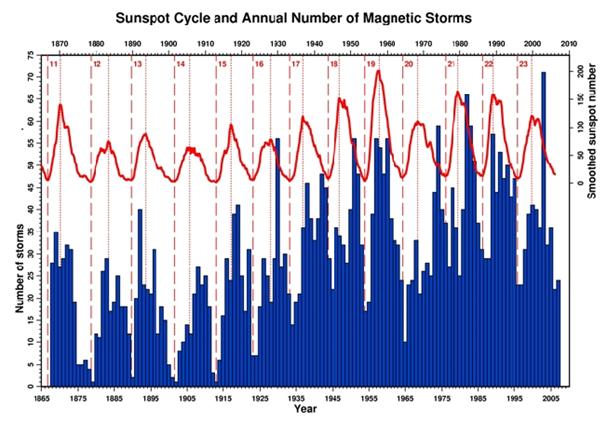
The following figure shows the sunspot cycle and annual number of solar magnetic storms (from http://www.geomag.bgs.ac.uk/earthmag.html which states: “The annual number of magnetic storms is represented by each bar of the histogram. Superimposed is the smoothed sunspot number. The dashed lines indicate solar minima and the dotted lines indicate solar maxima. Note the correlation of magnetic activity with solar activity and the apparent increase in magnetic activity with time.”).
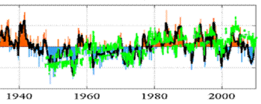
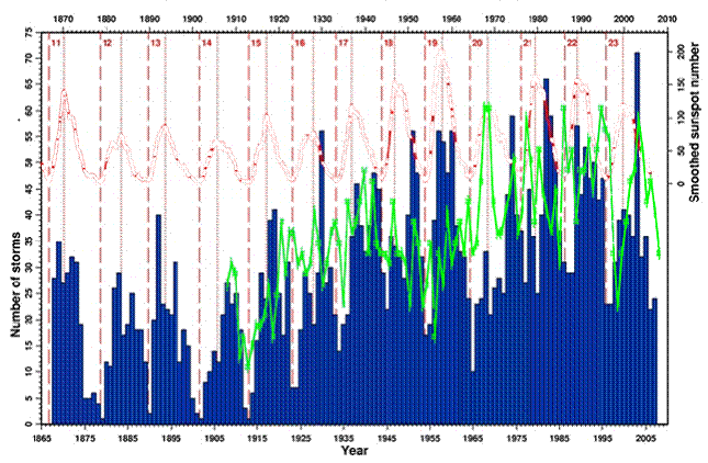
The following figure superimposes the Hilo annual mean temperature anomalies shown previously (changed to green) on the magnetic storm histogram. There is a strong correspondence, although other factors are clearly involved.
|
|
|