Global Warming Science - www.appinsys.com/GlobalWarming
The Sixty-Year Climate Cycle
[last update: 2012/10/10]
|
Cycles are apparent in climate data. This document examines the appearance of the approximately 60-year cycle that shows up in many areas. This cycle length is not exactly 60 years and varies by a few years between various climatic phenomena and locations.
Climate models do not account for this cycle.
[update 2012/10/10: Sea Level section added] [update 2012/01/09: Solar System section expanded] [update 2011/03/03: ITCZ section added, other sections expanded] [update 2011/01/01: “Morelet Wavelet” added to Global Temperature section, other sections expanded] [update 2010/06/05: “El Nino” section added] [update 2010/06/04: “Solar System Influence” section added] [original document: 2010/02/21]
|
|
Global Temperature Anomalies
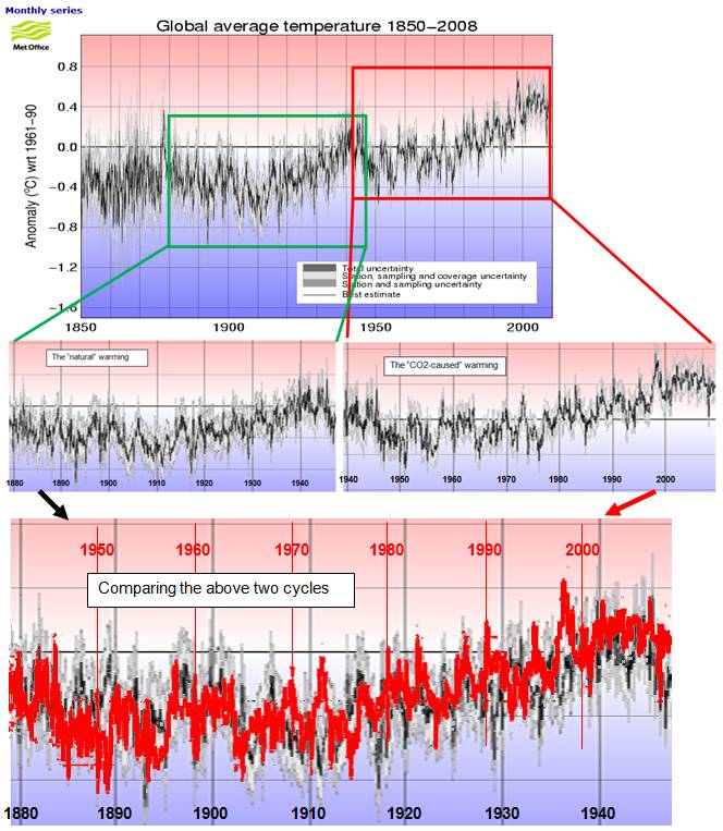
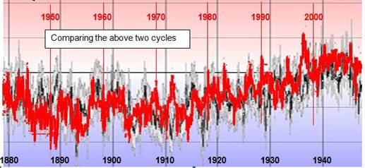
The following shows the Climatic Research Unit global average temperature anomalies (the IPCC uses data provided by HadCRU – plot from: [http://hadobs.metoffice.com/hadcrut3/diagnostics/global/nh+sh/]). Two cycles have been highlighted in rectangles (not peak-to-peak). The final part of the figure shows the cycle from the second rectangle, changed to red and superimposed on the first cycle (vertically shifted by 0.3 degrees).
As can be seen from the above figures, the two cycles were nearly identical, and yet the IPCC says the models can explain the early 1900s cycle with only natural forcings, but anthropogenic CO2 is needed for the later cycle. There appears to be a serious problem with the models when two identical cycles have two very different causes.
The cycle length is approximately 62 years, with maxima around 1879, 1942 and 2002, and minima around 1910 and 1972.
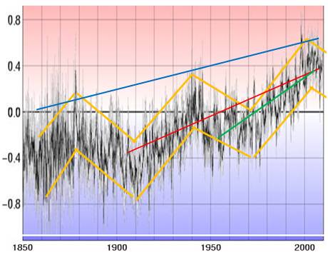
When the claim is made that the Earth has warmed 0.74 degrees from 1906 – 2005 (IPCC AR4 [http://www.ipcc.ch/pdf/assessment-report/ar4/syr/ar4_syr_spm.pdf]), they are spuriously ignoring the 60-year cycle and arbitrarily choosing a start and end for a linear trend within a non-linear cycle. The red line on the figure below shows the 0.74 degrees per century. The linear warming trend shown when accounting for the cycle is actually about 0.4 degrees per century as shown by the blue line on the figure below.
The IPCC also claims in the same AR4 summary document that “The linear warming trend over the last 50 years (0.13 [0.10 to 0.16]°C per decade) is nearly twice that for the last 100 years.” This is shown by the green line on the figure above. They call this “acceleration” of the warming trend, completely ignoring that a linear trend cannot be calculated arbitrarily in cyclical data.
The IPCC is either stupid, or trying to deceive by obfuscating the statistics (the latter is more likely).
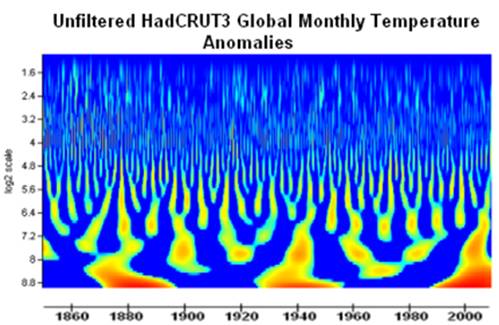
Morelet Wavelet Analysis
The following figure is from a study by Basil Copeland and Anthony Watts, showing a Morelet wavelet analysis of the HadCRUT3 global temperature anomalies [http://wattsupwiththat.com/2009/05/23/evidence-of-a-lunisolar-influence-on-decadal-and-bidecadal-oscillations-in-globally-averaged-temperature-trends/] The ~62-year cycle is clearly visible.
Zhen-Shan and Xian (“Multi-scale analysis of global temperature changes and trend of a drop in temperature in the next 20 years”, Meteorology and Atmospheric Physics, Vol.95, 2007 [http://www.springerlink.com/content/g28u12g2617j5021/]): “A novel multi-timescale analysis method, Empirical Mode Decomposition (EMD), is used to diagnose the variation of the annual mean temperature data of the global, Northern Hemisphere (NH) and China from 1881 to 2002. The results show that: (1) Temperature can be completely decomposed into four timescales quasi-periodic oscillations including an ENSO-like mode, a 6–8-year signal, a 20-year signal and a 60-year signal, as well as a trend. With each contributing ration of the quasi-periodicity discussed, the trend and the 60-year timescale oscillation of temperature variation are the most prominent.”
|
|
Atlantic Multidecadal Oscillation (AMO)
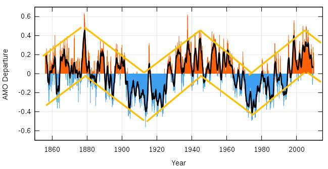
The following figure shows the AMO anomalies from 1850 to 2009 [http://en.wikipedia.org/wiki/File:Amo_timeseries_1856-present.svg].
The cycle length is approximately 62 years with maxima around 1878, 1943 and 2004, and minima around 1912 and 1974.
The AMO cycle is very close to the global temperature cycle in terms of cycle length and occurrence of maxima / minima.
Knudsen et al (“Tracking the Atlantic Multidecadal Oscillation through the last 8,000 years”, Nature Communications, 2011, [http://www.nature.com/ncomms/journal/v2/n2/full/ncomms1186.html]): “The nature and origin of the AMO is uncertain, and it remains unknown whether it represents a persistent periodic driver in the climate system, or merely a transient feature. Here, we show that distinct, ~55- to 70-year oscillations characterized the North Atlantic ocean-atmosphere variability over the past 8,000 years. We test and reject the hypothesis that this climate oscillation was directly forced by periodic changes in solar activity. We therefore conjecture that a quasi-persistent ~55- to 70-year AMO, linked to internal ocean-atmosphere variability, existed during large parts of the Holocene. Our analyses further suggest that the coupling from the AMO to regional climate conditions was modulated by orbitally induced shifts in large-scale ocean-atmosphere circulation.”
|
|
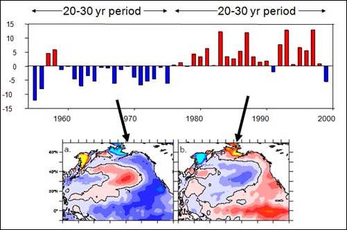
Pacific Decadal Oscillation (PDO)
The following figure is from a NOAA study of the impact of the PDO variability on the California Current ecosystem and shows the approximately 60-year cycle of the PDO and the corresponding northern Pacific Ocean temperature regimes [www.nwr.noaa.gov/Salmon-Hydropower/Columbia-Snake-Basin/upload/Briefings_3_08.ppt]
|
|
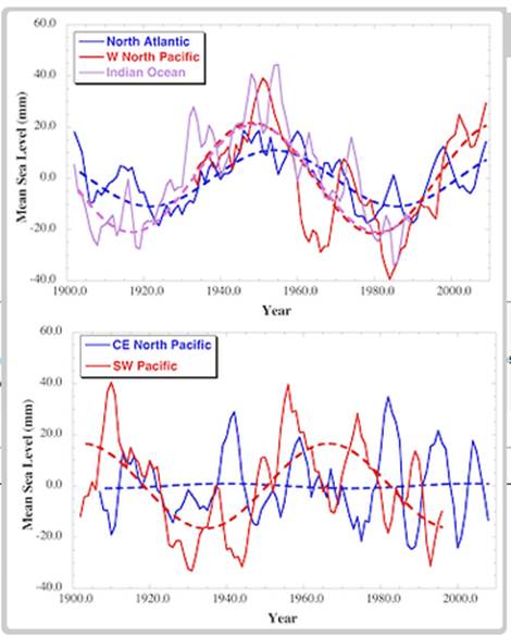
Sea Level
A 2012 paper (Chambers et al, “Is there a 60-year oscillation in global mean sea level?”, Geophysical Research Letters Vol 39 [http://www.agu.org/pubs/crossref/2012/2012GL052885.shtml] ) states: “We examine long tide gauge records in every ocean basin to examine whether a quasi 60-year oscillation observed in global mean sea level (GMSL) reconstructions reflects a true global oscillation, or an artifact associated with a small number of gauges. We find that there is a significant oscillation with a period around 60-years in the majority of the tide gauges examined during the 20th Century, and that it appears in every ocean basin. Averaging of tide gauges over regions shows that the phase and amplitude of the fluctuations are similar in the North Atlantic, western North Pacific, and Indian Oceans, while the signal is shifted by 10 years in the western South Pacific. The only sampled region with no apparent 60-year fluctuation is the Central/Eastern North Pacific. The phase of the 60-year oscillation found in the tide gauge records is such that sea level in the North Atlantic, western North Pacific, Indian Ocean, and western South Pacific has been increasing since 1985–1990. Although the tide gauge data are still too limited, both in time and space, to determine conclusively that there is a 60-year oscillation in GMSL, the possibility should be considered when attempting to interpret the acceleration in the rate of global and regional mean sea level rise.” The following figure from that paper shows the approximately 60-year cycle in the sea level data.
|
|
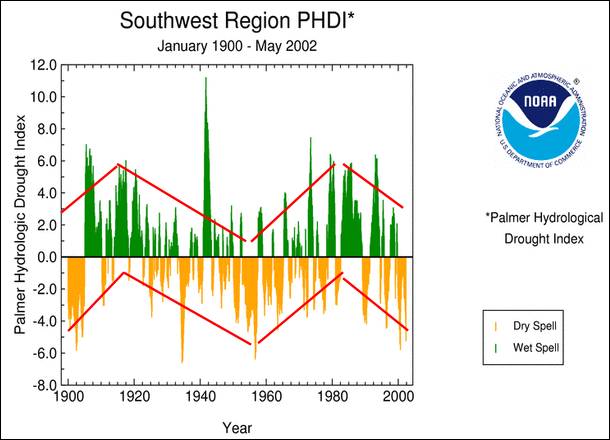
Southwest US Drought Cycle
The following figure shows the southwest United States drought index 1900 - 2002 [http://www.ncdc.noaa.gov/img/climate/research/2002/may/Reg107Dv00_palm06_01000502_pg.gif]
The cycle length is approximately 64 years, with maxima (wet) around 1918 and 1982 and a minimum (drought) in 1955.
The southwest US PHDI has about a 5 year lag from the AMO.
|
|
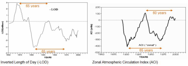
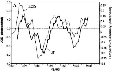
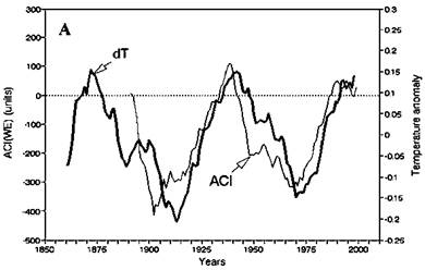
Length of Day / Atmospheric Circulation Index
A UN Food and Agricultural Organization (FAO) report on “Climate Change and Long-Term Fluctuation of Commercial Catches”, 2001 [ftp://ftp.fao.org/docrep/fao/005/y2787e/y2787e01.pdf] provides the following figures showing length of day (LOD) inverted (left) and the Zonal Atmospheric Circulation Index (right). Both exhibit an approximately 60-year cycle.
The FAO report stated: “Spectral analysis of the time series of dT, ACI and Length Of Day (LOD) estimated from direct observations (110-150 years) showed a clear 55-65 year periodicity. Spectral analysis of the reconstructed time series of the air surface temperatures for the last 1500 years suggested the similar (55-60 year) periodicity. Analysis of 1600 years long reconstructed time series of sardine and anchovy biomass in Californian upwelling also revealed a regular 50-70 years fluctuation. Spectral analysis of the catch statistics of main commercial species for the last 50-100 years also showed cyclical fluctuations of about 55-years.” The following figures are from that report and are also viewable at: [http://www.fao.org/docrep/005/Y2787E/y2787e03a.htm]
The following figures compare detrended LOD and ACI with detrended global temperature anomaly (from same FAO study).
The FAO report states the LOD is “a geophysical index that characterizes variation in the earth rotational velocity … Spectral density analysis of the LOD time series for 1850-1998 revealed clear, regular fluctuations with an approximate 60-year period length”
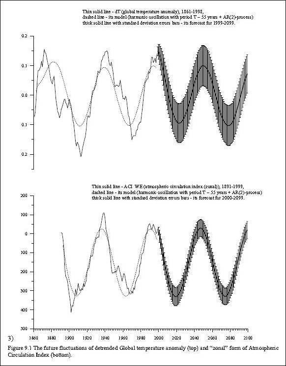
The FAO study found that fish catches vary according to these cycles and developed a model (shown below) to predict future fluctuations [http://www.fao.org/DOCREP/005/Y2787E/y2787e0aa.htm#FigureA]
See also: http://www.appinsys.com/GlobalWarming/FishCycles.htm
Klyashtorin et al (“Cyclic changes of climate and major commercial stocks of the Barents Sea”, Marine Biology Research, Vol.5, 2009 [http://www.informaworld.com/smpp/content~db=all~content=a907041648#]): “Spectral analysis of 100-year time series of Arctic surface temperature (Arctic dT), mean temperature of 200-m water column along the Kola meridian and global surface temperature anomaly (Global dT) was performed. It is shown that climatic indices of the Arctic region undergo long-term 50-70-year fluctuations similar to fluctuations of Global dT and Arctic dT for the last 1500-year reconstructed period and the recent 140 years of instrumental measurements. Long-term changes of Atlantic spring-spawning herring and Northeast Arctic cod commercial stocks also show 50-70-year fluctuations that are synchronous with the fluctuations of climatic indices.”
|
|
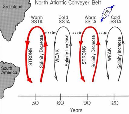
ThermoHaline Circulation (THC)
William Gray, the foremost hurricane expert and Professor of Atmospheric Science at Colorado State University published the following figure showing a 60-year cycle in the North Atlantic thermohaline circulation (W. M. Gray, 2009: Climate change: Driven by the ocean – not humans. The Steamboat Institute Conference, Steamboat Springs, Colorado, August 29, 2009. [http://tropical.atmos.colostate.edu/Includes/Documents/Presentations/graysteamboat2009.ppt])
This may be related also to the AMO.
|
|
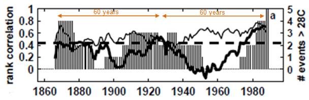
El Nino
The following figure shows “21-year sliding window correlation between Nino3AM and CPI AM (thick solid line), and between Jan-Feb TA cross-equatorial SSTA gradient and CPI AM (thin solid line). The sign of the first correlation is reversed. The dashed line is the 5% (2 sided) significance level based on the Student's t distribution (N-2 degrees of freedom) for the null hypothesis of no association. Bars are the number of Nino3AM events above 28oC in a 21 year sliding window (y axis values to the right).” [http://shadow.eas.gatech.edu/~kcobb/seminar/chiang00.pdf] Nino3AM is the Nino 3 region index April-May and CPI is a precipitation index related to Brazil rainfall. The correlation between these two (thick line) shows a 60 year cycle, as does the number of Nino 3 AM events above 28 degrees in a 21-year sliding window (vertical bars).
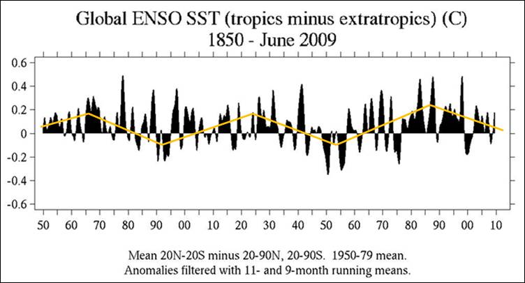
The following figure shows the global ENSO sea surface temperature for 1850 – 2009 with orange lines added to highlight the approximately 60-year cycle [http://www.jisao.washington.edu/data/globalsstenso/]
|
|
InterTropical Convergence Zone (ITCZ)
I was reading Ronald Wright’s book “Time among the Maya”, published in 1989. Wright arrived in Flores on the island in Lake Peten Itza and the proprietor told him about the fluctuating lake level: “Look at those poor fools! People come here and they don’t listen to the older folk. We Peteneros – we know the lake has a cycle every fifty years or so.”
The Hillesheim et al paper “Climate change in lowland Central America during the late deglacial and early Holocene” (Journal of Quaternary Science, 2005 [http://snre.ufl.edu/graduate/files/publicationsbyalumni/Hillesheim,%20Buck%20et%20al%202005.pdf]): “the observed changes in lowland Neotropical precipitation were related to the intensity of the annual cycle and associated displacements in the mean latitudinal position of the Intertropical Convergence Zone … Lake Pete´n Itza´ is a terminal basin fed by precipitation, subsurface groundwater inflow, and a small input stream in the southeast. The basin is effectively closed, lacking any surface outlets, although some downward leakage may occur. Lake Pete´n Itza´ is situated in a climatically sensitive region where the amount of rainfall is related to the seasonal migration of the Intertropical Convergence Zone (ITCZ) and Azores–Bermuda high-pressure System. Lake Pete´n Itza´’s volume is sensitive to precipitation changes and has fluctuated markedly in the recent past. For example, mean annual rainfall during the period from 1934 to 1942 was relatively high (2055mm/yr) and resulted in increased lake levels and flooding (Deevey et al., 1980). In contrast, the early to mid-1970s were relatively dry (mean annual rainfall 1415mm/yr) resulting in lower lake levels. During the late 1970s lake level rose again in response to increased precipitation continuing until the early 1990s at which time the trend reversed.” This is an approximately 60-year cycle.
This is implied by Knudsen et al (“Tracking the Atlantic Multidecadal Oscillation through the last 8,000 years”, Nature Communications, 2011, [http://www.nature.com/ncomms/journal/v2/n2/full/ncomms1186.html]): “these sites [in central America] seem to have become more sensitive to changes in ITCZ, and hence the AMO, as even slight changes in North Atlantic SST can cause N-S shifts in the ITCZ and thus in rainfall.” Since the AMO is on a 60-year cycle, the ITCZ also varies on a similar cycle.
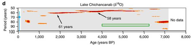
The following figure is from Figure 5 in Knudsen et al showing the spectrogram highlighting the 58-61 year periodicity in the Lake Chichancanab data in the Yucatan.
|
|
Climate Models
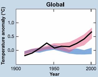
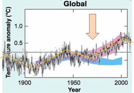
The following figure (left) shows climate model outputs from the IPCC 2007 AR4 Figure SPM-4 [http://www.ipcc.ch/pdf/assessment-report/ar4/syr/ar4_syr_spm.pdf]) In this figure, the blue shaded bands show the result of 19 simulations from 5 climate models using only the natural forcings. Red shaded bands show the result of 58 simulations from 14 climate models including anthropogenic CO2.
The following figure (right) shows the Hadley / Met Office data shown at the start of this document, superimposed on the models. (The zero location is different since the model plot is based on a 1901-1950 average whereas the Hadley plot is based on a 1961-1990 average.)
The above figures show the following:
The following figure compares the two recent 60-year cycles (shown previously near the start of this document). There appears to be a serious problem with the models when two identical cycles have two very different stated causes – one natural, the other CO2-induced.
If the climate models cannot reproduce the 60-year cycle that is evident in many climate phenomena, there is clearly a fundamental problem with the models.
|
|
Solar System Influence
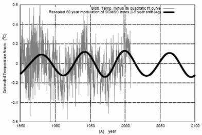
Nicola Scafetta has identified the change in the location of the center of mass of the solar system (CMSS) as a possible mechanism driving the 60-year cycle. (Scafetta, N., “Empirical evidence for a celestial origin of the climate oscillations and its implications”, Journal of Atmospheric and Solar-Terrestrial Physics (2010), doi:10.1016/j.jastp.2010.04.015 [http://arxiv.org/PS_cache/arxiv/pdf/1005/1005.4639v1.pdf])
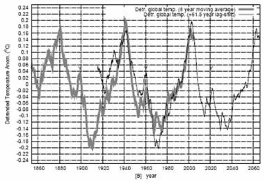
Scafetta shows the following figures described as: “[A- (left)] Rescaled SCMSS 60 year cycle (black curve) against the global surface temperature record (grey) detrended of its quadratic fit; [B- (right)] Eight year moving average of the global temperature detrended of its quadratic fit and plotted against itself shifted by 61.5 years. Note the perfect correspondence between the 1880-1940 and 1940-2000 periods. Also a smaller cycle, whose peaks are indicated by the letter “Y”, is clearly visible in the two records. This smaller cycle is mostly related to the 30-year modulation of the temperature. These results reveal the natural origin of a large 60-year modulation in the temperature records.” (SCMSS – Speed of the CMSS)
(Note: The term “barycenter” refers to the center of gravity of a system, which would be the same as the center of mass in a uniform gravitational field, and thus the two terms are often interchanged.)
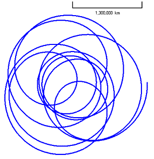
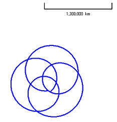
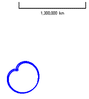
As the planets orbit around the sun, the sun’s position also changes as the whole solar system orbits around the CMSS, whose position changes as the relative positions of the planets change. The planets / sun influence this based on their relative mass. The following figure (left) show a gravity simulation of the solar system barycenter position. The center figure shows the hypothetical barycenter movement with Jupiter removed from the system showing that Jupiter causes most of the wobble. The right-hand figure then removes Saturn. Once Neptune is removed the effect of the remaining planets is barely noticeable (not shown below). [http://www.orbitsimulator.com/gravity/articles/ssbarycenter.html]
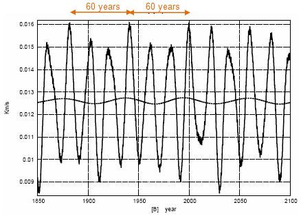
Jupiter has the largest mass of any planet and thus is the most influential. The Wolf cycle (solar sunspot cycle) has a period that fluctuates but averages 11.2 years. Jupiter’s solar orbital cycle is 11.9 Earth years. Saturn, the second-largest planet, has a solar orbital cycle of 29.4 Earth years. This leads to Jupiter-Saturn conjunction every 19.9 years (J/S Synodic Cycle). (As a coincidence, in the Maya calendar 1 Katun = 19.7 years.) A full cycle of Jupiter / Saturn around the sun (J/S Tri-Synodic Cycle) is 59.6 years – in other words it takes 60 (59.6) years for the Earth / Jupiter / Saturn reach the same relative alignment around the sun.
The following figure shows the speed of the Sun relative to the CMSS showing “20 and 60 year oscillations”. (From the Scafetta paper referenced above.) It shows a 60-year cycle with peaks similar to the global average temperatures shown at the start of this document – around 1880, 1940 and 2000.
See also: http://arxiv.org/ftp/arxiv/papers/1005/1005.5303.pdf
A shared frequency set between the historical mid-latitude aurora records and the global surface temperature Nicola Scafetta, October 2011 [http://www.sciencedirect.com/science/article/pii/S1364682611002872] “Herein we show that the historical records of mid-latitude auroras from 1700 to 1966 present oscillations with periods of about 9, 10–11, 20–21, 30 and 60 years. The same frequencies are found in proxy and instrumental global surface temperature records since 1650 and 1850, respectively, and in several planetary and solar records. We argue that the aurora records reveal a physical link between climate change and astronomical oscillations. Likely in addition to a Soli-Lunar tidal effect, there exists a planetary modulation of the heliosphere, of the cosmic ray flux reaching the Earth and/or of the electric properties of the ionosphere. The latter, in turn, has the potentiality of modulating the global cloud cover that ultimately drives the climate oscillations through albedo oscillations. In particular, a quasi-60-year large cycle is quite evident since 1650 in all climate and astronomical records herein studied, which also include a historical record of meteorite fall in China from 619 to 1943. These findings support the thesis that climate oscillations have an astronomical origin. We show that a harmonic constituent model based on the major astronomical frequencies revealed in the aurora records and deduced from the natural gravitational oscillations of the solar system is able to forecast with a reasonable accuracy the decadal and multidecadal temperature oscillations from 1950 to 2010 using the temperature data before 1950, and vice versa. The existence of a natural 60-year cyclical modulation of the global surface temperature induced by astronomical mechanisms, by alone, would imply that at least 60–70% of the warming observed since 1970 has been naturally induced. Moreover, the climate may stay approximately stable during the next decades because the 60-year cycle has entered in its cooling phase.”
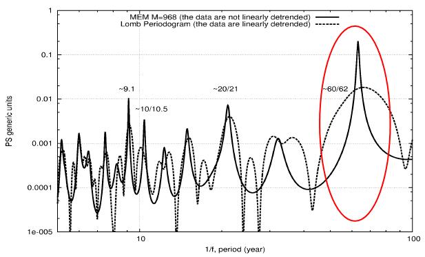
January 2012: Nicola Scafetta published “Testing an astronomically based decadal-scale empirical harmonic climate model versus the IPCC (2007) general circulation climate models” [http://scienceandpublicpolicy.org/images/stories/papers/reprint/astronomical_harmonics.pdf] “The most prominent cycles that can be detected in the global surface temperature records have periods of about 9.1 year, 10-11 years, about 20 year and about 60 years. The 9.1 year cycle appears to be linked to a Soli/Lunar tidal cycles, as I also show in the paper, while the other three cycles appear to be solar/planetary cycles ultimately related to the orbits of Jupiter and Saturn.” The following figure from that paper show the prominence of the 60 year cycle.
|
|
|