Global Warming Science - www.appinsys.com/GlobalWarming
Australia
[last update: 2011/03/02]
|
For information on the January 2011 flooding and tropical cyclone Yasi, see: http://www.appinsys.com/GlobalWarming/AustraliaFlood_Jan2011.htm
|
|
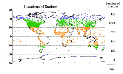
Australia has very few long-term stations in the GISS database. Most ended in the 1990’s. There is a distinct difference between southern and northern Australia (more long-term warming in the north). Most airports generally show no warming, urban areas show warming.
|
|
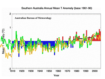
Southern Australia
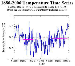
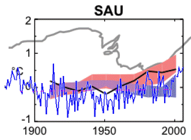
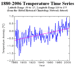
The following figures show average temperature anomalies for 1900 – 2006 (from the GHCN database) and then superimposed on the IPCC model plots (from AR4 Fig 9.12) for Southern Australia (pink= models with CO2, blue= models without CO2, black= observed).
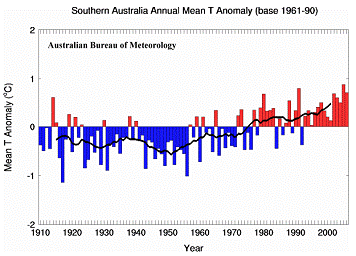
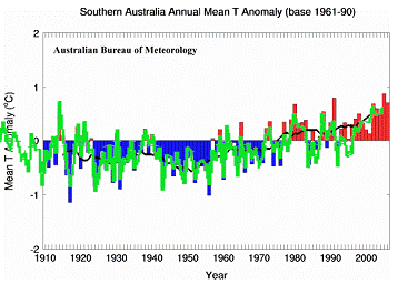
There is some discrepancy between the GHCN temperature (above left) and the IPCC (black line, above right). The following figures compare the Australian government data (left) with the GHCN temperature (superimposed green line, right). (Australian government climate site: http://www.bom.gov.au/cgi-bin/silo/reg/cli_chg/timeseries.cgi).
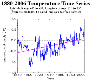
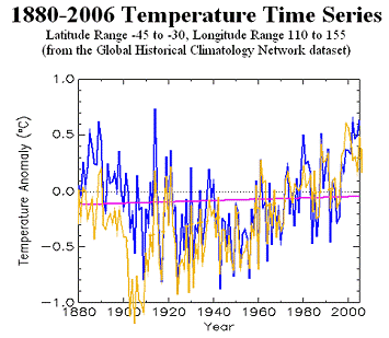
The next figures compare the HadCRUT data (left) with the GHCN (HadCRUT as orange line, right).
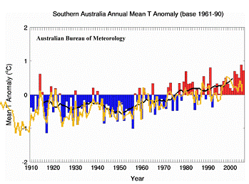
The next figures compare the Australian government data with the HadCRUT data (left – HadCRUT orange line) and with both the GHCN and HadCRUT (right - HadCRUT as orange line, GHCN as green line). The GHCN data more closely matches the Australian government data.
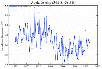
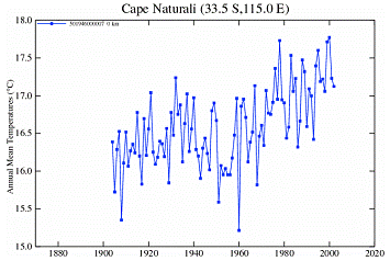
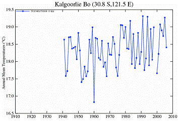
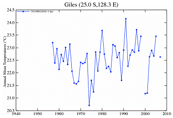
There are only two GISS stations with long-term data in southern Australia.
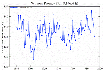
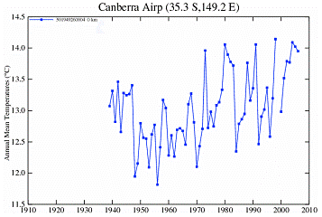
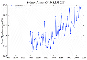
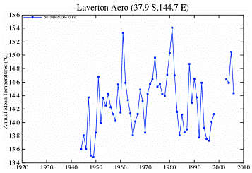
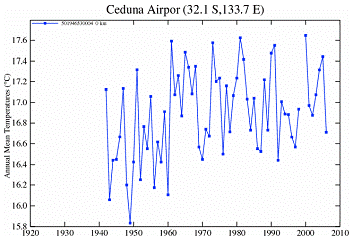
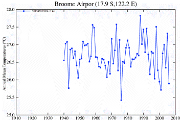
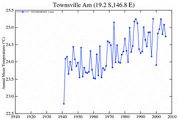
There are very few stations starting as early as the 1940’s in southern Australia. Larger urban areas exhibit significantly more warming. Rural areas have very little warming.
Urban Airports:
|
|
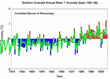
Northern Australia
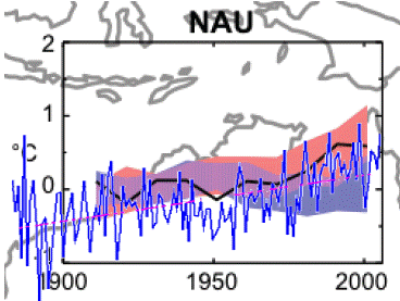
There is again some discrepancy between the GHCN temperature (above left) and the IPCC (black line, above right). The following figures compare the Australian government data (left) with the GHCN temperature (superimposed green line, right). (Looks like the IPCC forgot that the zero in temperature anomalies is based on the 1961 –1990 average).
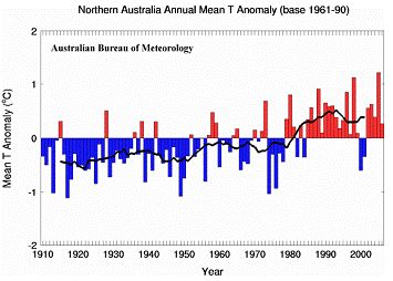
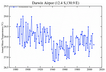
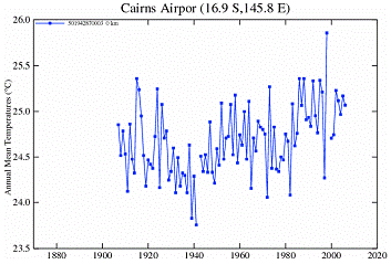
There are only two stations with long-term data in northern Australia.
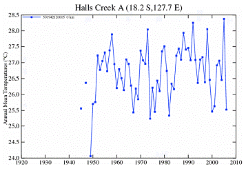
There are very few stations starting as early as the 1940’s in northern Australia.
|
|
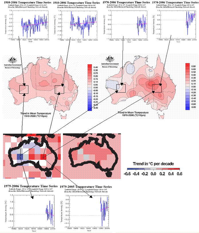
Australia and the IPCC
The following composite figure shows several items:
This figure illustrates the problem with choosing a short-term period for looking at temperature trends.
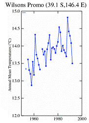
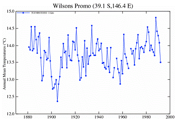
To further illustrate the problem of a lack of long term data (or the problem of choosing a short-term starting year) the following figures show the temperature trend for a rural station in southeast Australia for the years 1950-1992 (left, showing an average of about 0.2 degrees warming per decade) and for the years 1880 – 1992 (right, showing no long-term warming at all).
|
Precipitation
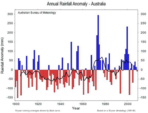
The following figure shows the annual rainfall anomaly for Australia (average annual rainfall for 1961-1990 – used to calculate anomalies – is 465 mm) [http://www.bom.gov.au/cgi-bin/climate/change/timeseries.cgi?graph=rranom&area=aus&season=0112&ave_yr=10] includes 10-year moving average. Recent decades have experienced higher rainfall than the first half of the 20th century.
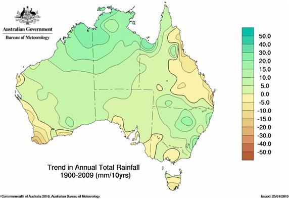
The following figure shows the trend in annual rainfall by area in the country. [http://www.bom.gov.au/web01/ncc/www/cli_chg/trendmap/rain/0112/aus/1900/latest.gif]
The above-referenced Australian Government website provides quite extensive climate graphing (unfortunately most data only goes back to 1950).
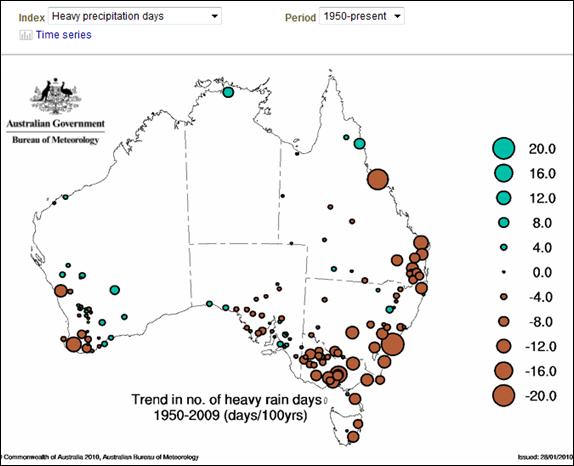
The following figure shows that even though precipitation has increased since 1950 (as shown above), the trend is to significantly fewer very heavy precipitation days.
|
|
Sea Level
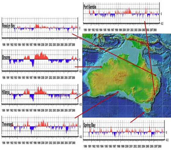
Australia started sea level measurements in the early 1990’s. The following figure shows sea level data at several locations around Australia to June 2009 (data from Fig. 10 in [http://www.bom.gov.au/ntc/IDO60202/IDO60202.2009.pdf]). Sea level trends vary greatly around Australia. The effect of the 1997-98 El Nino is quite noticeable on the west and north shores of the country.
|
|
|