Global Warming Science - www.appinsys.com/GlobalWarming
The Earth’s Greenhouse – CO2 and IPCC Climate Modeling
[last update: 2010/02/14]
|
The Earth’s climate system is very complex and many attempts have been made to model it. There is an interaction of solar radiation and magnetic fields, land, ocean, atmosphere, clouds, gases released by anthropogenic processes (deforestation, agriculture, land use change, burning of carbon-based fuels) and natural processes (volcanoes, etc.). In this system, the sun provides the heating of the earth through solar radiation in various wavelengths. Some of the solar radiation is reflected by clouds, thus reducing the heating from solar radiation (analogy: cloudy days in summer are typically cooler than sunny days because the clouds block heat from the sun). Heat is re-radiated by the Earth’s surface. Some of this heat is absorbed by “greenhouse gases” and re-emitted in the atmosphere, thus contributing to warming the Earth (analogy: cloudy days in winter are typically warmer than sunny days because the clouds keep heat in).
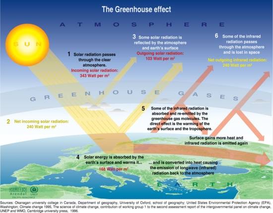
The greenhouse effect operates by inhibiting the cooling of the climate by reducing net outgoing radiation. The shorter wave radiation passes relatively unhindered by the CO2 to warm the Earth. The Earth re-radiates the energy in longer wave radiation (infrared, far-infrared) which is absorbed and reradiated by the CO2, causing atmospheric warming. The following figure provides a simplified conceptual overview of the process.
From: UNEP/GRID-Arendal. Greenhouse effect. UNEP/GRID-Arendal Maps and Graphics Library. 2002. http://maps.grida.no/go/graphic/greenhouse_effect.
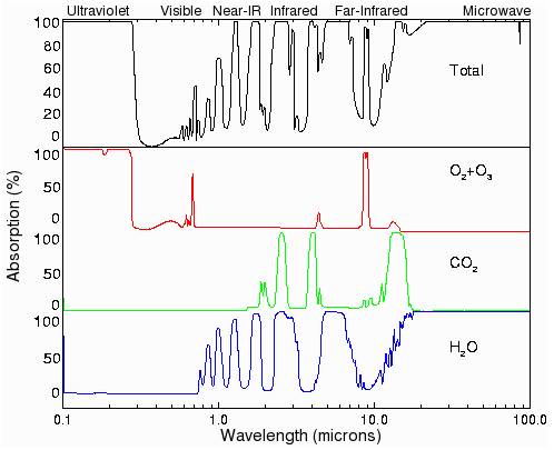
The following figure shows the absorption of radiation by wavelength for H2O, CO2 as well as oxygen and ozone (O2+O3). See http://brneurosci.org/co2.html for a good explanation of the potential global warming effects of CO2.
|
||
|
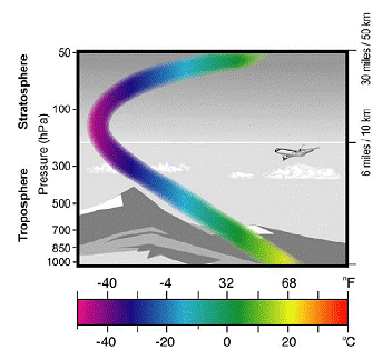
The temperature varies with altitude. The following
figure provides a general indication of the variation of temperature with
altitude and indicates the parts of the atmosphere referred to as the
troposphere and the stratosphere. The stratosphere is warmer due to
increased ozone levels absorbing ultraviolet radiation. The greenhouse
gas (GHG) theory indicates that increasing GHGs should result in warming
of the troposphere and cooling of the stratosphere. Temperature Variation By Altitude
|
||
|
The most important greenhouse gases in Earth's atmosphere include water vapor (H2O), carbon dioxide (CO2), methane (CH4), nitrous oxide (N2O), ozone (O3), and the chlorofluorocarbons (CFCs). In addition to reflecting sunlight, clouds are also a major greenhouse substance. Water vapor and cloud droplets are in fact the dominant atmospheric absorbers. Water vapor is the most important greenhouse gas due to its abundance in the atmosphere.
The relationship between CO2 and increased temperature has been demonstrated in laboratory experiments and shown to be a logarithmic relationship – i.e. one must keep doubling the concentration to achieve the same increment of warming. The effect of doubling the CO2 has been estimated to be approximately 0.7 C. However that does not take into account the presence of other greenhouse gases (GHG). Water vapor is the most prevalent GHG and the effect of increasing CO2 depends on the relative quantity of non-CO2 GHG. Thus in humid atmospheric conditions, CO2 contributes very little warming, whereas it could contribute more in dry atmospheric regions.
Richard Lindzen (MIT Atmospheric Science Professor) states: “there is a much more fundamental and unambiguous check of the role of feedbacks in enhancing greenhouse warming that also shows that all models are greatly exaggerating climate sensitivity. Here, it must be noted that the greenhouse effect operates by inhibiting the cooling of the climate by reducing net outgoing radiation. However, the contribution of increasing CO2 alone does not, in fact, lead to much warming (approximately 1 deg. C for each doubling of CO2). The larger predictions from climate models are due to the fact that, within these models, the more important greenhouse substances, water vapor and clouds, act to greatly amplify whatever CO2 does. This is referred to as a positive feedback. It means that increases in surface temperature are accompanied by reductions in the net outgoing radiation – thus enhancing the greenhouse warming. ... Satellite observations of the earth’s radiation budget allow us to determine whether such a reduction does, in fact, accompany increases in surface temperature in nature. As it turns out, the satellite data from the ERBE instrument (Barkstrom, 1984, Wong et al, 2006) shows that the feedback in nature is strongly negative -- strongly reducing the direct effect of CO2 (Lindzen and Choi, 2009) in profound contrast to the model behavior.” [http://www.quadrant.org.au/blogs/doomed-planet/2009/07/resisting-climate-hysteria]
|
||
|
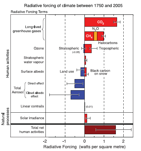
The following figure shows the estimated radiative forcing components as defined by the IPCC in the latest scientific basis report (May 2007). The report states: “Energy consumption by human activities, such as heating buildings, powering electrical appliances and fuel combustion by vehicles, can directly release heat into the environment. Anthropogenic heat release is not an RF, in that it does not directly perturb the radiation budget; the mechanisms are not well identified and so it is here referred to as a non-initial radiative effect.” Note also in the following figure the large uncertainty bar for aerosols and cloud effects, which are poorly understood and thus not well modeled. A good explanation of climate sensitivity is provided by Nir Shaviv, describing how the cosmic ray flux and effect on cloud cover is insufficiently modeled. [http://www.sciencebits.com/OnClimateSensitivity]
Estimated Radiative Forcing Components (Figure FAQ 2.1 – 2 in the IPCC AR4)
|
||
|
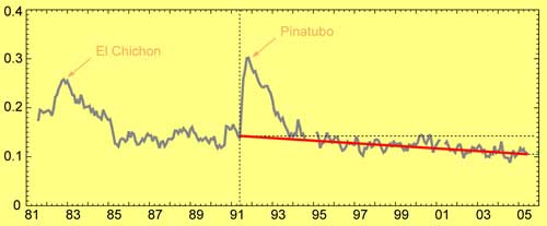
Data regarding volcanic aerosols is very sparse. A recent NASA study found that the levels of cooling volcanic aerosols has been declining in recent decades, as shown in the following figure. (Global 'Sunscreen' Has Likely Thinned, Report NASA Scientists 3/15/07) [http://www.nasa.gov/centers/goddard/news/topstory/2007/aerosol_dimming.html] The National Research Council (National Academy of Sciences) in their study “Climate Change Science: An Analysis of Some Key Questions, said “The monitoring of aerosol properties has not been adequate to yield accurate knowledge of the aerosol climate influence”. (Notice in the above IPCC radiative forcing components figure, volcanic aerosols do not appear in the Natural Processes section of the figure.)
Atmospheric Volcanic Aerosols 1981 – 2006 Showing General Declining Trend
|
||
|
|
||
|
Greenhouse Gas Sources
The sources of greenhouse gases (GHG) come from various sectors including transportation, industrial processes, power generation for residential consumption, agriculture and deforestation. According to the United Nations Food and Agriculture Organization (FAO), deforestation accounts for 25 to 30 percent of the release of GHG [http://www.fao.org/newsroom/en/news/2006/1000385/index.html]. The report states: “Most people assume that global warming is caused by burning oil and gas. But in fact between 25 and 30 percent of the greenhouse gases released into the atmosphere each year – 1.6 billion tonnes – is caused by deforestation.” From 1990 to 2000, the net forest loss was 8.9 million hectares per year. From 2000 to 2005, the net forest loss was 7.3 million hectares per year.
The ten countries with the largest net loss of forest per year (2000 – 2005) are: Brazil, Indonesia, Sudan, Myanmar, Zambia Tanzania, Nigeria, Democratic Republic of the Congo, Zimbabwe, and Venezuela (combined loss of 8.2 million hectares per year). The ten countries with the largest net gain of forest per year (2000 – 2005) are: China, Spain, Viet Nam, United States, Italy, Chile, Cuba, Bulgaria, France and Portugal (combined gain of 5.1 million hectares per year). [http://www.fao.org/forestry/site/28821/en/]
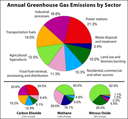
The following figure (left) shows a generalized source of GHG from various sources. However, this does not include deforestation (the number one cause of GHG). Various studies show various differing contributions by sector, since not all consider the same factors. The right-hand figure shows emissions by sector from another source using 1996 IPCC data [http://www.idosi.org/aejaes/jaes3(5)/1.pdf]. These are global estimates and do not reflect the fact that GHG contributions by sector vary regionally (for example, in Washington State where a large portion of power generation is hydroelectric, and where there is no net deforestation).
Estimated Greenhouse Gas Emissions by Sector from Two Sources
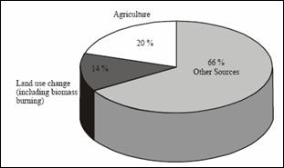
The above figure ignores one of the largest sources of GHG – deforestation and shows a smaller impact other anthropogenic land use change effects than most studies. The following figure shows the effect of land-use change on atmospheric CO2 [http://cdiac.ornl.gov/trends/landuse/houghton/houghton.html]
Annual Effect of Land-Use Change on Atmospheric CO2
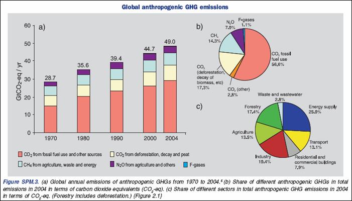
The following figure shows GHG by type (pie chart b) and sector (pie chart c) from the IPCC AR4 SPM [http://www.ipcc.ch/pdf/assessment-report/ar4/syr/ar4_syr_spm.pdf]. Note that CO2 fossil fuel use is only 56.6 % of GHG.
GHG Emissions by Type and Sector from IPCC AR4 SPM
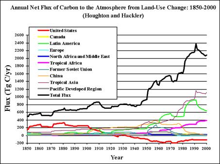
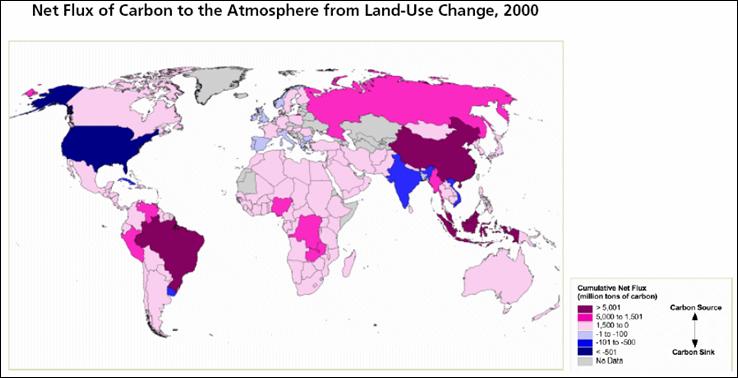
The following figure shows the net flux of carbon to the atmosphere due to land use change. The United States has the largest land use change carbon sink in the world – i.e. while much of the world is burning its forests, the US is absorbing the carbon from the atmosphere. This figure shows: “Cumulative Emissions of C02 From Land-Use Change measures the total mass of carbon absorbed or emitted into the atmosphere between 1950 and 2000 as a result of man-made land use changes (e.g.- deforestation, shifting cultivation, vegetation re-growth on abandoned croplands and pastures). Positive values indicate a positive net flux ("source") of CO2; for these countries, carbon dioxide has been released into the atmosphere as a result of land-use change. Negative values indicate a negative net flux ("sink") of CO2; in these countries, carbon has been absorbed as a result of the re-growth of previously removed vegetation.” [http://earthtrends.wri.org/pdf_library/maps/co2_landuse.pdf].
The same report also states: “While the majority of global CO2 emissions are from the burning of fossil fuels, roughly a quarter of the carbon entering the atmosphere is from land-use change.”
Becoming vegetarian would be more efficient in reducing greenhouse gases than driving a hybrid car. The United Nations Food and Agriculture Organization (FAO) released a report in November 2006 [http://www.fao.org/newsroom/en/news/2006/1000448/index.html ] that states: “the livestock sector generates more greenhouse gas emissions as measured in CO2 equivalent – 18 percent – than transport…. the livestock sector accounts for 9 percent of CO2 deriving from human-related activities, but produces a much larger share of even more harmful greenhouse gases. It generates 65 percent of human-related nitrous oxide, which has 296 times the Global Warming Potential (GWP) of CO2…it accounts for 37 percent of all human-induced methane (23 times as warming as CO2) ” [http://www.un.org/apps/news/story.asp?NewsID=20772&Cr=global&Cr1=environm ]
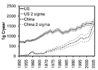
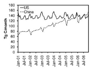
A study published in 2008 reports that China (which was excluded from the Kyoto requirements) became the largest emitter of CO2 from fossil fuel combustion and cement production in 2006. (Gregg, J. S., R. J. Andres, and G. Marland, “China: Emissions pattern of the world leader in CO2 emissions from fossil fuel consumption and cement production”, Geophysical Research Letters 35, 2008) [http://www.agu.org/pubs/crossref/2008/2007GL032887.shtml]. The following figures are from that study. The left-hand figure compares the US annual carbon emissions with China’s since 1950. The right-hand figure compares the monthly carbon for 2001 – 2007. The study states: “the annual emission rate in the US has remained relatively stable between 2001–2006 while the emission rate in China has more than doubled.”
|
||
|
Paleo-Historical CO2
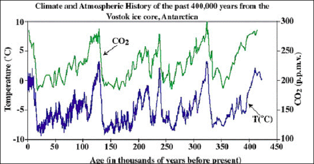
The atmospheric CO2 has been shown to lag the temperature in the past warming cycles, as shown in the following figure (From http://calspace.ucsd.edu/virtualmuseum/climatechange2/07_2.shtml).
Vostok Ice Core Temperature and CO2 Trends for Past 450,000 Years
The IPCC AR4 Scientific Basis report, Part 6 (May 2007), makes the following statements:
Many scientific studies have shown that CO2 increase follows temperature increase in the pre-historical records. A few examples:
Many scientists disagree that past CO2 has been constantly as low as the IPCC states. An examination of the history of CO2 measurement is provided at http://www.co2web.info/ESEF3VO2.pdf
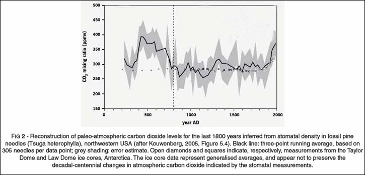
Reconstructions of past CO2 (prior to continuous measurements) have been made from various sources. The IPCC uses reconstruction from ice cores. Other reconstructions show different trends. The following figure shows CO2 reconstruction from pine needle stomatal density. [http://icecap.us/images/uploads/200705-03AusIMMcorrected.pdf]
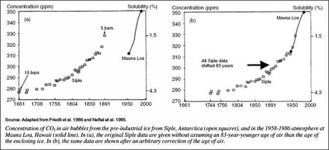
The IPCC rejected all available historical measurements of CO2, except Antarctic ice cores, because the measurements did not match their preferred theory: “more than 90,000 direct measurements of CO2 in the atmosphere, carried out in America, Asia, and Europe between 1812 and 1961, with excellent chemical methods (accuracy better than 3%), were arbitrarily rejected”. Even the ice core measurements were adjusted to match their CO2 story line, as shown in the following figure. [http://www.warwickhughes.com/icecore/zjmar07.pdf]
A CO2 reconstruction study based on oak tree leaf stomata in the Netherlands (van Hoof et al “A Role for Atmospheric CO2 in Preindustrial Climate Forcing”, Proceedings of the US National Academy of Sciences, 2007) shows the following figure comparing the study findings (red line) with the IPCC findings (blue line) in terms of the CO2 climate forcing. [http://www.pnas.org/content/105/41/15815.full.pdf+html] The study states: “Comparable to other stomata-based records, reconstructed preindustrial CO2 levels fluctuate between 319.2 and 292.3 ppmv with an average value of 311.4 ppmv … It should be noted that, in general, CO2 data derived from stomatal frequency analysis have higher average values (300 ppmv) compared with the IPCC baseline ”
See also: Beck: http://www.biokurs.de/treibhaus/180CO2/08_Beck-2.pdf
|
||
|
CO2 Monitoring
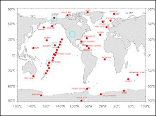
The NOAA Earth System Research Laboratory – Global Monitoring Division [http://www.esrl.noaa.gov/gmd/aggi/] provides data from a network of CO2 monitoring stations around the world (with data for Mauna Loa starting in 1970). The following figures show the location of the monitoring locations (left) and the global average CO2 concentration from these sites (right).
NOAA/ESRL CO2 Monitoring Locations (Left) and Global Average CO2 Concentration (Right)
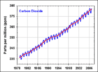
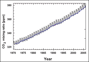
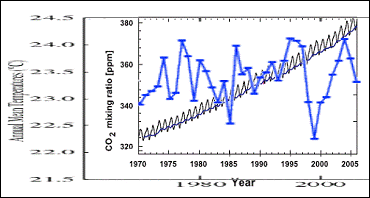
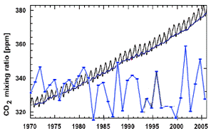
The following figure shows the IPCC graph of atmospheric CO2 as measured at Mauna Loa, Hawaii (left), while the right-hand graph compares the CO2 at Mauna Loa and the South Pole. They show a similar trend in slope. In fact the CO2 plots from any of the CO2 stations in the NOAA database show a similar CO2 trend. It can be seen from the figure below that the CO2 is greater in the summer than the winter (the CO2 is not causing seasons, but it is a response to the seasonal change in temperature).
Comparing the various CO2 trends available from the NOAA database shows a consistent trend in atmospheric CO2 rise around the world (as illustrated by comparing the figures shown above and below). But the temperature trends vary greatly by region.
Left: Atmospheric CO2 at Mauna Loa (Figure 2.3 in the IPCC AR4) Right: Atmospheric CO2 at Mauna Loa (Red) and at South Pole (Blue) from the NOAA Database
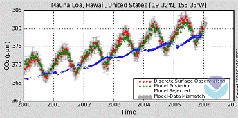
The temperature trend at Mauna Loa shows no correspondence with the CO2 trend. The following figure shows the Mauna Loa CO2 along with the temperature trend from the nearest station in the NASA GISS database (Hilo, Hawaii) clearly illustrating the lack of correspondence between the two.
Atmospheric CO2 at Mauna Loa (Figure 2.3 in the IPCC AR4) with Temperature Trend from the NASA GISS Database for Hilo.
|
||
|
CO2 – Ocean Water Relationship
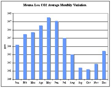
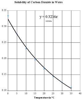
The following figure shows the monthly variation in CO2 at Mauna Loa (left) and the solubility of CO2 in water as a function of temperature [from http://wattsupwiththat.com/2007/11/04/guest-weblog-co2-variation-by-jim-goodridge-former-california-state-climatologist/]. Seasonal changes in CO2 are a result of seasonal CO2 sources and sinks in the global carbon cycle. The ocean temperature plays a large role in this.
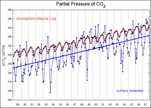
The following figure compares the atmospheric CO2 and ocean surface CO2 at a station in Hawaii. [http://hahana.soest.hawaii.edu/hot/trends/trends.html] It shows the inverse annual correlation between atmospheric and sea surface CO2 – within each year the cycle is opposite.
|
||
|
CO2 – Temperature Observations
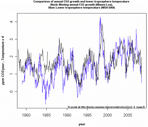
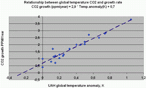
The following figure compares satellite-based lower troposphere temperature (blue) with CO2 growth rate (black) for 1979 - 2008. The temperature changes precede the CO2 growth rate changes. The second figure shows a regression of CO2 growth as a function of temperature calculated from points in the first figure [from http://icecap.us/images/uploads/FlaticecoreCO2.pdf].
|
||
|
CO2 – IPCC Modeling Problems
The conclusion that the current regional warming trend is significant and caused mainly by anthropogenic CO2, is a result of theoretical climate models (General Circulation Models - GCMs) in which the human-defined models are only able to reproduce current global temperature trends since 1970 by increasing the CO2 levels.
The availability of the CRU emails since November 2009 has shed further light on some of the modeling issues. For example: Tom Wigley (senior scientist at NCAR) to Michael Mann (creator of the hockey stick graph) [Oct 14, 2009]: “The Figure you sent is very deceptive. As an example, historical runs with PCM look as though they match observations -- but the match is a fluke. PCM has no indirect aerosol forcing and a low climate sensitivity -- compensating errors. In my (perhaps too harsh) view, there have been a number of dishonest presentations of model results by individual authors and by IPCC.” [http://www.eastangliaemails.com/emails.php?eid=1057&filename=1255553034.txt]
The IPCC AR4 Scientific Basis report (Part 6) states: “Climate models are used to simulate episodes of past climate... Models allow the linkage of cause and effect in past climate change to be investigated. Models also help to fill the gap between the local and global scale in palaeoclimate, as palaeoclimatic information is often sparse, patchy and seasonal. For example, long ice core records show a strong correlation between local temperature in Antarctica and the globally mixed gases CO2 and methane, but the causal connections between these variables are best explored with the help of models.” So, models in which the causal connections are programmed in, are used to explore the causal connections.
One major problem is that Antarctica does not match the models and is now ignored by the IPCC.
The following figure is from the IPCC AR4 report (2007). It does not show modeling of Antarctica, because Antarctica does not fit the models.
From IPCC AR 4 Figure 9.6
The following figure (left) shows modeled temperature change from the IPCC TAR report (2001). The models show warming in Antarctica with cooling around the Antarctic Peninsula and in the adjacent Weddell Sea – exactly the opposite of the observed trend. The following figure (right) shows the observed temperature trend in the “cooling” area.
Left: From IPCC TAR Figure 9.2 – Modeled temperature differences from 1975 to 1995 to the first decade in the 21st century. Right: From NASA / GISS database.
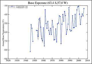
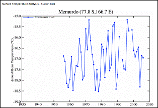
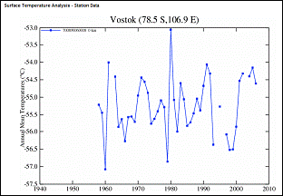
Unlike the northern hemisphere, temperature measurements in Antarctica only started in the 1950’s, and there are very few stations covering a 40-year period to the present. The following figure shows two of the available non-peninsula temperature stations’ measurements are shown in the following figures (plots from stations in the NASA / GISS database). [http://data.giss.nasa.gov/cgi-bin/gistemp/gistemp_station.py?id=700896640008&data_set=1&num_neighbors=1 ]
Typical Antarctica Temperature Station Trends
For a more detailed regional study of Antarctica, see: http://www.appinsys.com/GlobalWarming/RS_Antarctica.htm
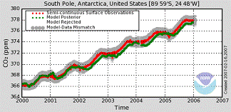
The NOAA Earth System Research Laboratory – Global Monitoring Division maintains a network of CO2 monitoring stations around the world. [http://www.esrl.noaa.gov/gmd/aggi/]. The following figures compare the recent CO2 trends at Palmer Station (on the Antarctic Peninsula) and the South Pole. There is virtually no difference between the two locations, although there is a substantial temperature difference as seen in the previous temperature trend graphs. The next figure compares CO2 and temperature trend at the South Pole showing the lack of correlation between the two.
CO2 Trends at Palmer Station and at the South Pole – Same CO2 Trends, Very Different Temperature Trends
Combining CO2 and South Pole Temperature Trends – No Correlation
The greenhouse hypothesis suggests the warming would be greatest in the atmosphere (troposphere) and that the warming would be significant both day and night. It would also be greatest in the polar regions because gases like CO2 are most effective at trapping the heat in very cold temperatures. The reason that the warming should be greatest at the polar regions is due to the following: CO2 in the atmosphere absorbs and re-emits infra-red radiation in distinctive wavebands, particularly around 12 - 18 microns. Radiation at other wavelengths simply passes through the atmosphere without being intercepted by CO2. The wavelength of infrared radiation from the earth's surface depends on the temperature of the surface. All bodies emit infrared over a wide band of wavelengths, but peak at a `dominant wavelength' determined by the temperature of the emitting surface. For example, an object with a temperature of 32°C will radiate most intensely at 9.5 microns. At 15°C (the mean surface temperature of the earth), the dominant wavelength will be 10 microns. At -25°C, it becomes 11.7 microns, and at -50°C becomes 13 microns. The problem is that the observations do not match the CO2 hypothesis.
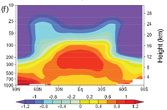
The IPCC 2007 Report Chapter 9 – Understanding and Attributing Climate Change [http://ipcc-wg1.ucar.edu/wg1/Report/AR4WG1_Print_Ch09.pdf] provides a climate model based simulation of the expected CO2 “spatial signature” of all forcings including anthropogenic CO2 (left-hand figure below shows degrees change per decade). However, a study of actual data from radiosonde data shows a non-CO2 based signature [http://www.climatescience.gov/Library/sap/sap1-1/finalreport/sap1-1-final-chap5.pdf]. The models do not match reality. In reference to this, Richard Lindzen (MIT Atmospheric Sciences Professor) stated: “surface warming should be accompanied by warming in the tropics around an altitude of about 9km that is about 2.5 times greater than at the surface. Measurements show that warming at these levels is only about 3/4 of what is seen at the surface, implying that only about a third of the surface warming is associated with the greenhouse effect, and, quite possibly, not all of even this really small warming is due to man (Lindzen, 2007, Douglass et al, 2007). This further implies that all models predicting significant warming are greatly overestimating warming. This should not be surprising (though inevitably in climate science, when data conflicts with models, a small coterie of scientists can be counted upon to modify the data. Thus, Santer, et al (2008), argue that stretching uncertainties in observations and models might marginally eliminate the inconsistency. That the data should always need correcting to agree with models is totally implausible and indicative of a certain corruption within the climate science community).” [http://www.quadrant.org.au/blogs/doomed-planet/2009/07/resisting-climate-hysteria]
Trends in degrees per decade – left: IPCC CO2-based trend; right: actual data
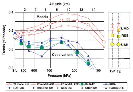
A study comparing the models to observations from satellites and balloons (1979-2004) also shows a problem with the models. The following figure is from the study. “A comparison of tropical temperature trends with model predictions”, by Douglass, D.H., J.R. Christy, B.D. Pearson, and S.F. Singer, 2007 - International Journal of Climatology. [http://www.scribd.com/doc/904914/A-comparison-of-tropical-temperature-trends-with-model-predictions]. The models exhibit the CO2 theory of most warming occurring in the troposphere. However, the satellite and balloon based observations show warming only at the surface of the earth. The report stated: “Model results and observed temperature trends are in disagreement in most of the tropical troposphere, being separated by more than twice the uncertainty of the model mean. In layers near 5 km, the modelled trend is 100 to 300% higher than observed, and, above 8 km, modelled and observed trends have opposite signs. … On the whole, the evidence indicates that model trends in the troposphere are very likely inconsistent with observations that indicate that, since 1979, there is no significant long-term amplification factor relative to the surface. If these results continue to be supported, then future projections of temperature change, as depicted in the present suite of climate models, are likely too high.”
A 2009 paper states: “There appears to be something fundamentally wrong with the way temperature and carbon are linked in climate models” [http://www.rice.edu/nationalmedia/news2009-07-14-globalwarming.shtml]
In a 2008 paper published by Engel et al in Nature Geoscience [http://www.sciencedaily.com/releases/2008/12/081215111305.htm] found that “Most atmospheric models predict that the rate of transport of air from the troposphere to the above lying stratosphere should be increasing due to climate change. … an international group of researchers has now found that this does not seem to be happening. On the contrary, it seems that the air masses are moving more slowly than predicted. … Due to the results presented now, the predictions of atmospheric models must be re-evaluated.”
In an assessment of the IPCC modeling, a paper by: Bellamy, D. and Barrett, J. (2007). “Climate stability: an inconvenient proof”, (Proceedings of the Institution of Civil Engineers – Civil Engineering, 160, 66-72) states: “The climate system is a highly complex system and, to date, no computer models are sufficiently accurate for their predictions of future climate to be relied upon.”
In another review of IPCC modeling (Carter, R.M. (2007). “The myth of dangerous human-caused climate change” The Aus/MM New Leaders Conference, Brisbane May 3, 2007) Carter examined evidence on the predictive validity of the general circulation models (GCMs) used by the IPCC scientists. He found that “while the models included some basic principles of physics, scientists had to make “educated guesses” about the values of many parameters because knowledge about the physical processes of the earth’s climate is incomplete. In practice, the GCMs failed to predict recent global average temperatures as accurately as simple curve-fitting approaches. They also forecast greater warming at higher altitudes in the tropics when the opposite has been the case.”
A 2007 study by Douglass and Christy published in the Royal Meteorological Society’s International Journal of Climatology [http://www.physorg.com/news116592109.html] found that the climate models do not match the data for the tropical troposphere. ““When we look at actual climate data, however, we do not see accelerated warming in the tropical troposphere. Instead, the lower and middle atmosphere are warming the same or less than the surface. For those layers of the atmosphere, the warming trend we see in the tropics is typically less than half of what the models forecast.””. A previous study cited in the same article blamed the data instead of the models!
A 2008 study “On the Credibility of Climate Predictions” (D. Koutsoyiannis, A. Efstradiadis, N. Mamassis & A. Christofides, Department of Water Resources, Faculty of Civil Engineering, National Technical University of Athens, Greece) states: “Geographically distributed predictions of future climate, obtained through climate models, are widely used in hydrology and many other disciplines, typically without assessing their reliability. Here we compare the output of various models to temperature and precipitation observations from eight stations with long (over 100 years) records from around the globe. The results show that models perform poorly, even at a climatic (30-year) scale. Thus local model projections cannot be credible, whereas a common argument that models can perform better at larger spatial scales is unsupported.” [http://www.atypon-link.com/IAHS/doi/pdf/10.1623/hysj.53.4.671]
Increasing atmospheric CO2 does not by itself result in significant warming. The climate models assume a significant positive feedback of increased water vapor in order to amplify the CO2 effect and achieve the future warming reported by the IPCC. According to the models, as the Earth warms more water evaporates from the ocean, and the amount of water vapor in the atmosphere increases. Since water vapor is the main greenhouse gas, this leads to a further increase in the atmospheric temperature. The models assume that changes in temperature and water vapor will result in a constant relative humidity (i.e. as temperatures increase, the specific humidity increases, keeping the relative humidity constant. This is one of the most controversial aspects of the models. Some studies say that the positive feedback is correct, others say not. Models that include water vapor feedback with constant relative humidity predict the Earth's surface will warm more than twice as much over the next 100 years as models that contain no water vapor feedback.
According to the IPCC [http://www.ipcc.ch/pdf/assessment-report/ar4/wg1/ar4-wg1-chapter3.pdf] “Water vapour is also the most important gaseous source of infrared opacity in the atmosphere, accounting for about 60% of the natural greenhouse effect for clear skies, and provides the largest positive feedback in model projections of climate change.“
A 2004 NASA study using satellite humidity data found that “The increases in water vapor with warmer temperatures are not large enough to maintain a constant relative humidity” resulting in overestimation of temperature increase. [http://www.nasa.gov/centers/goddard/news/topstory/2004/0315humidity.html]
MIT’s Richard Lindzen (the Alfred P. Sloan Professor of Meteorology at MIT) argues that the IPCC models have not only overestimated warming due to positive water vapor feedback, they also have the sign wrong: “Our own research suggests the presence of a major negative feedback involving clouds and water vapor, where models have completely failed to simulate observations (to the point of getting the sign wrong for crucial dependences). If we are right, then models are greatly exaggerating sensitivity to increasing CO2.” [http://meteo.lcd.lu/globalwarming/Lindzen/Lindzen_testimony.html] He also stated: “the way current models handle factors such as clouds and water vapor is disturbingly arbitrary. In many instances the underlying physics is simply not known. In other instances there are identifiable errors. … current models depend heavily on undemonstrated positive feedback factors to predict high levels of warming.” [http://www.cato.org/pubs/regulation/regv15n2/reg15n2g.html]
Roy Spencer (Team Leader, Advanced Microwave Scanning Radiometer – Earth Observing System (AMSR-E), NASA) has a presentation providing evidence that there is net negative feedback due to water vapor: www.ghcc.msfc.nasa.gov/AMSR/meetings2008/monday14july/spencer_precipitation_microphysics.ppt
A study of model feedbacks “Validating and Understanding Feedbacks in Climate Models” (D-Z. Sun, T. Zhang, and Y. Yu, NOAA-CIRES/Climate Diagnostics Center) states: “The models tend to overestimate the positive feedback from water vapor in El Nino warming. … [and] tend to underestimate the negative feedback from cloud albedo in El Nino warming.” Another paper by the same authors concludes: “The extended calculation using coupled runs confirms the earlier inference from the AMIP runs that underestimating the negative feedback from cloud albedo and overestimating the positive feedback from the greenhouse effect of water vapor over the tropical Pacific during ENSO is a prevalent problem of climate models“ [http://climatesci.org/2008/05/13/tropical-water-vapor-and-cloud-feedbacks-in-climate-models-a-further-assessment-using-coupled-simulations-by-de-zheng-sun-yongqiang-yu-and-tao-zhang]
See www.appinsys.com/GlobalWarming/WaterVapor.htm for more details on the problem of water vapor not cooperating with the CO2 based theory.
The National Research Council (National Academy of Sciences) produced a study called “Climate Change Science: An Analysis of Some Key Questions” [http://books.nap.edu//html/climatechange/]. Here are a couple of statements from that report:
The sun provides the energy that warms the earth. And yet according to the NOAA National Climatic Data Center [http://www.ncdc.noaa.gov/oa/climate/globalwarming.html ] “Our understanding of the indirect effects of changes in solar output and feedbacks in the climate system is minimal”. The importance of fluctuations and trends in solar inputs in affecting the climate is inadequately modeled. Although the sun exhibits varies types of energy related events (sunspots, solar flares, coronal mass ejections), sunspots have been observed and counted for the longest amount of time.
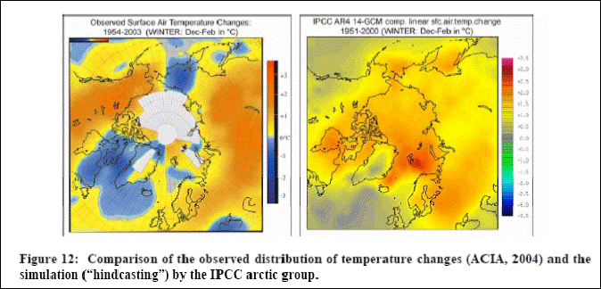
A 2007 paper by Syun-Ichi Akasofu at the International Arctic Research Center (University of Alaska Fairbanks) provides an analysis of warming trends in the Arctic. [http://www.iarc.uaf.edu/highlights/2007/akasofu_3_07/index.php ] They analyzed the capability of climate models (GCMs) to reproduce the past temperature trends of the Arctic (shown in the following figure): “we asked the IPCC arctic group (consisting of 14 sub-groups headed by V. Kattsov) to “hindcast” geographic distribution of the temperature change during the last half of the last century. To “hindcast” means to ask whether a model can produce results that match the known observations of the past; if a model can do this, we can be much more confident that the model is reliable for predicting future conditions … Ideally, the pattern of change modeled by the GCMs should be identical or very similar to the pattern seen in the measured data. We assumed that the present GCMs would reproduce the observed pattern with at least reasonable fidelity. However, we found that there was no resemblance at all.”
Model vs Observed temperature Changes [from Akasofu, above]
The authors’ conclusions: “only a fraction of the present warming trend may be attributed to the greenhouse effect resulting from human activities. This conclusion is contrary to the IPCC (2007) Report, which states that “most” of the present warming is due to the greenhouse effect. One possible cause of the linear increase may be that the Earth is still recovering from the Little Ice Age. It is urgent that natural changes be correctly identified and removed accurately from the presently on-going changes in order to find the contribution of the greenhouse effect… The fact that an almost linear change has been progressing, without a distinct change of slope, from as early as 1800 or even earlier (about 1660, even before the Industrial Revolution), suggests that the linear change is natural change”
A recent paper studying the effect of “brown clouds” (caused by biomass burning) on warming in Asia (Ramanathan, V., M.V. Ramana, G. Roberts, D. Kim, C. Corrigan, C. Chung, and D. Winker, 2007. “Warming trends in Asia amplified by brown cloud solar absorption”. Nature, 448, 575-578) concludes “atmospheric brown clouds contribute as much as the recent increase in anthropogenic greenhouse gases to regional lower atmospheric warming trends”.
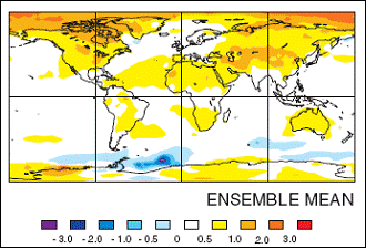
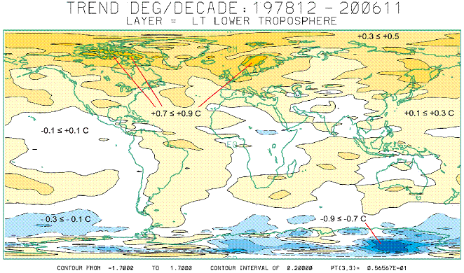
The University of Alabama at Huntsville provides monthly plots of worldwide temperature anomalies for the troposphere since 2000 [http://climate.uah.edu/]. The following figure is from UAH and shows the temperature trend (degrees per decade) for 1978 to 2006. According to the CO2 theory, warming should be occurring over both poles – but this is not happening.
Recent studies are showing that black carbon (soot) plays a larger role than CO2 in causing Arctic warming. A 2008 Cornell University report “Global Warming Predictions are Overestimated, Suggests Study on Black Carbon” [http://www.news.cornell.edu/stories/Nov08/SoilBlackCarbon.kr.html]. The report states: “As a result of global warming, soils are expected to release more carbon dioxide, the major greenhouse gas, into the atmosphere, which, in turn, creates more warming. Climate models try to incorporate these increases of carbon dioxide from soils as the planet warms, but results vary greatly when realistic estimates of black carbon in soils are included in the predictions, the study found. … black carbon can take 1,000-2,000 years, on average, to convert to carbon dioxide. … the researchers found that carbon dioxide emissions from soils were reduced by about 20 percent over 100 years, as compared with simulations that did not take black carbon's long shelf life into account. The findings are significant because soils are by far the world's largest source of carbon dioxide, producing 10 times more carbon dioxide each year than all the carbon dioxide emissions from human activities combined. Small changes in how carbon emissions from soils are estimated, therefore, can have a large impact.”
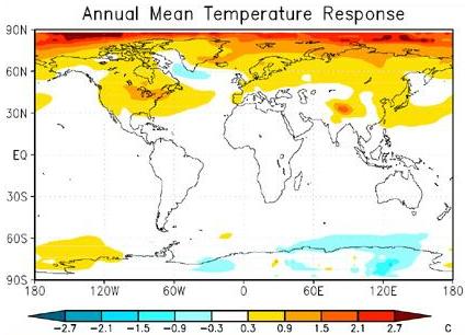
The following figure shows the temperature response around the world due to black carbon from research at the University of California, Irvine [http://www.sciencedaily.com/releases/2007/06/070606113327.htm]. The global pattern matches the global temperature changes shown above more closely than does the modeled results of CO2 influence.
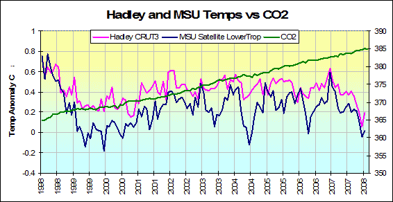
The atmospheric CO2 generally has a low correlation with temperature. The following figure shows the global temperatures and CO2 from 1998 to 2008 (comparing the satellite-measured lower troposphere temperature and the Hadley Climatic research Unit data (used by IPCC). [http://intellicast.com/Community/Content.aspx?a=127]. While CO2 has steadily increased over the last decade, temperatures have not.
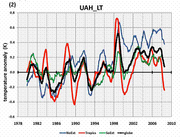
A 2008 study of the satellite-era temperature data (Christy & Douglass: “Limits on CO2 Climate Forcing from Recent Temperature Data of Earth”) [http://arxiv.org/ftp/arxiv/papers/0809/0809.0581.pdf]. “The recent atmospheric global temperature anomalies of the Earth have been shown to consist of independent effects in different latitude bands. The tropical latitude band variations are strongly correlated with ENSO effects. …The effects in the northern extratropics are not consistent with CO2 forcing alone … These conclusions are contrary to the IPCC [2007] statement: “[M]ost of the observed increase in global average temperatures since the mid-20th century is very likely due to the observed increase in anthropogenic greenhouse gas concentrations.”” They found that the underlying trend that may be due to CO2 was 0.07 degrees per decade.
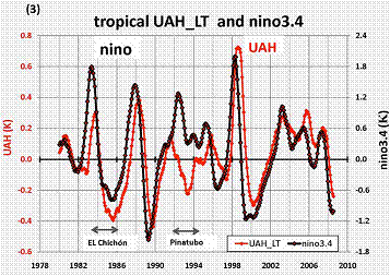
The following two figures are from the above Christy & Douglass study. The first (left) shows the satellite-based temperature anomalies for the Tropics (red), globe (black), northern extratropics (blue) and southern extratropics (green). The second figure (right) shows the correlation between the tropical temperatures and the ENSO3.4 (El Nino SSTs for area 3.4)
There are many scientific studies on the atmospheric residence of CO2, with many disagreements (i.e. the science is not settled). Many studies show a residence of 5 to 15 years (although the IPCC claims that it’s 100-200 years).
An example:“Atmospheric CO2 residence time and the carbon cycle : Global warming” [http://cat.inist.fr/?aModele=afficheN&cpsidt=4048904]: “An atmospheric CO2 residence time is determined from a carbon cycle which assumes that anthropogenic emissions only marginally disturb the preindustrial equilibrium dynamics of source/atmosphere/sink fluxes. This study explores the plausibility of this concept, which results in much shorter atmospheric residence times, 4-5 years, than the magnitude larger outcomes of the usual global carbon cycle models which are adjusted to fit the assumption that anthropogenic emissions are primarily the cause of the observed rise in atmospheric CO2. The continuum concept is consistent with the record of the seasonal photosynthesis swing of atmospheric CO2 which supports a residence time of about 5 years, as also does the bomb C14 decay history.”
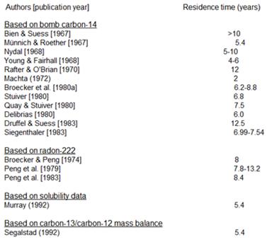
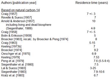
This link: http://folk.uio.no/tomvs/esef/ESEF3VO2.htm provides a list of published studies showing CO2 residence times as listed below. See that reference for details on this.
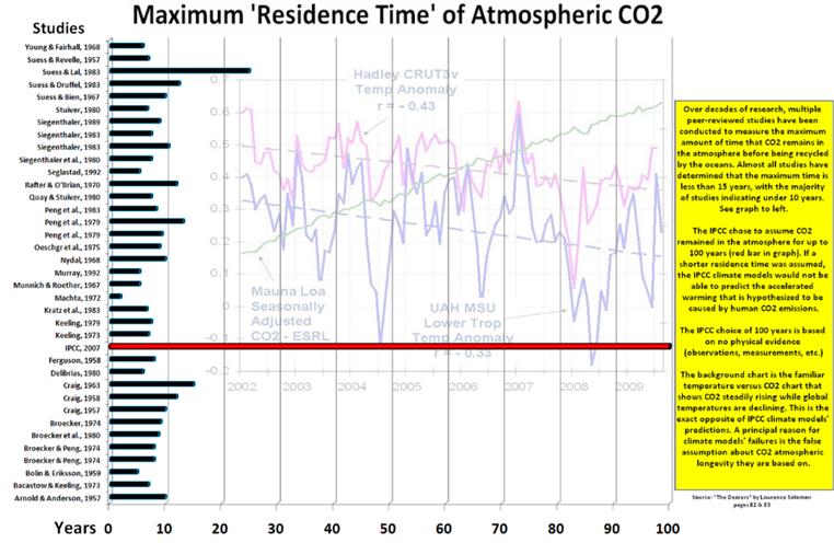
The following figure compares maximum atmospheric CO2 residence time from various studies [http://c3headlines.typepad.com/.a/6a010536b58035970c0120a5e507c9970c-pi]
|
||
|
NOAA had a “Weather School” “Learning Lesson” web page with a CO2 experiment (it has since been removed but can still be viewed at: [http://web.archive.org/web/20060129154229/http://www.srh.noaa.gov/srh/jetstream/atmos/ll_gas.htm]). The web page is shown below (originally at: [http://www.srh.noaa.gov/srh/jetstream/atmos/ll_gas.htm] – removed in Nov. 2009) [Red highlighting added.]
|
||
|
|
||
|
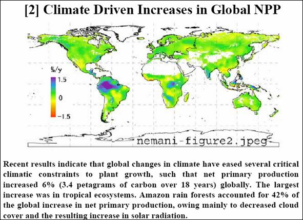
CO2 – Positive Effects
The positive effects of increased atmospheric CO2 are ignored in the alarmist scare stories.
The UN periodically produces an assessment of the worldwide ozone depletion. The most recent report: WMO/UNEP: “Scientific Assessment of Ozone Depletion: 2006” by the Scientific Assessment Panel of the Montreal Protocol on Substances that Deplete the Ozone Layer [http://www.wmo.ch/pages/prog/arep/gaw/reports/ozone_2006/pdf/exec_sum_18aug.pdf] states: “Model simulations suggest that changes in climate, specifically the cooling of the stratosphere associated with increases in the abundance of carbon dioxide, may hasten the return of global [(60°S-60°N)] column ozone to pre-1980 values by up to 15 years”. Perhaps CO2 isn’t all-bad.
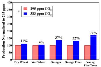
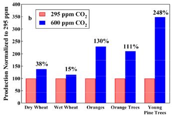
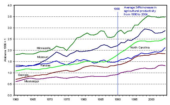
Studies of crop growth rates under various concentrations of CO2 also show a positive effect of the current increase in atmospheric CO2. The following figures show an example.
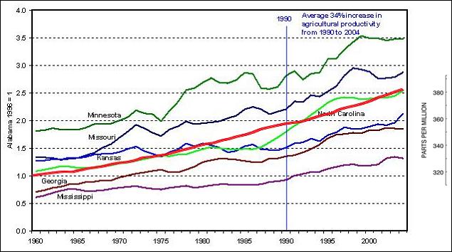
The USDA provides agricultural productivity data [http://www.ers.usda.gov/Data/AgProductivity/table03.xls] listing state-by-state yearly data. The data has been graphed by David Archibald [http://icecap.us/images/uploads/STATESPRODUCTIVITY.JPG] and is shown below for 1960 to 2005 for several states. I have added the thick red line showing atmospheric CO2 at Mauna Loa over the same time period (CO2 graph from http://www.esrl.noaa.gov/gmd/ccgg/trends/co2_data_mlo.html).
Agricultural Productivity for Six States, Plus Atmospheric CO2 (Red – Scale at right)
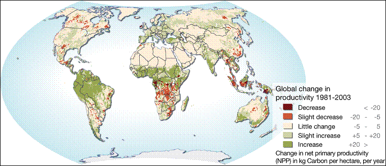
The following figure is from the United Nations UNEP [http://maps.grida.no/go/graphic/losses-in-land-productivity-due-to-land-degradation] showing a substantial increase in global productivity from 1981 – 2003 (interestingly, the UNEP’s caption was “losses in land productivity due to land degradation” – typical of the UN’s cup-half-empty viewpoint).
The following figure is from a study “Long Term Monitoring of Vegetation Greenness from Satellites” [http://www.ias.sdsmt.edu/STAFF/INDOFLUX/Presentations/14.07.06/session1/myneni-talk.pdf]
A study of tree growth in Maryland indicates that “forests in the Eastern United States are growing faster than they have in the past 225 years” and is attributed to increased CO2 [http://sercblog.si.edu/?p=466]
|
||
|
|


