Global Warming Science - www.appinsys.com/GlobalWarming
James Hansen – Warming is Natural, Mainly in Arctic
[last update: 2009/10/11]
|
This document examines James Hansen’s climate modeling and its relationship to actual observations. Hansen published an evaluation of the model in Hansen et al 2007 “Climate simulations for 1880–2003 with GISS modelE” Clim Dyn (2007) 29:661–696 [http://pubs.giss.nasa.gov/docs/2007/2007_Hansen_etal_3.pdf] comparing the model to observations.
|
|
The IPCC
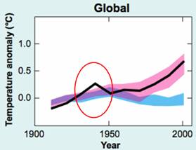
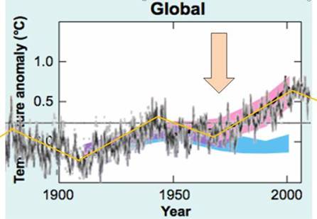
The following figure (left) is from the IPCC AR4 Summary for Policymakers figure SPM-4. It shows “observed” global annual average temperature anomaly (black), model outputs with only natural forcings (blue) and models including anthropogenic greenhouse gases (pink). There is unexplained warming in the 1930s-1940s. The right-hand figure shows the Hadley global temperature data used by the IPCC superimposed on their “summary” graph. The models need input of CO2 only after about 1970 – prior to 1970 all warming was natural, according to the IPCC.
|
|
Hansen’s Climate Model
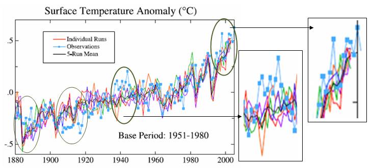
The following figure is from Figure 6 in Hansen et al 2007 “Climate simulations for 1880–2003 with GISS modelE” Clim Dyn (2007) 29:661–696 [http://pubs.giss.nasa.gov/docs/2007/2007_Hansen_etal_3.pdf]. It compares the GISS global “observed” annual average (blue) with model runs and model 5-run mean (black).
The following quotations are from the above Hansen 2007 report:
|
|
Recent Warming is Mainly in the Arctic
Key issue: the models cannot reproduce the warming that occurred in the 1930s-1940s. Hansen states: “the observed maximum is due almost entirely to temporary warmth in the Arctic. Such Arctic warmth could be a natural oscillation … there are few forcings that would yield warmth largely confined to the Arctic”
And yet, the current warming is also mostly confined to the Arctic.
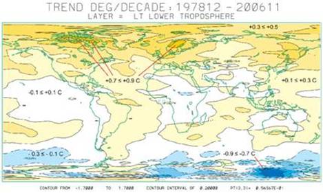
The following figure shows the global temperature change from 1978 to 2006 for the lower troposphere from satellite data [http://climate.uah.edu/25yearbig.jpg]. Most of the recent warming has been in the Arctic.
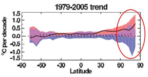
The following figure is from the IPCC Fourth Assessment Report (AR4) Figure 9.6 (2007). It shows the change in temperature (C per decade) by latitude. The black line shows the observed temperature, the blue band shows the output of the computer models including only natural factors, whereas the pink band shows the output of computer models including anthropogenic CO2. Notice that the models with only natural factors (blue shaded area) can explain all of the warming for most of the world up to 30 degrees north latitude. This figure also shows that the recent warming is mainly in the Arctic.
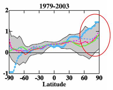
The following figure is from the same Hansen et al 2007 paper. It shows the results of the GISS model simulations by latitude (grey band) with the standard model run in red and the “observed” temperature anomalies in blue, for 1979 – 2003. This again clearly shows that the models can’t reproduce either the Arctic warming or the Antarctic cooling, and the recent warming is mainly in the Arctic.
James Hansen says: “there are few forcings that would yield warmth largely confined to the Arctic”.
|
|
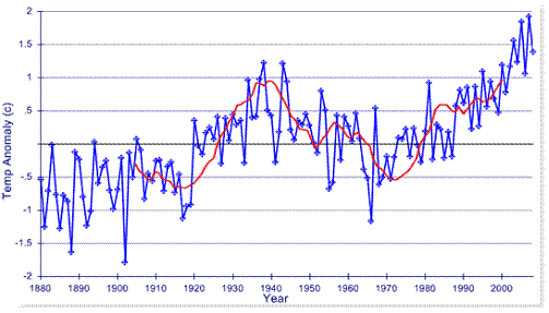
The Arctic Cycle
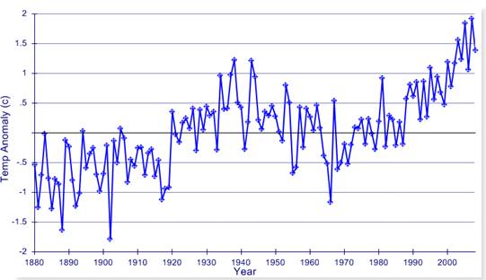
The following graph shows the average temperature anomaly for the Arctic from the Hadley CRUTEM3 database (www.cru.uea.ac.uk/cru/data/temperature/). This graph is the average of all 5x5 degree cells north of 60 degrees N, having data starting prior to 1930 (74 grids).
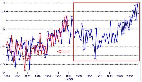
The following figure shows the same temperature anomaly data as above (blue). The years bounded by the red rectangle (1944 – 2008) have been copied, changed to red and shifted back 68 years. The pattern shows that it is a recurrent cycle and the net warming has been about 0.6 degrees between cycles.
The Hansen / IPCC position is that the first cycle is natural and the second cycle is due to anthropogenic CO2. But the cycles are identical in shape. The climate models cannot reproduce the cycle. But Hansen states: “Such Arctic warmth could be a natural oscillation”
|
|
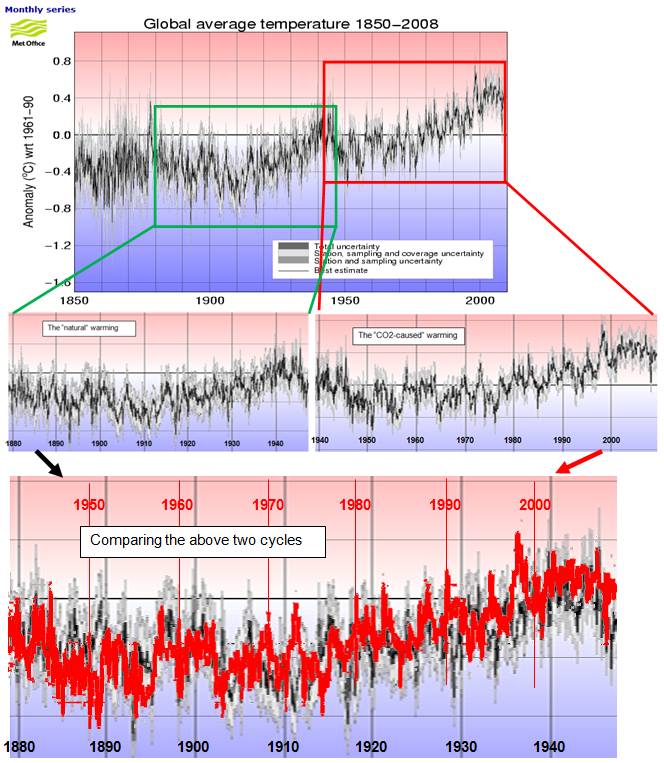
The Global Cycle
The following figures show the global temperature anomalies from the Hadley climate data used by the IPCC (from: [http://hadobs.metoffice.com/hadcrut3/diagnostics/global/nh+sh/]). Two cycles have been highlighted in rectangles: the “natural” cycle (1880-1946: green) and the “CO2-caused” cycle (1942-2008: red), according to the IPCC. The final part of the figure shows the 1942-2008 cycle changed to red and overlaid on the 1880-1946 cycle (vertically shifted by 0.3 degrees).
As can be seen from the above figures, the two cycles were nearly identical, and yet the IPCC says the models can explain the early 1900s cycle with only natural forcings, but anthropogenic CO2 is needed for the later cycle. There appears to be a serious problem with the models when two identical cycles have two very different causes.
|
|
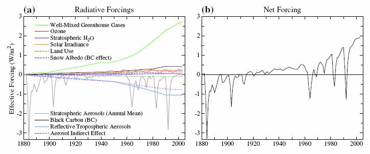
Climate Model Forcings
From the same Hansen 2007 paper: “Well-mixed GHGs provide the dominant forcing, which is Fa = 2.50 W/m2 and Fe = 2.72 W/m2 in 2003 relative to 1880. The total O3 forcing, including tropospheric increase and stratospheric depletion, is Fa = 0.28 W/m2 and Fe = 0.23 W/m2, as Ea for O3 is 82%. The CH4-derived H2O forcing is Fs–Fe = 0.06 W/m2. Thus the total GHG forcing is Fe = 3.0 W/m2 in 2003, with CO2 providing about half of the total GHG forcing. … Aerosols, based on our estimates, yield a forcing Fe = –1.37 W/m2 in 2003 relative to 1880. Thus the aerosol forcing in our estimate is about half of the GHG forcing, but of opposite sign. … the solar forcing itself is moderate in magnitude and uncertain.”
Note that without greenhouse gases (green line above left), the climate models would be unable to reproduce any warming.
|
|
Hansen’s Previous Model Work
James Hansen is one of the biggest promoters of the anthropogenic CO2 global warming (AGW) scare. And yet his own work shows that the AGW theory is false.
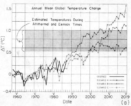
In 1988 he provided temperature predictions based on climate models (results of which he presented to the US congress to promote the scare). He modeled three scenarios: ‘A’ had an increasing rate of CO2 emissions, ‘B’ had constant rate of CO2 emissions, while scenario ‘C’ had reduced CO2 emissions rate from 1988 levels into the future “such that the greenhouse gas climate forcing ceases to increase after 2000” (Hansen 1988, [http://pubs.giss.nasa.gov/abstracts/1988/Hansen_etal.html]).
The following figure is from Hansen 1988, showing the “observed” global temperature (solid black line) along with model outputs for the three future CO2 scenarios. (The shaded area is the estimate of global temperature during the peak of the current and previous interglacial periods 6,000 and 120,000 years ago.)
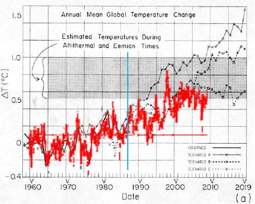
The following figure superimposes the Hadley temperature anomaly data used by the IPCC and shown previously (red) on Hansen’s 1988 model projections. The vertical blue line indicates the year in which the projections were made. (Note: The zero level is different since Hansen used 1951-1980 as the base period for the calculation of temperature anomalies, while the IPCC currently uses 1961-1990.)
In the 20 years since Hansen’s model projections, the global temperature is below the scenario ‘C’ in which “the greenhouse gas climate forcing ceases to increase after 2000”. So his scenario ‘C’ most closely matches reality. But there is a problem: CO2 has continued to increase. Obviously there is a problem with the models.
|
|
Hansen Suggests It’s All Natural
In Hansen et al 2007, he states: “Such Arctic warmth could be a natural oscillation … there are few forcings that would yield warmth largely confined to the Arctic. Candidates might be soot blown to the Arctic from industrial activity at the outset of World War II, or solar forcing of the Arctic Oscillation (Shindell et al. 1999; Tourpali et al. 2005) that is not captured by our present model. Perhaps a more likely scenario is an unforced ocean dynamical fluctuation with heat transport to the Arctic and positive feedbacks from reduced sea ice”
An “unforced ocean dynamical fluctuation”… perhaps it’s all natural.
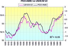
The following figure shows the smoothed sum of the Atlantic Multidecadal Oscillation (AMO) index plus the Pacific Decadal Oscillation (PDO) index (AMO+PDO red line) superimposed on the Arctic average annual temperature shown previously. (The AMO+PDO line is from the black line in the right-hand figure from [http://intellicast.com/Community/Content.aspx?a=127])
The above figure shows the strong correlation of the Arctic temperature cycles to the oceanic oscillations. Perhaps Hansen is correct – it’s all natural.
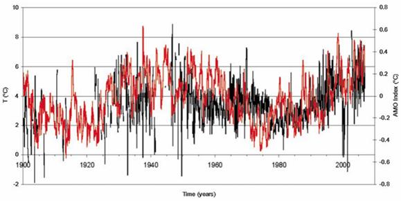
Hansen is also supported in this “ocean dynamical fluctuation” theory for Arctic warming by recent work. A study published in 2009 (Levitus et al: “Barents Sea multidecadal variability”, Geophysical Research Letters, Vol.36, 2009) provides the following figure showing “Monthly temperature (C) in the Barents Sea for the 100–150 m layer, from 1900 to 2006. Years without all 12 months of data are not plotted. The red line is the Atlantic Multidecadal Oscillation Index” [http://www.leif.org/EOS/2009GL039847.pdf]. This shows a strong correspondence between Arctic – Barents Sea – sea temperatures and the AMO.
|
|
Conclusion
Hansen states regarding the warming anomaly in the 1930s – 1940s (which cannot be reproduced by the models): “Such Arctic warmth could be a natural oscillation” and suggests it is due to natural “ocean dynamical fluctuation”.
The identical climate cycle has occurred twice in the last 120 years since temperature measurements began. If the first one was a “natural oscillation”, then the identical second one could not be something vastly different as claimed by the IPCC.
The climate modelers have a very incomplete understanding of how the earth’s climate works – the models are overwhelmingly dependent on greenhouse gases, and thus cannot reproduce the observed cycles. But the cycles match the oceanic oscillations.
|