Brazil
See www.appinsys.com/GlobalWarming for further information.

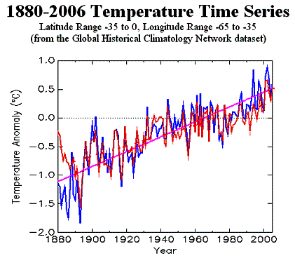
The following temperature graphs are for the rectangle that is approximately Brazil comparing GHCN (left), HadCRUT (right), and both.
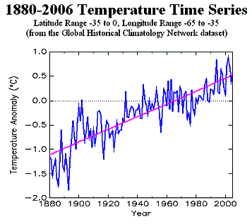
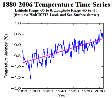
The following figure superimposes the HadCRUT (red) on the GHCN (blue).
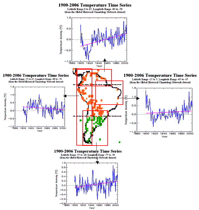
The following figure shows average temperature anomalies for 1900 – 2006 (from the GHCN database) for four regions within South America (note different scales on the temperature plots). This is figure is from the regional summary for South America at www.appinsys.com/GlobalWarming