Global Warming Science - www.appinsys.com/GlobalWarming
Temperature Fakery
[last update: 2019/08/23]
|
NOAA’s Machinations/Manipulations Create Fake Record Warming for July 2019
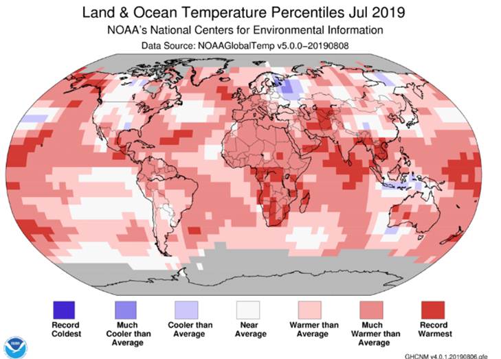
NOAA says: “The July temperature across global land and ocean surfaces was 1.71°F above the 20th century average of 60.4°F and was the highest for July in the 1880–2019 record. July 2019 bested the previous record—set in 2016—by 0.05°F” https://www.ncei.noaa.gov/news/global-climate-201907
I guess they don’t understand precision and statistics. Temperature is not measured to 2 decimal places, so to say that 0.05 is significantly different from zero when averaging this data is incorrect.
This is the temperature map they show:
Wow! That looks really hot!
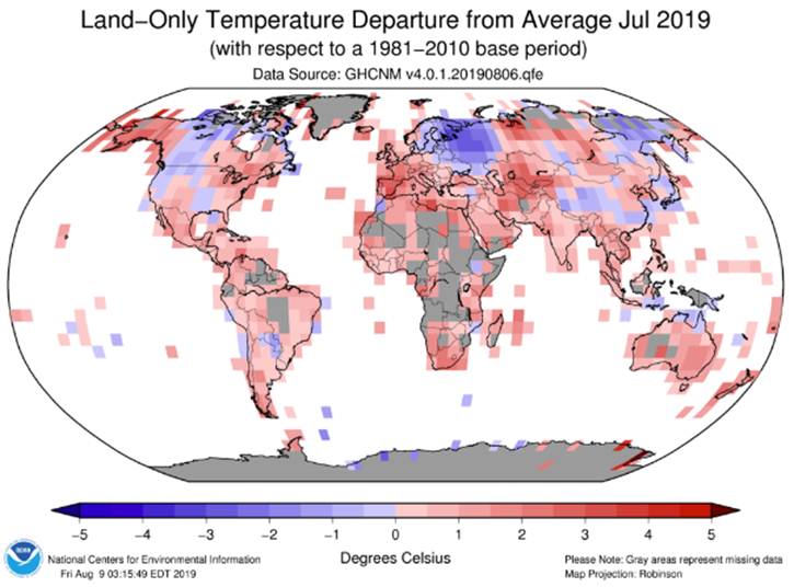
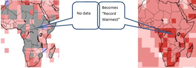
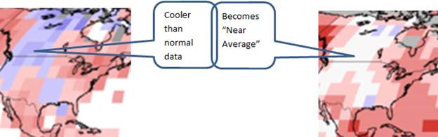
But here is the temperature station data they have for deriving the above: (from https://www.ncdc.noaa.gov/temp-and-precip/global-maps) Do you get the same impression from these two images?
The gray areas have no temperature data.
Through NOAA’s data manipulations:
See http://appinsys.com/GlobalWarming/NOAA_JanJun2010.htm for an examination of NOAA’s infilling with fake data.
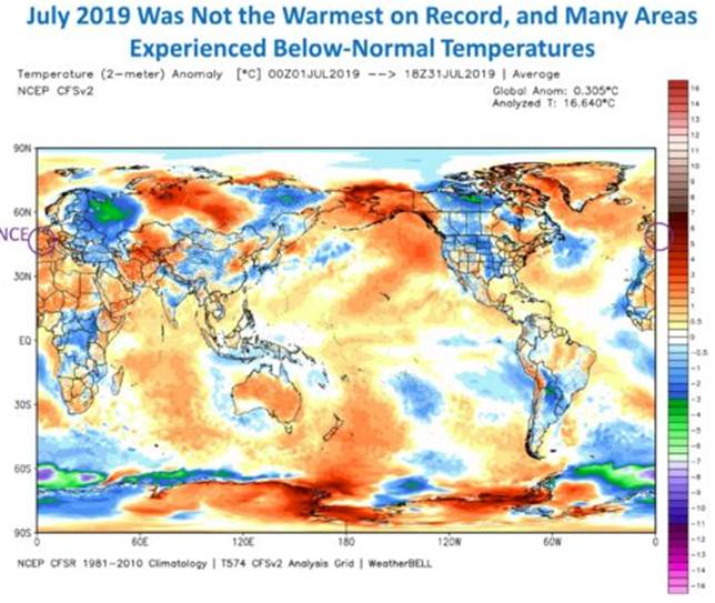
Roy Spencer (who works with NASA’s satellite temperature data processing) provides the following: http://www.drroyspencer.com/2019/08/july-2019-was-not-the-warmest-on-record/
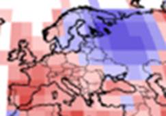
The July heat wave in Europe was all over the mainstream media news, but they neglected to mention that Eastern Europe had a cold wave setting new low temperature records in July:
See:
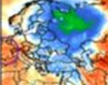
The European heat wave in 2019 is similar to the Russian heat wave of 2010, which NOAA said was not due to global warming. See: http://appinsys.com/GlobalWarming/Russia2010.htm
|
|
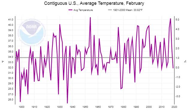
United States
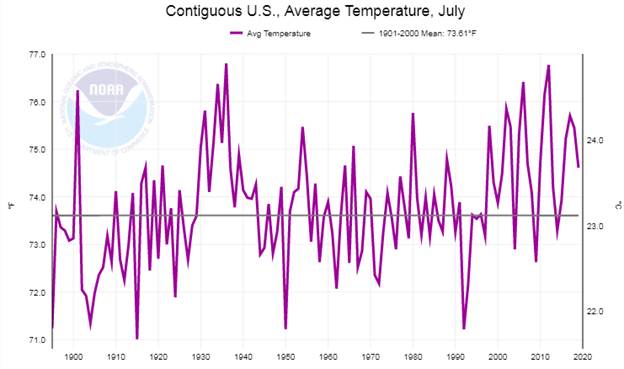
NOAA provides temperature graphing at https://www.ncdc.noaa.gov/cag The following figure shows US July average temperature from the complete record, 1895 - 2019
The hottest July in the US was 1936 (followed by 2012, 2006, 1934)
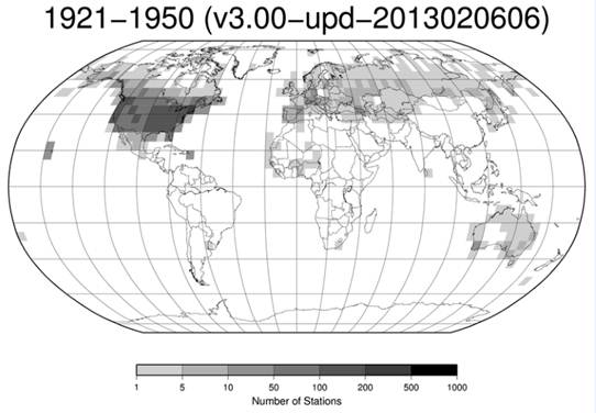
Although the US comprises only 6 % of the world’s surface area, it is the most important area for the following reason: it has the most reliable records. Most of the world has very little coverage of temperature data. The US has more than 50 % of the world’s stations and an even greater percent of world stations with long-term data.
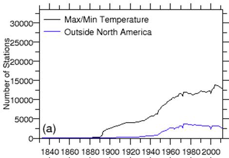
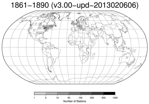
NOAA provides the following (from ftp://ftp.ncdc.noaa.gov/pub/data/ghcn/daily/figures/) :
The US has always had the best data coverage.
http://appinsys.com/GlobalWarming/GW_Part2_GlobalTempMeasure.htm
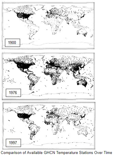
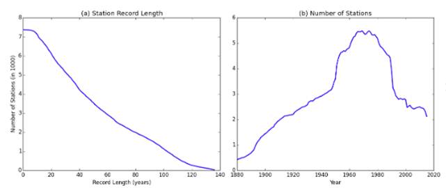
See the University of Delaware for an animated movie of station locations over time: [http://climate.geog.udel.edu/~climate/html_pages/air_ts2.html].
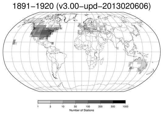
From NOAA: ftp://ftp.ncdc.noaa.gov/pub/data/ghcn/daily/figures/station-counts-1891-1920-temp.png
The 1930s were extreme in the US and globally the 1940s, but there were hardly any stations outside of the US and some in Europe.
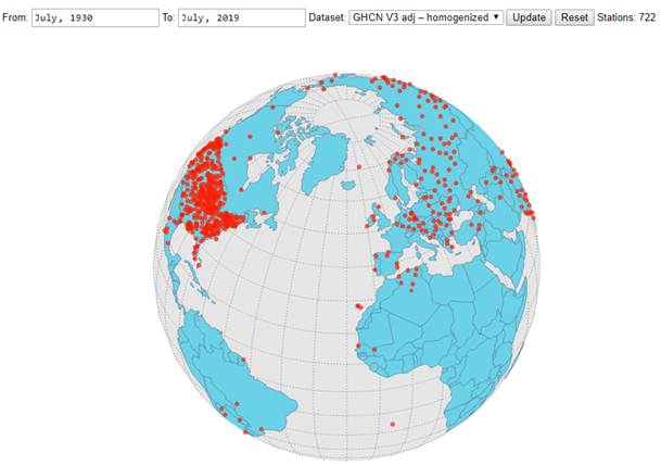
Individual station data (for anywhere in the world) can be plotted here: https://data.giss.nasa.gov/gistemp/stdata/ They also provide the following:
How many stations existed in 1930 that still exist? 722
The lack of historical data for the world means that the US is the only large area that has much long-term data. It also means that insufficient data exist to even measure “climate change” for most of the world.
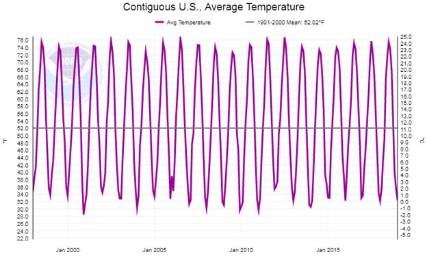
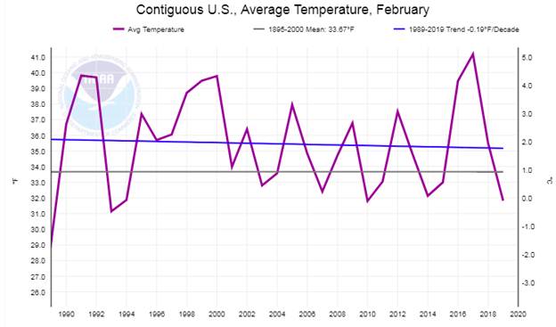
Here is the monthly temperature data for the US for the last 20 years (from https://www.ncdc.noaa.gov/cag)
Can you spot the climate emergency?
|
|
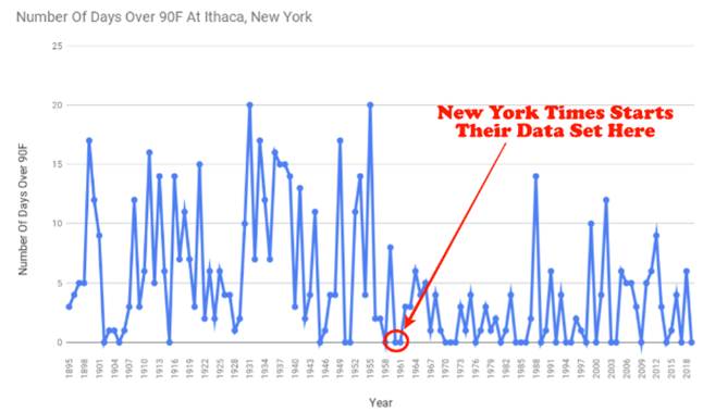
New York Times
NYT provides a feature to find out “How Much Hotter is Your Hometown Than When You Were Born?” https://www.nytimes.com/interactive/2018/08/30/climate/how-much-hotter-is-your-hometown.html
But their data only displays from 1960 on.
They are correct that “weather station coverage worldwide is poor before about 1950”, but not for the US. They are just hiding the 1930s which still holds most of the heat records in the US. The “some parts of the world” they refer to for longer term data, includes the US and some of Europe. And since their app is for US towns, it seems like an excuse. Tony Heller explains why:
So if I pick the closest station to my home town that has data going back to 1930 what does the NASA web site show? https://data.giss.nasa.gov/gistemp/stdata/
The NYT starting in 1960 shows a steep increase in temperature since 1960. Not so much in the NASA data when the 1930s are included. This is the dishonesty of the NYT in cherry picking their start date. Lies by omission.
See also the NYT says it’s time to PANIC. http://appinsys.com/GlobalWarming/Panic.htm
|
|
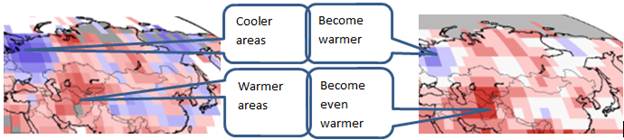
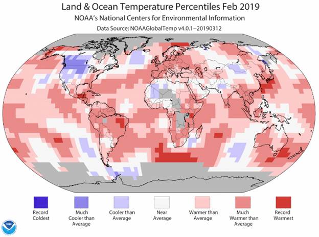
Spreading the Warmth
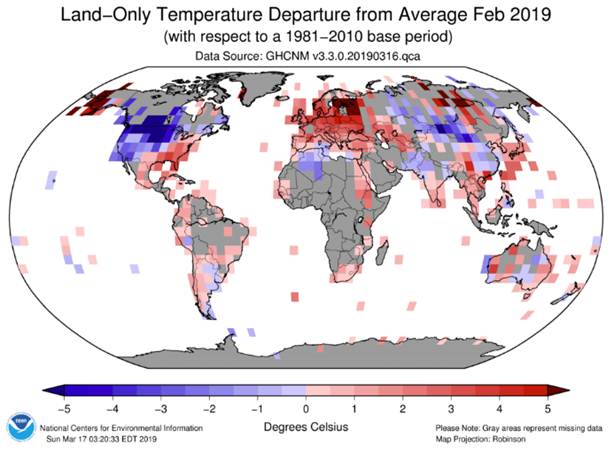
Here is the February 2019 data from https://www.ncdc.noaa.gov/temp-and-precip/global-maps
Except for the warmer than normal in Europe, the world doesn’t look too hot.
But NOAA says “The global land and ocean surface temperature departure from average for February 2019 was the fifth highest for the month of February in the 140-year NOAA global temperature dataset record, which dates back to 1880.” https://www.ncei.noaa.gov/news/global-climate-201902
NOAA tells lies of omission: “the 140-year NOAA global temperature dataset record, which dates back to 1880” implies they have long-term global coverage. So what was the global coverage in 1880? There were far more stations in the US than in Europe and essentially none anywhere else except a few in Australia.
For the US, February 2019 ranked as the 33rd warmest.
The NYT cherry-picked the 1960 starting year for their propaganda plotting tool. What if we just look at the last 30 years? Februaries are getting colder.
Even though CO2 is a well-mixed gas throughout the globe, somehow it only causes warming in some places, some of the time. That is not how the basic CO2 theory works. But then the believers won’t come up with a scientifically testable hypothesis because they know it’s not really the cause of the climate changes that have been observed.
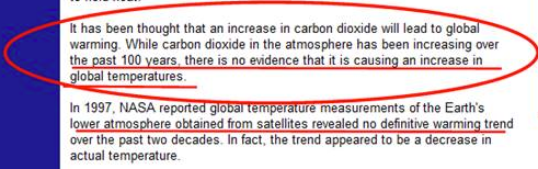
NOAA used to tell the truth:
See: http://appinsys.com/GlobalWarming/GW_Basics.htm
|
|
|