Global Warming Science - www.appinsys.com/GlobalWarming
Illinois
[last update: 2010/11/20]
|
Illinois Temperatures
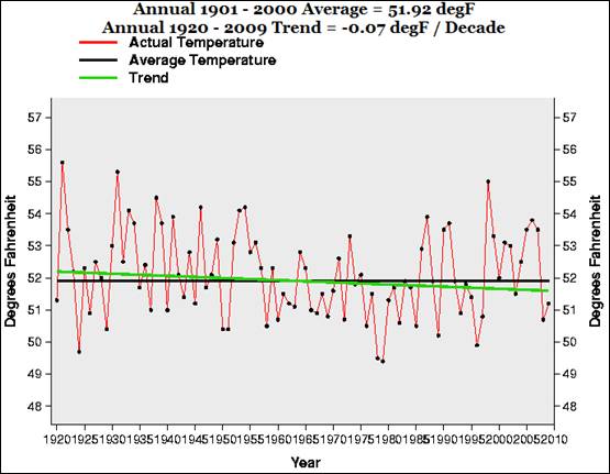
The following figure shows average annual temperature in Illinois for 1920-2009 (plotted at the NOAA NCDC website: http://www.ncdc.noaa.gov/oa/climate/research/cag3/state.html) No warming.
|
|
Obama’s Misleading Advisors
Science Advisor, John Holdren: “Lessening our global dependence on fossil fuels and increasing energy production from renewable resources is vital in reducing the harmful effects of climate change, said Holdren. … “It’s [global warming] actually lulled people into a degree of complacency about this problem,” Holdren said, calling the term a “dangerous misnomer.” Climate data on increases in floods, droughts, heat waves, pest outbreaks, typhoons and hurricanes of the largest categories, among several factors, show the pattern of what is actually happening to the Earth— not just what you would expect to happen if global climate change was the cause, said Holdren.” (from the Northwestern University Medill School report “Global warming picking up steam, Obama top science adviser says” 2010/04/28. [http://news.medill.northwestern.edu/chicago/news.aspx?id=163838]) Too bad he ignores the data showing what is actually happening.
Energy Secretary, Stephen Chu: “in the Midwest, the temperature will increase 5 to 10 degrees Fahrenheit on average. With hotter summers, that means that during the growing season, the soil moisture will decrease by 20 to 30 percent. Now, if you take that at face value, then the great agricultural machinery of the U.S. is at risk, with huge economic consequences.” [http://berkeley.edu/news/media/releases/2005/10/03_chu.shtml]
|
|
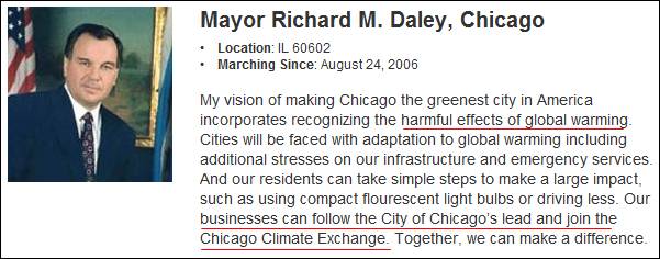
Chicago’s Mayor, Richard Daley Displays His Ignorance
[www.stopglobalwarming.org/marchers/richard-m-daley/]
Oops – the Chicago Climate Exchange went out of business in 2010. (See: [http://wattsupwiththat.com/2010/11/08/public-carbon-trading-dead-in-the-usa/] (Obama was involved in the creation of the Chicago Climate Exchange (CCX), and both Gore and Goldman Sachs were investors; see: http://www.appinsys.com/globalwarming/WhiteHouseDeception.htm Former UN advisor and (creator of the UN environmental conferences) Maurice Strong was on the board of CCX. For more info on CCX see: http://www.appinsys.com/GlobalWarming/CarbonMonetization.htm)
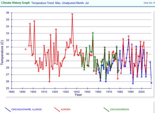
The following figure shows the July average maximum temperature for three NOAA GHCN stations around Chicago (Chicago Midway, O’Hare and Aurora, plotted at http://www.appinsys.com/GlobalWarming/climate.aspx)
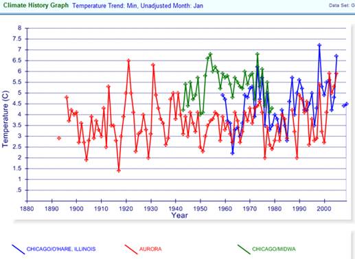
The following figure shows the January average minimum temperature for the same three Chicago area stations.
Over the last 100 years Chicago summer maximum temperature has been declining while winter minimum temperature has been increasing. That would seem to be a positive impact of global warming.
|
|
Northwestern University, Chicago – Not So Educated
“Climate change poses health hazards for Chicago” 2010/03/11 [http://news.medill.northwestern.edu/chicago/news.aspx?id=161559]
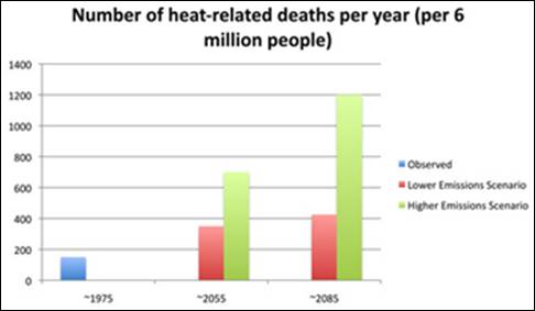
They present the following figure as the expected future due to increased CO2.
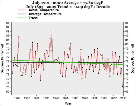
They mention a deadly July 1995 heat wave. The following figure shows that July temperatures have been declining since the 1930s.
A 1997 study of the 1995 heat wave, reported in the Bulletin of the American Meteorological Society [http://lightning.sbs.ohio-state.edu/geo622/paper_heatwave_Karl1997.pdf] states: “The data would suggest that trends of Tap in Chicago are increasing at an appreciably faster rate near the time of the daily maximum temperature compared with times near the minimum, but this is likely to be at least partially, if not fully, due to a change from the HO-63 to the HO-83 instrument that the National Weather Service introduced at all of its primary stations in throughout much of the 1980s. … the severity of the heat wave during 1995 was quite rare”
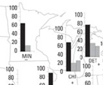
The following figure is from a National Institute of Environmental Health Sciences report in 2003 (Davis et al, “Changing Heat-Related Mortality in the United States” [http://ehp.niehs.nih.gov/members/2003/6336/6336.html]). The figure shows annual heat-related excess mortality by decade (Each histogram bar indicates a different decade: from left to right, 1960s-1970s, 1980-1989, and 1990-1998.) The figure shown here shows the Chicago data (CHI). The report states: “In 19 of our 28 study cities, total annual heat-related (population-adjusted) mortality was statistically significantly lower in the 1990s than in our 1960s-1970s decade”
|
|
Cooling Study
[http://www.sciencenews.org/view/generic/id/55527/title/Crop_irrigation_could_be__cooling_Midwest]
From the above study:
|
|
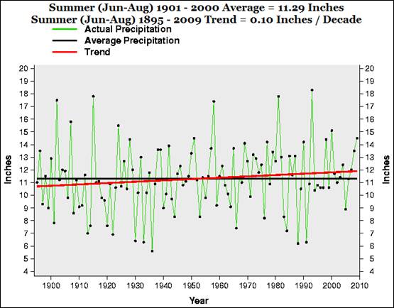
Summer Climate Data
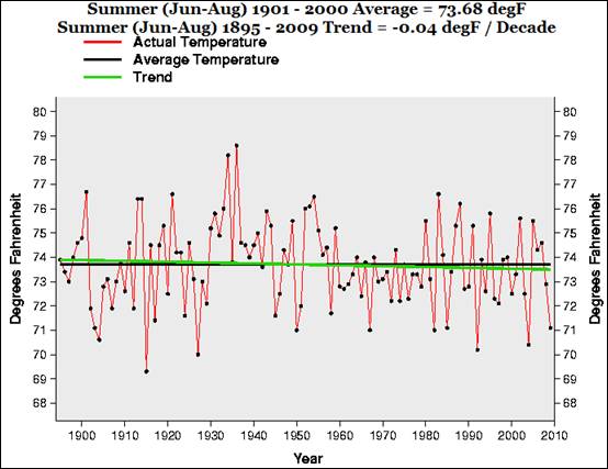
The following figures show the average summer temperature and summer precipitation for Illinois (plotted at the NOAA NCDC website: http://www.ncdc.noaa.gov/oa/climate/research/cag3/state.html). Neither trend is statistically significant.
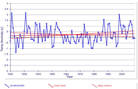
The following figure shows the annual average temperature for the 5x5 degree grid encompassing Chicago (from the Hadley / UEA Climatic Research Unit (CRU) data plotted at http://www.appinsys.com/GlobalWarming/climate.aspx) The figure includes a linear trend and confidence interval of the trend (0.019 +/- 0.061 deg./decade). There is no statistically significant trend in annual average temperature.
|
|
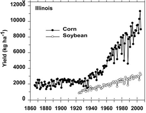
Agriculture
Stephen Chu says the “great agricultural machinery of the U.S. is at risk” due to global warming. An Agronomy Journal report [http://agron.scijournals.org/cgi/content/full/100/Supplement_3/S-79] states: “The dramatic increases in corn yield that occurred since the founding of ASA in 1907 occurred almost entirely in the second half of the 20th century”. The following figure is from that report showing corn and soybean yields per acre for Illinois. Unlike Chu’s alarmist position, the data show the opposite trend.
|
|
The Lunch
Steven Chu is out to lunch if he thinks somehow the above trends will suddenly change and it will warm by several degrees just because the climate models say so.
Holdren carefully selects his data in order to misrepresent the trends.
For more on Chu and Holdren’s lack of scientific understanding (as well as other Obama people) see: http://www.appinsys.com/GlobalWarming/ObamasGovernment.htm
Universities promoting alarmist scare stories when the data show the opposite – they have joined the alarmist propaganda team.
|
|
|