Global Warming Science - www.appinsys.com/GlobalWarming
NOAA Fakery in Updating Historical Temperature Data
[last update: 2022/04/13]
|
In 2009 / 2010, I plotted the various state historical temperature graphs from the NCDC / NOAA web site. I recently noticed that the historical graphs have changed, as the historical data has been rewritten to increase the fake warming. The magic of data adjustments!
Below are some examples…
(Current NOAA data graphing is available at: https://www.ncdc.noaa.gov/cag/statewide/time-series )
|
|
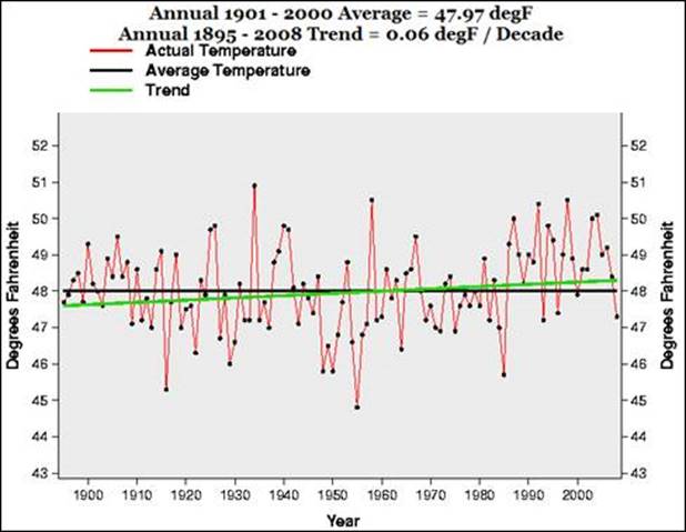
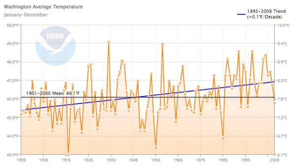
Washington State Average Annual Temperature
NOAA Graph in 2009 showing data for 1895 to 2008.
The original post is here: http://appinsys.com/globalwarming/RS_Washington_usa.htm
The same data (1895 – 2008) plotted in 2022 (https://www.ncdc.noaa.gov/cag/statewide/time-series):
Mean temperature dropped from 47.97 to 46.1 Temperature trend increased from 0.06 to 0.1 Coldest year was 1955 moved back to 1916 (At least they finally figured out that 2 decimal places was fake precision.)
|
|
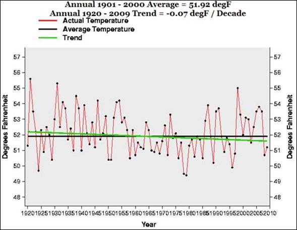
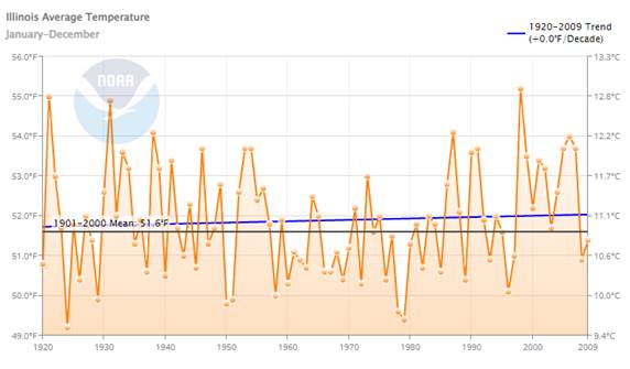
Illinois State Average Annual Temperature
NOAA Graph in 2010 showing data for 1920 to 2009.
The original post is here: http://appinsys.com/globalwarming/RS_Illinois.htm
The same data (1920 – 2009) plotted in 2022:
Mean temperature dropped from 51.92 to 51.6 Temperature trend increased from -0.07 to 0.0 Coldest year was 1979 now moved back to 1924
|
|
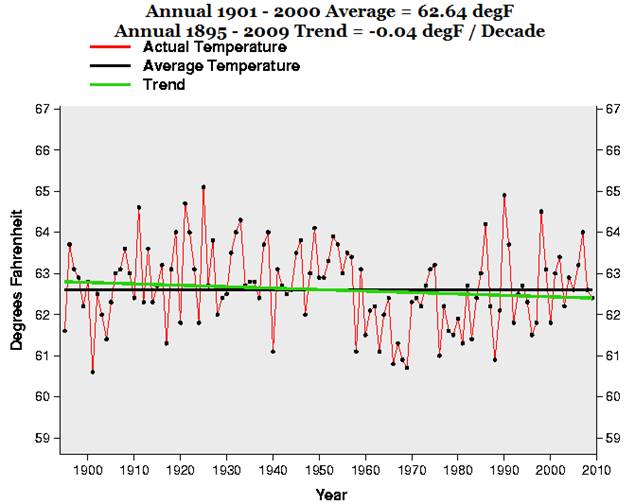
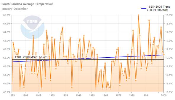
South Carolina State Average Annual Temperature
NOAA Graph in 2010 showing data for 1895 to 2009.
The original post is here: http://appinsys.com/globalwarming/RS_SouthCarolina.htm
The same data (1895 – 2009) plotted in 2022:
Mean temperature dropped from 62.64 to 62.4 Temperature trend increased from -0.04 to 0.0 Warmest year was 1925 moved forward to 1990
|
|
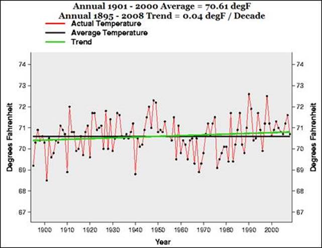
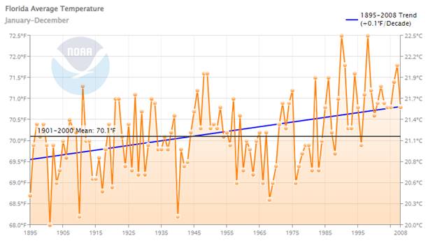
Florida State Average Annual Temperature
NOAA Graph in 2009 showing data for 1895 to 2008.
The original post is here: http://appinsys.com/globalwarming/RS_FloridaUSA.htm
The same data (1895 – 2008) plotted in 2022:
Temperature trend increased from 0.04 to 0.1 Six years were previously above 72 – now only the two most recent of the six are above 72
|
|
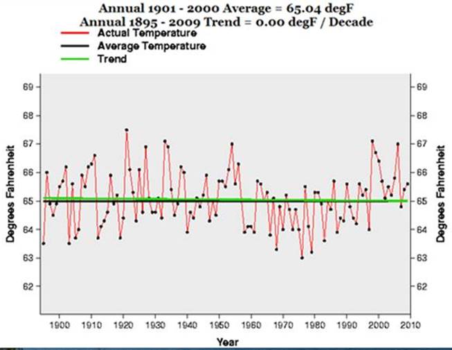
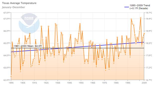
Texas State Average Annual Temperature
NOAA Graph in 2010 showing data for 1895 to 2009.
The original post is here: http://appinsys.com/globalwarming/RS_FloridaUSA.htm
The same data (1895 – 2009) plotted in 2022:
Temperature trend increased from 0.00 to 0.1 Warmest year was 1922 moved forward to 2006 Coldest year was 1976 moved back to 1895 Six years were previously above 67 – now only the single most recent of the six is above 67
|
|
NOAA does not mention:
Ø Cooling the Past: Increased warming trends are created through data adjustments. Ø Statistical Significance: When data has this much variance, the statistical significance of these slight “warming” trends is not statistically different from zero trend. Ø Warmest Year / Coldest Year: One cannot trust their fake data adjustments.
|
|
See also: http://appinsys.com/GlobalWarming/TempFakery.htm for more of NOAA’s temperature fakery in 2019.
|
|
NOAA 2009:
See: http://appinsys.com/GlobalWarming/StillNoWarming.htm
NOAA has been faking data for a long time. See: http://appinsys.com/globalwarming/noaa_janjun2010.htm
|
|
|